GRAPHIC DESIGN
Type Design BA2 – S1 2025
with Aurèle Sack
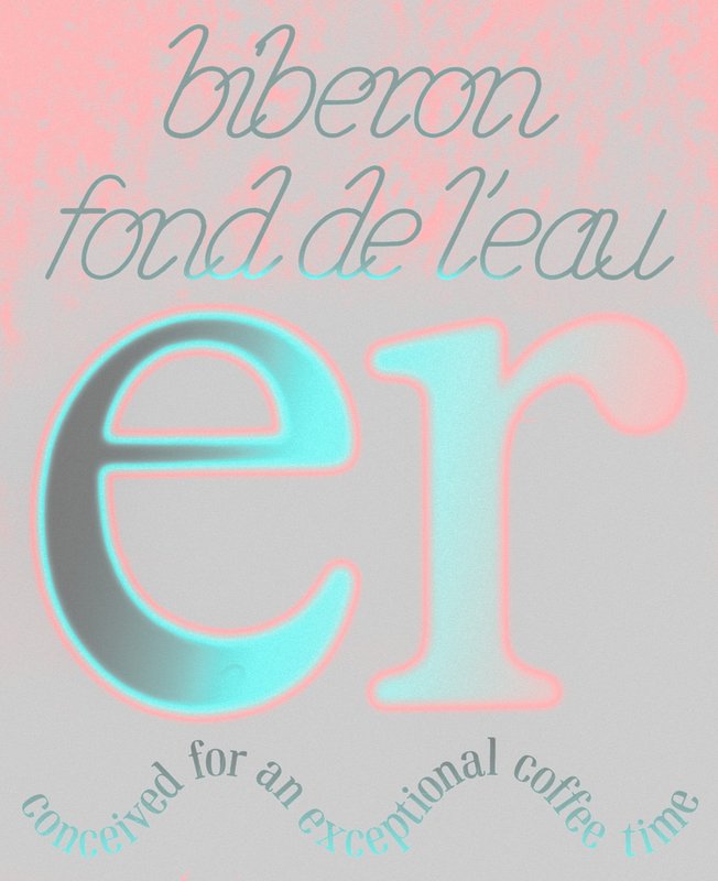
Second-year students were required to manually develop the lowercase letters of two typefaces.
GRAPHIC DESIGN
with Aurèle Sack
Second-year students were required to manually develop the lowercase letters of two typefaces.
GRAPHIC DESIGN
with Adeline Mollard
As part of the visual identity course led by Adeline Mollard, students developed a visual identity starting from a randomly selected business card. By appropriating one of its graphic elements and its title, each project offers a unique interpretation. The identity is then expanded across a range of formats, from business cards to F4 posters, including posters, flyers, business cards, and an animated poster.
GRAPHIC DESIGN
with Diego Bontognali
As part of this editorial design course, students developed a research-based project focused on the selection and design of texts around a shared theme. Based on a curated set of sources, each project presents two editions with identical content, produced in both a large and a small format.
GRAPHIC DESIGN
by Leandra Adler, Cansu Celen, Layana Comte, Anaïs Dermont, Camille Genoud, Eve Gremaud, Eloïse Guillod, Mathis Harmant, Marie Hintzy, Matteo Lucca, Maxime Manera, Gaëtan Mauclair, Mathys Mauron, Emma Morisseau, Sara Pedersoli, Lucie Pittet, Hélène Prongué, Leonardo Mariucci, Alice Refachinho, Justine Renevey, Gaspard Schlatter, Laura Simons, Vu Toni Thien Duc, Maïa Yassin, Jonas Zesiger
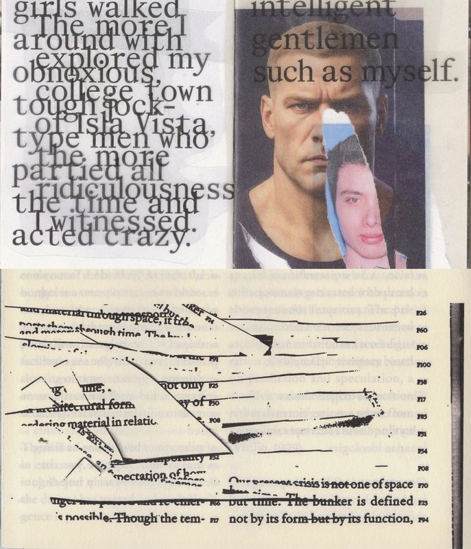
In November 2025, 27 ECAL students took part in Work and Turn, a workshop led by Geoff Han exploring the theme of labor and the often overlooked work that sustains the school. Located in a former IRIL knitwear factory in the industrial area of Renens, ECAL occupies a vast building whose daily functioning depends on many visible and invisible forms of labor. Over five days, students worked in small teams to produce a collective 96-page pocket-sized publication. Each pair created an 8-page photographic visual essay focusing on a specific aspect of labor at ECAL. Rather than relying on traditional portraits, the projects explored more poetic and indirect ways of documenting traces of work through spaces, gestures, materials, and infrastructures. The entire publication was manually printed on an offset press by the students themselves, in either black or red and black. The printing process was a central part of the workshop: participants prepared the plates, set up the press, and ran the prints. This hands-on production process echoed the theme of labor explored throughout the publication.

GRAPHIC DESIGN
with Robert Huber
Designing a logotype means defining a strong visual identity anchored in a specific context. First-year Graphic Design students developed a hand-drawn logotype based on a subject, theme, or environment of their own choosing. This creation was informed by prior research in typographic archives. Each student produced a reference booklet and a specimen system based on six or more typefaces, to ground their visual and conceptual exploration. Balancing typographic culture and contemporary expression, each project investigates what makes a visual identity truly distinctive.

GRAPHIC DESIGN
with Alice Franchetti
During this workshop, each student was tasked with designing a poster inspired by the architectural legacy of Richard Neutra. Drawing from his modernist philosophy and formal principles — clean lines, transparency, strict geometry, and integration with the landscape — each student visually reinterpreted Neutra’s ideas within a 2D graphic format.

GRAPHIC DESIGN
with Adeline Mollard
During the visual identity course with Adeline Mollard, the students had to develop an identity project promoting a collection chosen by them. Each project includes the design of a catalogue contextualising and presenting the collection, together with the design of a poster.

GRAPHIC DESIGN
with Guy Meldem
In the age of social media, Instagram has become a true space for graphic experimentation. This semester, first-year Graphic Design students created a printed edition of at least 100 pages, exploring the question: what does it mean to design for Instagram? Through this investigation, they examined the platform’s visual codes, its attention-driven dynamics, and the graphic forms it inspires. Each project reflects on how these creations can be translated, extended, or reinterpreted in the digital space. Balancing printed matter and online presence, these works outline new ways of inhabiting both images and networks.

GRAPHIC DESIGN
MEDIA & INTERACTION DESIGN
PHOTOGRAPHY
with Vincent Veillon, Paul Walther, Florian Pittet (Sigmasix), Vincent Jacquier, Julien Gurtner
During an intensive week, first-year students from the Visual Communication department at ECAL had the opportunity to create and produce the first edition of ECAL Night Live. The goal was to design a show inspired by satirical television formats. Divided into multidisciplinary teams—including students from the Bachelor programs in Graphic Design, Media & Interaction Design, and Photography—they collaborated to create all the content, set design, and visual identity of the show, delivering a fully homemade project in record time. The main theme revolved around self-mockery, targeting the visual communication professions, students, and the institution itself, with a subtle touch of current events. This project was supervised by Vincent Veillon and Paul Walther, directors of the RTS show 52 Minutes, as well as Florian Pittet, a digital scenography expert who guided the creation of the show's set design.

GRAPHIC DESIGN
with Adeline Mollard
During the visual identity class, first-year Bachelor's students in Graphic Design were tasked with creating a poster project based on a randomly assigned event. They had to define their own visual system and explore a series of hand-drawn typographic posters. The visual identity of the event was developed through a poster and a flyer, accompanied by a research booklet documenting their entire creative process.

GRAPHIC DESIGN
with Robert Huber
First-year students were invited to manually sketch the typographic skeleton of lowercase alphabet letters. The objective was to maintain the proportions, curves, and characteristic axes of each letter while paying close attention to visual coherence and consistency in the drawing.

GRAPHIC DESIGN
with Guy Meldem
First-year students were invited to design their own coloring book, while exploring bichromy and experimenting with different printing techniques to create the cover.

GRAPHIC DESIGN
with Harry Bloch
During the editorial design course with Harry Bloch, the 1st year students developed, during the fall semester, an edition around a personal survey.