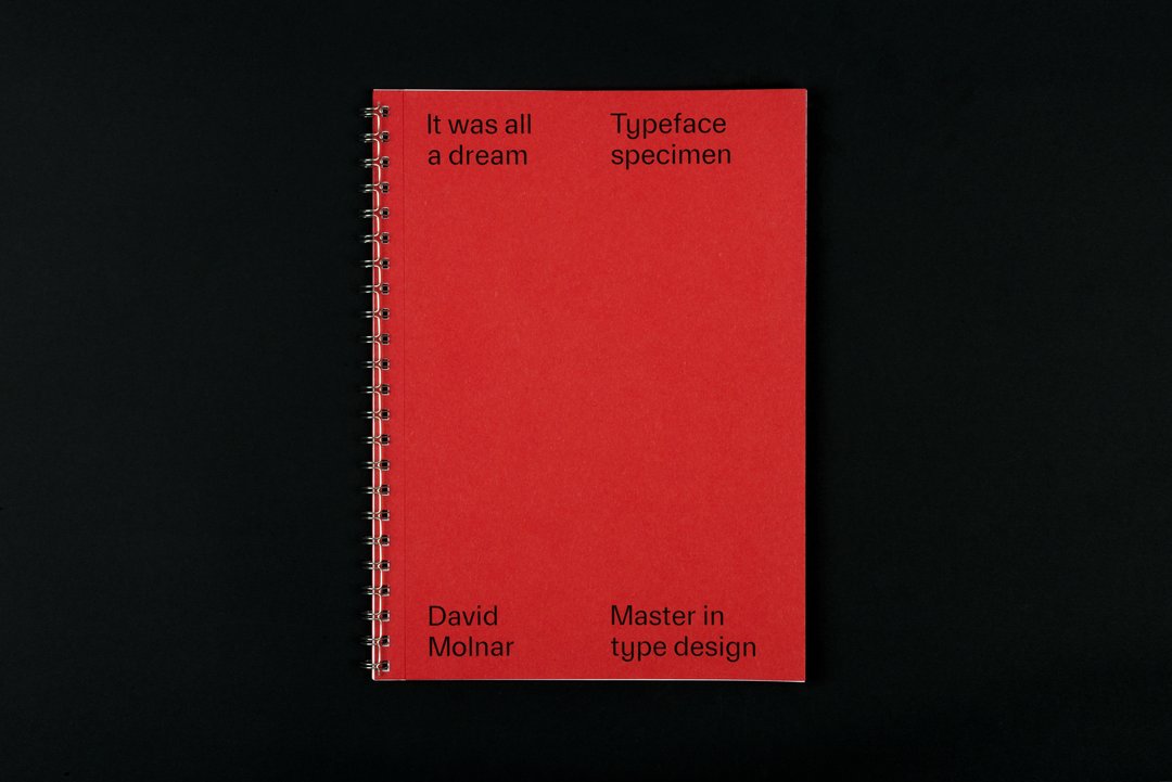
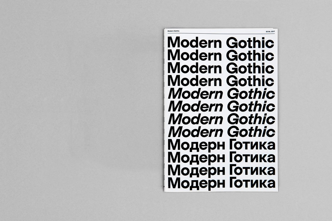
Presentation

ECAL is introducing a new master’s degree in Type Design as from the 2016 academic year. Unique in Switzerland, this two-year programme gives graduate students with a Bachelor in Graphic Design an opportunity to develop projects in the long term. This training provides privileged access to one of the flagship disciplines in Swiss graphic design, relying on ECAL’s expertise in this field as the first Swiss school to have integrated digital typography as part of its curriculum.

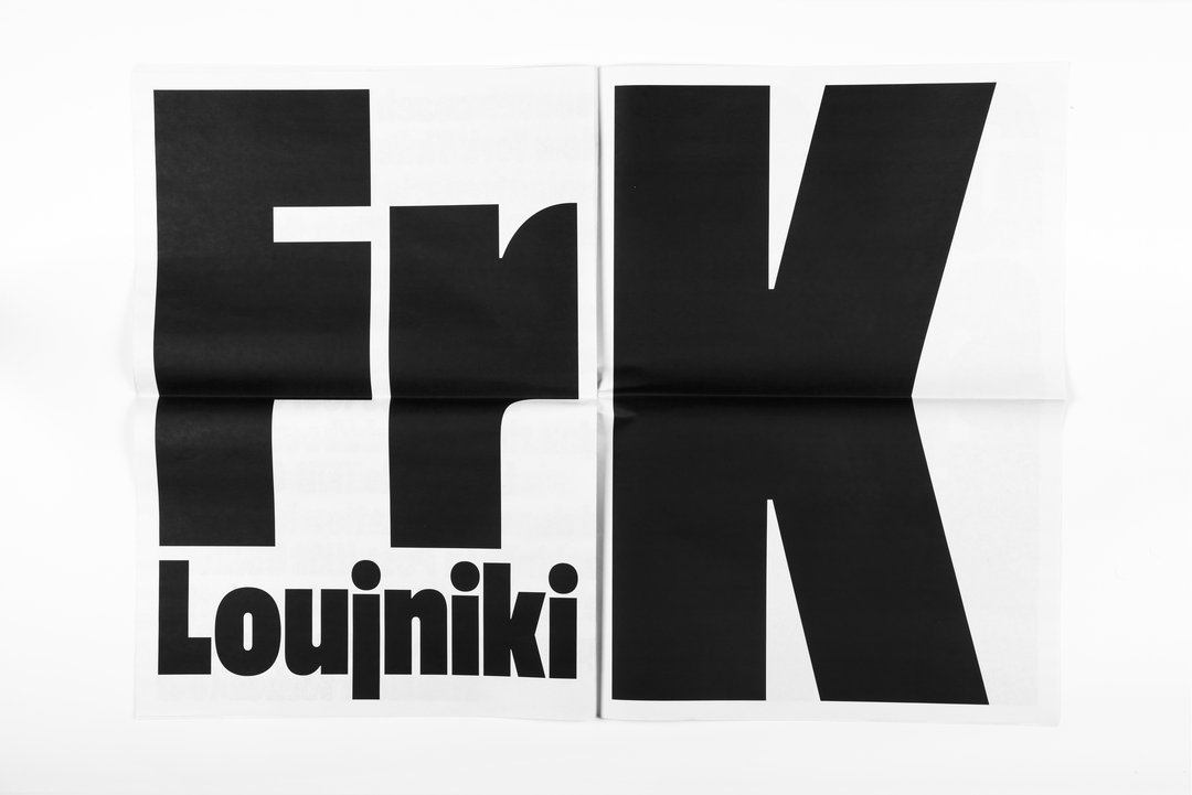
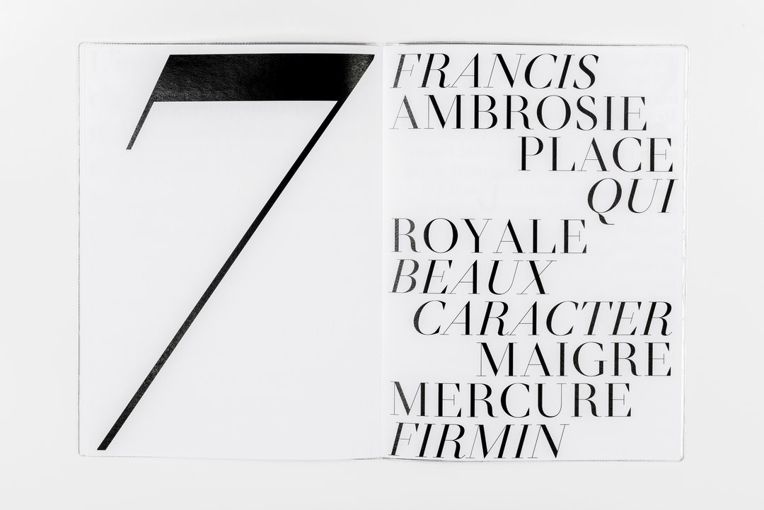
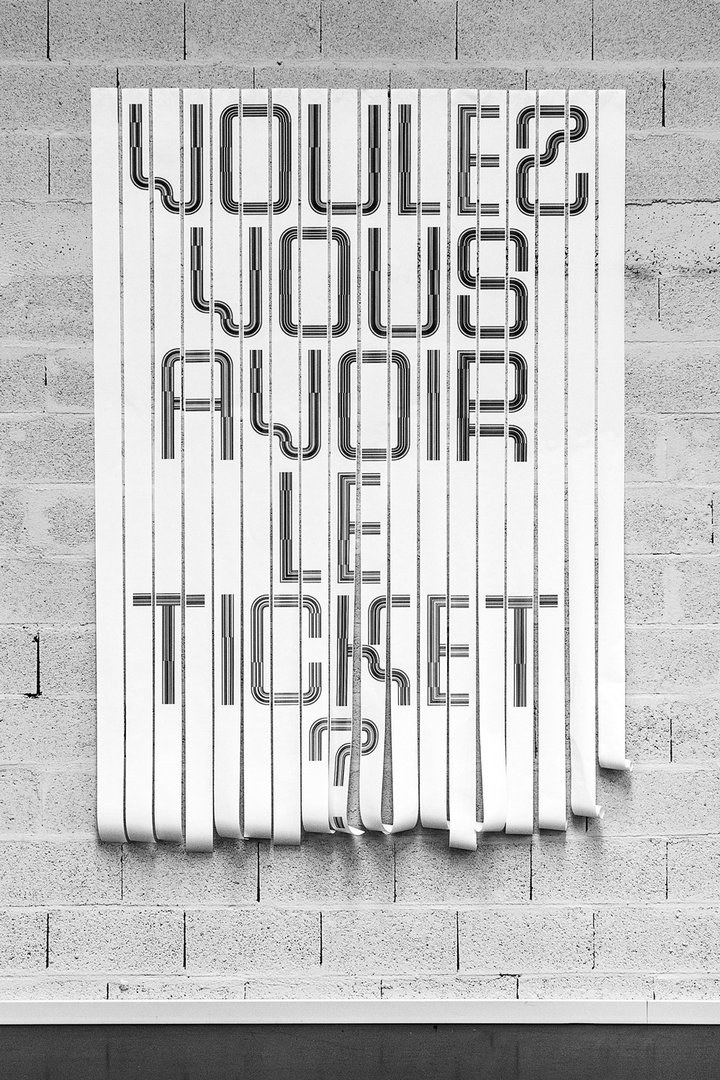
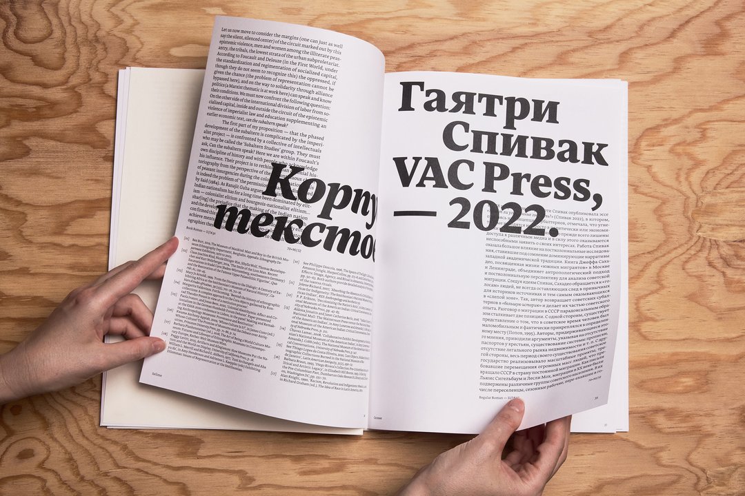
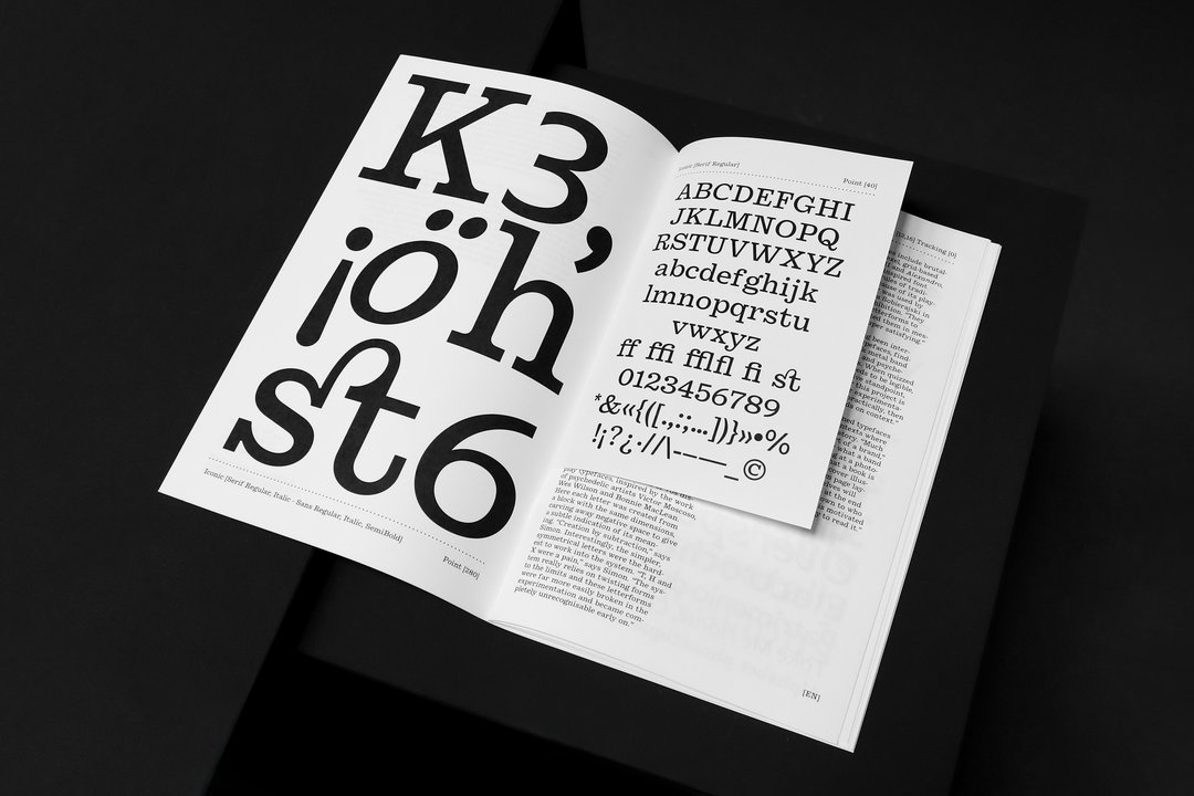
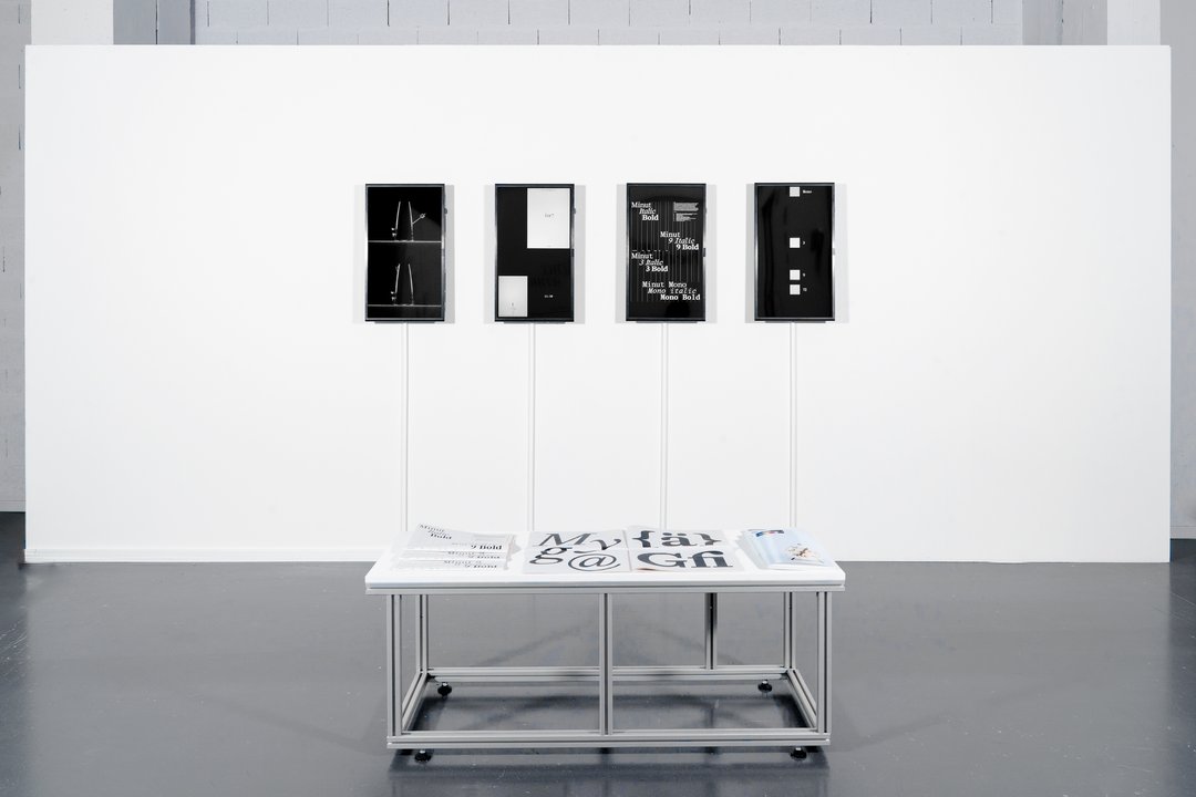
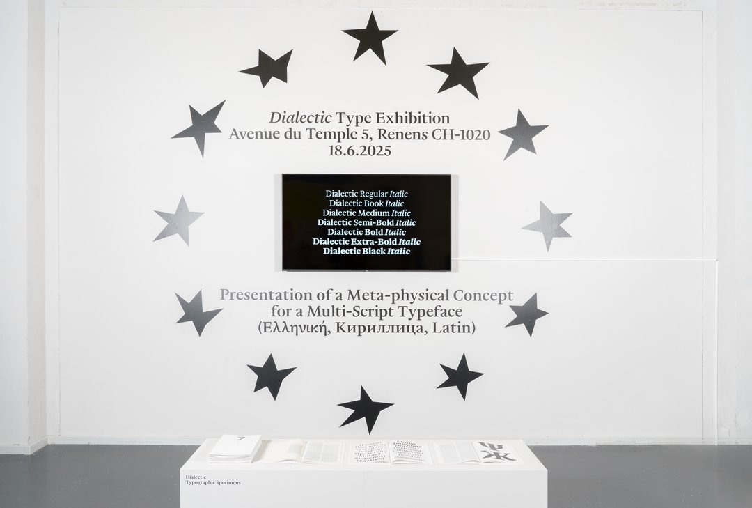
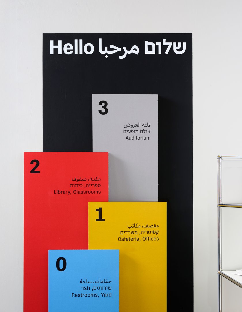
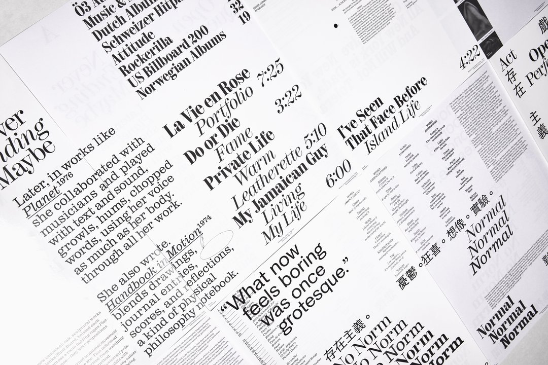
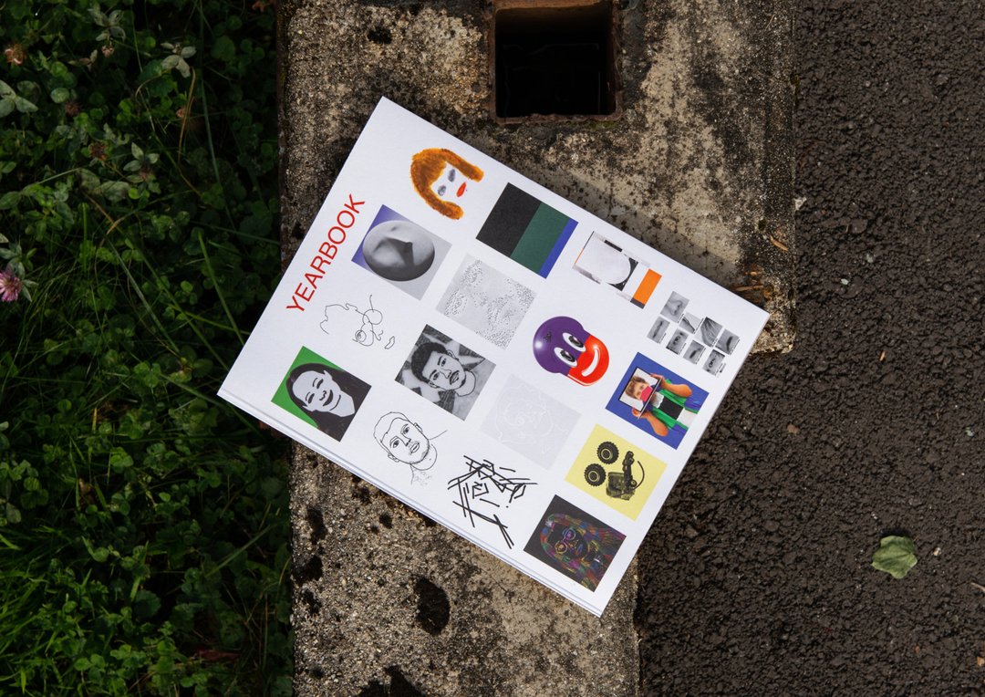
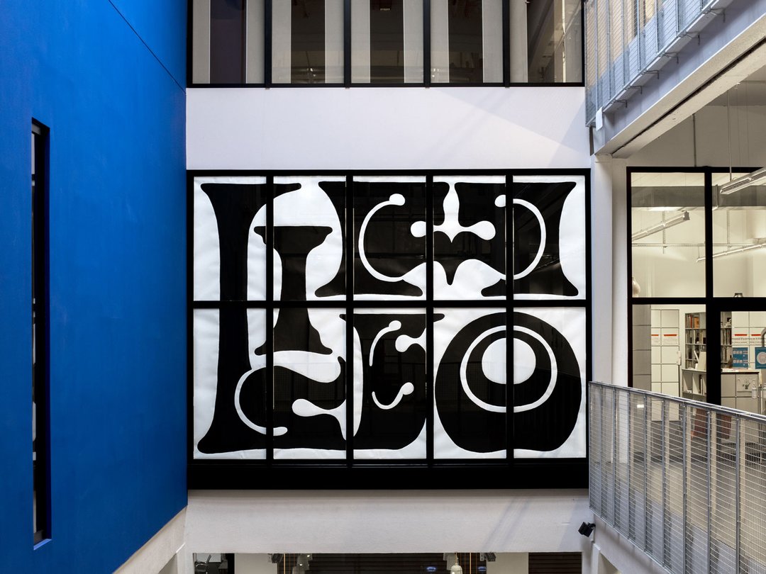
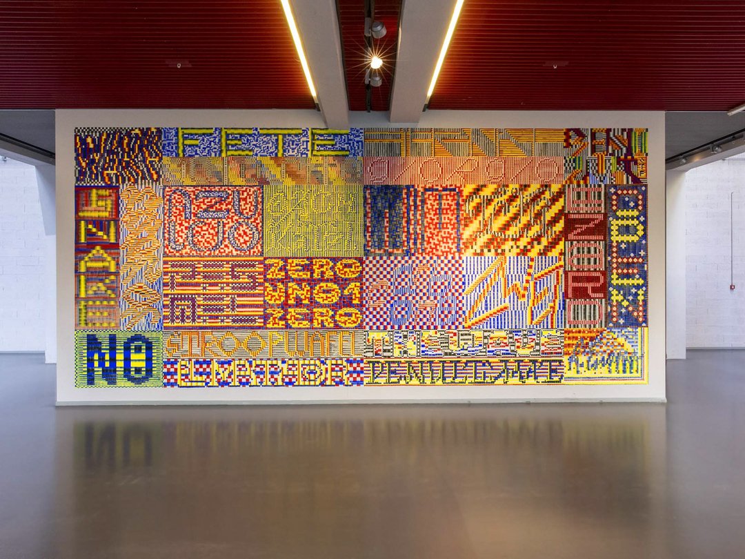
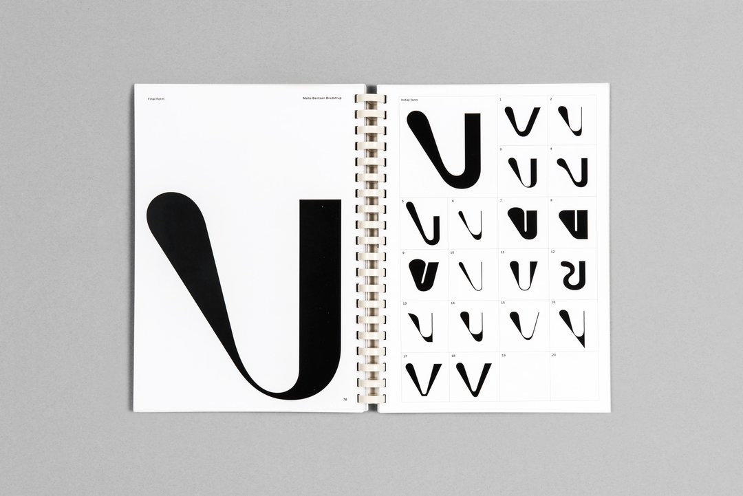
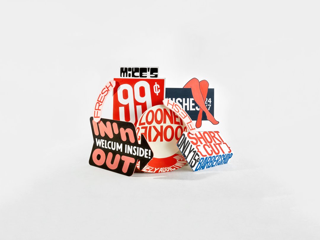
With the support of renowned professionals and academics, students explore fields ranging from corporate typography to experimental research, focusing on creativity. They work on techniques specific to typeface design (calligraphy, work on curves, construction, digital drawing), including the development of multi script font families. They acquire and develop a sharp and thoughtful eye, technical and methodological skills and an ability to produce quality digital fonts with efficiency and rigour (mastering, scripting) as part of courses and workshops where their projects are assessed and commented by experts invited for conferences and individual interviews. Finally, they attend lectures and research sessions around concepts ranging from the prospective to the historical, including aesthetic and legal aspects, which are given concrete form through dissertations, online or paper publications and even exhibitions.

The skills and projects developed throughout the curriculum serve to produce a portfolio that meets the highest standards. At the end of their curriculum, having acquired a solid typographical culture, students will have the  opportunity to apply their skills either as part of a company or in a self-employed capacity.

Language

English

Qualification issued

Master of Arts HES-SO in Design, major in Type Design

Yearly fees (materials included)

Fees detail

Length

4 semesters

Credits

120 ECTS

Useful links

Admissions Contact ECAL Typefaces

Equipments & infrastructures

Open Space MA Type Design Printshop Digital printshop

Learning Objectives

First year
Sascha Bente - Semester project, 2020
Laura Zsófia Csocsán , Samira Schneuwly - Semester project, 2021
Julia Born - Visit in Zurich
Radim Peško - Workshop
Alexandre Lescieux - Semester project, 2020
Individual reviews with Jan Horčik
Non-Legitur class with Noheul Lee
Kai Bernau - Tools makes shapes, class

1/8

  • Work on transposition from one medium to another, from the communication of ideas to sensations (e.g., transposition of a piece of music into typography).
  • Question type design processes according to the tools used, whether analogue or digital.
  • Contextualise letter drawing in its history.
  • Work in a group with the aim of creating a functional typeface based on specifications provided by a client.
  • Include typography in the wider context of graphic design (Editorial Design).
  • Develop research on writing that none of the students are able to read with a guest lecturer throughout the 2nd semester.
  • Enhance your knowledge through lectures given by lecturers from the MA in Type Design or guest lecturers (history of graphic design and typography, technical issues, design problems and presentations of their work by lecturers).
  • Write a Master’s thesis based on the knowledge acquired throughout the course and in line with the professional field.
  • Benefit from technical assistance to learn and solve technical issues that arise in type design.
  • Take part in weeks of workshops supervised by practitioners from all over the world with the aim of carrying out collective or personal projects.
Second year
Study Trip - Museum Plantin-Moretus
Archive Visite - Museum Meermanno
Diploma Jury 2023
Anne Seseke - Diploma 2021
Chiachi Chao - Diploma 2021
Sophie Wietlisbach - Diploma 2020

1/6

  • Develop three self-initiated projects (type design, use of typography in an editorial context and free project); for each project, the student chooses a teacher who will monitor the project.
  • Write a Master’s thesis based on the knowledge acquired throughout the course and in line with the professional field.
  • Put into practice the know-how acquired in a graduation work.

Projects

This section contains a selection of emblematic or recent projects related to the disciplines taught in the Master's degree.
See all projects

Studio projects

Wallace

TYPE DESIGN

Wallace

with Kai Bernau

Wallace is a semester project by Gabriela Jaime and Pauline Heppeler, developed during the course “Tools Make Shapes”, led by Kai Bernau. “We worked with the metaphor of dancing and how our body behaves when it moves. This led to experimentation with two types of mechanisms; the first prototype followed the scissors logic, while the later one (and final) followed the compass logic. This typology of object allowed us to translate dance movements like spin and pivot, drag and drag across (sliding along the floor) onto an open typographical stroke and structure. It was important for us to show the coordination and movement of two that becomes one – hence we chose to maintain the final output as an open stroke typeface.”

Rasa

TYPE DESIGN

Rasa

with Marie Lusa

Rasa is a modular stencil typeface designed by Mac Wang. It consists of two masters, Roman and Alien, with the possibility of complementing each other by overlaying them. Semester project mentored by Marie Lusa.

Labour Tool Product

TYPE DESIGN

Labour Tool Product

with Julia Born

“Labour, Tool, Product” is an editorial project, self-initiated by Samira Schneuwly. The book explores the universal profession of farming, its evolution and the technologies and possibilities associated with it through carefully curated images from ETH Zürich’s online image archive and excerpts from her great-grandfather’s and grandfather’s inventory books.

Max Fett

TYPE DESIGN

Max Fett

by Weichi He

MaxFett is a free interpretation of the typeface Fette Grotesk, widely distributed as a single cut among former German type foundries under different names. Fette Grotesque, Breite fette grotesque, Fette Steinschrift, Zeitung-Grotesque, Ganz fette Groteske. This interpretation of the source by Herrlinger & Schmidt from 1881 is taking a contemporary approach on heavy squarish grotesks.

Typetitle, projet de semestre par Quentin Coulombier

TYPE DESIGN

Typetitle, projet de semestre par Quentin Coulombier

with Kai Bernau

Typetitle is a condensed typeface designed for newspaper headlines which was inspired by American wooden type models.

Didot Vafflard semester project by Dávid Molnár

TYPE DESIGN

Didot Vafflard semester project by Dávid Molnár

with François Rappo

Inside-Out semester project by Dávid Molnár

TYPE DESIGN

Inside-Out semester project by Dávid Molnár

with Radim Peško

Tools make shapes. Semester Project by Malte Bentzen et Kaj Lehmann

TYPE DESIGN

Tools make shapes. Semester Project by Malte Bentzen et Kaj Lehmann

with Kai Bernau

Modern Gothic, Semester Project by Malte Bentzen

TYPE DESIGN

Modern Gothic, Semester Project by Malte Bentzen

with François Rappo

Diploma projects

Gabriela Jaime – Fabrikaat

TYPE DESIGN

Gabriela Jaime – Fabrikaat

by Gabriela Jaime

Fabrikaat is a sans-serif typeface that breaks from the traditional Swiss neo-grotesk genre. Its curves, translated from steel to vector, vary in width from Condensed [0] to Regular [4] to Wide [8]. A monospace cut, incorporating features from its proportional siblings, serves as a text style for small sizes. Fabrikaat is inspired by manipulating rigid materials and analyzing the resulting curves, focusing on deformation and tension. Like the exploration of shaping stiff materials, Fabrikaat’s curves have a mechanical feel. Smooth transitions between flat and curved forms are achieved through a stylistic set designed to facilitate movement along the design space. This adds character and rhythm to a sturdy, mechanical typeface, allowing versatile application across media and font sizes.

Antoine Pasi – Quasi

TYPE DESIGN

Antoine Pasi – Quasi

by Antoine Pasi

The Quasi family started with the idea of “Mécalde”, a french typographic term employed by Maximilien Vox to describe José Mendoza y Almeida’s way of mixing Mechanistic and Garalde genres. Like a soft sculpture molded by hand, Quasi offers a contemporary dive into an empiric and hybrid process by joining traces from the craft and the industrial, gathering fragments from different periods. The brush, the chisel and the broad nib pen are joining on a rigid and boxy construction, without rejecting the digital tool. Quasi embraces the beauty of imperfections and finds its interest in inconsistent and grotesque details, mediating antagonistic ideas. Like a Janus-faced performer, Quasi is confident yet clumsy – rough yet elegant, inhabiting polarizing personalities within a character set.

Hólmfríður Benediktsdóttir – KRULLA.SANS

TYPE DESIGN

Hólmfríður Benediktsdóttir – KRULLA.SANS

by Hólmfríður Benediktsdóttir

What is the difference between a curl, a swirl and a whirl? What about a whirl and a whorl? What about a swash, a flourish, a spiral, a twist and a twirl? Using the curl as an experiment in expression and disobedience in text, KRULLA.SANS is a sans serif typeface that comes in three weights with corresponding curls. Inspired by the original drawing of Antique No. 8 by Miller and Richard, KRULLA is an endeless exploration of contemporary curls taken to a curly extreme. With its condensed proportions and unexpected curves throughout the styles, KRULLA evolves from a Bold Confused and arrives at a disobedient Crazy Light that reimagines the relationship between curve, curl, spiral, twist and a twirl. Can a curly letter be repurposed and shown as a tool to signify resistance and disobedience?

Maximilian Inzinger – Embajador

TYPE DESIGN

Maximilian Inzinger – Embajador

by Maximilian Inzinger

Embajador is an all-purpose serif font family designed for extended reading. Referencing historical Spanish influences that show an unfamiliar dynamic in their strokes, Embajador strives to harmonize contemporary type setting while maintaining the essence of the Spanish spirit and charm. Available from Light to Black with corresponding italics, Embajador’s weights are drawn as optical sizes. Whereas the Light is monolinear with wider proportions, the Black features more condensed, high-contrasted letterforms. These variations in weight are intended to guide users in choosing the appropriate style for their specific application and size. With the addition of optical spacing, however, all styles can also be used effectively at any size.

Simon Memel – Itinérant

TYPE DESIGN

Simon Memel – Itinérant

by Simon Memel

Itinérant takes Robert Granjon’s work as its starting point, producing a type family of four cuts: a text and display roman, each with a corresponding italic. The text cuts pare back some of the extravagance that Granjon was famous for, and lower the contrast in order to create type suitable for continuous setting, especially in smaller sizes. In part they draw on historical typefaces which themselves were influenced by Granjon- namely Plantin and Times New Roman. The display cuts reference the writing masters that preceded Granjon, and influenced the masters work. They restore the details that were removed in the rendering of the text cuts, and go further still, creating characters more calligraphic than Granjon, but rendered with a contemporary cleanness.

Lucrezia Noro – Plaxid

TYPE DESIGN

Lucrezia Noro – Plaxid

by Lucrezia Noro

Plaxid is a uniwidth typeface developed to enhance the typesetting of complex hierarchies and text-heavy layouts. Inspired by the mechanical structure of the Ionic genre, Plaxid is a practical font family with a solid feel and modest character. The specificity of duplex matrices used by Linotype during the hot metal typesetting era improved with the contemporary design possibilities of negative spacing and applied kerning. This complementary duality makes it possible to achieve a uniwidth design without compromising letterforms. Plaxid maintains consistent width measurements across its eight cuts, making it easy to change styles without affecting quality, copyfit and layout.

Mirela Belcheva – Astra

TYPE DESIGN

Mirela Belcheva – Astra

by Mirela Belcheva

Astra is a humanist serif type family designed to meet the demands of complex text environments, such as dictionaries and reference materials, particularly in the fields of language learning and translation. Its calm personality, and clear and functional presence, add to its versatility and allow it, nevertheless, to adapt to different types of text, both printed and on screen. Its neutrality ensures that it can be used in a variety of contexts and applications, without being limited by specific use cases. The family comes in two optical sizes: Display and Text, the latter with a range of weights from Light to Bold, one of which includes a Cyrillic extension.

Eran Ben Barak – Olivia Typeface

TYPE DESIGN

Eran Ben Barak – Olivia Typeface

by Eran Ben Barak

Olivia is a font family supporting both Latin and Hebrew scripts. It explores the shapes and conventions of these scripts without blending or “Latinizing” Hebrew. The project rethinks Latin type design norms, leveraging my background and education. As a Hebrew type designer, I advocate for mutual learning between scripts. This typeface serves as a bridge, demonstrating how Hebrew and Latin can coexist and enrich each other.

Thorgeir Kristinn Blöndal – Flaneri

TYPE DESIGN

Thorgeir Kristinn Blöndal – Flaneri

by Thorgeir Kristinn Blöndal

Flaneri is a cursive script-like typeface that invites references born after industrialization to find its place. Torn between the human stroke and its translation into the machine, it steps into a world where authenticity is becoming harder to detect, and a longing for “human made” becomes greater. While wandering around many places, Flaneri finds inspiration in everything from Jan van de Velde’s art of writing to my grandmother’s and my own handwriting, the digital translation carries questions on what is to be left out, polished or even highlighted. Resulting in a cursive font with a physical texture and broken connections, leaving the observer with a feeling of what has been or what is to come.

Pauline Heppeler – Shift

TYPE DESIGN

Pauline Heppeler – Shift

by Pauline Heppeler

Shift is a type family consisting of four pairs of roman and italic ranging from sans to serif styles and from medium to light weight. Exploring the space between a traditional “super-family” and a font-pairing, the projects’ starting point is the notion of voice and the idea of conversation between different typestyles. Through breaking up the binary thinking of this or that in the weight axis, the pairs of sans and serif are put into context with each other through exchanging straightforwardness with richness in detail and vice versa. The extended family aims to put things together that are reacting to each other but ultimately their own idea of something highlighting the importance of negotiating agreement and disagreement.

Nell May – Night Editor

TYPE DESIGN

Nell May – Night Editor

by Nell May

Night Editor is a text font family designed for the dark screen writing environment: a focused space for creation and thinking. Night Editor features a calm low contrast calligraphic skeleton. Large counters, open apertures and generous spacing all aid legibility and counter the impact of light halation. Styles are limited to necessary tools: Regular, Bold, Italics (plus accompanying light mode grades). Night Editor Mono is the text production workhorse with oversized punctuation. It is designed for a slower, more physical access to a text in progress and is also available in Round with softened terminals that embrace the bloom of light. Night Editor Sans is the proportional counterpart, suitable for both writing and reading texts in the tranquil darkness.

Anna-Sophia Pohlmann – Eternity

TYPE DESIGN

Anna-Sophia Pohlmann – Eternity

by Anna-Sophia Pohlmann

From Rational to Functional: Eternity is a family of six styles inspired by the French typeface Romain du Roi in 1694. Its creation is one of the first examples of rational type design. Philippe Grandjean, who cut the punches for the metal type, took many liberties to moderate the original letterforms. Eternity raises the question of what makes a functional typeface contemporary. What criteria are important for a typeface to be usable in different contexts? The finished typeface continues to use characteristic elements of Romain du Roi and Philippe Grandjean, but questions the functionality of the typeface by breaking with mathematical and analytical principles. Eternity collects and creates the ideal parameters for each font style, applied on an axis between rational and function.

Workshops

Yearbook

TYPE DESIGN

Yearbook

with Nejc Prah

In October 2021, the Master Type Design welcomed Nejc Prah for a one-week workshop. Being in a masters program is a special time, both personally and professionally. To keep a memory of it, the students were invited to create a Yearbook. First years and second years were assigned into pairs and asked to make a contribution about their partner. Drawings, collages, letterings, doodles, patterns, 3D-modelling, … Experimentations and explorations were encouraged. It resulted into a colourful and joyous publication, displaying a diversity of characters and approaches. After a collaborative effort for the production on the last day, each student got a copy, as a memory.

Böcklin Zoo

TYPE DESIGN

Böcklin Zoo

with Karl Nawrot

Workshop with Karl Nawrot. Handpainted compositions inspired by the typeface Arnold Böcklin from Schriftgiesserei Otto Weisert (1904).

All Over

TYPE DESIGN

All Over

with MATD, Job Wouters (Letman)

Workshop with Dutch designer Job Wouters.

Indentity Of The Zone

TYPE DESIGN

Indentity Of The Zone

with Jan Horčík, MATD

Patches from workshop with Jan Horčík.

Workshop with studio NORM

TYPE DESIGN

Workshop with studio NORM

with Dimitri Bruni (NORM), Manuel Krebs (NORM)

Workshop with Zürich based studio NORM on the theory, the design and the use of stencil typefaces.

Workshop with Thibault Brevet

TYPE DESIGN

Workshop with Thibault Brevet

with Thibault Brevet

Workshop with Thibault Brevet.

Type Poster Workshop with Dafi Kühne

TYPE DESIGN

Type Poster Workshop with Dafi Kühne

with Dafi Kühne, MATD

Atlas of Letterforms, workshop with Radim Peško

TYPE DESIGN

Atlas of Letterforms, workshop with Radim Peško

with MATD, Radim Peško

Sign Painting Workshop with Alaric Garner

TYPE DESIGN

Sign Painting Workshop with Alaric Garner

with Alaric Garnier, MATD

Programme

This section lists the detailed modules and courses for each semester of the programme.

Semester 1 2 3 4

Type Design I
9 ECTS
  • Characters
  • Type (hi)stories
  • Custom Type
Typography I
6 ECTS
  • Tools makes shapes

  • Type in use workshop
  • Type lectures 
Pré-Memoire I
5 ECTS
  • MA Thesis preparation

Transversal Workshop I
3 ECTS
  • 5 days workshop
Training in research I
3 ECTS
  • Introductory course on design research
  • Interdisciplinary workshop
Cross lectures I
4 ECTS
  • Cycle of lectures
Type Design II
9 ECTS
  • Type hi(stories)
  • Non Legitur
  • Translation
Typography II
6 ECTS
  • Optical sizes
  • Type in use
  • Type lectures
Pré-Memoire II
5 ECTS
  • MA Thesis preparation
Transversal workshop II
3 ECTS
  • 5 days workshop
Training in research II – Experimentation
3 ECTS
  • 3-day week with lecturers

  •  
Cross Lectures II
4 ECTS
  • Cycle of lectures
Type Design III
5 ECTS
  • Self-initiated project
Typography III
5 ECTS
  • Self-initiated project
Open project
5 ECTS
  • Self-initiated project
Pré-memoire III
6 ECTS
  • MA Thesis preparation
Transversal workshop III
3 ECTS
  • 5-days workshop
Training to research III — Application
3 ECTS
  • Presentations and interdisciplinary workshop
  • Junior Research Conference
Cross lectures III
3 ECTS
  • Cycle of lectures
Master's practical project
21 ECTS
  • Development of a major personal project
Master's thesis
9 ECTS
  • Theoretical Master’s thesis

Find all the programme documents below

Alumni

Jacopo Aztori
Federico Paviani
Florence Meunier
Luca Pellegrini
Kim Sohee
Davide Tomatis
Rani Yasmine Putri
Career Opportunities

Type designer, Graphic designer, Motion designer, Art director, Creative director, Publisher, Illustrator, Web designer, Teacher…

Other alumni

(BA Graphic Design and MA Type Design) Leonardo Azzolini (Omnigroup), Ondřej Báchor, Sascha Bente, Harry Bloch (Studio Harris Blondman), Chaumont & Zaerpour, Guillaume Chuard, Matthias Clottu, Emmanuel Crivelli, Marietta Eugster, Eurostandard, Matthew Fenton, Louisa Gagliardi, Gavillet & Cie, Eliott Grunewald, Noémie Gygax, Weichi He, Robert Huber, Larissa Kasper (Kasper-Florio), Sean Ervan Kuhnke, Kaj Lehmann, Simon Mager (Omnigroup), Maximage, Adeline Mollard, Olga Prader, Aurèle Sack, Teo Schifferli, Haakon Spencer, Florence Tétier, Chi-Long Trieu, Nicole Udry…

Staff

Head

Matthieu Cortat

Assistants

Nicolas Bernklau
Raphaela Häfliger

ECAL Typefaces Manager

Malte Bentzen Bredstrup

Professors

Kai Bernau
Julia Born
Matthieu Cortat
Wayne Daly
Roland Früh
Anniina Koivu
Marie Lusa
Radim Peško
Alice Savoie
Chi­-Long Trieu

Lecturers

George Anton Kiraz
Gerry Leonidas
Hrant Papazian
Irene Vlachou

Visiting Lecturers

Sahar Afshar
Khajag Apelian
Roberto Arista
Etienne Aubert­-Bonn
Leonardo Azzolini (Omnigroup)
Stuart Bailey
Alexandru Balgiu
Chiara Barbieri
Paul Barnes
Sofie Beier
Selina Bernet
Bianca Berning
Eleni Beveratou
Alex Blattmann
Thibault Brevet
Vincent de Boer
Mirko Borsche
Johannes Breyer (Dinamo)
Dimitri Bruni (NORM)
Matthew Carter
Nadine Chahine
Mathieu Christe
Pippo Ciorra
Bart De Baets
Sara de Bondt
Lizá Defossez Ramalho (R2Design)
Maria Doreuli
Gary Fogelson
Tom Foley
Alaric Garnier
Gilles Gavillet (Optimo)
Emilio Gentile
Tanya George
Eliott Grunewald
Fabian Harb (Dinamo)
Jonathan Hares
Leila Hekmat
Franz Hoffman
Jan Horčík
Robert Huber
Thomas Huot­-Marchand
Larissa Kasper (Kasper-Florio)
Ueli Kaufmann
Simone Koller (Studio NOI)
Manuel Krebs (NORM)
Matthias Kreutzer
Dafi Kühne
Indra Kupferschmid
‍Phil Lubliner (Other Means)
Louis Lüthi
Bruno Maag
Simon Mager (Omnigroup)
Amir Mahdi Moslehi
Robin Mientjes
Yoann Minet
John Morgan
Reto Moser (Grilli Type)
Sandrine Nugue
Mitch Paone (DIA Studio)
Michele Patanè
Julie Peeters
Edwin Pickstone
Jonathan Pierini
Krista Radoeva
Mohamed Rafed
Artur Rebelo (R2Design)
David Rudnick
Aurèle Sack
Kristyan Sarkis
Jens Schildt
Isabel Seiffert (Offshore)
Wissam Shawkat
Izet Sheshivari
Fred Smeijers
Huda Smitshuijzen AbiFarès
Adam Szymczyk
David Jonathan Ross
Régis Tosetti
Nora Turato
Richard Turley
Linda van Deursen
Carlo Vinti
Ryan Waller (Other Means)
Job Wouters
Pascal Zoghbi

ECAL Typefaces


ECAL Typefaces has, since 2016, been the first online type foundry based within a university. Its initial remit was to respond to frequent requests to acquire the typefaces seen in ECAL corporate communications, such as posters, invitation cards and catalogues. The foundry is now fully embedded in the ECAL Master’s Degree in Type Design (MATD), and also features work from the ECAL Bachelor’s Degree in Graphic Design. All fonts have been designed by students.

Go to ECAL Typefaces Website

ECAL_Typeface_01.png