Böcklin Zoo

Böcklin Zoo

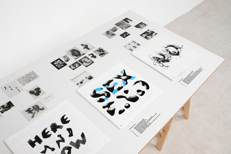
Workshop with Karl Nawrot. Handpainted compositions inspired by the typeface Arnold Böcklin from Schriftgiesserei Otto Weisert (1904).

Workshop (2020) by Dominik Bissem, Giacomo Bastianelli, Laura Zsófia Csocsán, Sam Fagnart, Amélie Gallay, Raphaela Haefliger, Joana Siniavskaja, Elena Baranowski, Charly Derouault, Stefan Fitze, Sergei Rasskazov, Karima Deghayli, Samira Schneuwly, Alexandre Lescieux

Know-how
Calligraphy

Handpainted compositions inspired by the typeface Arnold Böcklin from Schriftgiesserei Otto Weisert (1904).

1/4

Projects related to Calligraphy

ON 2040 - MASTER TYPE DESIGN

MA TYPE DESIGN

ON 2040 - MASTER TYPE DESIGN

with Larissa Kasper

Following a collaboration with the Swiss avant-garde brand On, ECAL is proud to present the interdisciplinary work carried out jointly by the 2nd year students of the Product Design, Photography and Type Design Masters.
Summer University to Bangkok

MA TYPE DESIGN

Summer University to Bangkok

with Matthieu Cortat

Summer University to Bangkok with first year ECAL Master Type Design students.

Glass gilding workshop with Eddy Bennet

MA TYPE DESIGN

Glass gilding workshop with Eddy Bennet

with Eddy Bennett

In this analogue workshop, students merged the ornate lettering styles of the late 19th century and the meticulous craft of reverse glass painting and gilding with their personal perspectives on type design. Thanks to Gold Leaf Supplies for supporting us with material!

Chandra Sperle – Gradual

MA TYPE DESIGN

Chandra Sperle – Gradual

by Chandra Sperle

How we perceive and interpret the world is influenced by scale—by the distance, size, and the spatial relationship between observer and object. This project explores how scale influences meaning and perception through an experimental dialogue of type design, photography, and visual art. At its core is Gradual, a typeface that remixes Ladislas Mandel’s Galfra and Adrian Frutiger’s Roissy, reversing their original scale of habitat. In collaboration with artist Pai Litzenberger and the design duo Scinema (Leidy Karina Gómez Montoya and Tonda Budszus), the project expands the typographic concept of optical sizes from nano to macro dimensions. Together, Gradual offer a multi-layered reflection on our spatial interactions with the world.

Giulia Zanzarella – Minut

MA TYPE DESIGN

Giulia Zanzarella – Minut

by Giulia Zanzarella

How long does a Minut last? Time is standardized, but its experience follows no rules, being mathematically equal for all, but felt differently by each. Minut explores this gap: a play on words between “minute” and “unit,” it is a type family built around four styles defined by width constraints—72 units (proportional), 9, 3, and 1 (monospace). Each style reflects a degree of mechanization, inspired by unit systems used in proportional spacing typewriters. Celebrating the beauty of constraint, the characters of Minut find their own rhythm, generating textures with subtle variations. Rather than being interpolated, each style of Minut is drawn individually, prioritizing the overall texture of each font—going against the limitless flexibility of digital design.

Related courses