Feed

Type

Course

Know-how

Years

2008 2025
Rebekka Hausmann – Equilibre

TYPE DESIGN

Rebekka Hausmann – Equilibre

by Rebekka Hausmann

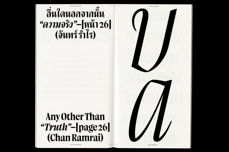
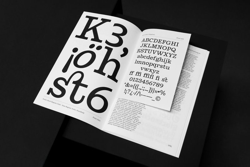
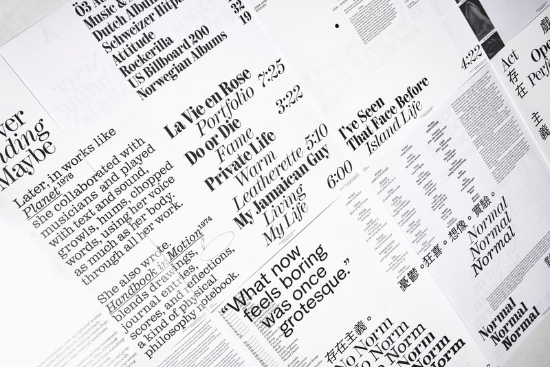
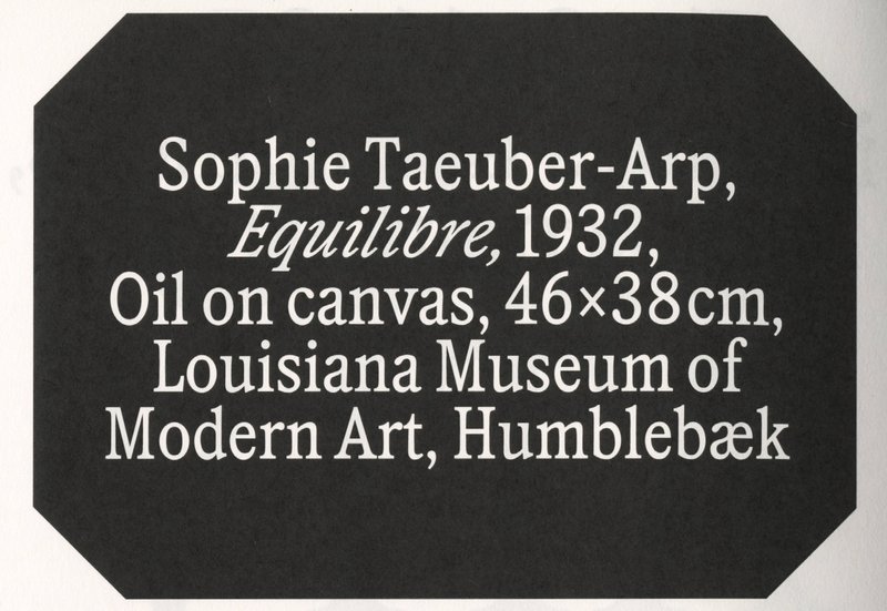
Equilibre is a typeface inspired by depictions of fragile balance in 20th-century art. The project began during a residency at Kunstbibliothek Sitterwerk with a study of how artists capture moments of tension, just before collapse. To translate these observations into type design, the designer explored eight approaches including contradicting counters, extreme shapes and physical instability. The final typeface takes a subtler path: vertical stress, condensed proportions and tense curves provoke slight discomfort. The italic style’s harsh slant further reflects instability. Equilibre is not a neutral container, but a strong voice for long texts and expressive italic highlights.

Nir Zabari Yenni – Safra ספרא سفرا

TYPE DESIGN

Nir Zabari Yenni – Safra ספרא سفرا

by Nir Zabari Yenni

Safra ספרא سفرا is a trilingual typeface family comprising both serif and sans styles. Designed with a contemporary, low-contrast approach, it supports Hebrew, Arabic, and Latin scripts with clear and consistent typesetting across languages. Balancing structural differences while preserving the distinct voice of each script, it enables multilingual communication without forcing uniformity. The design functions as a bridge between writing systems, maintaining typographic integrity and visual harmony. Suitable for both extended reading and display use in cultural, educational, and public contexts.

Ratchanon Boongsrithong – Sahn

TYPE DESIGN

Ratchanon Boongsrithong – Sahn

by Ratchanon Boongsrithong

Sahn is a solemn yet flavorful typeface designed to expand the possibilities within the Thai loop typeface family. In this project, both Thai and Latin scripts were developed simultaneously. Features from one script can influence and be integrated into the other, creating a cohesive visual language. While the Thai script may appear very different from Latin, both scripts share a similar repertoire of shapes; although they are disconnected, they seek moments of connection. Sahn aims to foster a dialogue between the two scripts by highlighting their commonalities in terms of tone and texture, while honouring their unique cultural differences.

Giulia Zanzarella – Minut

TYPE DESIGN

Giulia Zanzarella – Minut

by Giulia Zanzarella

How long does a Minut last? Time is standardized, but its experience follows no rules, being mathematically equal for all, but felt differently by each. Minut explores this gap: a play on words between “minute” and “unit,” it is a type family built around four styles defined by width constraints—72 units (proportional), 9, 3, and 1 (monospace). Each style reflects a degree of mechanization, inspired by unit systems used in proportional spacing typewriters. Celebrating the beauty of constraint, the characters of Minut find their own rhythm, generating textures with subtle variations. Rather than being interpolated, each style of Minut is drawn individually, prioritizing the overall texture of each font—going against the limitless flexibility of digital design.

Chandra Sperle – Gradual

TYPE DESIGN

Chandra Sperle – Gradual

by Chandra Sperle

How we perceive and interpret the world is influenced by scale—by the distance, size, and the spatial relationship between observer and object. This project explores how scale influences meaning and perception through an experimental dialogue of type design, photography, and visual art. At its core is Gradual, a typeface that remixes Ladislas Mandel’s Galfra and Adrian Frutiger’s Roissy, reversing their original scale of habitat. In collaboration with artist Pai Litzenberger and the design duo Scinema (Leidy Karina Gómez Montoya and Tonda Budszus), the project expands the typographic concept of optical sizes from nano to macro dimensions. Together, Gradual offer a multi-layered reflection on our spatial interactions with the world.

Lucas Portron – Dialectic

TYPE DESIGN

Lucas Portron – Dialectic

by Lucas Portron

Dialectic is a multi-script typeface family supporting, Latin, Greek, Cyrillic, designed to allow different writing systems to coexist in harmony. Developed side by side, the scripts share a common design foundation, encouraging a visual dialogue that respects their individual identities. With seven weights and matching italics, the family explores a balance between controlled visual disruption, within the letterforms themselves, and a consistent text color. These subtle tensions challenge established norms of legibility and reading habits, opening a critical reflection on legibility and readability. In doing so, Dialectic invites us to reconsider our relationship with text and how we engage with written form.

Jamie Michiki – Dutyfree

TYPE DESIGN

Jamie Michiki – Dutyfree

by Jamie Michiki

Dutyfree is a bi-script sans-serif typeface that supports both the Latin alphabet and Japanese scripts. It includes eight weights and covers the full range of Hiragana, Katakana, and Kanji characters. Designed to harmonize the atmosphere of both writing systems through shared skeletal structure, detail, and contextual nuance, Dutyfree bridges two distinct typographic origins: the Latin typeface Venus and the Japanese Ishi Chu-Futo Gothic. With a theme of overlap and crossover between writing systems and design cultures, the project was developed under the concept of "logistics graphics." Beyond just a typeface, Dutyfree also includes symbols and signage elements designed for use in logistics and packaging contexts.

Maria Kosheleva – Selime

TYPE DESIGN

Maria Kosheleva – Selime

by Maria Kosheleva

Selime is a contemporary humanist serif typeface designed for comfortable, immersive reading. Developed with a focus on long-form texts in the Chuvash language — a Turkic language spoken primarily in the Chuvash Republic of Russia — it combines cultural specificity with wide usability across both Cyrillic and Latin scripts. Drawing inspiration from the earliest Chuvash typefaces and 20th-century Dutch humanist serif design traditions, Selime reimagines these influences through a contemporary typographic voice. The family includes five weights with matching italics, providing flexibility for editorial, literary, and multilingual publishing.

Jonathan Bruun – Sekvens

TYPE DESIGN

Jonathan Bruun – Sekvens

by Jonathan Bruun

Sekvens is a typeface family of five weights with corresponding italics shaped by a continuous dialogue between perceptions of time and the design of letterforms. Revisiting early digital aesthetics and humanist sans serifs, Sekvens balances a standardized structure with subtle, idiosyncratic details. It navigates the familiar, embracing defaults, norms, and conventions, while simultaneously questioning how the inherited connotations of these forms are aging within the current landscape of type design. Embracing this duality, Sekvens represents both a documentation of past tendencies and a search for new proposals.

Lynn Birrer – Brienz

TYPE DESIGN

Lynn Birrer – Brienz

by Lynn Birrer

Important opinion: WE AINT BOYZ. Brienz examines “Swiss Style” in graphic and type design and its legacy which is learned and appreciated but doesn’t feel relatable to everyone. Brienz is a type family consisting of 4 styles ranging from Buch to Kursiv and from Schmal to Schmalfett. A typeface that feels more human, vernacular, and rooted in a different set of values. Like mash-up culture in music, it mixes contrasting influences to create something that feels familiar but new, responsive, moving and with its own voice. Construction, deconstruction, and then reconstruction. Kisses from Brienz. Type beat!

Stephanie Wilson – Iconic

TYPE DESIGN

Stephanie Wilson – Iconic

by Stephanie Wilson

Iconic stands at the intersection of typography, social research, and inclusive design. It addresses a growing concern: making reading more accessible for senior readers. Through the development of a typeface named Iconic, the project aims to enhance reading comfort while offering an aesthetic, functional, and adaptable typeface suited to the changes associated with aging. The project was created in collaboration with senior-lab, a Swiss platform dedicated to enhancing the quality of life for seniors. Grounded in a participatory methodology, this collaboration enabled a reality-based approach: available in serif, sans serif, sans semibold, and italics, Iconic was designed based on feedback and testimonials gathered from seniors during sessions held at ECAL.

Lee Xiang-Xiang – Revue

TYPE DESIGN

Lee Xiang-Xiang – Revue

by Lee Xiang-Xiang

Revue is an expressive, versatile typeface family inspired by the drama and typographic flair of 19th-century theatre posters. Its 12 serif styles—Romans and Italics—are grouped by contrast: High, Low, and Slab. Each shares a stem width within its weight, exploring contrast, serif shape, and proportion to evoke distinct tones and dramatic tension. The family also includes a Grotesk, based on the Slab’s structure and tuned to echo its rhythm in sans form, and a Hanzi Slab, an experimental serif-gothic hybrid that brings the same sense of character across scripts. An Open Ending is a photo-text book where a photographer and a type designer offer parallel interpretations of moment and mood. The reader is invited into a shared performance shaped by rhythm, reading, perception, and pause.

Antoine Pasi – Quasi

TYPE DESIGN

Antoine Pasi – Quasi

by Antoine Pasi

The Quasi family started with the idea of “Mécalde”, a french typographic term employed by Maximilien Vox to describe José Mendoza y Almeida’s way of mixing Mechanistic and Garalde genres. Like a soft sculpture molded by hand, Quasi offers a contemporary dive into an empiric and hybrid process by joining traces from the craft and the industrial, gathering fragments from different periods. The brush, the chisel and the broad nib pen are joining on a rigid and boxy construction, without rejecting the digital tool. Quasi embraces the beauty of imperfections and finds its interest in inconsistent and grotesque details, mediating antagonistic ideas. Like a Janus-faced performer, Quasi is confident yet clumsy – rough yet elegant, inhabiting polarizing personalities within a character set.

Hólmfríður Benediktsdóttir – KRULLA.SANS

TYPE DESIGN

Hólmfríður Benediktsdóttir – KRULLA.SANS

by Hólmfríður Benediktsdóttir

What is the difference between a curl, a swirl and a whirl? What about a whirl and a whorl? What about a swash, a flourish, a spiral, a twist and a twirl? Using the curl as an experiment in expression and disobedience in text, KRULLA.SANS is a sans serif typeface that comes in three weights with corresponding curls. Inspired by the original drawing of Antique No. 8 by Miller and Richard, KRULLA is an endeless exploration of contemporary curls taken to a curly extreme. With its condensed proportions and unexpected curves throughout the styles, KRULLA evolves from a Bold Confused and arrives at a disobedient Crazy Light that reimagines the relationship between curve, curl, spiral, twist and a twirl. Can a curly letter be repurposed and shown as a tool to signify resistance and disobedience?

Gabriela Jaime – Fabrikaat

TYPE DESIGN

Gabriela Jaime – Fabrikaat

by Gabriela Jaime

Fabrikaat is a sans-serif typeface that breaks from the traditional Swiss neo-grotesk genre. Its curves, translated from steel to vector, vary in width from Condensed [0] to Regular [4] to Wide [8]. A monospace cut, incorporating features from its proportional siblings, serves as a text style for small sizes. Fabrikaat is inspired by manipulating rigid materials and analyzing the resulting curves, focusing on deformation and tension. Like the exploration of shaping stiff materials, Fabrikaat’s curves have a mechanical feel. Smooth transitions between flat and curved forms are achieved through a stylistic set designed to facilitate movement along the design space. This adds character and rhythm to a sturdy, mechanical typeface, allowing versatile application across media and font sizes.

Nell May – Night Editor

TYPE DESIGN

Nell May – Night Editor

by Nell May

Night Editor is a text font family designed for the dark screen writing environment: a focused space for creation and thinking. Night Editor features a calm low contrast calligraphic skeleton. Large counters, open apertures and generous spacing all aid legibility and counter the impact of light halation. Styles are limited to necessary tools: Regular, Bold, Italics (plus accompanying light mode grades). Night Editor Mono is the text production workhorse with oversized punctuation. It is designed for a slower, more physical access to a text in progress and is also available in Round with softened terminals that embrace the bloom of light. Night Editor Sans is the proportional counterpart, suitable for both writing and reading texts in the tranquil darkness.

Eran Ben Barak – Olivia Typeface

TYPE DESIGN

Eran Ben Barak – Olivia Typeface

by Eran Ben Barak

Olivia is a font family supporting both Latin and Hebrew scripts. It explores the shapes and conventions of these scripts without blending or “Latinizing” Hebrew. The project rethinks Latin type design norms, leveraging my background and education. As a Hebrew type designer, I advocate for mutual learning between scripts. This typeface serves as a bridge, demonstrating how Hebrew and Latin can coexist and enrich each other.

Pauline Heppeler – Shift

TYPE DESIGN

Pauline Heppeler – Shift

by Pauline Heppeler

Shift is a type family consisting of four pairs of roman and italic ranging from sans to serif styles and from medium to light weight. Exploring the space between a traditional “super-family” and a font-pairing, the projects’ starting point is the notion of voice and the idea of conversation between different typestyles. Through breaking up the binary thinking of this or that in the weight axis, the pairs of sans and serif are put into context with each other through exchanging straightforwardness with richness in detail and vice versa. The extended family aims to put things together that are reacting to each other but ultimately their own idea of something highlighting the importance of negotiating agreement and disagreement.

Naiqian Mac Wang – Nimonic

TYPE DESIGN

Naiqian Mac Wang – Nimonic

by Naiqian Mac Wang

Nimonic is designed to help Chinese native speakers learn English, the typeface addresses common problems Chinese English learners would likely encounter, such as stress placement, vowel reduction, and unfamiliar phonemes. Based on letter identification and legibility research, the letterforms are drawn to emphasize their idiosyncrasies, resulting in subtle yet quirky features that purposefully slow down the reading process of the learner. The combined technical and aesthetic considerations allow Nimonic to maintain a familiar first impression while hosting many unorthodox details, like having a vague gist memory instead of a vivid verbatim memory.

Mirela Belcheva – Astra

TYPE DESIGN

Mirela Belcheva – Astra

by Mirela Belcheva

Astra is a humanist serif type family designed to meet the demands of complex text environments, such as dictionaries and reference materials, particularly in the fields of language learning and translation. Its calm personality, and clear and functional presence, add to its versatility and allow it, nevertheless, to adapt to different types of text, both printed and on screen. Its neutrality ensures that it can be used in a variety of contexts and applications, without being limited by specific use cases. The family comes in two optical sizes: Display and Text, the latter with a range of weights from Light to Bold, one of which includes a Cyrillic extension.

Anna-Sophia Pohlmann – Eternity

TYPE DESIGN

Anna-Sophia Pohlmann – Eternity

by Anna-Sophia Pohlmann

From Rational to Functional: Eternity is a family of six styles inspired by the French typeface Romain du Roi in 1694. Its creation is one of the first examples of rational type design. Philippe Grandjean, who cut the punches for the metal type, took many liberties to moderate the original letterforms. Eternity raises the question of what makes a functional typeface contemporary. What criteria are important for a typeface to be usable in different contexts? The finished typeface continues to use characteristic elements of Romain du Roi and Philippe Grandjean, but questions the functionality of the typeface by breaking with mathematical and analytical principles. Eternity collects and creates the ideal parameters for each font style, applied on an axis between rational and function.

Simon Memel – Itinérant

TYPE DESIGN

Simon Memel – Itinérant

by Simon Memel

Itinérant takes Robert Granjon’s work as its starting point, producing a type family of four cuts: a text and display roman, each with a corresponding italic. The text cuts pare back some of the extravagance that Granjon was famous for, and lower the contrast in order to create type suitable for continuous setting, especially in smaller sizes. In part they draw on historical typefaces which themselves were influenced by Granjon- namely Plantin and Times New Roman. The display cuts reference the writing masters that preceded Granjon, and influenced the masters work. They restore the details that were removed in the rendering of the text cuts, and go further still, creating characters more calligraphic than Granjon, but rendered with a contemporary cleanness.

Maximilian Inzinger – Embajador

TYPE DESIGN

Maximilian Inzinger – Embajador

by Maximilian Inzinger

Embajador is an all-purpose serif font family designed for extended reading. Referencing historical Spanish influences that show an unfamiliar dynamic in their strokes, Embajador strives to harmonize contemporary type setting while maintaining the essence of the Spanish spirit and charm. Available from Light to Black with corresponding italics, Embajador’s weights are drawn as optical sizes. Whereas the Light is monolinear with wider proportions, the Black features more condensed, high-contrasted letterforms. These variations in weight are intended to guide users in choosing the appropriate style for their specific application and size. With the addition of optical spacing, however, all styles can also be used effectively at any size.

Lucrezia Noro – Plaxid

TYPE DESIGN

Lucrezia Noro – Plaxid

by Lucrezia Noro

Plaxid is a uniwidth typeface developed to enhance the typesetting of complex hierarchies and text-heavy layouts. Inspired by the mechanical structure of the Ionic genre, Plaxid is a practical font family with a solid feel and modest character. The specificity of duplex matrices used by Linotype during the hot metal typesetting era are improved with the contemporary design possibilities of negative spacing and applied kerning. This complementary duality makes it possible to achieve a uniwidth design without compromising letterforms. Plaxid maintains consistent width measurements across its eight cuts, making it easy to change styles without affecting quality, copyfit and layout.

Thorgeir Kristinn Blöndal – Flaneri

TYPE DESIGN

Thorgeir Kristinn Blöndal – Flaneri

by Thorgeir Kristinn Blöndal

Flaneri is a cursive script-like typeface that invites references born after industrialization to find its place. Torn between the human stroke and its translation into the machine, it steps into a world where authenticity is becoming harder to detect, and a longing for “human made” becomes greater. While wandering around many places, Flaneri finds inspiration in everything from Jan van de Velde’s art of writing to my grandmother’s and my own handwriting, the digital translation carries questions on what is to be left out, polished or even highlighted. Resulting in a cursive font with a physical texture and broken connections, leaving the observer with a feeling of what has been or what is to come.

Beyond Bézier. Explorations of drawing methods in type design

TYPE DESIGN

Beyond Bézier. Explorations of drawing methods in type design

with Matthieu Cortat, Alice Savoie, Kai Bernau, Radim Pesko, Roland Früh

In the early age of digital type, several methods were explored to draw letterforms. One of them, the Bézier spline, an algorithm that generates curves with a small quantity of data, has the crucial advantage of sparing computer memory and processing resources. It is today the industry standard. This project aims to question and reevaluate it, to move beyond established trends, to develop innovative ideas by exploring alternative methods of drawing curves, and letterforms.

Minjong Kim – Amateur

TYPE DESIGN

Minjong Kim – Amateur

with Kai Bernau, Matthieu Cortat

Amateur is a serif typeface that synthesises the calligraphic features derived from historical research. It evokes a niche sanctuary for a forgotten genre, exuding a sense of elegance. Inspired by the letterforms of early antique German models, Amateur cleverly plays with a distinctive form of horizontality, simultaneously revealing untamed strokes and meticulously crafted details. The uniform text styles provide robust, harmonised textures for optimal readability, while the display styles amplify the expressive qualities of each letter to the extreme, fearlessly embracing deliberate imperfections that blur conventional type systems and showcase captivating aesthetics.

Coline Besson – Girlz – They Gave Us Pink Let Us Make It Powerful

TYPE DESIGN

Coline Besson – Girlz – They Gave Us Pink Let Us Make It Powerful

with Kai Bernau, Julia Born

This editorial project embraces a new interpretation of the stereotypes of Femininity. The conscious reappropriation of its attributes becomes an act of awareness, subversion and empowerment. As a woman, being dissonant, allegedly vulgar and girly is a way to disrupt and challenge the established order and the agreed expectations of society. The publication gathers and highlights the works of a variety of female artists for this cause. It also features a custom-made font, Courtesy, with a neo-kitsch display cut that plays with proportions and consistency and a reader-friendly text cut – both sharing specific and sharp features. Finally, a monospace version allows for more freedom in compositions. It is used where traditional typesetting would favour italics.

Paul Sturm – Substanz

TYPE DESIGN

Paul Sturm – Substanz

with Kai Bernau, Alice Savoie

Substanz is a typeface that can be customised and adjusted to diverse artistic needs. The type family contains two single-line cuts (Upright and Italic), which act as a gateway into the typeface, as they only become usable when something is added, e.g. a stroke or a pen. They constitute an interface for graphic designers to engage with the typeface and add their own ideas and “handwriting” to the design. The typeface is completed by four text cuts (Regular, Italic, Bold and Bold Italic), which aim for good legibility and balanced text colour. They are designed for situations where legibility is favoured over expression – for example in small sizes.

Elena Baranowski – Speira

TYPE DESIGN

Elena Baranowski – Speira

with Julia Born, Radim Peško

This publication connects fashion with type design by simultaneously presenting the Russian Doll couture collection (Autumn/Winter,1999) and the Speira variable typeface family. The project juxtaposes photographic and typographic elements, visualising similar approaches to shapes, layers and proportions. Designed with particular attention to the interaction between the different weighs, the typeface family evolves and transforms from thin to bold, affecting the tone of the overall typeface. The typographic exploration includes several weights and corresponding italics, offering multiple typesetting possibilities.

Lana Soufeh – Toujan Display: Contextual Arabic Typeface

TYPE DESIGN

Lana Soufeh – Toujan Display: Contextual Arabic Typeface

with Kai Bernau, Matthieu Cortat

Today, most typographic design is done in Latin script and type design software is geared towards Western scripts. Toujan is a contextual Arabic typeface that aims to explore the potential of this software to reintegrate versatility and connectivity in Arabic script, while preserving its dynamic nature. It is inspired by the Tawqii’ style, a hybrid of thuluth and naskh calligraphy and features ligatures that enhance the visual allure of the text but also serve a functional purpose, optimising the spacing and improving the text flow. Toujan pushes the boundaries of Arabic type by reintroducing one of its unique features, i.e. that of connecting all words in a sentence with a series of swashes that link the last letter of each word to the first letter of the following word.

János Vári – Família

TYPE DESIGN

János Vári – Família

by János Vári

What is a family? Are all families toxic? Who is the loudest at the table and what are the dynamics between those who are related? Contemporary type design relies heavily on interpolation methods, leading to a huge amount of styles. This often results in predictable type families. My work is an attempt to return to the roots of typesetting, when no superfamilies existed. Printers used to mix and match different typefaces when composing text. Instead of designing a family from a single source, I have constructed it from a variety of elements, a variety styles, which I have polished and modified until they work as a family. A type family of bold, regular and italic, text and display optical styles, designed for the catalogues and signage of a second-hand bookstore.

Niklas Herrmann – Kyū Maru Gothic

TYPE DESIGN

Niklas Herrmann – Kyū Maru Gothic

with Kai Bernau, Alice Savoie

Inspired by hand-painted Japanese station signs from the late 1950s, Kyū Maru Gothic interprets and expands their handmade heritage into a coherent rounded sans serif and multiscript Latin/Japanese typeface. It carefully considers the warm and individual character created by the brush of the original sign painters and integrates it coherently into a typeface that is aimed at contemporary use. Further following the source, the typeface comes on a width axis to allow for more flexible typesetting for its intended use at display sizes.

Noam Benatar – Ktura

TYPE DESIGN

Noam Benatar – Ktura

with Julia Born, Alice Savoie

Ktura is a biscriptual, humanistic Slab-serif, Hebrew-Latin type family aimed for use as a text and title face. It includes nine cuts for both scripts, with four upright and corresponding italic text weights, and a display cut for titles. Ktura was designed following research on the way in which multi-script typefaces, specifically Hebrew-Latin ones, should be designed. The design process emphasises the idea that the understanding of the cultural background of each of the scripts is a crucial part in the design of multiscriptual typefaces. By experimenting with notions of contrast, proportion, white space and more, a comprehensive solution is introduced in the design which allows the typeface to work optimally in different environments where an intersection of the scripts occurs.

Edouard Bérard – Sita

TYPE DESIGN

Edouard Bérard – Sita

with Kai Bernau, Alice Savoie

Sita is a family of sans and serif typefaces with origins in the Scotch Roman style. Sita Serif is a contemporary interpretation of Miller and Richard’s 1822 Double Pica Roman. Sita Sans is derived from its counterpart, with influences from early British grotesques from the same foundry. Designed to be set together, Sita Sans and Sita Serif are optically matched for optimal typesetting. While they share the same construction, they complement each other by retaining their unique characteristics. Sita’s harmonious texture and intricate details make it suitable for both small and large text sizes. Each style is available in five weights, from light to black, with corresponding italics. An additional display variant, Sans Black Condensed, completes the family.

André Teixeira da Silva – Herk Type Crew

TYPE DESIGN

André Teixeira da Silva – Herk Type Crew

with Radim Peško, Alice Savoie

Herk is a typeface that incorporates roman and gothic styles, inspired by the aesthetics of b-boying and the recurrence of blackletter on the clothing of its practitioners. The contrast between this centuries-old typography and the relatively young underground world of breaking intrigued me. Inspired by a mysterious letterform popular among b-boys and b-girls, I started by designing a new skeleton. This became the basis for the pencil, marker and brush versions. This early exploration led to the creation of the gothic and roman display variants, underlining a more refined development of Herk. Finally, with the addition of the text versions, Herk underwent its final metamorphosis, combining roman and gothic styles into a unified typeface family.

Feng Juan Jun – Solux

TYPE DESIGN

Feng Juan Jun – Solux

with Kai Bernau, Radim Peško

Solux is a typeface family that emerged from a study of an often-overlooked genre – the slab serif fonts. The goal of Solux Roman is to be functional and enduring, prioritising timelessness over trends, with its static construction and human-crafted details. On the other hand, Solux Italic has been designed to be narrower and more calligraphic, allowing for a broader range of typographic applications. The design of the family draws inspiration from slab-serif logos such as the ones on Honda’s cars, which often exhibit a sense of stability and confidence. Solux aims to offer a balanced and contemporary typographic solution, for both print and wayfinding.

Rongyi Tang – Veil

TYPE DESIGN

Rongyi Tang – Veil

with Julia Born, Alice Savoie

Imagine a remarkable companion who remains by your side every hour of the day, responding to your every whim, seamlessly blending cuteness with sensuality, someone who never cheats or lies. Would you be enticed to embark on a date with such an ideal partner? What if that companion happened to be an egg timer? This project delves into the profound themes of human connections, loneliness and the nature of love in an era dominated by digital advancements. Through the unconventional concept of marrying inanimate objects, Rongyi presents a narrative that is both absurd and humorous, inviting the audience to ask a fundamental question: where do we truly invest our emotions?

Quirk85

TYPE DESIGN

Quirk85

with Kai Bernau, Radim Peško

Quirk 85 started with the discovery by Kim Minjong of a fascinating Branding Manual from Korea dating from the late 70s and early 80s. Sharing a mutual fascination for logotypes and corporate items, he paired with Juan Jun Feng to embark on a journey that transcends cultural boundaries. Both born in the 90s, they unearthed striking similarities in their childhood experience, at a time when both China and Korea went through distinctive paths toward economic development, resulting in indelible impressions from brainwashing advertisement, the rapid transformation of cities, and the overwhelming wave of technological innovation. A time of iconic design, that the two type designers explored through cultural narratives and historical context. Quirk 85 is a fusion of those elements: impact of commercialisation, the intricate web of education, production, daily life, healthcare and more. By bridging their two distinct nations, they aspire to evoke a sense of shared identity and collective memory, inviting viewers to embark on a visual and intellectual journey.

Norma Elzoghbi – Nostalgic Futures

TYPE DESIGN

Norma Elzoghbi – Nostalgic Futures

with Julia Born, Alice Savoie

This magazine aims to deconstruct, reinterpret and question Eastern and Western narratives through two distinct lenses: the West in the eyes of the East and the East in the eyes of the West. In a globalised and multi-cultural world, understanding identity disputes has become a crucial issue to end patterns of cross-border misrepresentations. It challenges the notion of “the other”, by documenting past, current and speculative future conflicts. Rather than persuading people, it conveys news from a two-sided narrative, acting as a cross-cultural bridging mechanism. It features a network of international contributors: writers, photographers and researchers. This project showcases my identity as an Lebanese/American, who belongs neither here nor there.

Rasa

TYPE DESIGN

Rasa

with Marie Lusa

Rasa is a modular stencil typeface designed by Mac Wang. It consists of two masters, Roman and Alien, with the possibility of complementing each other by overlaying them. Semester project mentored by Marie Lusa.

Wallace

TYPE DESIGN

Wallace

with Kai Bernau

Wallace is a semester project by Gabriela Jaime and Pauline Heppeler, developed during the course “Tools Make Shapes”, led by Kai Bernau. “We worked with the metaphor of dancing and how our body behaves when it moves. This led to experimentation with two types of mechanisms; the first prototype followed the scissors logic, while the later one (and final) followed the compass logic. This typology of object allowed us to translate dance movements like spin and pivot, drag and drag across (sliding along the floor) onto an open typographical stroke and structure. It was important for us to show the coordination and movement of two that becomes one – hence we chose to maintain the final output as an open stroke typeface.”

ON 2040 - MASTER TYPE DESIGN

TYPE DESIGN

ON 2040 - MASTER TYPE DESIGN

with Larissa Kasper

Following a collaboration with the Swiss avant-garde brand On, ECAL is proud to present the interdisciplinary work carried out jointly by the 2nd year students of the Product Design, Photography and Type Design Masters.

Raphaela Haefliger – Aligna

TYPE DESIGN

Raphaela Haefliger – Aligna

with Kai Bernau, Alice Savoie

Aligna is a typeface that aims to improve the typographic composition of web pages. Thanks to a combination of variable axes, it fills up the white space without recognising it. It balances the two pitfalls that are distorted characters and irregular composition and provides a regular text grey. Aligna can be combined with an algorithm that distributes the blank space of the line. During research for this project, a parametric font was created to evaluate the respective influence of different aspects of type design. Aligna gathers and combines the ideal value for each element combined on one variable font axis.

Giacomo Bastianelli – Quarto

TYPE DESIGN

Giacomo Bastianelli – Quarto

with Matthieu Cortat, Irene Vlachou

Unlike the more traditional five-lined musical stave, a graphic score is a different way of notating a piece of music. Originally called “eye music,” it first appeared in its modern form in the 1950s, when notation became more and more influenced by a dialogue with painting, installations, and performativity. These conceptions required a new language and a unique reading of what it is to be musical. Quarto aims to revisit the idea of graphic scores in a contemporary tone, connecting MIDI technology with variable fonts and producing an experience that could take the form of an interactive/synesthetic performance or a piece of printed visual music with its own autonomy, independent of sound.

Sergei Rasskazov – Entro

TYPE DESIGN

Sergei Rasskazov – Entro

with Kai Bernau, Alice Savoie

Entro: A font family for posters and web that combines modern digital technologies and pays tribute to traditional analogue letterpress wood type techniques. Entro Press: A wood type modular system for Letterpress that brings variable features from digital to analogue. Entro Text: A font with soft rounded shapes in variable format, from light to black, for texts and captions. Latin, Cyrillic and Greek supported. Entro Brutal: Geometric typeface without optical compensations that gives brutal charm to text. Entro Py: A series of experimental variable fonts inspired by the specificities of entropy, handcrafted and code-generated with Python.

Alexandre Lescieux – Radiolar

TYPE DESIGN

Alexandre Lescieux – Radiolar

with Alice Savoie, Matthieu Cortat

Radiolar was inspired by Heinrich Jost’s Jost Mediaeval (1927), which marked a turning point in typography, as geometrically constructed sans serif typefaces started appearing, namely Erbar (1926), Kabel (1927), and Futura, which was published under Jost’s own direction by Bauer. Jost Antiqua seems to be the first serif typeface to go down this utopian path of elementary typography. How does one synthesise the geometric and the organic in typography? Radiolar, named after the spherical marine micro-organisms whose skeletons are made up of highly detailed spicules, attempts to answer this question. Its forms have the intense warmth of calligraphy and the utopia of rationality through geometry, oscillating between complexity and simplicity.

Samira Schneuwly – Lyga

TYPE DESIGN

Samira Schneuwly – Lyga

with Kai Bernau, Alice Savoie

Lyga is a restrained and balanced serif typeface family with heavily angled italics to emphasise individual words, short paragraphs or brief headlines. Designed as a utilitarian text font, it is well suited for small sizes where its even and harmonious text colour comes into effect. Lyga draws from a source originally designed as a lead typeface in the late 19th century. Elzévir Turlot was found in the Caractères de Labeurs de l’Imprimerie A. Rey specimen and was carefully interpreted in order to create a design that supports present-day text settings, while retaining the spirit and charm of its original appearance. Lyga comes in six weights with corresponding italics.

Dominik Bissem – Rivale

TYPE DESIGN

Dominik Bissem – Rivale

with Kai Bernau, Alice Savoie

Rivale Serif and Rivale Grotesk are the main typefaces in this family. Both styles are designed to be used at the same time, while retaining their own character. The structure is not mathematically based on the same skeleton, the optical impression stands in the foreground and reflects the concept of the system: as homogeneous as necessary and as independent as possible. Throughout the design process both styles constantly influenced one another, and the system grew organically. Serif and Grotesk come in five weights – light, regular, medium, bold, and dark – with matching italics. The presentation attempts to show the typefaces in a realistic terrain and contrasts them with the author’s own paintings.

Laura Zsófia Csocsán – Neureal

TYPE DESIGN

Laura Zsófia Csocsán – Neureal

with Kai Bernau, Marie Lusa

The book Neureal features an exploration of AI software that was tested on a series of images. Glitches and the software’s “residues” expose the neural filter’s activity, which colourises black and white photographs. The visual material highlights different scenarios in relation to our technology-influenced, everyday lives, shown in contrast with images of flowers and nature. They ultimately construct an alternate reality created by the programme. Neureal Display is a reverse-contrast sans, accompanied by a Mono version designed for small sizes. Initial drawings based on visual distortions were extrapolated, generating new ideas with mathematical calculations. The final typeface consists of these revised and redrawn shapes as a result of this back-and-forth experimentation with the software.

Filter