BA GRAPHIC DESIGN
Type Design BA2 – S2 2026
with Aurèle Sack
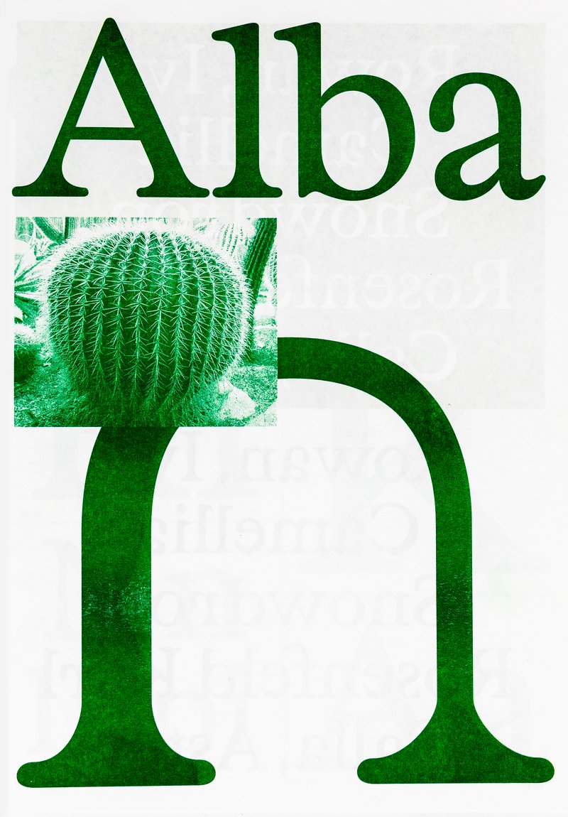
Second-year students were required to develop the whole alphabet for one typeface.

Sita is a family of sans and serif typefaces with origins in the Scotch Roman style. Sita Serif is a contemporary interpretation of Miller and Richard’s 1822 Double Pica Roman. Sita Sans is derived from its counterpart, with influences from early British grotesques from the same foundry.
Designed to be set together, Sita Sans and Sita Serif are optically matched for optimal typesetting. While they share the same construction, they complement each other by retaining their unique characteristics. Sita’s harmonious texture and intricate details make it suitable for both small and large text sizes. Each style is available in five weights, from light to black, with corresponding italics. An additional display variant, Sans Black Condensed, completes the family.
Diploma project (2023) by Edouard Bérard


1/2


1/5
BA GRAPHIC DESIGN
with Aurèle Sack
Second-year students were required to develop the whole alphabet for one typeface.

BA GRAPHIC DESIGN
with Robert Huber
First-year students were invited to manually sketch the typographic skeleton of lowercase alphabet letters. The objective was to maintain the proportions, curves, and characteristic axes of each letter while paying close attention to visual coherence and consistency in the drawing.
BA GRAPHIC DESIGN
with Aurèle Sack
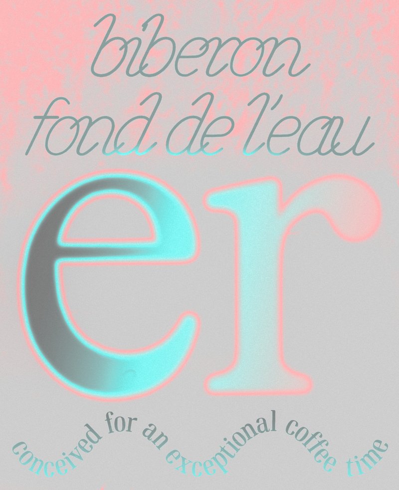
Second-year students were required to manually develop the lowercase letters of two typefaces.

BA GRAPHIC DESIGN
with Robert Huber
The creation of a logotype involves establishing a distinct visual identity, embedded in a clearly defined universe. First-year Graphic Design students designed a fully hand-drawn logotype, connected to a subject, a concept, or an environment of their own choice. This work was based on thorough research in typographic archives. Each student compiled a reference notebook and developed a set of specimens, in order to enrich and structure their graphic and formal thinking.

BA GRAPHIC DESIGN
with Aurèle Sack
The third-year students had to develop a typeface and digitize it.