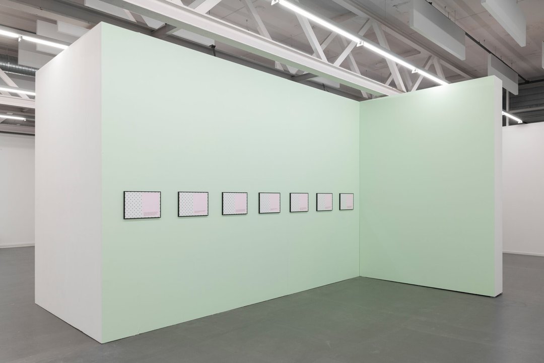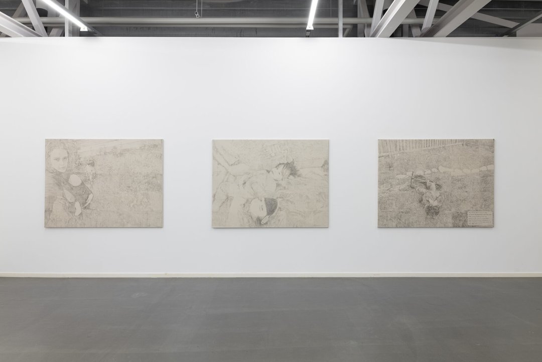
In the face of the contemporary challenges that are transforming creative professions, ECAL is committed to preparing its students for the issues of their time and to anticipate those of the future. This dedication, shared with both faculty and students, goes hand in hand with the myriad of projects, collaborations, study trips, exhibitions, and encounters that characterize the programs offered by ECAL.
 
The diploma projects of the Bachelor and Master graduates featured in this Yearbook bear witness to this dynamic, as well as to each student’s personal aspirations and sensibilities. They reflect journeys that combine innovation, rigor, experimentation, and commitment. Throughout their studies, our graduates have built a community, developed a network, refined their perspective on the world, and found their own path. These experiences have shaped them into skilled and resourceful alumni, who are about to enthusiastically continue their journeys into the professional world.
 
We look forward to seeing our graduates thrive in their creative practice with curiosity and ambition, and to discovering the projects they will bring to life in the future.
 

Alexis Georgacopoulos , Director

Bachelor

BA Fine Arts

Malou Martinelli – À peine déplacé

FINE ARTS

Malou Martinelli – À peine déplacé

by Malou Martinelli

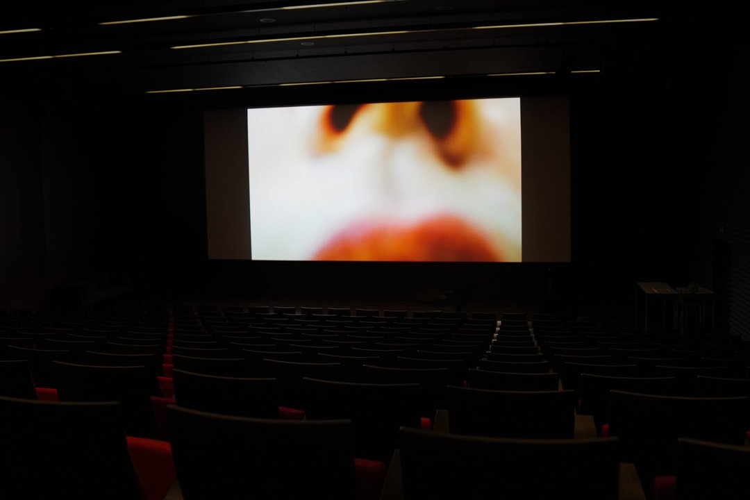
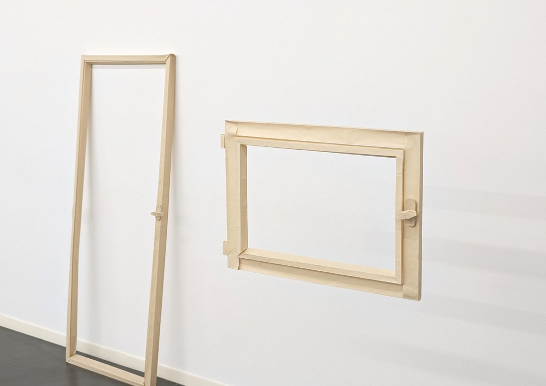
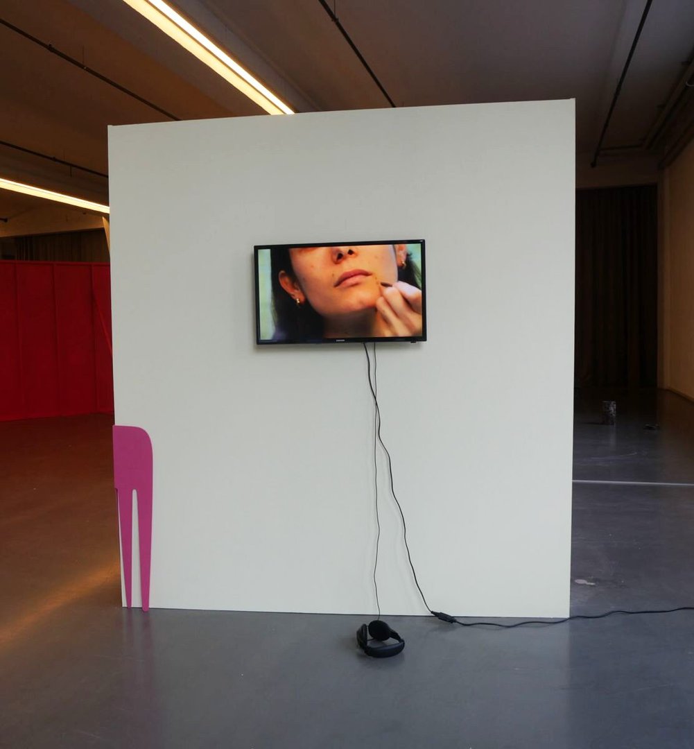
À peine déplacé is an installation composed of a wooden sculpture and a video. It unfolds around a carefully chosen wall, which serves as a spatial and narrative anchor. In an approach that is both intimate and speculative, the installation explores the notion of home — and, more broadly, the built environment — as a place of projection, memory, transformation and unease. The narratives that run through it appear fragmented, sometimes discontinuous, much like the memories that constitute them. The body is constrained within it, put under strain, caught in spaces that oscillate between familiarity and strangeness. From this friction emerge ambiguous, dream-like experiences, where the familiar gradually slips away, creating a sense of diffuse imbalance.
Niki Loroch – Marching band

FINE ARTS

Niki Loroch – Marching band

by Niki Loroch

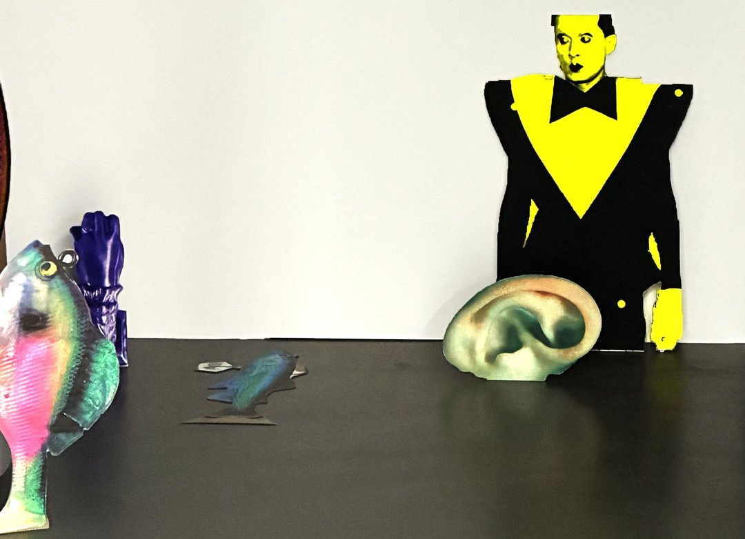
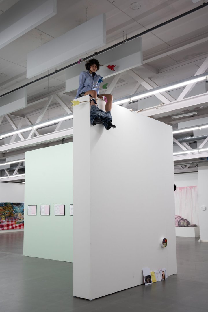
"Heterosexuals can't understand camp because everything they do is camp." – Charles Ludlam, "Ridiculous Theatre: Scourge of Human Folly", 1992 Marching band is a corpus of performative actions deployed and punctually activated within an exhibition space. Conceived as a fanfare and through tropological incarnations, the various characters that compose it mobilize in order to — amongst other things — attempt to ruffle the few tacit contracts that regulate the fields of display. In short: get your handkerchiefs ready.

Eloïse Llanca Bolivar – La Llorona / Las chismosas / Cha Cha Gitano

FINE ARTS

Eloïse Llanca Bolivar – La Llorona / Las chismosas / Cha Cha Gitano

by Eloïse Llanca Bolivar

"I heard the last coin drop into the coin slot of the pay phone, a sound like leaves, like the wind lifting dry leaves, a sound like cables twisting and untwisting, then unraveling into nothingness. Poetic misery. Do you remember that I wanted to tell you something and that in the end I didn't tell you? Her voice sounded perfectly normal. When? I heard myself say stupidly. A long time ago, […]" – Roberto Bolaño, "The Savage Detectives", 1998

Celia Cusanno – Waiting for the White Rabbit

FINE ARTS

Celia Cusanno – Waiting for the White Rabbit

by Celia Cusanno

Time is taken to meticulously cover forms and materials. Gluing, peeling, folding, pasting, cutting, stamping, heating, and cooling until they border on uselessness. Freed from their original purpose, they come to exist without seeking to satisfy. Through an act of care, a way of tending to forms and materials, the work strives to hold them on a threshold that stretches out. They then escape the general flow and slow down until they come to a standstill. They remain there, far from the clamor of expectations. Between momentum and restraint, openness and withdrawal, they breathe. Later, perhaps some of them will leave. Or perhaps not.

Arthur Troisfontaine – Piezo

FINE ARTS

Arthur Troisfontaine – Piezo

by Arthur Troisfontaine

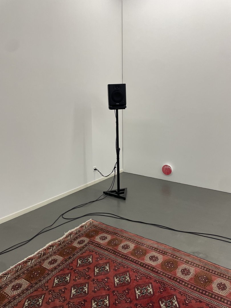
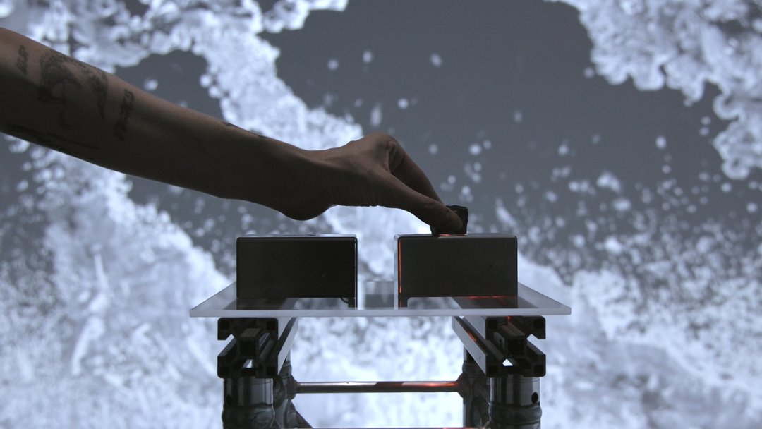
Piezo is an interactive sound installation activated by the movements of its audience. Hidden beneath a carpet, piezoelectric microphones capture the pressure, vibrations, and motions of visitors. This information is sent to a modular synthesizer, which transforms it into sound material and broadcasts it through four independent sound sources. Conceived as a work that can adapt to different architectural and acoustic contexts, the installation reconfigures itself according to the space in which it is presented. Fully reusable and generating no waste, Piezo offers an experience in which the body becomes simultaneously an interface, an instrument, and a generator of sonic landscapes.

Armine Salifu – Let it fly!

FINE ARTS

Armine Salifu – Let it fly!

by Armine Salifu

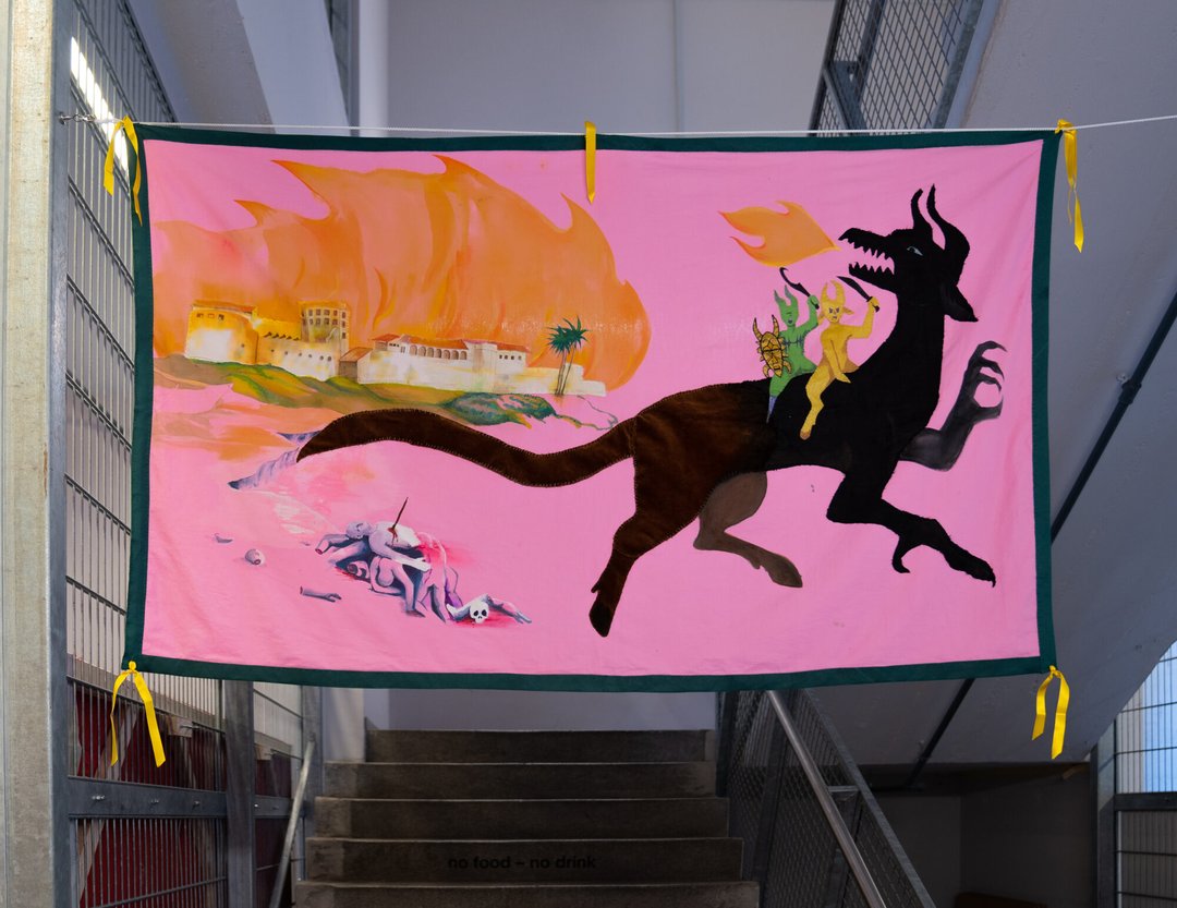
The oldest European building and first trading post of the Atlantic slave trade built in sub-Saharan Africa is a white fort on the coast of Elmina in Ghana, built in 1482 by the Portuguese and called Saint George's Castle. On a pink background, Let it fly! illustrates a white fort standing on a coast, burning. Next to it, a Dragon spits fire, in celebration with two of its friends. This flag is a retelling of the myth of Saint George and the Dragon. The several techniques and materials used to make this picture, which was slowly stitched together and painted by hand, are fully visible. The back is neither covered nor hidden; it is a part of the narrative, showcasing the complex relationship between the myth and the material reality that inspires it.

Jonas Ruchti – La colombe, La ménagerie, La noisette, L'éléphant

FINE ARTS

Jonas Ruchti – La colombe, La ménagerie, La noisette, L'éléphant

by Jonas Ruchti

Elephants are afraid of mice.

Nathan Pidoux – Reste

FINE ARTS

Nathan Pidoux – Reste

by Nathan Pidoux

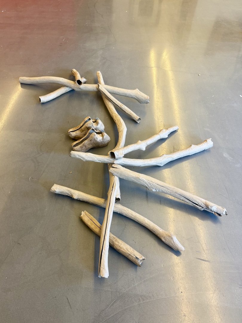
Reste does not tell a story. This project presents the traces of a passage, the remains of an action that has already come to an end. Somewhere between waste, relic, and fiction, the forms occupy the space as stubborn presences: awkward, vulnerable, irreducible. The hollow branches imitate wood without possessing its density. They are skins, tubes, simulacra. Their presence oscillates between prop and debris, between construction and collapse. The shoes and the backpack evoke an absent body, an interrupted journey, the possibility of departure or abandonment. In this installation, the exhibition space is envisionned as a site where objects can negotiate with one another. Forms collide, support one another, and occasionally meet.

Kathleen Pickavance – La Senteuse

FINE ARTS

Kathleen Pickavance – La Senteuse

by Kathleen Pickavance

In the film La Senteuse, the artist plays a character who struggles to walk through a field in high heels. In order to reach her desired destination, she carries a long ladder with her, drawing the viewer closer to her body through the lens of an anonymous eye.

Kathleen Pickavance – The Mannequin Behind the Curtain

FINE ARTS

Kathleen Pickavance – The Mannequin Behind the Curtain

by Kathleen Pickavance

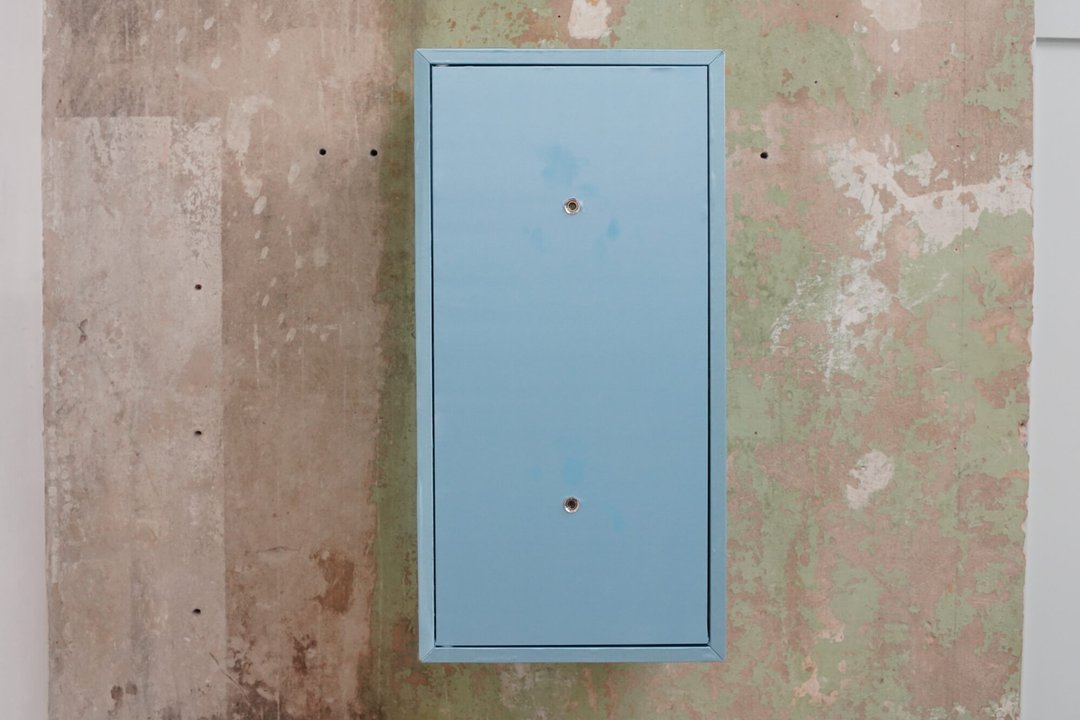
The film The Mannequin Behind the Curtain is presented in a blue satin box with two peepholes. It stages a dimly lit setting in which a mannequin and a person are scrutinised by a moving flashlight. The footage features images of mannequins observed at night through a store window. The piece draws inspiration from a short story by Sadegh Hedayat, in which a man becomes obsessed with a mannequin he cannot stop gazing at.

Romane Persoz – Home sweet home !!

FINE ARTS

Romane Persoz – Home sweet home !!

by Romane Persoz

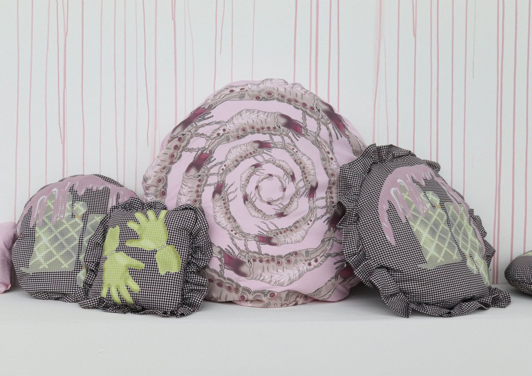
The woman that became « Wife » finds herself hampered by her household and kitchen gloves. The woman that became « Mom » finds herself in a space colonized and invaded by insects with insidious behaviors. The woman finds herself in a refuge until the walls give up under her flow. Home sweet home !!

Ielyzaveta Okhrimchuk – Marevo

FINE ARTS

Ielyzaveta Okhrimchuk – Marevo

by Ielyzaveta Okhrimchuk

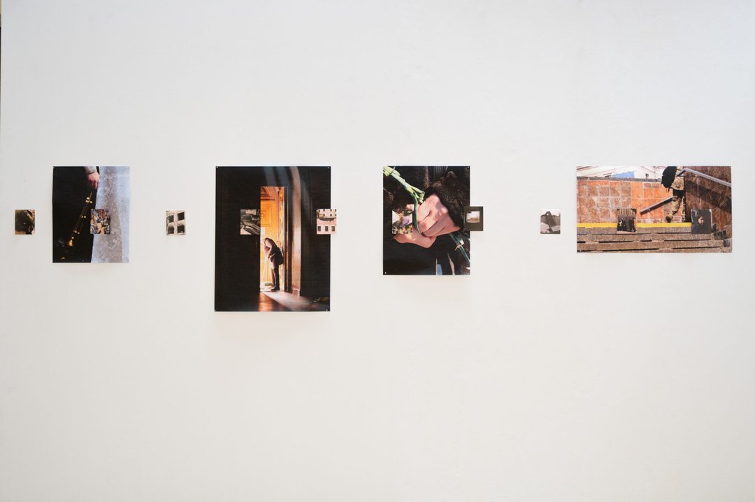
Marevo is a phenomenon in which the air appears to shimmer or dissolve, making perception unstable. In Ukrainian, the word also designates a state of in-between. This is precisely what this project explores: a series of photographs made during the artist's return to Kyiv, their hometown, in March 2026, which documents how people live in a state of permanent suspension — between destruction and daily life, between before and after, between knowing and not knowing. The installation presents two scales of images: smaller photographs showing traces of war, larger ones illustrating how life continues alongside it. Not as opposites, but as two simultaneous realities.

Félicie Morel – Rêve, trésor rêve.

FINE ARTS

Félicie Morel – Rêve, trésor rêve.

by Félicie Morel

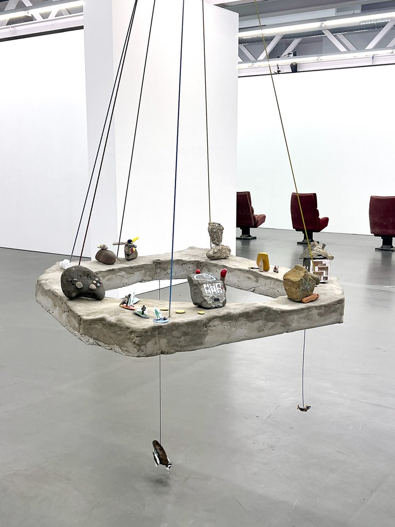
Is it perhaps a question mark, or subtle details slipping into these stones? Rêve, trésor rêve. examines the forms that shape the collective imagination from early childhood onwards. Through the attractive power of aesthetics — bright or softened colours, rounded edges, scaled-down proportions, and gentle tones played on broken crockery. Toys often become symbols of contemporary issues. They replay the dynamics that have led past generations into current crises. They offer an innocent form to violence, rendering it acceptable, even normalised, as the heroine of childhood narratives.

Avril Hélard – I Tell A Fly

FINE ARTS

Avril Hélard – I Tell A Fly

by Avril Hélard

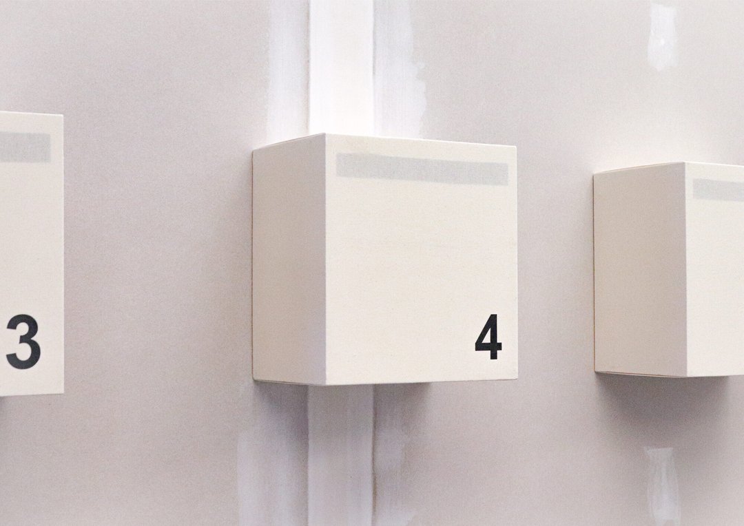
I Tell A Fly is an installation in which the idea of the enigma structures the relationships between the works, evoking a latent space where meaning is constantly produced but never fully resolved. Different forms of modular structures connected to scenography, writing, memory, and repetition function as strategies through which a narrative emerges, unfolding through the visitor's movement within the exhibition space.

Virginie Emonet – That's all folks!

FINE ARTS

Virginie Emonet – That's all folks!

by Virginie Emonet

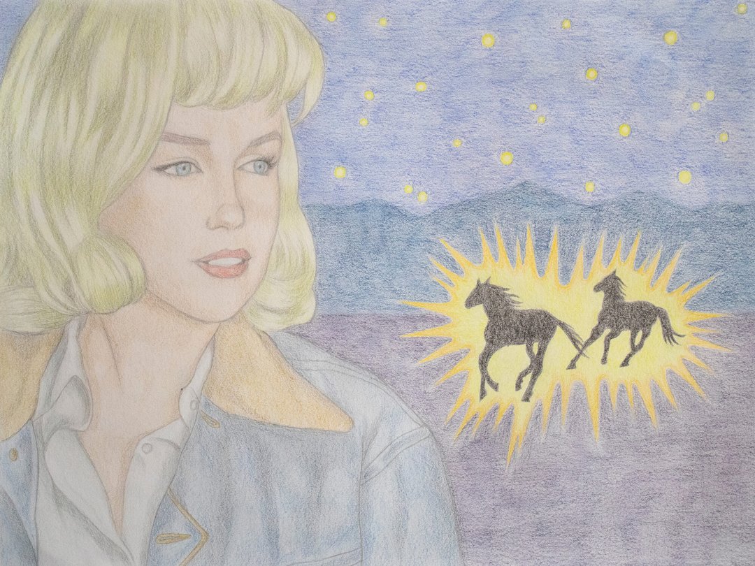
That's all folks! explores various concepts, such as self-image as a woman, sexist stereotypes, and the influence and strategies of advertising and cinematic imagery. These themes are examined through the figure of Marilyn Monroe, a complex media figure. Her personality is multifaceted, and she embodies both the essence of the society of the spectacle and of Hollywood. The endings of her films are supposed to be happy; however, they ultimately amount to Monroe finding refuge with misogynistic and abusive male characters. By creating new narratives, That's all folks! restores — or rather, redraws — joyful and empowering final scenes for her, moving away from the reductive clichés of her era.

Livia de Goumoëns – A Horse collection from or for Vanessa Rossetto / A Sound recollection

FINE ARTS

Livia de Goumoëns – A Horse collection from or for Vanessa Rossetto / A Sound recollection

by Livia de Goumoëns

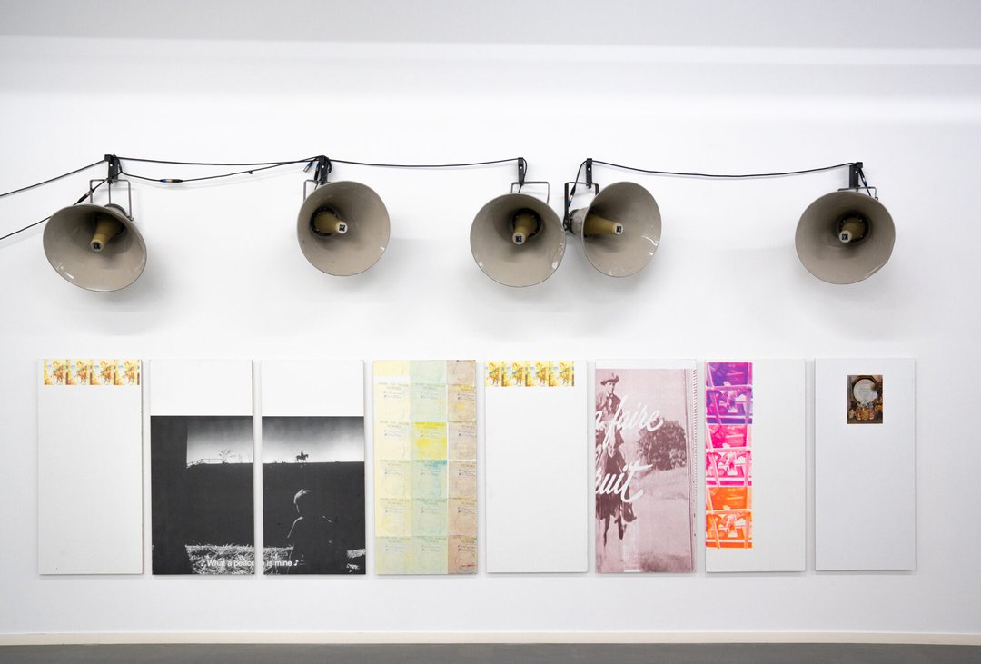
A Horse collection from or for Vanessa Rossetto Six images for and by V. Rossetto: an artist who makes music – or rather, who assembles bits and pieces to create music. This collection is a tribute and a demonstration of my love for her, life, images, sound. A Sound recollection : a selection of 25 sound collages made with my friend M.B., broadcast across five train station platforms. We piece together things we love and things we make. The sound plays every 13 minutes for about a minute. They provide a rhythm and they provide silence. Breaking the rhythm to reveal. And this probably only works when you establish a rhythm. Arrhythmia does not arise from a void but from its presence within a score that excludes it.

BA Cinema

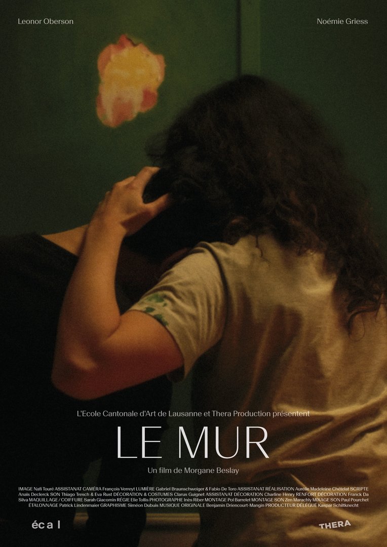
Morgane Beslay – Le Mur (Directing) – 2026

FILM STUDIES

Morgane Beslay – Le Mur (Directing) – 2026

by Morgane Beslay

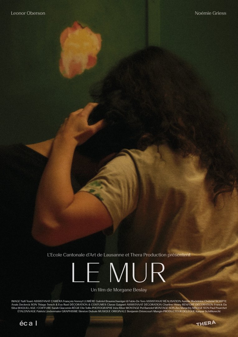
Following their difficult separation, Eliane and Laure have to repaint a wall of the house they are leaving, a wall as full of their own history as that of others before them.

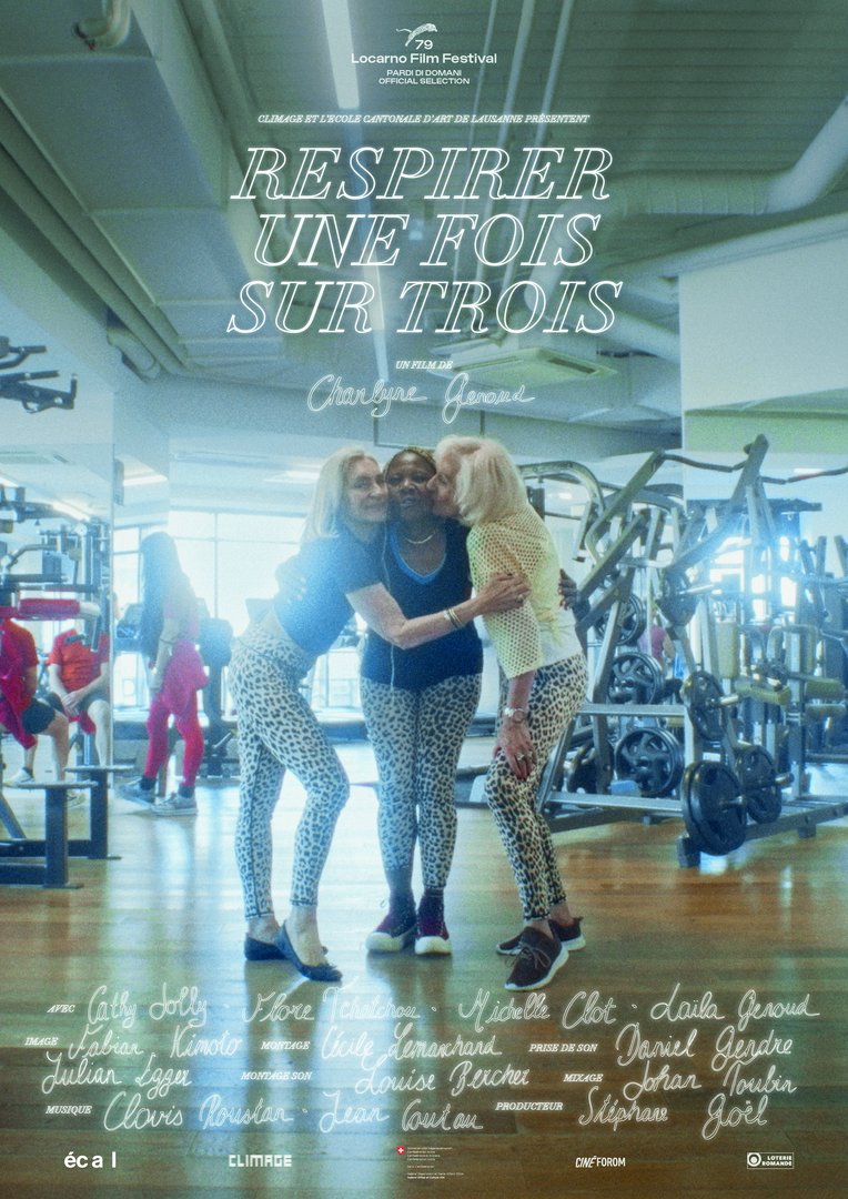
Charlyne Genoud – Respirer une fois sur trois – 2026

FILM STUDIES

Charlyne Genoud – Respirer une fois sur trois – 2026

by Charlyne Genoud

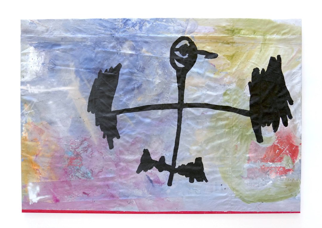
In group strength-training classes, people breathe in unison every day. Charlyne lifts weights alongside three retired women who love to sing. What if a cheerful gym could be the place to break our family curses?

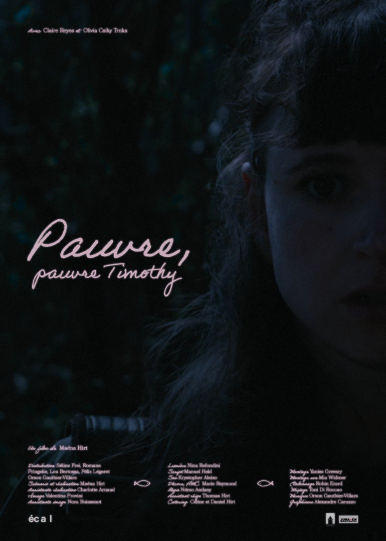
Maéna Hirt – Pauvre Pauvre Timothy– 2026

FILM STUDIES

Maéna Hirt – Pauvre Pauvre Timothy– 2026

by Maéna Hirt

Timothy disappears. Then Astride's friends vanish, and soon the entire town seems to fade away without explanation.

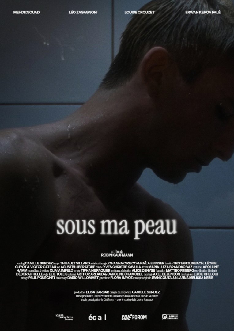
Robin Kaufmann – Sous ma peau

FILM STUDIES

Robin Kaufmann – Sous ma peau

by Robin Kaufmann

The night Gabriel celebrates his abuser’s conviction, he is confronted with Lucien’s tenderness.

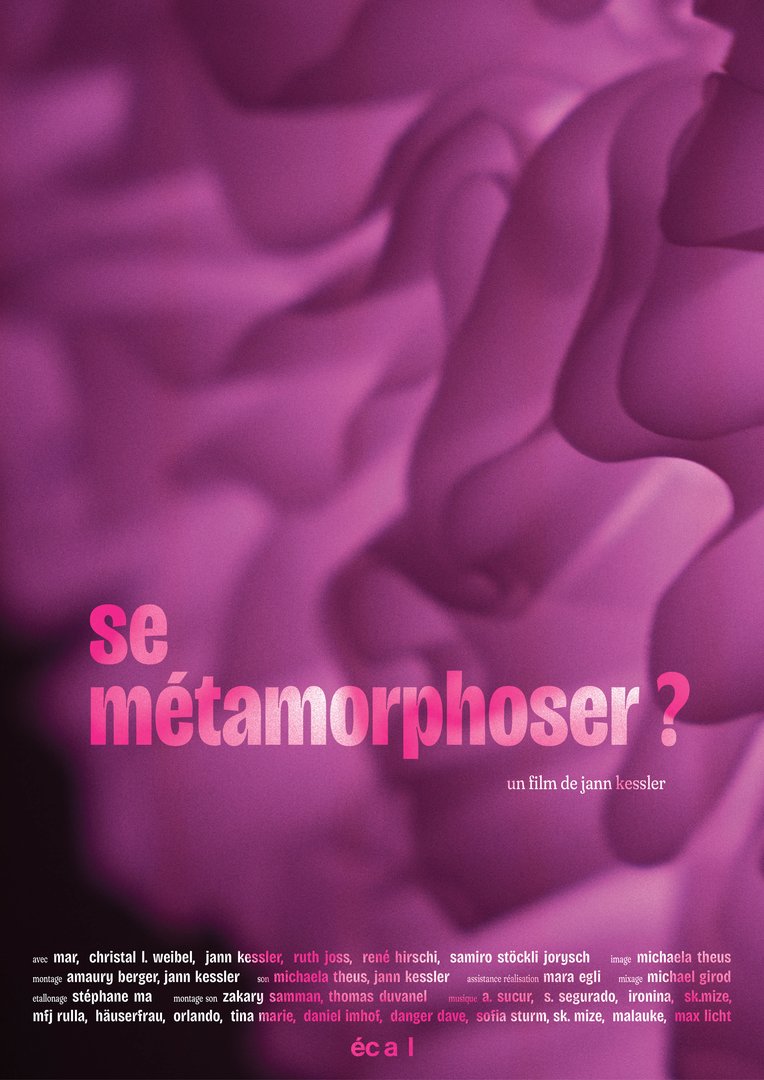
Jann Kessler – Se métamorphoser ? – 2026

FILM STUDIES

Jann Kessler – Se métamorphoser ? – 2026

by Jann Kessler

How do I build healthy, equal relationships? An intimate cinematic-therapeutic journey of discovery.

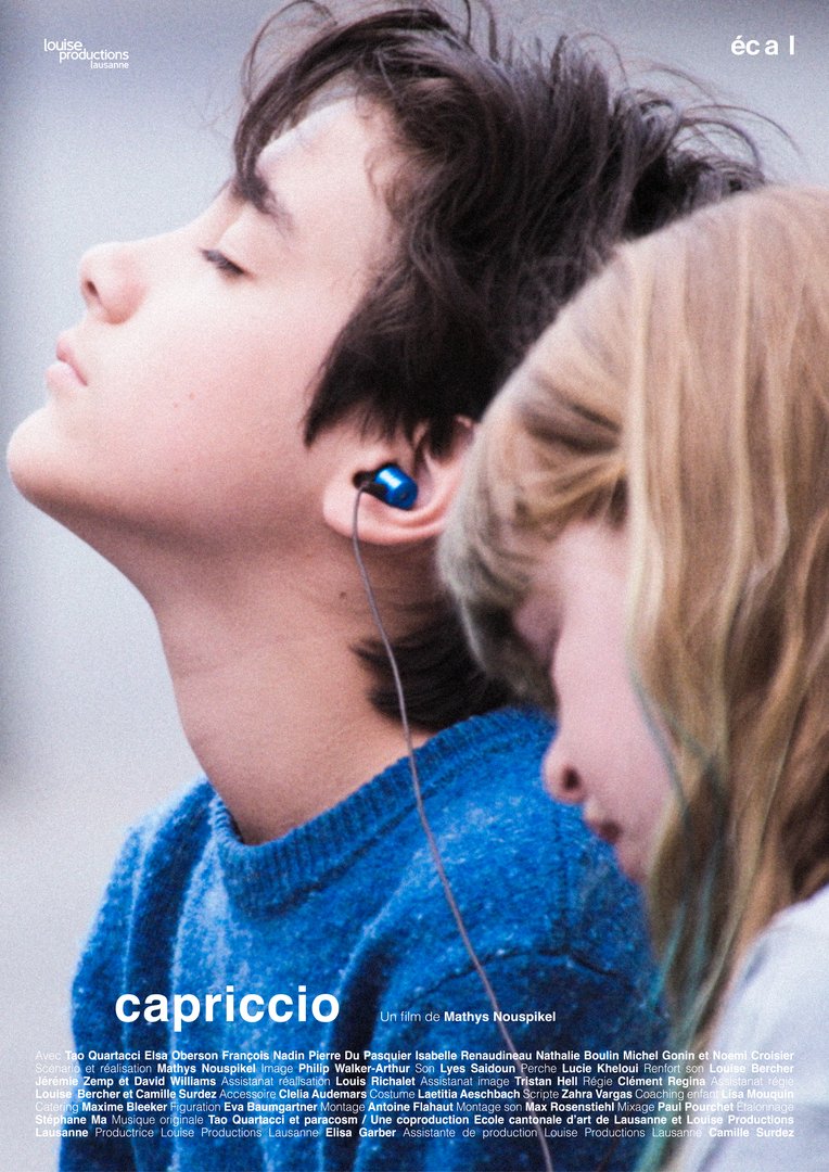
Mathys Nouspikel – Capriccio – 2026

FILM STUDIES

Mathys Nouspikel – Capriccio – 2026

by Mathys Nouspikel

Arsène runs away before playing for his dying grandfather, but an unexpected encounter helps him find the courage to return.

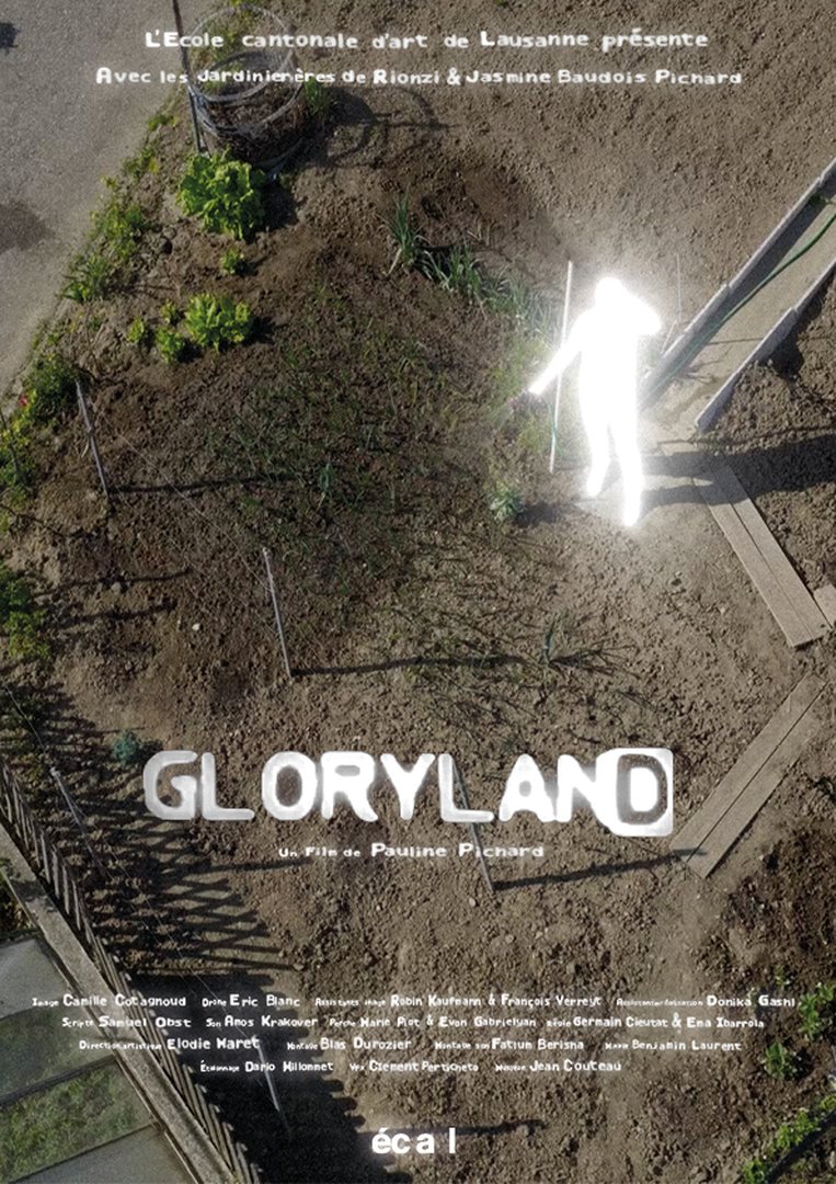
Pauline Pichard – GLORYLAND – 2026

FILM STUDIES

Pauline Pichard – GLORYLAND – 2026

by Pauline Pichard

Last spring, unknown lights appeared in the sky above Lausanne. In a garden, the last fragment of an ordinary Eden, tales blur with rumours after a series of strange disappearances.

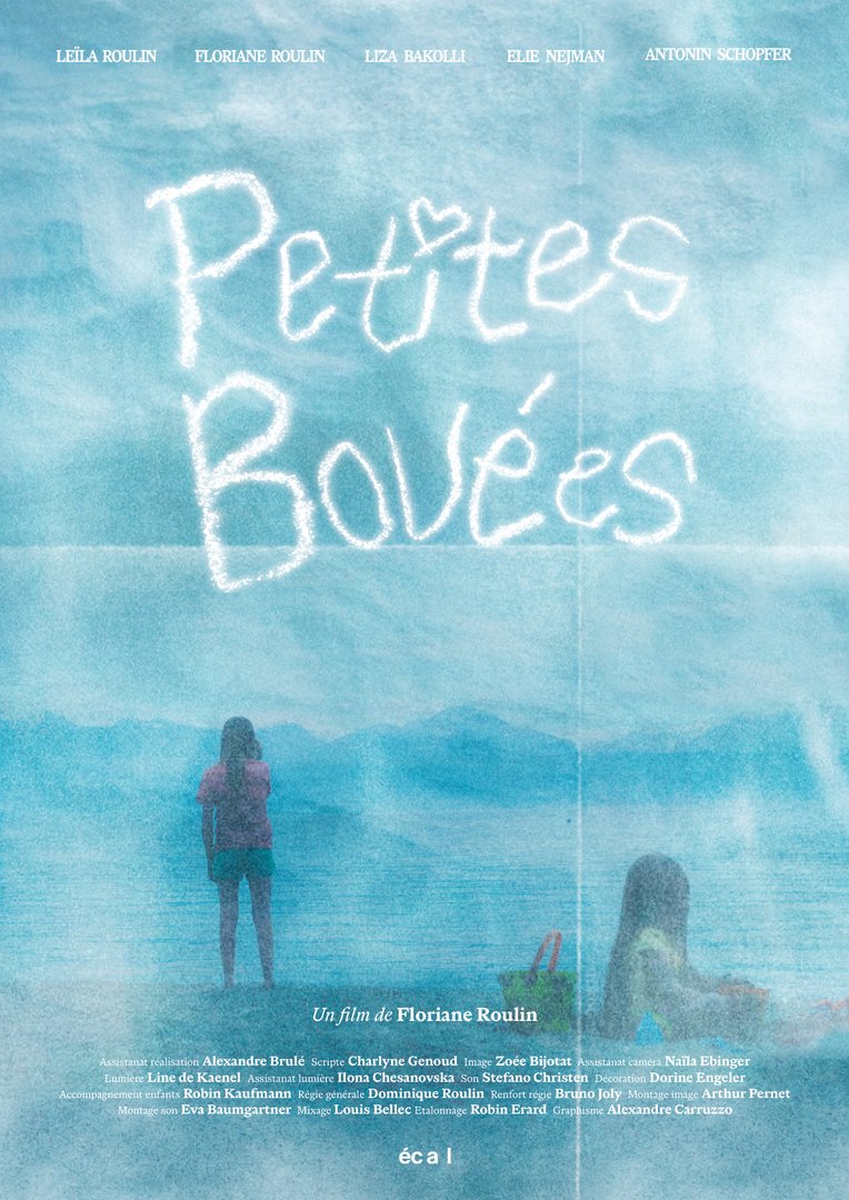
Floriane Roulin – Petites Bouées – 2026

FILM STUDIES

Floriane Roulin – Petites Bouées – 2026

by Floriane Roulin

During their father’s wedding preparations, Sophie and Mila are confronted with their childhood memories.

Nafi Touré – Le Mur (Photography) – 2026

FILM STUDIES

Nafi Touré – Le Mur (Photography) – 2026

by Nafi Touré

Following their difficult separation, Eliane and Laure have to repaint a wall of the house they are leaving, a wall as full of their own history as that of others before them.

BA Graphic Design

Clara Besson – L'Or du Transvaal / L'Or des DuBois

GRAPHIC DESIGN

Clara Besson – L'Or du Transvaal / L'Or des DuBois

by Clara Besson

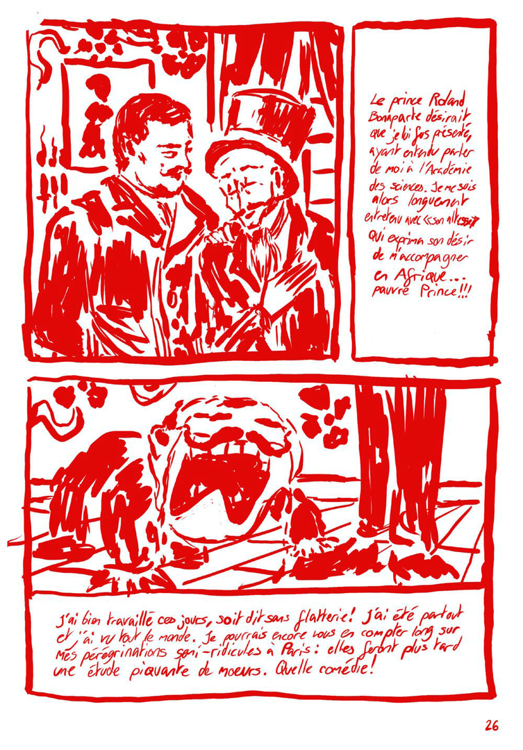
L'Or du Transvaal / L'Or des DuBois is the first volume of the Recto / Verso collection, which aims to encourage Swiss people, and especially young people, to question the history of their country. This volume explores how Switzerland has been and remains imperialist, through the story of the DuBois family from Le Locle, who left to exploit gold in Transvaal in the 19th century. Each double page mirrors two simultaneous realities: the imperialist narrative on the left and its multidimensional critique on the right, the same events told from radically different points of view, by entities that coexist without ever directly interacting. In a context of rising far-right politics across the West, L'Or du Transvaal / L'Or des DuBois intends to fight by the transmission of knowledge beyond academic circles.

Joe Bionda – FINGERS CROSSED WHEN YOU HAVE NO CHOICE

GRAPHIC DESIGN

Joe Bionda – FINGERS CROSSED WHEN YOU HAVE NO CHOICE

by Joe Bionda

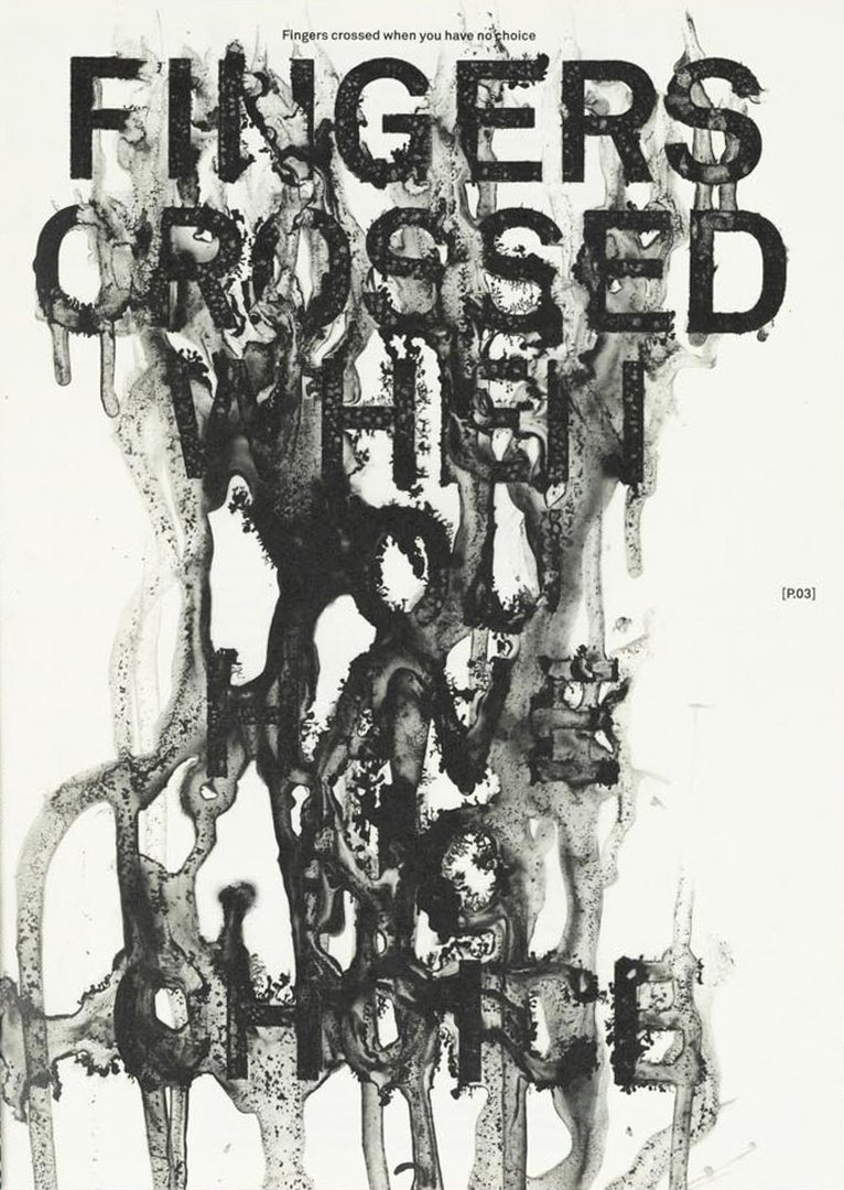
Mexico City rests on a ghost. Built on the waters of the former Lake Texcoco, the site of Tenochtitlán, the city sinks by 20 to 40 cm per year. Buildings tilt, cracks spread, structures become unstable: the city is slipping. Through the local creative scene, the magazine INGERS CROSSED WHEN YOU HAVE NO CHOICE envisions a post-apocalyptic Mexico City not as a distant fiction, but as a sensitive extension of the present. A territory where anxiety, desire, and nightmares coexist, shaped by insecurity and violence. This project brings together research, editorial and art direction, graphic design, and artisanal printing. It offers a situated reading of the city, seen as a living palimpsest in constant transformation.

Alexandre Carruzzo – CH38

GRAPHIC DESIGN

Alexandre Carruzzo – CH38

by Alexandre Carruzzo

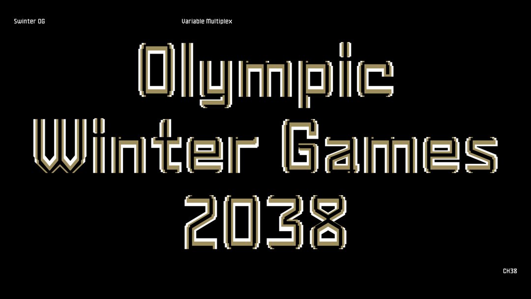
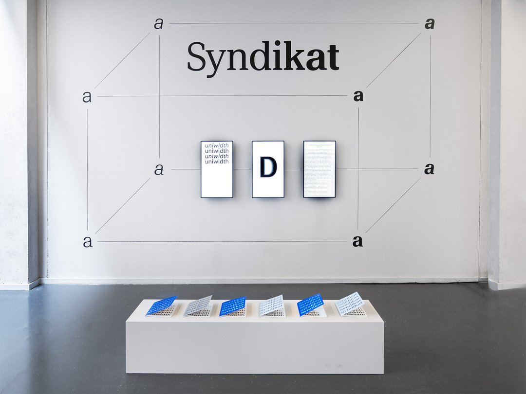
CH38 is a visual identity design proposal for the upcoming 2038 Olympic Winter Games in Switzerland. This project seeks to address the lack of visual unity between the increasingly complex live analytical overlays of televised sporting events with the overall aesthetic of the Games. In an effort to establish a consistent visual connection between the greater aesthetic and the various information displayed on-screen, CH38 offers a variable uniwidth typeface, Swinter. With three degrees of spatial freedom, it brings visual dynamism to the overlay, reflecting the sporting spirit of the Games. Moreover, its geometric construction echoes Swiss values of rigor and precision.

Maeva Chanson – RIPOST(er)

GRAPHIC DESIGN

Maeva Chanson – RIPOST(er)

by Maeva Chanson

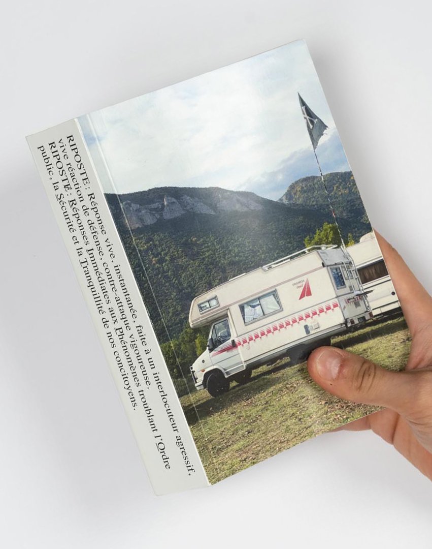
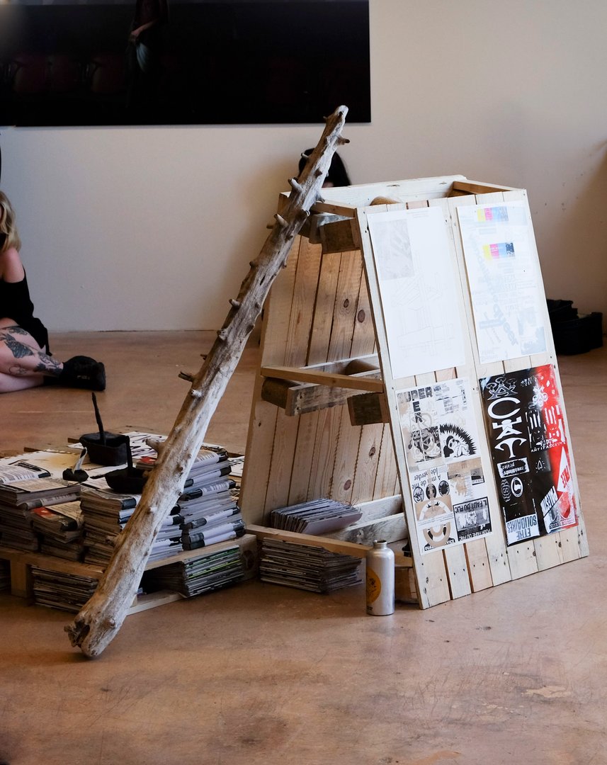
RIPOST(er) is an edition situated between archive and manifesto, exploring temporary autonomous zones through the lens of freeparties. This publication focuses on these ephemeral spaces where individuals gather to dance, vibrate, create, and self-organize outside the frameworks imposed by the system. In the current French political context, where surveillance, repression, and criminalization are increasingly reinforced, these collective forms become targets. This project questions what is truly at stake: not the party itself, but the temporary existence of spaces that escape the logics of control, normalization, and commodification. RIPOST(er) reveals the possibility, however brief, of other ways of creating and living together.

Simon Cossy – Openground

GRAPHIC DESIGN

Simon Cossy – Openground

by Simon Cossy

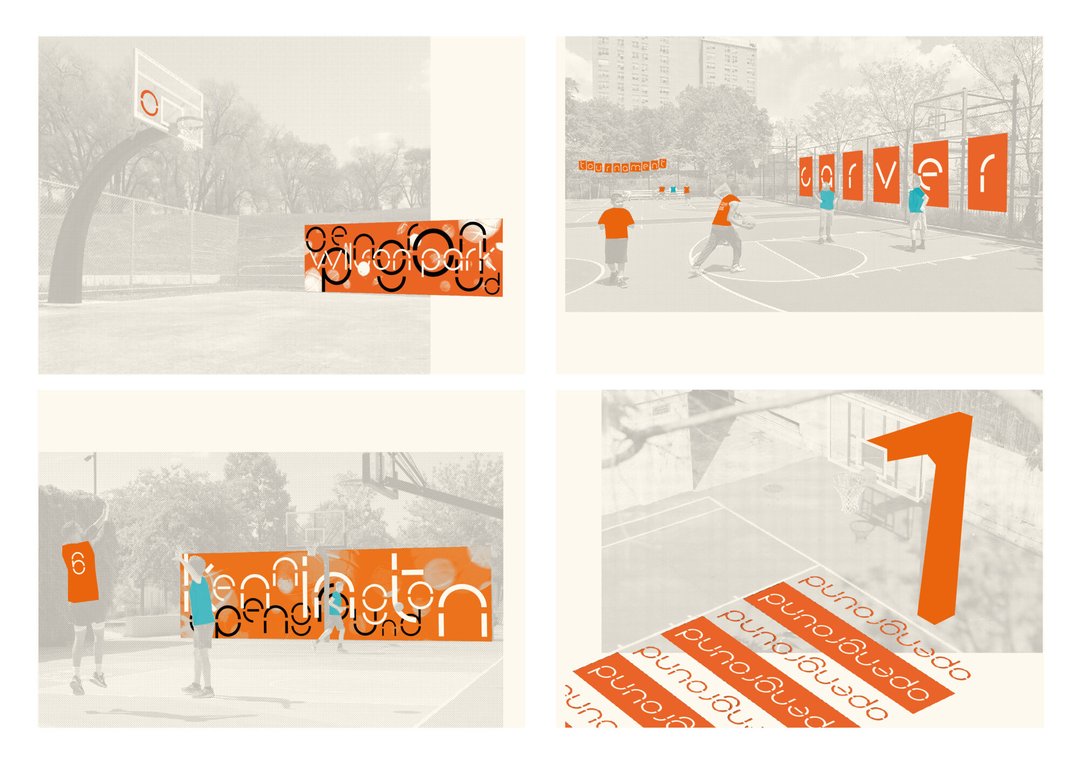
The Openground visual identity project is born out of two observations made by the graphic designer in his practice of basketball coaching for 14 year olds. Firstly, organized sports require resources, organisation and a framework that many kids don't have access to. A lot of them thus quit their club, and some will continue playing the sport they love outside, on public playgrounds. Secondly, an impactful visual language can be a powerful tool to create enthusiasm, motivation and a sense of belonging for these youths. How, then, can one use of this tool in the context of exterior amateur basketball, so that kids who are not able to join a club still feel concerned by the game and legitimate to play it?

Carolina Crivelli – Gossip

GRAPHIC DESIGN

Carolina Crivelli – Gossip

by Carolina Crivelli

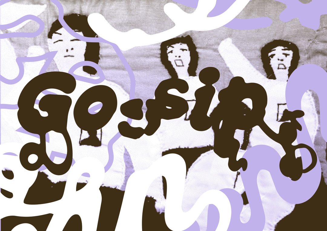
Gossip is a magazine which explores perceptions of femininity through activities that have historically been — and still are today — associated with women, such as knitting, embroidery and cooking. Every aspect of the magazine aims to reclaim the female mode of transmission, which has until now remained on the margins of history, in a political and feminist way: from the hierarchy between text and image, through the horizontal structure of voices, to the printing process, where areas of white, which are normally never highlighted, are printed and brought to the foreground. In an era marked by the resurgence of misogyny, patriarchy and the concept of the "trad wife", Gossip aims to be a space for rediscovering women's history and discussing the role of our activities within society.

Da Silva Romão Caroline – Ce qui nos fica

GRAPHIC DESIGN

Da Silva Romão Caroline – Ce qui nos fica

by Da Silva Romão Caroline

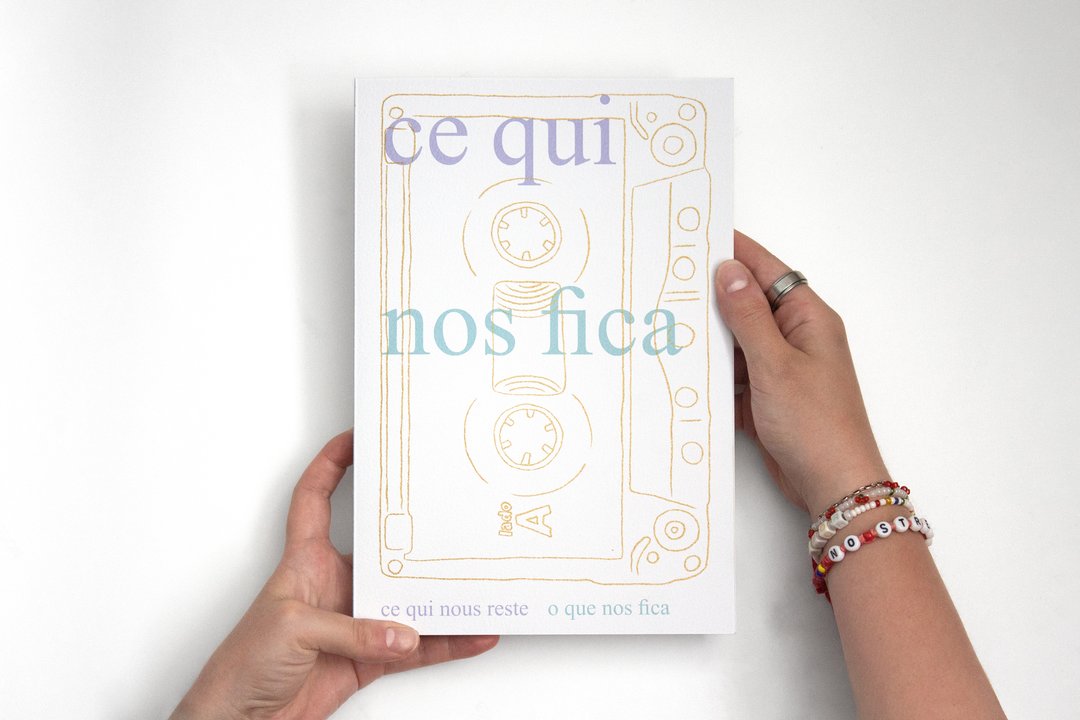
The book Ce qui nos fica brings together Frentuguese, a hybrid French-Portuguese language that emerged within Portuguese immigrant families in French-speaking Switzerland. Through words that were never written down but passed on orally, it captures a memory that is both collective and personal: that of a linguistic, cultural, and familial in-between. The book offers a snapshot of this language, frozen in time as it exists in 2026. What we are left with are not only these words and expressions, but also the memories of the annual journeys between Switzerland and Portugal: the long trips by car or autobus, which are, like us, suspended between two countries. Este livro reúne o frantuguês, uma língua híbrida franco-portuguesa nascida nas famílias da imigração portuguesa na Suíça (França). Através de palavras nunca escritas, mas transmitidas oralmente, ele capta uma memória ao mesmo tempo coletiva e pessoal: a de um entre-dois linguístico, cultural e familiar. A obra propõe assim uma fotografia desta linguagem, fixada no tempo, no seu estado de 2026. O que nos fica são essas palavras, mas também as memórias das viagens anuais entre a Suíça e Portugal: as longas viagens de carro ou de autocarro, que são também elas, como nós, um entre-dois países.

Siméon Dubuis – UNFOLDING TOPOGRAPHIES

GRAPHIC DESIGN

Siméon Dubuis – UNFOLDING TOPOGRAPHIES

by Siméon Dubuis

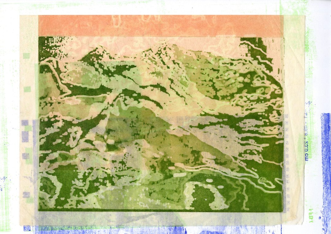
In recent years, the mountains have been crumbling spectacularly, and with them, various myths. Far from the idyllic images of postcards, valleys and villages are cut off from the world; in the worst cases, they are wiped off the map. Against this backdrop, UNFOLDING TOPOGRAPHIES re-examines the clichés of Alpine representation to propose new visual narratives. This graphic research project intervenes at the very heart of the production matrix where images are created, appropriating both industrial production techniques such as offset printing and more traditional methods such as copper engraving. UNFOLDING TOPOGRAPHIES explores how our representations shape our environment and influence our interactions with it.

Clea Dunand – Il faut se perdre pour se retrouver

GRAPHIC DESIGN

Clea Dunand – Il faut se perdre pour se retrouver

by Clea Dunand

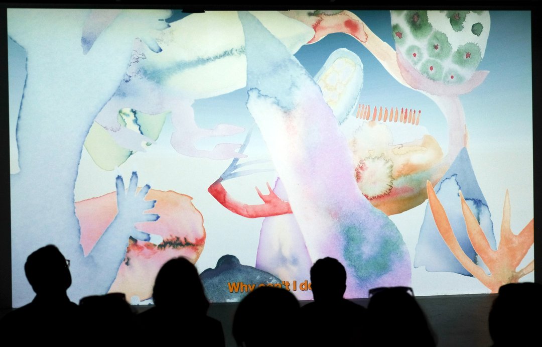
Il faut se perdre pour se retrouver est un court-métrage d'animation qui retrace un voyage intérieur : le cheminement sensible vers la guérison d'une dépression. Entièrement réalisé à l'aquarelle, le concept utilise la fluidité et les fusions de l'eau pour traduire visuellement l'évolution des états d'âme, de la sombre stagnation vers la reconnexion à la lumière. Ce projet constitue un défi de développement personnel majeur, transformant une expérience intime en une œuvre universelle. Sa particularité réside dans l'expérimentation de cette technique traditionnelle exigeante, où chaque frame peinte à la main apporte une texture vibrante et organique. Une quête artistique et thérapeutique menée de bout en bout.

Alice Gillioz – A Landscape of Consciousness

GRAPHIC DESIGN

Alice Gillioz – A Landscape of Consciousness

by Alice Gillioz

A Landscape of Consciousness materializes contemporary theories of consciousness through an immersive exploration. Along a non-linear narrative journey, visitors navigate a virtual campus where conceptual frameworks take the form of streets and urban structures. A Landscape of Consciousness also unfolds as a festival whose topography mirrors this organization, allowing neighboring theories to coexist and engage in dialogue. Inspired by Robert Lawrence Kuhn's Landscape of Consciousness — a resource originally designed for researchers — this project seeks to build bridges between specialists and non-specialists.

Clara Hoya – Monumentum post inferna

GRAPHIC DESIGN

Clara Hoya – Monumentum post inferna

by Clara Hoya

Monumentum post inferna is a tribute to the place music holds in the graphic designer's life. Since childhood, music has shaped her relationship with the world, and in her teens, black metal opened the doors to a universe whose center of gravity seemed to lie in Oslo, at a now-legendary venue: Neseblod, formerly Helvete. Behind the records and display cases lingers the enduring presence of this shop's past, which has left its mark on the history of black metal, and become a place of collective memory and pilgrimage. Book conceived as a film script, Through Monumentum post inferna presents the objects, stories, and myths that continue to echo the history of black metal within its walls, highlighting their significance and excess.

Noa Jetzer – Alula

GRAPHIC DESIGN

Noa Jetzer – Alula

by Noa Jetzer

Born from an interest in animation, digital media and accessibility, Alula is a project developed in collaboration with occupational therapist Romain Savioz. It explores the following question: what might a digital environment designed to foster autonomy in emotional self-regulation among young people look like? Conceived as a resource space alongside therapy, the project envisions its visual universe through a stop-motion animation, pen-and-ink illustrations and interactive prototypes. Together, they outline an evolving digital garden where each action contributes to shaping a unique landscape. By combining analogue techniques with interactive design, Alula develops a sensitive, narrative and accessible approach to digital graphic design.

Darina Komm – Threads

GRAPHIC DESIGN

Darina Komm – Threads

by Darina Komm

For centuries, the knowledge of embroidery was passed down among women, gradually becoming a tradition and an integral part of culture. Threads reflects a contemporary perspective, exploring embroidery as a form of visual communication. Here, ornaments treated as a structured language — one that carries ideas of protection, identity, and conection. Rooted in the traditions of Central Ukraine between late 19th and early 20th centuries, Threads combines research with interpretation, offering not only historical insight but also a personal attempt to reconnect with cultural memory through photography, pattern, and storytelling.

Mattias Koskinen – SKRÅ - Mind in Finland

GRAPHIC DESIGN

Mattias Koskinen – SKRÅ - Mind in Finland

by Mattias Koskinen

SKRÅ is a clothing brand that draws its inspiration directly from Finland. Designed to reveal what others may not perceive, it opens new paths for exploration. The term Skrå comes from the Swedish language means something oblique or inclined. This first pre-capsule collection, "Mind in Finland", aims to showcase the very essence of the brand. The collection sets aside conventional codes to present a new perspective. It embraces opacity, textures, organic silhouettes, and elongated forms, elements that emerge when landscapes are immersed in light and the shadows it creates. These are the principles that run throughout this work, shaping both the identity and the common thread of the collection.

Nadia Laprés – Partysound

GRAPHIC DESIGN

Nadia Laprés – Partysound

by Nadia Laprés

Partysound is a musical game designed for children. Using cards placed on a table, participants build a score that is performed collectively while moving around it. Three colours correspond to three sound sources: hands, percussion, and voice. Each player is assigned a colour and performs the corresponding symbols as they appear in the score. The music emerges through alternating actions and active listening. Presented in a box containing several game scenarios to help discovering the rules, the project encourages experimentation and the pleasure of being and making music together. Developed from a reflection on the methods of musical education, Partysound offers a freer and more accessible way of approaching music.

Amélie Matthey – révolte urgence, douceur collective

GRAPHIC DESIGN

Amélie Matthey – révolte urgence, douceur collective

by Amélie Matthey

“Revolt Urgency, Collective Warmth” is a manifesto. Printed in a run of 140 copies. Printed exclusively on recycled paper. Printed using donated printing credits. Printed using manual offset printing. Printed using lithography. Printed through resourcefulness and ingenuity. The Pirate Manifesto. Pirate because we must act. Pirate because we must keep telling stories. Pirate as political inspiration. Pirate because, whether it's a massive firestorm or small fires, it will be a revolution. Pirate as living legends of how societies could be organized differently. Pirate as freedom for everyone. Pirate because it's no longer “knock, knock, knock, who's there?” but “knock, knock, knock, we're here.” Pirate is a message in a bottle.

Joanna Metz – Galerie Nationale

GRAPHIC DESIGN

Joanna Metz – Galerie Nationale

by Joanna Metz

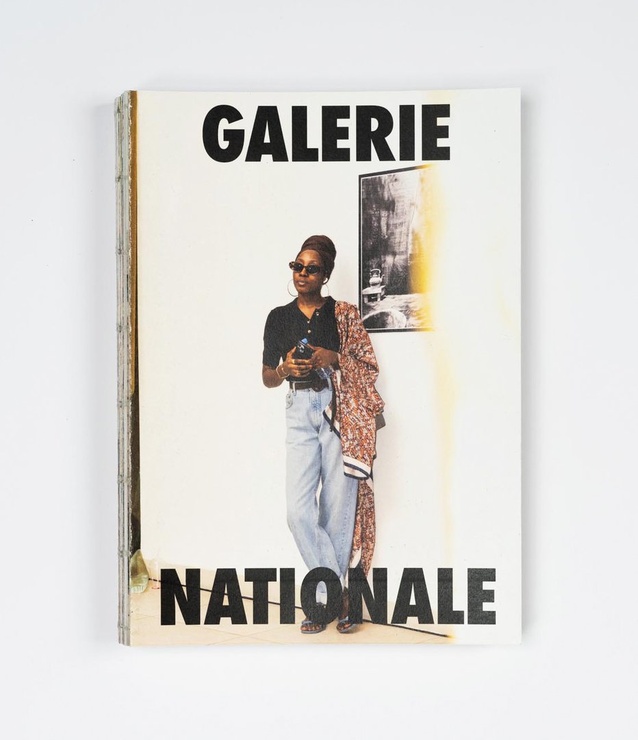
Galerie Nationale offers a glimpse of the young photographic scene in Dakar. In collaboration with a team of Senegalese photographers, the artist organised the exhibition Li Nu Boole, What connects us, which culminated in an opening in May, 2026 at the National Gallery in Dakar. This book documents the preparation of the event, the environment, the artists and their artworks, as well as the spectators taking part as actors during the opening. Through conversations and texts, the artists share their journeys, their visions of what connects us, as well as their reactions to the project. Throughout this project, the artist took on the roles of artistic director, curator, and graphic designer, while living an artistic and human experience in the country of her childhood.

Eliott Mouissat – Face Z

GRAPHIC DESIGN

Eliott Mouissat – Face Z

by Eliott Mouissat

Face Z is a publication dedicated to the festival of the same name, which is committed to musical discovery and showcasing emerging artists. Drawing on archives, interviews, and testimonials, this publication seeks to capture the festival's identity and the values that underpin it: horizontality, exchange, and openness to the diversity of musical practices. The project also relies on a handmade production process using an old Riso printer, whose technical limitations defined the layout. Conceived as an evolving archive, this publication preserves a record of the history, memories, and relationships that have shaped Face Z.

Gabriel Polgar – Tenir la rue, imprimer la rue

GRAPHIC DESIGN

Gabriel Polgar – Tenir la rue, imprimer la rue

by Gabriel Polgar

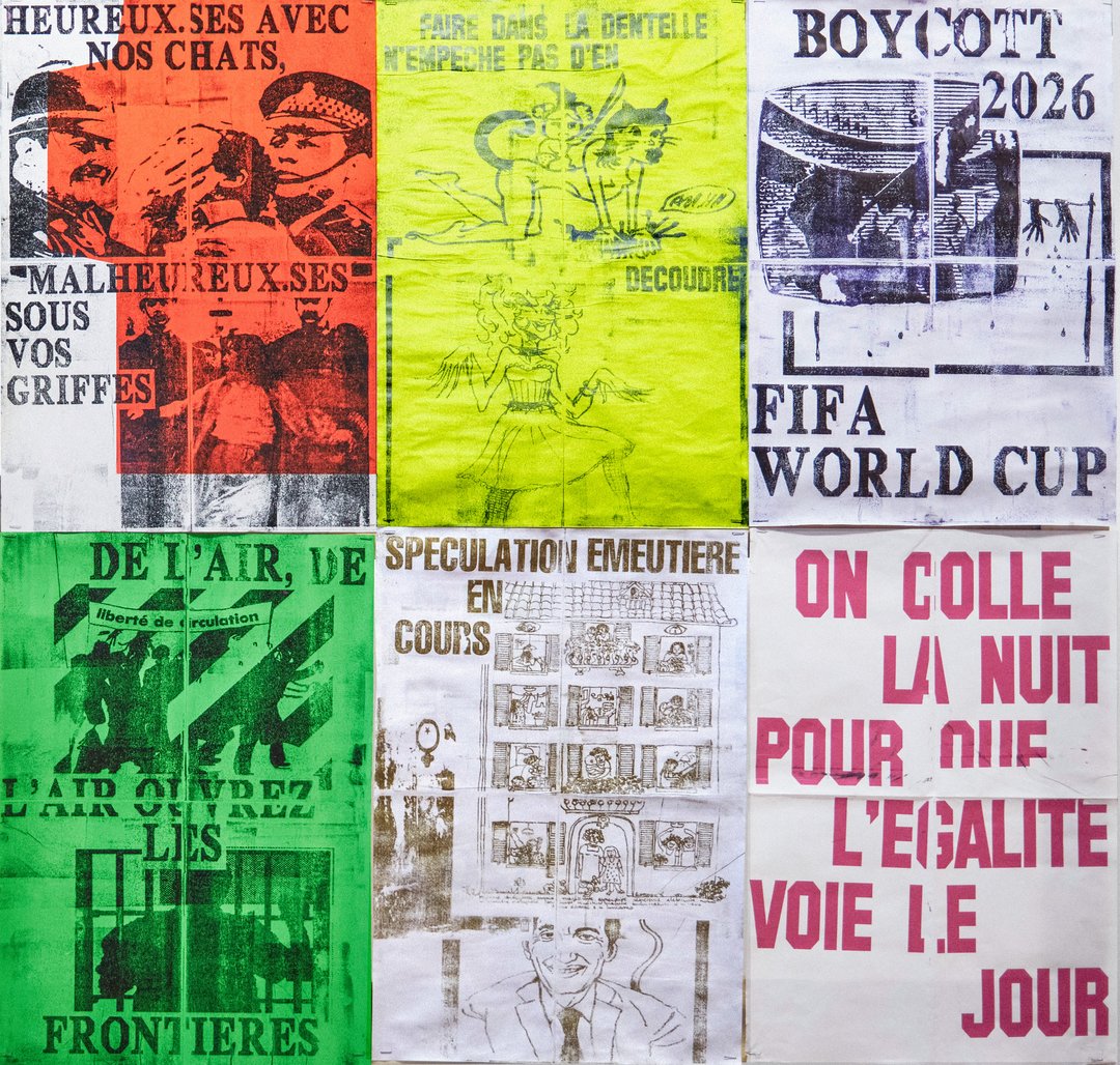
In a context marked by the erosion of social rights and the resurgence of far-right discourse, demonstrations are spaces where voices come together and grow stronger. From these gatherings emerges a rare collective energy: words are set free, solidarity is reinforced, and a shared momentum takes hold. Yet this force often fades and disappears far too quickly. Through a web-based design tool grounded in randomness, Tenir la rue, imprimer la rue aims to capture and extend these moments into everyday life. Using collectively gathered and contributed content, this project allows anyone to compose and print their own poster in the street.

Adam Saragoussi – La Soupe

GRAPHIC DESIGN

Adam Saragoussi – La Soupe

by Adam Saragoussi

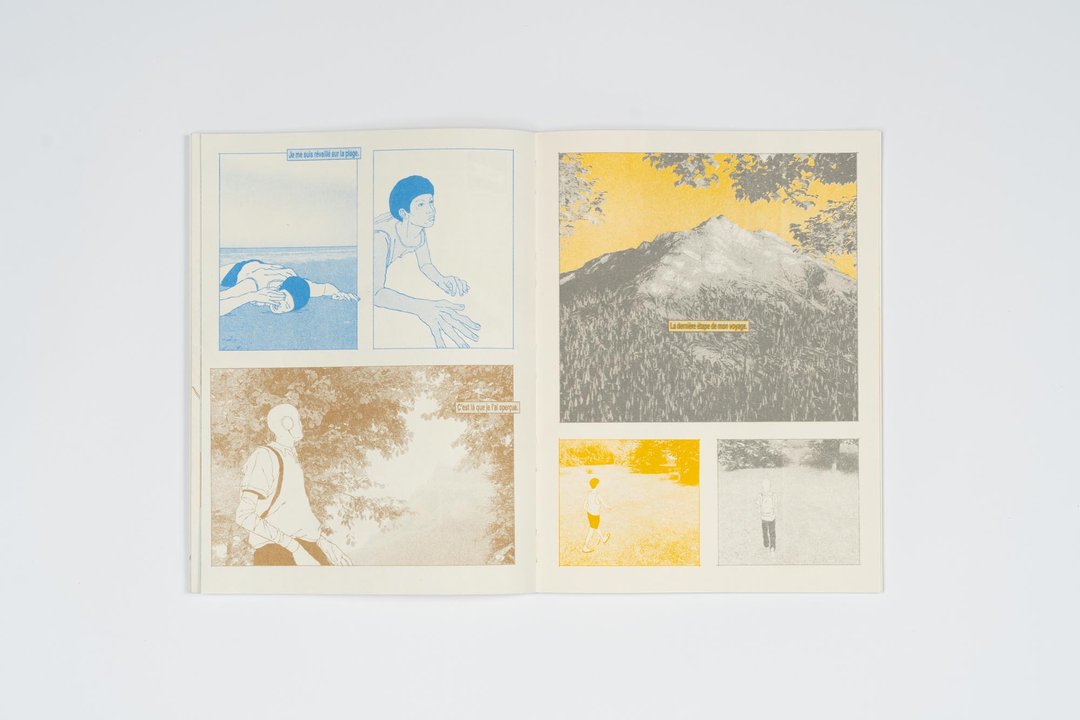
How can new narrative mechanics emerge in comics? La Soupe follows the surreal journey of Clarence and Ludwig in their quest toward the Nucleus of the world. Although they share the same pages, the two characters evolve within distinct parallel realities, each associated with a different printing layer. Developed as a space for narrative exploration, the project investigates the possibilities offered by the coexistence of multiple stories and multiple levels of reading within a single page. The images, combining hand-drawn elements with 3D-set designs, build a universe oscillating between science fiction and dreamlike imagery. Entirely printed in risograph, La Soupe deploys various narrative devices in which realities intersect, contaminate one another, and evolve throughout the story.

Korakot Unasit – Close stranger

GRAPHIC DESIGN

Korakot Unasit – Close stranger

by Korakot Unasit

It all starts with a friendship — born by chance, through moments shared in virtual spaces. Without ever meeting physically, a relationship took shape. This paradox raises a question: what does it truly mean to be present for someone? From this experience comes Close Stranger, a moving image project rooted in the world of video games that explores how a bond can evolve in a dematerialized environment, where presence defines itself differently. The trailer gives form to these immaterial ties that inhabit a shared world, but are never fully accessible to one another.

Léa Verboux – In Other Words

GRAPHIC DESIGN

Léa Verboux – In Other Words

by Léa Verboux

Thirteen million works published for free, without publishers or institutional recognition, yet read and rewritten by millions of readers. In Other Words is an anthology dedicated to fanfiction, documenting this practice in its various aspects: its codes, its communities, and the sheer volume of work circulating online. This publication also gathers texts that bear witness to the freedom offered by this parallel literature, where existing works become material to be transformed, extended, corrected, or reinterpreted. By confronting the codes of the traditional book with those of digital culture, In Other Words questions the boundaries between original work and rewriting, and proposes to offer it legitimacy, space, as well as a tangible form.

Arnaud Wenger – How You Read, How You Know

GRAPHIC DESIGN

Arnaud Wenger – How You Read, How You Know

by Arnaud Wenger

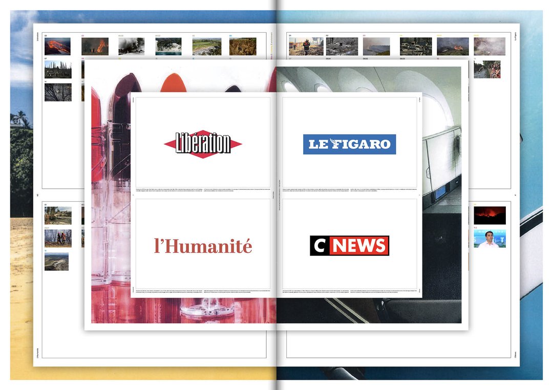
Our perception of climate change depends on what we read. How You Read, How You Know is an investigation into the invisible architecture of information. When a wildfire burns, the facts are the same: the hectares, the wind, the displaced lives. But the story told about it never quite is. It shifts depending on who writes, from where, and for whom. This project analyzes the media coverage of two wildfires in 2025: the Los Angeles wildfires in January, and the Corbières wildfires, in the south of France, in August.

David Zwicker – Typeable Images

GRAPHIC DESIGN

David Zwicker – Typeable Images

by David Zwicker

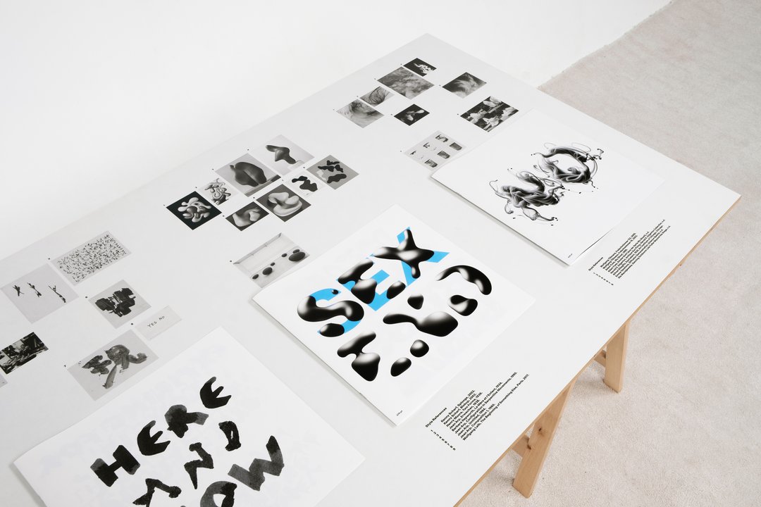
What happens when a typeface steps outside the boundaries of the vector? Typeable Images is a type design and research project that explores this question through emoji font technology, a medium that allows typefaces to be built from pixels rather than paths. Across analog and digital processes, the project reinterprets a single typeface through distinct artistic styles, from analog to digital reproduction, producing image-based fonts that can be typed, combined and overlaid. Typeable Images offers a new human-machine interaction, as well as a new dimension for type design.

BA Industrial Design

Mathilda Zubek – VANTA DT-1

INDUSTRIAL DESIGN

Mathilda Zubek – VANTA DT-1

by Mathilda Zubek

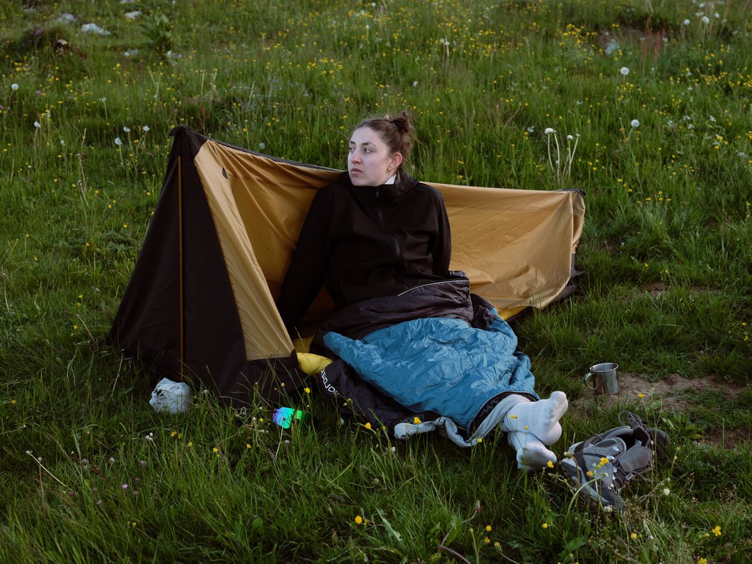
VEKTA-DT1 is a dual terrain shelter designed for solo adventurers. Combining the functionality of a ground tent and a suspended hammock tent, it adapts to changing environments without requiring additional equipment. The central structural poles serve two purposes: positioned vertically, they supports the tent in ground mode, repositioned horizontally, they become the structural spreader that stabilizes the suspended shelter between two trees. This dual use system enables rapid adaptation to uneven, rocky, wet, or otherwise unsuitable terrain. Lightweight, compact, and versatile, VEKTA-DT1 offers a reliable shelter solution wherever the journey leads.

Archibald Simon – Séjour

INDUSTRIAL DESIGN

Archibald Simon – Séjour

by Archibald Simon

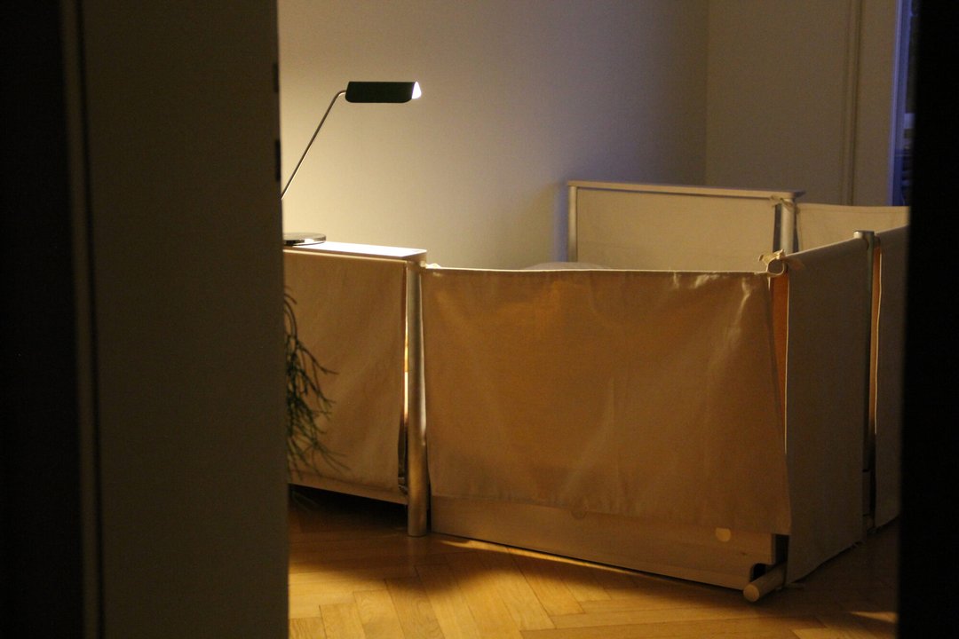
While the French word "séjour" refers, on the one hand, to the act of residing somewhere, it also denotes the living room of a home. It is precisely this multiple meaning that informs the Séjour project: a sofa bed designed for hospitality in all its forms — sharing and conviviality with guests, then comfort and privacy when used as a bed. When the sofa converts into a double bed, its backrest transforms into a screen, creating a private space for the occupant and shielding them from the hustle and bustle of the living room, so they may feel right at home.

Matthieu Rigelo – Doll Museum

INDUSTRIAL DESIGN

Matthieu Rigelo – Doll Museum

by Matthieu Rigelo

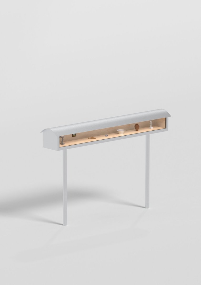
Several Swiss cities now reserve their advertising spaces exclusively for culture, sports, and local initiatives. Doll Museum is an urban showcase dedicated to the promotion of local museums. As a three-dimensional alternative to traditional posters, it displays objects from ongoing exhibitions, offering a more immersive preview to spark curiosity and invite people into museums. Its double-walled stainless steel structure and safety double-glazing preserve the exhibited pieces while making culture more accessible to the public.

Romain Ricci – Rooster

INDUSTRIAL DESIGN

Romain Ricci – Rooster

by Romain Ricci

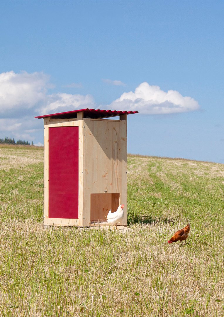
Rooster is a modular flat-pack chicken coop designed to promote autonomy and local food production. Its concept is based on modularity: a base module for two chickens, expandable up to six chickens. Designed for people with no DIY experience, it uses CNC-machined three-ply spruce panels. Assembly is easily done with a power drill, thanks to a threaded insert system. The wood is treated with linseed oil to ensure its longevity outdoors. This transparent approach emphasizes repairability, as each part can be easily replaced. Inside, the layout features a roosting bar and a nesting box.

Flavia Renaud – Soft Room

INDUSTRIAL DESIGN

Flavia Renaud – Soft Room

by Flavia Renaud

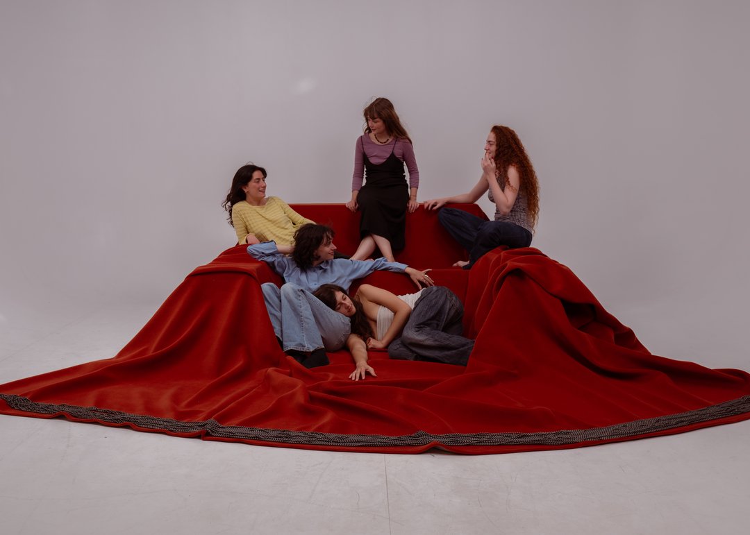
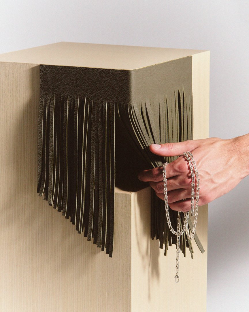
Soft Room is a hybrid object that connects sofa and rug to create a space for sharing moments with friends, family or flatmates. It almost creates a small room outlined by the rug, where people gather to do everything or nothing together. The low sofa and rug extend the resting surface so that everyone, seated or lying down, stays on the same level. The wooden structure, fully covered with foam, offers several angles to feel comfortable and cocooned, and to find one's favourite spot. The loosely draped Kvadrat fabric forms folds that replace cushions and add comfort. A heavy fringe controls the way the fabric falls and keeps it in place, while reinforcing the character of the piece.

Anouk Quillet – Poucet

INDUSTRIAL DESIGN

Anouk Quillet – Poucet

by Anouk Quillet

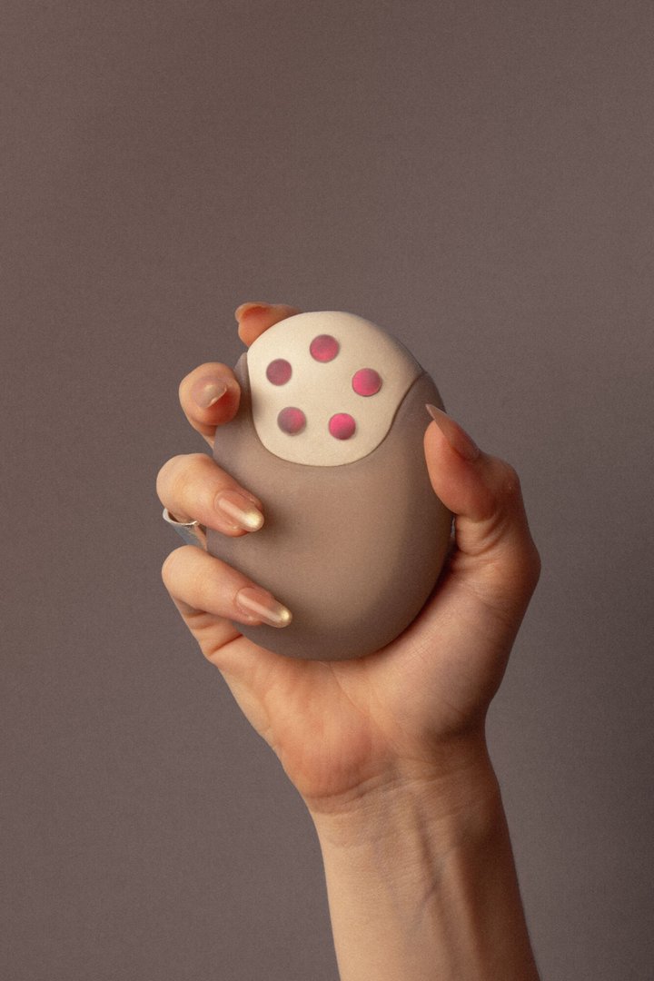
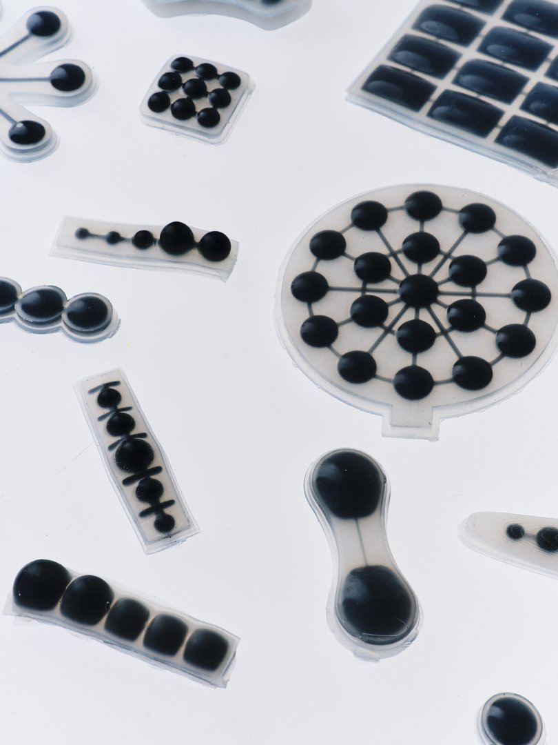
"No one knows your body better than you do. Poucet simply helps you listen." Poucet is a connected device that brings menstrual cycle tracking back to the user's body: it records a symptom based on the pressure applied to a silicone pebble. The stronger the pressure, the higher the intensity. The gesture is instinctive, takes three seconds, and transforms tracking into a ritual rather than a chore. A companion app stores the user's history, reveals patterns, and gives them full control over their data. Every symptom, every cycle parameter can be customized: Poucet adapts to any profile, any reality.

Léa Perrelet – LOBI

INDUSTRIAL DESIGN

Léa Perrelet – LOBI

by Léa Perrelet

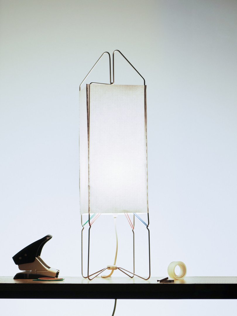
LOBI is a collection of five lamps made from components available at the Swiss craft store OBI. This project explores ways of making design more accessible by creating objects that anyone can build themselves. All the necessary parts can be purchased in a single location and easily assembled at home without requiring advanced technical skills. By encouraging autonomy through DIY practices, the project also questions the conventional use of industrial products by repurposing components originally designed for other functions. LOBI hence reveals the creative potential hidden within ordinary everyday materials, transforming them into new objects.

Leo Niksch – Tonno

INDUSTRIAL DESIGN

Leo Niksch – Tonno

by Leo Niksch

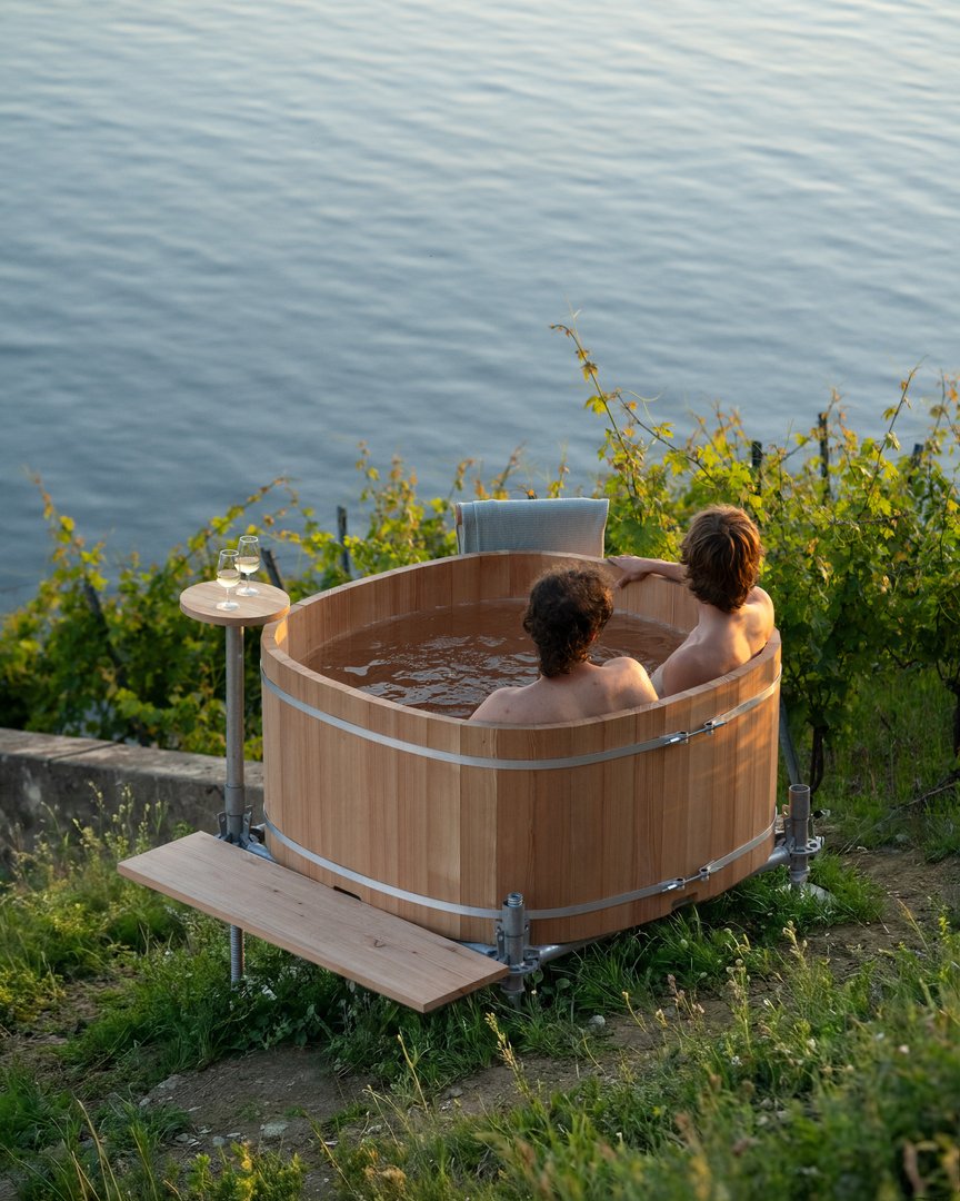
Every winter, news about the Swiss wine industry is dominated by the increasing uprooting of vineyards. This phenomenon, driven by the economic challenges faced by winemakers, leaves the land bare and the wood ready to be burned without any benefit derived from its combustion. This is especially true in Lavaux, a region characterized by varied slopes, terraces, and streams. In this context, Tonno offers a temporary structure that transforms waste into supplemental income. Suitable for any plot in Lavaux, it harnesses the heat generated by burning wood to welcome wine lovers into warm waters during what was once considered the off-season.

Arthur Németh – Sofra – 2026 #2

INDUSTRIAL DESIGN

Arthur Németh – Sofra – 2026 #2

by Arthur Németh

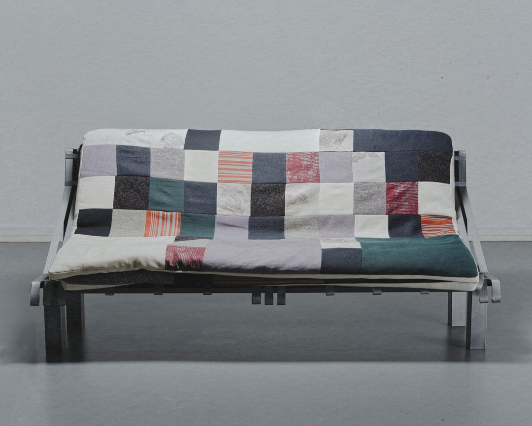
Sofra is a couch you sink into at the end of the day. But when the people you love arrive and the table needs to grow, it transforms. The mattresses that make it up lift and rearrange into a welcoming surface, turning a living room into a place of genuine gathering. Its name comes from "Supra" the communal cloth spread across Georgia, around which families and friends sit close together to share a meal. This term has always referred to more than eating. It means care, proximity, and the warmth of being truly welcomed at someone's table. Sofra carries the same idea. A couch in its quiet moments, a table when it matters. Designed to save space, but really designed to bring people closer.

Melchior Myard – Zeste

INDUSTRIAL DESIGN

Melchior Myard – Zeste

by Melchior Myard

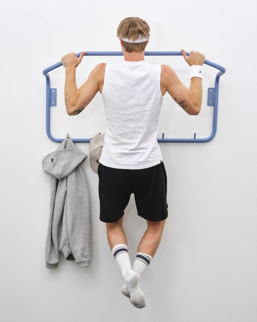
Zeste is a series of five hybrid objects that combine furniture and physical activity. Designed for students and young professionals living in small spaces, the project addresses both limited living areas and sedentary lifestyles. Far removed from any notion of performance or training, Zeste encourages a more active way of life through brief interactions embedded in everyday routines. Each object combines a furniture function with a natural invitation to move. Distributed throughout the home, they create an indoor activity path that transforms everyday objects into opportunities for movement. The combination of cork, wool, and softly coloured metal creates a warm and calming atmosphere, placing well-being at the heart of the experience rather than performance.

Arthur Moreillon – Buisson

INDUSTRIAL DESIGN

Arthur Moreillon – Buisson

by Arthur Moreillon

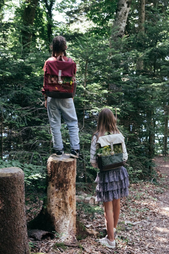
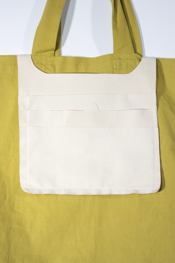
Learning outside takes organisation. Outdoor lessons are multiplying in Swiss schools, and with them, the need for equipment designed for nature. Buisson was born from that reality, accompanying students and teachers on their regular outings, from course materials to lunch and everything in between, without compromising on comfort or durability. Made from Swiss wool and Etaproof ripstop fabric, this bag is built for all weathers. But beyond its resilience, it encourages curiosity. Tucking away a stone, slipping in a leaf, keeping a piece of moss. The bag becomes a space for collecting as much as carrying, a field companion that grows with every outing. Because learning outside shouldn't be complicated.

Séraphin Monnard – Selah

INDUSTRIAL DESIGN

Séraphin Monnard – Selah

by Séraphin Monnard

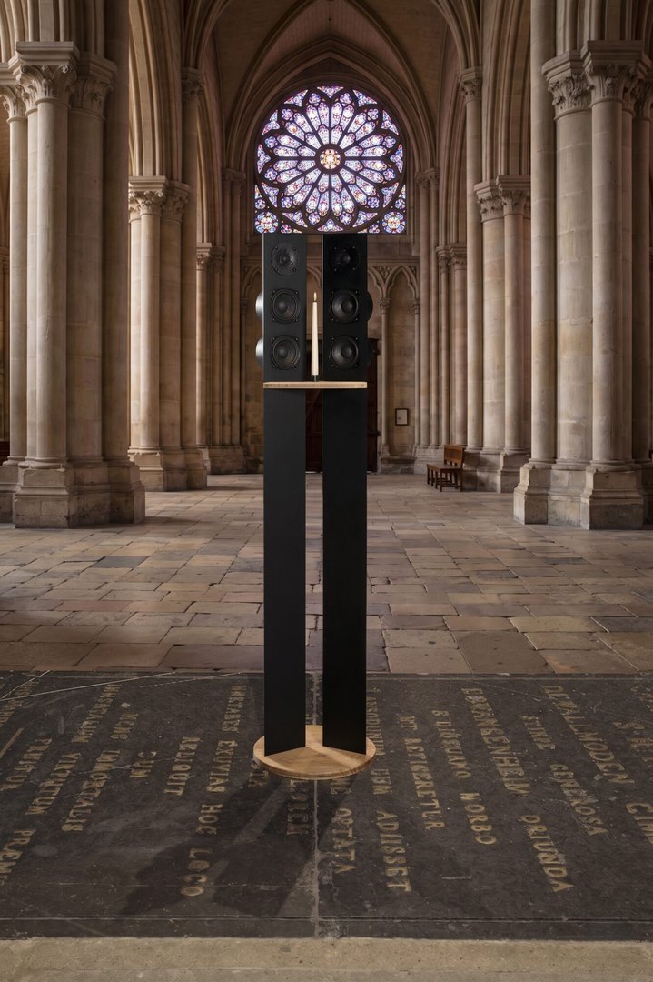
Selah is a scenographic installation inviting the public to wander through Lausanne Cathedral to listen to its history. Three sculptural loudspeakers embody the site's major milestones: origins, mutations, and openings. They broadcast six soundscapes retracing its evolution: initiation, construction, the golden age, the reformation, restorations, and living heritage. The culmination of his research in acoustic design, Selah also resonates deeply with the designer's Protestant heritage.

Jonas Meynet – Latzoum

INDUSTRIAL DESIGN

Jonas Meynet – Latzoum

by Jonas Meynet

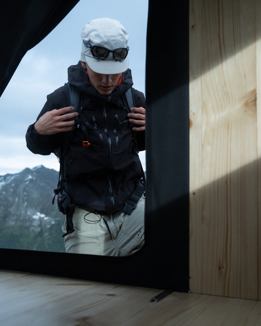
Latzoum is a compact emergency refuge designed to protect two people from harsh weather conditions in remote alpine environments. The shelter provides the minimum space required for two occupants to stay safely for up to 72 hours. Closed when not in use, it unfolds when occupied, transforming from a small box to a functional living space. Bright pink details act as visual landmarks within the mountain landscape, making the shelter easier to identify from a distance. Lightweight and easy to transport by helicoptere, the refuge can be installed in isolated locations and adapted to uneven terrain. Designed to operate independently with minimal maintenance, Latzoum offers a reliable and durable solution for emergency protection in the mountains.

Valentin Meghit – Axe X

INDUSTRIAL DESIGN

Valentin Meghit – Axe X

by Valentin Meghit

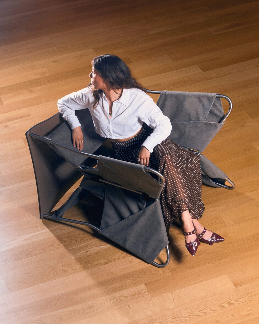
Axe X is a hybrid piece of furniture designed for museums, entrance halls, and multifunctional public spaces. Through a simple rotation around its axis, the object transforms from a seat into a high table, allowing a space to be quickly adapted to different uses such as waiting, informal discussions, conferences, exhibition openings, or workshops. Designed to support the growing need for flexibility in cultural and professional environments, it combines multiple functions within a single object while minimizing clutter. Made of metal, compact plywood, and textile, Axe X follows a sustainable design approach in which each component can be disassembled, facilitating maintenance, reuse, and material recycling.

Dona Levy – PRELUDE

INDUSTRIAL DESIGN

Dona Levy – PRELUDE

by Dona Levy

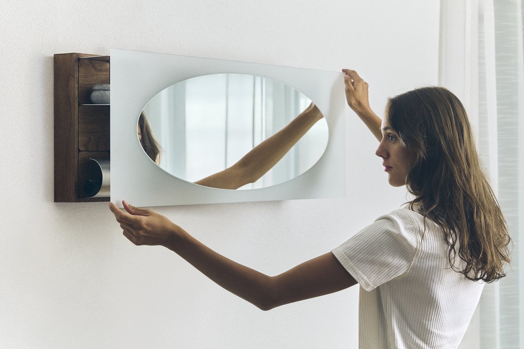
PRELUDE reinterprets the traditional dressing table to respond to contemporary lifestyles and the reduction of domestic living space. Designed as a compact wall-mounted object, it recreates a dedicated space for the ritual of personal grooming. Its opening mechanism is the central element of the project: rotating the mirror from a horizontal to a vertical position unlocks the object and reveals the products stored inside, transforming storage into a display. Hidden behind the mirror, an integrated lighting system illuminates the face through a sandblasted section of the mirror. Inside, removable metal compartments can be freely rearranged, allowing each user to organize the space according to their habits, products, and needs.

Zoé Letoucque – Vagabond

INDUSTRIAL DESIGN

Zoé Letoucque – Vagabond

by Zoé Letoucque

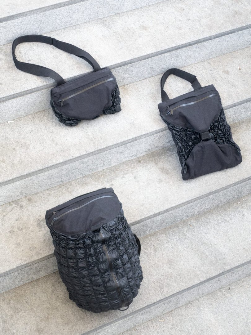
Vagabond is a bag designed for short trips, born from a simple observation: when travelling, we often end up with several bags ; one for transport, another for use at our destination. This project aims to combine these uses into a single object. Through its stretchable fabric, the bag can shift from 35 litres to 3 litres, adapting to different situations and scales of use. Velcro straps allow its configuration to be adjusted, while various zips offer multiple ways of opening it. It can thus become a pouch, a tote bag or a backpack. The project is based on research into elastic thread stitching as a way of generating both form and function.

Gabrielle Lefèvre – Anina

INDUSTRIAL DESIGN

Gabrielle Lefèvre – Anina

by Gabrielle Lefèvre

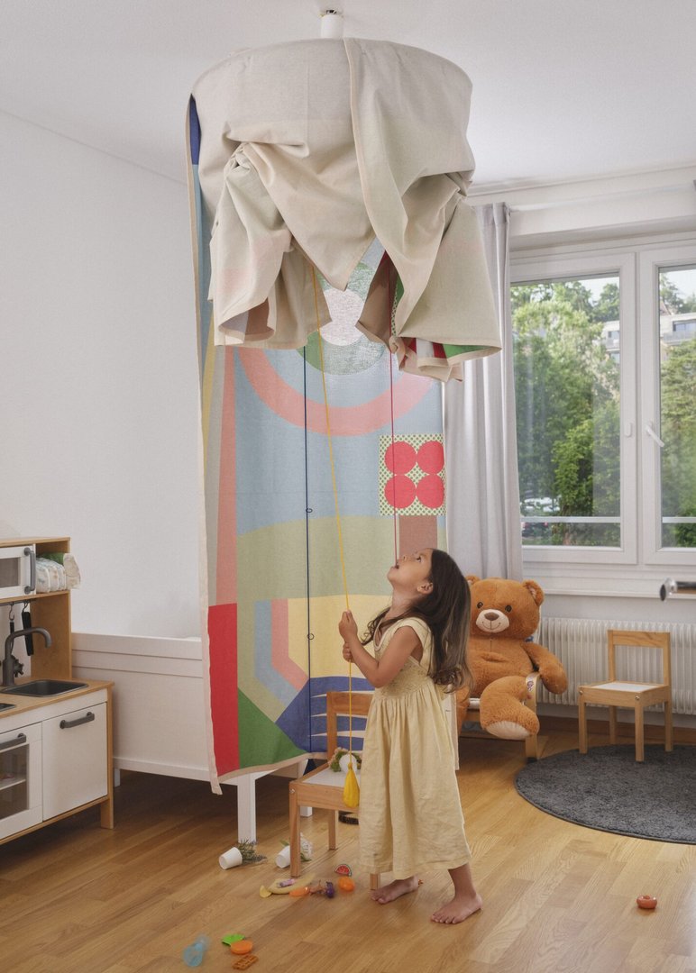
Anina is a children's playhouse that hangs from the ceiling and invites adventure. Children need colors, contrasts, and shapes to stimulate their curiosity about the world, which are somtimes hard to incorporate within a neutral interior. Anina elegantly solves this dilemma: discreet from the outside, it reveals a rich and stimulating graphic universe on the inside, developed in collaboration with graphic designer Candice Aepli, who specializes in creating for children. Once play time is over, a few cords are all it takes to pull the fabric back up: the playhouse folds away and disappears into the room. Anina can also be fitted with a ceiling light fixture and function as a lampshade.

Chloé Hamel – Tilt – 2026

INDUSTRIAL DESIGN

Chloé Hamel – Tilt – 2026

by Chloé Hamel

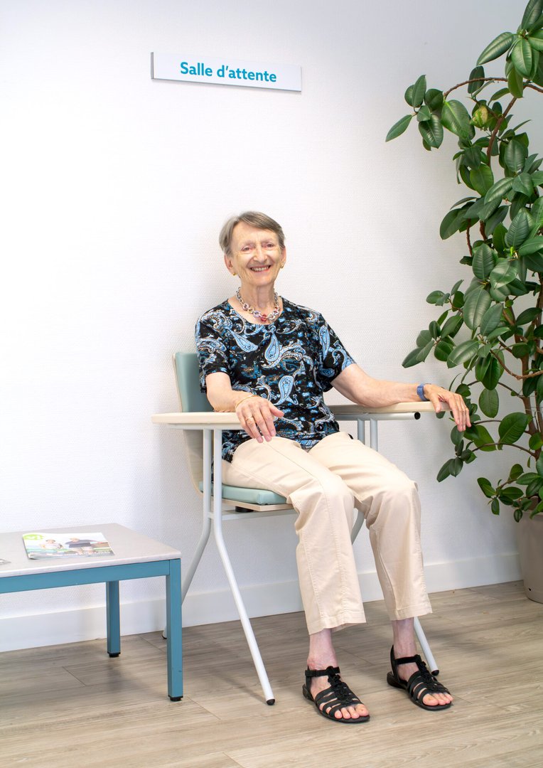
Tilt is a rocking chair designed for the waiting room of the pain management unit at the hospital. Waiting still can be difficult, especially for the patients with physical pain for whom immobility only enhance their pain. Thanks to the four rubber tubes placed under the seat, Tilt offers a soft and silent rocking motion which helps enhancing comfort and patience by activating the parasympathetic nervous system, responsible for relaxation and well-being. Furthermore, the balanced tilt helps patients transition from a sitting to a standing position: when the chair leans forward, it welcomes and accompanies the lower body. The various parts composing Tilt can be disassembled and replaced if need be, to ensure its durability.

Mélissa Da Silva Nicolet – No Wings

INDUSTRIAL DESIGN

Mélissa Da Silva Nicolet – No Wings

by Mélissa Da Silva Nicolet

There is someone who lives alone and wants to be a bird. We don't know why they stopped going out. We don't know why they decided to become a bird. It happened gradually. The apartment transforms in silence, in a quiet and luminous strangeness. From this script, three objects were designed, each tied to a scene from this character's daily life: a perch, a bathing object, and a sleep wrap. Each one answers a human need, translated through the logic of a bird's life. The project takes the form of a set built around these objects, an atmosphere, a fragment of the life of someone who chose, in their own way, to live differently.

Benjamin Claus – UKS

INDUSTRIAL DESIGN

Benjamin Claus – UKS

by Benjamin Claus

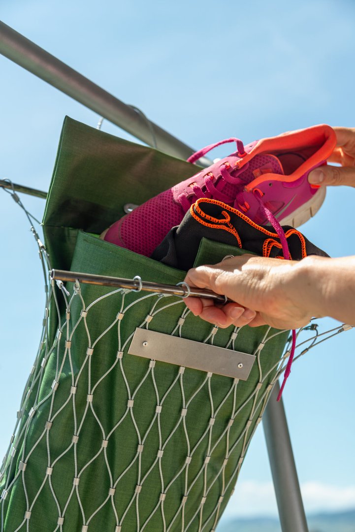
UKS (Urban Keep Safe) is an urban storage system designed for municipalities and event organisers. Conceived for temporary deployments, festivals, marathons or seasonal installations, it offers a simple infrastructure for users to secure their personal belongings. The flexible bags rely on a stainless steel mesh combined with water-resistant fabric to offer a lighter and more compact solution to traditional lockers, while remaining weather-resistant and theft-deterrent. UKS fits on a standard pallet when disassembled, ready to be stored away and redeployed the following next big event.

Damien Barman – Terrasse en place

INDUSTRIAL DESIGN

Damien Barman – Terrasse en place

by Damien Barman

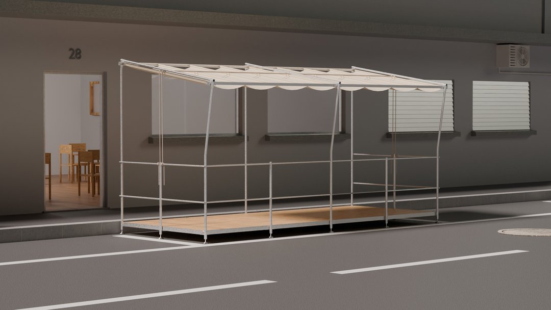
Modular Parking Terrace. Designed for restaurants that temporarily occupy parking spaces during the summer, this modular terrace offers a standardized alternative to custom-built installations. It is a reusable solution that can be adapted to different locations and expanded when needed. The terrace is composed of half-parking-space modules that connect together to fit a variable number of parking spaces. It features a fabric roof that unfolds accordion-style along rails using a rope system, allowing it to be opened or closed from the end of the terrace without disturbing users. Fully demountable for easy winter storage, the structure is made of galvanized steel, while the flooring is constructed from maritime pine panels.

Clara Uzunovic – Les Javelles

INDUSTRIAL DESIGN

Clara Uzunovic – Les Javelles

by Clara Uzunovic

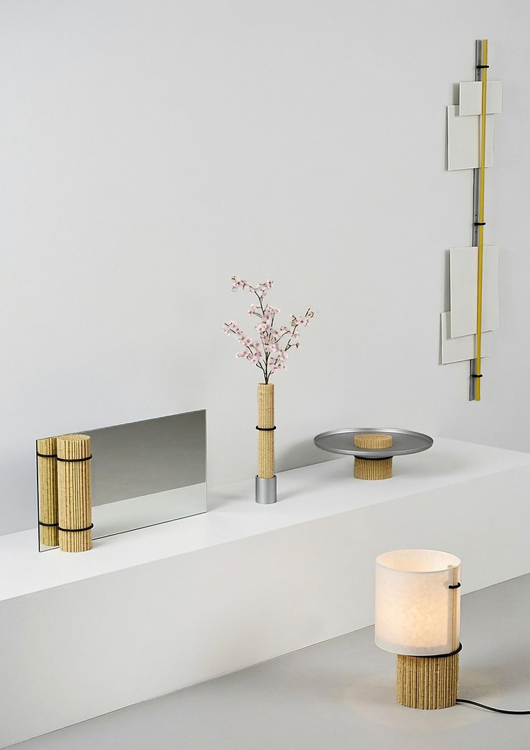
Born out of a collaboration with Jean-Luc Rodot, a rye straw producer, Les Javelles brings together five objects resulting from a research process centered on this material. Traditionally used for chair seating, thatched roofs, and marquetry, rye straw becomes here a structural element. Inspired by the gestures and processes of its harvest, this project explores new applications to reveal its material and aesthetic qualities. Through an experimental approach combining craftsmanship and material exploration, Les Javelles investigates the potential of a centuries-old material and expands its scope of application.

Aurélie Richard – Marquise

INDUSTRIAL DESIGN

Aurélie Richard – Marquise

by Aurélie Richard

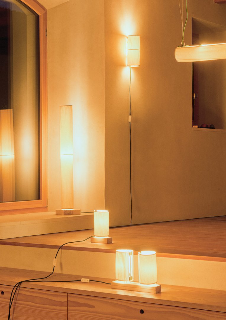
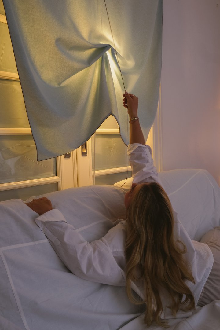
Inspired by the movement of curtains, the series of textile lamps Marquise explores how light can be modulated by material. Each piece consists of a fabric surface behind which a light source can be moved using a cord. This movement creates a pleating effect that transforms the diffusion of light and alters the resulting luminous effects. Across different formats, these lamps inhabit space as textile and luminous presences, inviting a simple interaction that reveals the sensitive qualities of both fabric and light.

Anouck Morlon – Multiples

INDUSTRIAL DESIGN

Anouck Morlon – Multiples

by Anouck Morlon

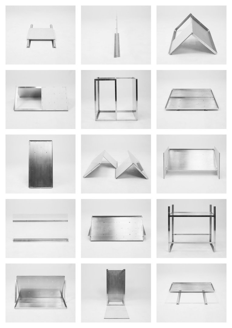
Composed of six modular panels, the flat-pack vitrine system Multiples generates a wide range of display configurations and spatial arrangements. Designed as a flexible tool, it can be assembled, disassembled, transported, and reconfigured to adapt to different contexts. The project explores the role of display and investigates how modes of presentation shape the perception of artworks and objects. By questioning the idea of display as a neutral support, it highlights its influence on the relationship between object, space, and viewer. Positioned between exhibition design and industrial design, Multiples considers display as an active component of the viewing experience.

Thaïs Matty – Mousseline

INDUSTRIAL DESIGN

Thaïs Matty – Mousseline

by Thaïs Matty

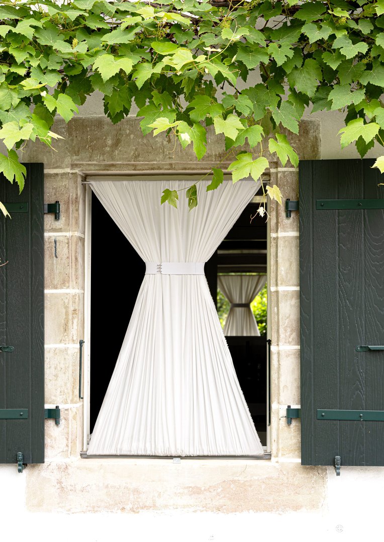
Dress up our windows, before the heat undresses us. A solution to overheated interiors has existed for millennia, suspended, silent, in the homes of Mosul. It is in this Mesopotamian city, which lent its name to the fabric, that damp sheets were hung from the windows to get through the summer. Mousseline revisits this ancestral gesture: a curtain that fits into the outer window frame through adjustable bars. A reserve of water comes to top the curtain: you hang it, fill it, hoist it back up, and the water descends slowly, impregnating the fibers. As the water evaporates, it absorbs the few extra degrees of the room. Once the heat fades, simply draw the curtain aside and let the view reveal itself.

Gion Luginbühl – FURNITURE FOR PRISON ENVIRONMENT

INDUSTRIAL DESIGN

Gion Luginbühl – FURNITURE FOR PRISON ENVIRONMENT

by Gion Luginbühl

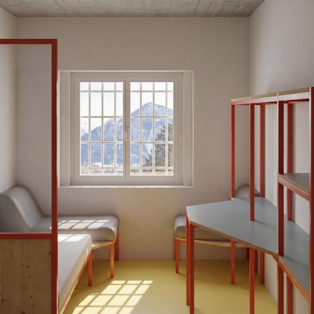
FURNITURE FOR PRISON ENVIRONMENT proposes a more humane approach to prison interiors. Designed as a modular structure fixed directly to the wall, it combines storage, work surfaces, lighting, seating, and spatial separation within a single coherent system. The construction responds to the specific requirements of prison environments: durability, safety, easy maintenance, and the possibility of local production in prison workshops. A careful selection of materials, including laminated beech, larch, plexiglas, and fire-resistant textiles, introduces warmth and variety to the cell. By strengthening the connection between the living space and the window, this project seeks to improve everyday comfort and create a stronger sense of normality.

Nicola Gut – Smash

INDUSTRIAL DESIGN

Nicola Gut – Smash

by Nicola Gut

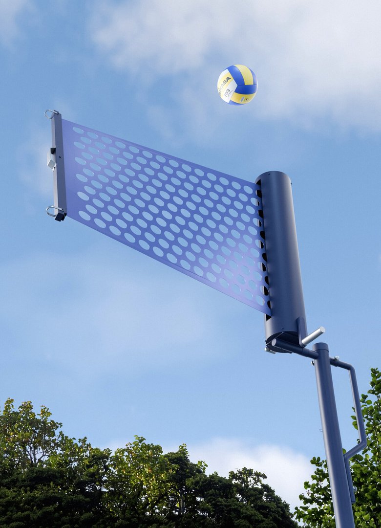
Smash is an urban sports net designed to make volleyball and badminton accessible in public spaces through a single adaptable structure. Traditional installations for these sports often require large, permanent infrastructure that is costly to install, maintain, and store, limiting their presence in urban environments. Smash addresses this challenge with a compact system featuring a retractable net that rolls into its case when not in use, minimizing its footprint while protecting the equipment. A rotating handle allows users to quickly adjust the net height, switching between volleyball and badminton in seconds. Designed for parks, alleys, and existing sports areas, Smash encourages spontaneous play and brings flexible sporting opportunities into the urban landscape.

Damien Gabriel – Niv'o

INDUSTRIAL DESIGN

Damien Gabriel – Niv'o

by Damien Gabriel

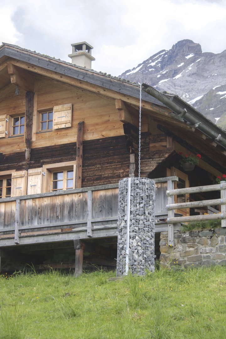
The climate is gradually transforming the Alpine landscape. Glaciers are retreating, rivers are changing course, and some lakes are drying up. In this context, mountain refuges are becoming particularly vulnerable, especially during periods of drought. By 2050, 40% of tourist refuges could face water shortages. Niv'o is a rainwater collector designed for small refuges, where water needs to be stored carefully through simple, durable, and accessible solutions. Its gabion structure is filled with stones found around the site, without requiring heavy installation or altering the place. This mineral mass protects the stainless steel tank, slows down freezing in winter, and helps keep the water cool in summer. Niv'o thus becomes a discreet, precious reserve, adapted to its environment.

Matheo Dusong – NEX-1

INDUSTRIAL DESIGN

Matheo Dusong – NEX-1

by Matheo Dusong

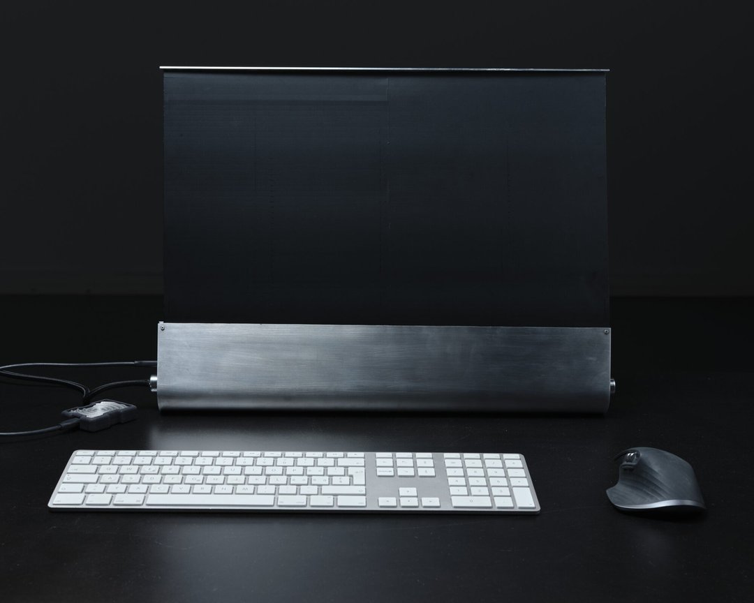
What happens to a desktop computer when not in use? In the era of remote work, this question hits close to home. Designed for those working from home, the computer often remains as an intrusive black rectangle in our living space once the workday is over. NEX-1 offers an alternative: a computer with a flexible screen that rolls into its base. Moving from a work tool to a discreet piece of furniture, it clears the visual space and helps separate personal and professional life. By redefining this typology, and while AI infiltrates every smart home device, NEX-1 chooses the opposite approach: an advanced technology capable of disappearing from our daily lives.

Laura Cipriano – Roll3

INDUSTRIAL DESIGN

Laura Cipriano – Roll3

by Laura Cipriano

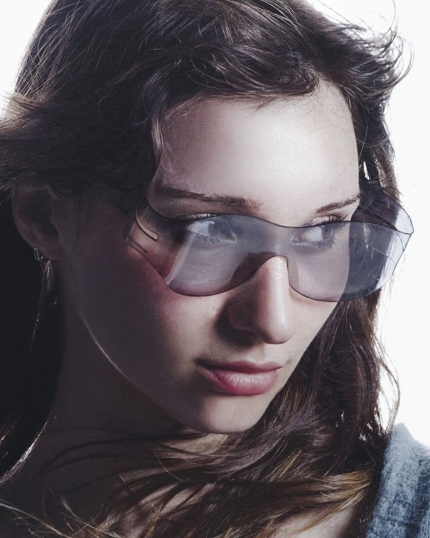
Roll3 is a universally adjustable pair of 3D glasses that explores a new way of inhabiting vision. Flexible, rollable, and made from a single material, it adapts to different face shapes as well as to the wearing of prescription glasses. It replaces traditional temples with a support system based on gentle pressure at the temples, allowing for quick and intuitive placement, either directly on the face or over other glasses. Made from PET, it simplifies manufacturing and facilitates recycling at the end of its life cycle. In a context where around 640,000 pairs of 3D glasses were used in Switzerland in 2025 and 81% of the population wears some form of visual aid, Roll3 questions the sustainability of these ephemeral objects and their potential for transformation.

BA Media & Interaction Design

Andreas Abbaszadeh – KIN

MEDIA & INTERACTION DESIGN

Andreas Abbaszadeh – KIN

by Andreas Abbaszadeh

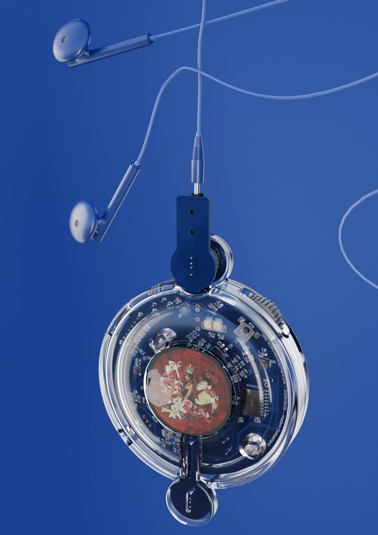
Streaming made music infinite and weightless: access to everything, ownership of nothing. This dynamic frayed the bond between artists and the people who listen to them. KIN rematerializes listening. It's a portable player that holds only a handful of tracks, like a mixtape. Its magnetic connectors let two devices touch to exchange their music, hand to hand: sharing becomes a gesture between two people again. Built around scarcity and ritual; custom electronics, a translucent body, physical controls, a screen that reflects light rather than emitting it, KIN slows the circulation of music to give back its value and its human weight.

Steve Bouillant – Re:soil

MEDIA & INTERACTION DESIGN

Steve Bouillant – Re:soil

by Steve Bouillant

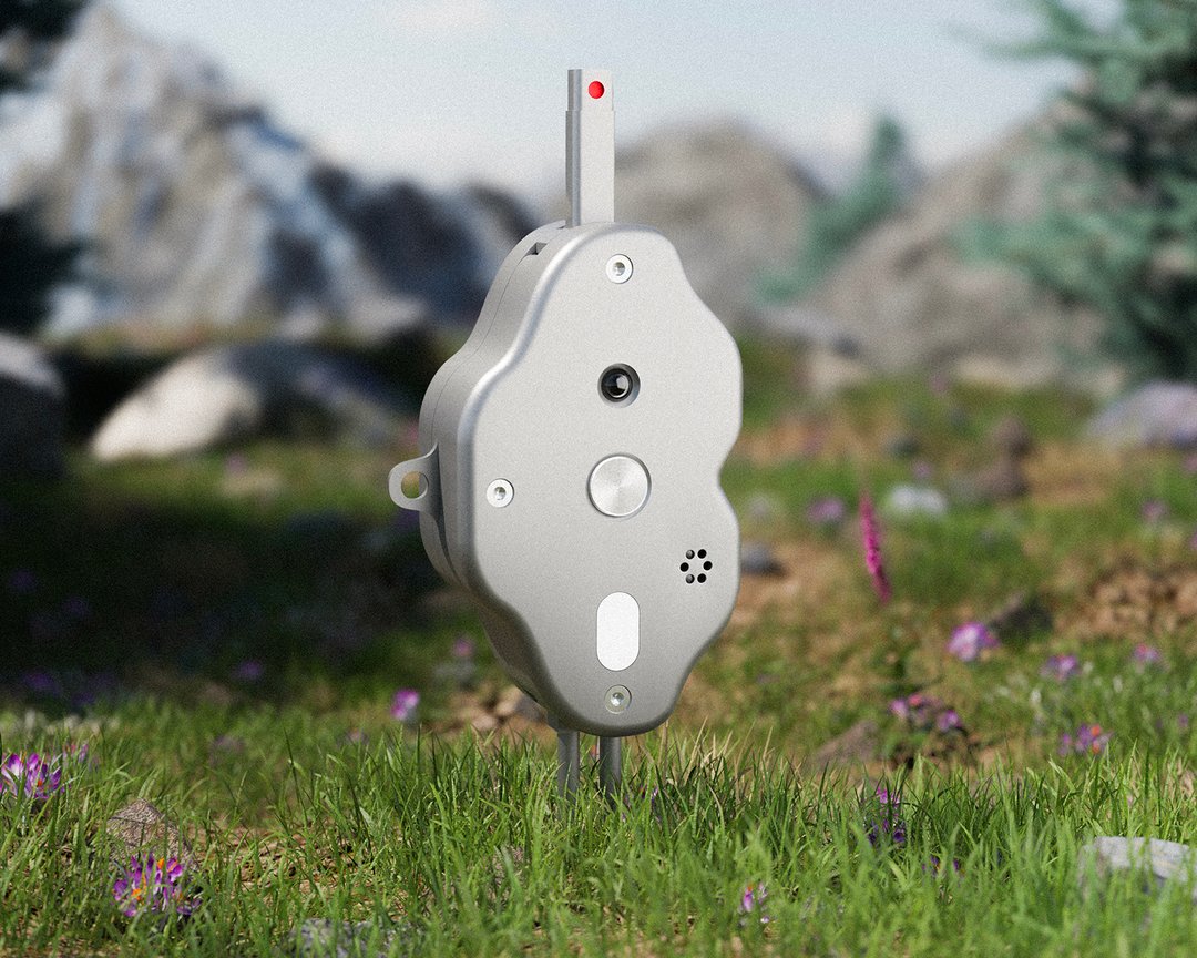
The smartphone has turned a trip to the mountains into an exercise in documentation. We take photos, tag our location, and post them: the natural world becomes content before it becomes a moment of reconnection. Re:soil offers a compact outdoor device whose sensors continuously measure humidity, light, and the transitions between environments. Its probe, planted in the ground, measures the earth's heat and compares it to that of the user's hand. Its microphone captures the soundscape of the location. Re:soil conveys these connections through vibration and light, without a screen, without performance, and without a phone. Upon the user's return, a linked app generates an ephemeral journal blending sensory interpretations, the geology of the site, and likely flora and fauna.

Laurine Gigandet – CLAWS

MEDIA & INTERACTION DESIGN

Laurine Gigandet – CLAWS

by Laurine Gigandet

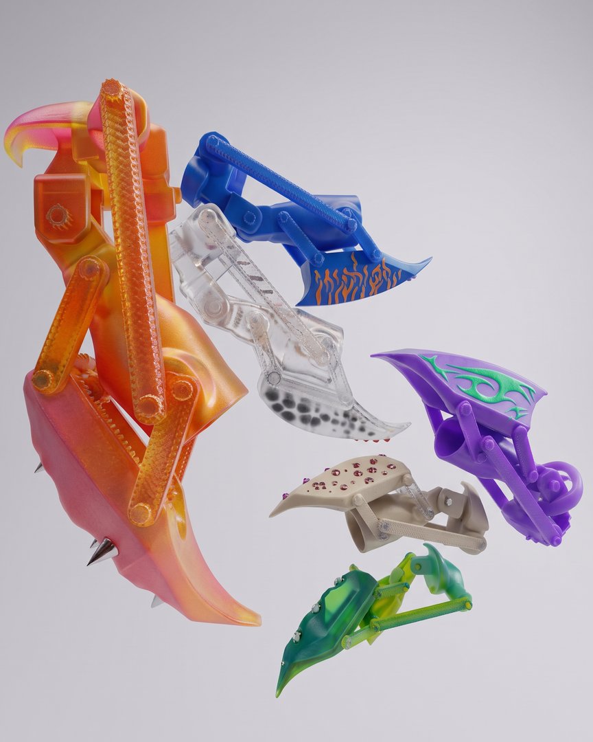
CLAWS is a collection of interactive accessories designed for a connected community. Worn on the fingertips, these devices enable users to assert their presence and engage with their surroundings on their own terms. Blurring the line between prosthetics and augmented nail art, the project explores how bodily ornamentation can transform the body into an interface with the physical, digital, and social worlds. Each CLAW is customizable : textures, colors, and patterns become symbols of identity and belonging. Inspired by Afrofuturist visions, the project centers on the concept of "digital marronage" through fugitive, self-organizing technologies. CLAWS acts as a political and cultural extension that resists the standardization of mainstream contemporary technology.

Nyria Graber – Haptobiosis

MEDIA & INTERACTION DESIGN

Nyria Graber – Haptobiosis

by Nyria Graber

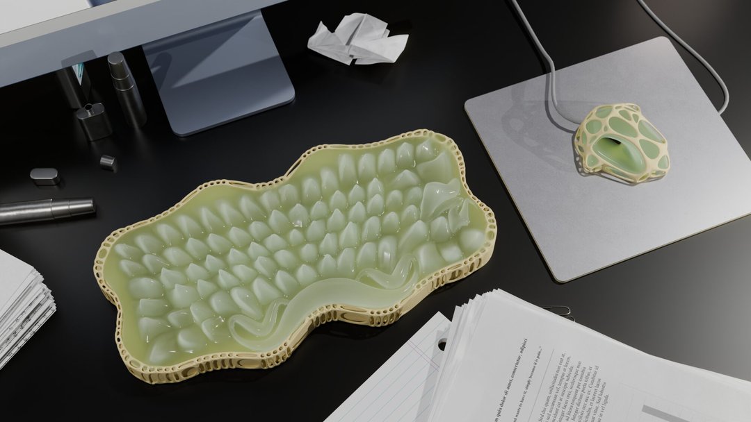
Haptobiosis reveals the microbiome of our desk, the living, invisible world that our gestures shape. The installation is built around three hybrid objects: a keyboard, a mouse and its mat, reimagined somewhere between the technological and the organic. In a society that sterilises its spaces and fights off microorganisms, how can we reconnect with this imperceptible living world? By interacting with these objects, we uncover bacteria, their shapes, their presence, the silent life unfolding beneath our fingers, across our surfaces, evolving alongside us. Every gesture lets this microbiome grow behind the screen, the most sterile place of all, where no organism should exist. Touch becomes the medium of interaction between our gestures and this ecosystem.

Teo Grajqevci – reform

MEDIA & INTERACTION DESIGN

Teo Grajqevci – reform

by Teo Grajqevci

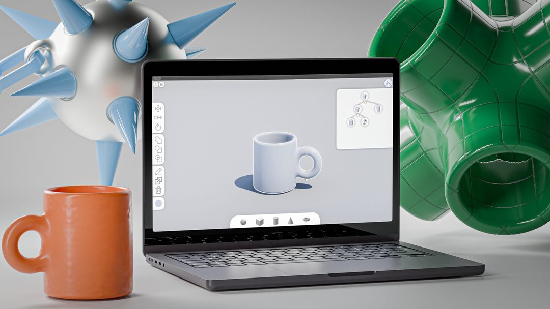
reform responds to a context in which designers are gradually losing control over their tools: creative software is becoming more automated, closed and dependent on cloud-based services. Today, generative AI can produce 3D models with ease, but often at the cost of control, understanding and ownership of the creative process. reform offers another approach: making 3D modelling easier to access, in a field that is usually complex and difficult to learn. The project takes the form of free and open-source software, built around a simplified interface, intuitive interactions and guides that support the learning of these tools. Through demonstrations and didactic exercises, reform restores the designers' motivation and means to model 3D shapes themselves.

Brikeld Hoxha – Compliant

MEDIA & INTERACTION DESIGN

Brikeld Hoxha – Compliant

by Brikeld Hoxha

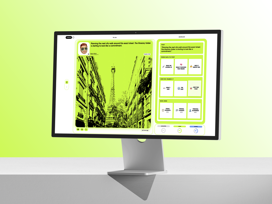
Welcome to Compliant, the first social network built entirely around you. Not around what you want to show, but around who you really are. During the setup phase, we show you exactly what we collect about you. Your profile is generated automatically. Your first posts, your behaviors, and your interactions feed your content. Then, hour after hour, Compliant updates itself for you. Without you having to do a thing. Your place in the community will be established. Compare yourself to your peers and climb the rankings. For the first time, others see you as you truly are. You no longer need to search for what to say, we already know the answers.

Shana Meinecke – She Kept Playing

MEDIA & INTERACTION DESIGN

Shana Meinecke – She Kept Playing

by Shana Meinecke

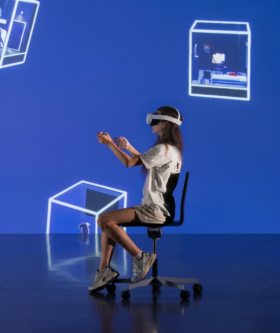
While women make up half of all gamers in Europe, they account for only 7% of participants in esports competitions. The VR project "She Kept Playing" explores the causes of this disparity. Although esports is a relatively young sector, gender stereotypes and misogyny remain. By listening to short stories based on testimonials from professional female gamers, participants directly discover the systemic obstacles these women face. Carried by influential players like Kayane and Loupiote, they serve as powerful role models for the next generation, empowering female gamers to carve out a place in the field without having to worry about gender bias.

Yann Müller – Trame Noire

MEDIA & INTERACTION DESIGN

Yann Müller – Trame Noire

by Yann Müller

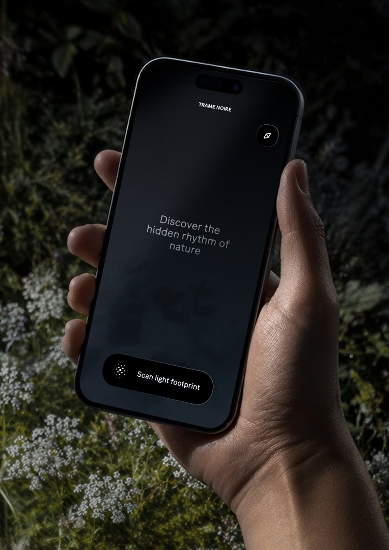
As cities light up, the night fades from our sight. Trame Noire is a night-exploration mobile app designed to raise public awareness about the impacts of light pollution on the wildlife and flora that come alive at dusk. Combining immersive experience and citizen science, the project offers a new way to observe and understand our coexistence with the living world. Guided by the seasons and natural cycles, the app invites users to explore the urban environment and capture, from one location to the next, the unique light footprint of each space. Through these explorations, Trame Noire maps a sensitive geography of the dark, bringing to light how artificial illumination alters the behavior of nocturnal life.

Daniel Rocha – HOMAZON

MEDIA & INTERACTION DESIGN

Daniel Rocha – HOMAZON

by Daniel Rocha

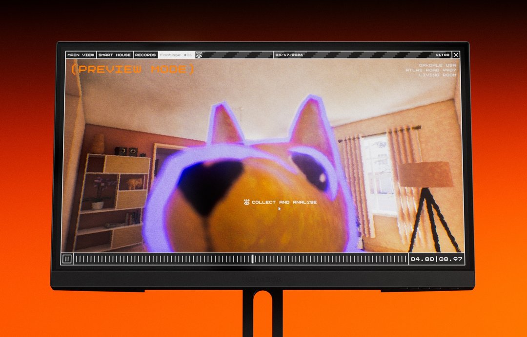
In this video game, the user plays as a support agent at HOMAZON, whose mission is to ensure a family's comfort in their smart home. Every action is designed to make the family's daily life simpler, more convenient, and more comfortable. Throughout the game, the player performs actions that seem at first glance harmless. Yet they ultimately tell a different story. Behind these actions, the smart devices have in fact collected a wealth of data on the family's lifestyle. HOMAZON does not seek to reveal the existence of data collection, a reality already known to the general public, but aims to raise awareness among teenagers and young adults about what is really happening behind the use of smart devices, which appear harmless and convenient.

Dalia Spichtig – Breaking the Narrative

MEDIA & INTERACTION DESIGN

Dalia Spichtig – Breaking the Narrative

by Dalia Spichtig

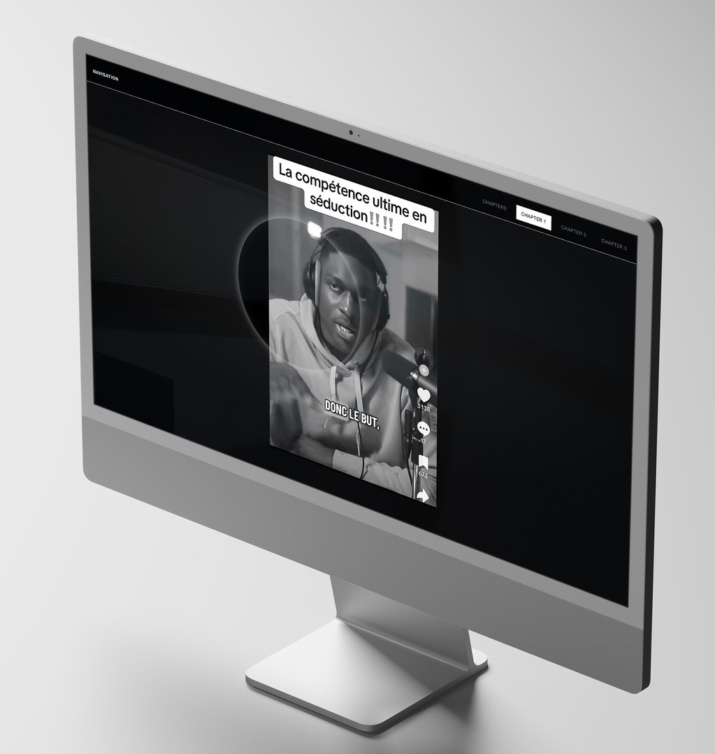
Breaking the Narrative is an interactive educational web documentary exploring manosphere narratives. Structured in three parts, it examines the three media formats most used by these communities: video, text, and audio, to analyze their communication and dissemination strategies. Through playful interactions, the project raises awareness of the persuasive mechanisms used by the manosphere while exposing the systemic and ideological realities these narratives often conceal. Aimed primarily at young boys, as well as parents, guardians, and educators, Breaking the Narrative provides tools for understanding, critical analysis, and education around these contemporary issues.

Jonathan Vögele – Siphonophores

MEDIA & INTERACTION DESIGN

Jonathan Vögele – Siphonophores

by Jonathan Vögele

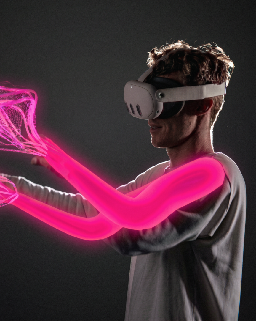
Siphonophores is an immersive experience in which two participants learn to share a single virtual body. The siphonophore, this marine animal that seems to be but a single gelatinous creature, is in fact a colony of organisms. We too, who believe ourselves separate, are already multiplicities and together we form bodies vaster still. Linked by a device that captures and synchronizes their movements, the participants feel their gestures seek one another out, meet, and at times work against each other. An arm rises without our quite knowing who willed it. How far can we feel ourselves extended, displaced, shared?

Charlotte Waridel – Bloom

MEDIA & INTERACTION DESIGN

Charlotte Waridel – Bloom

by Charlotte Waridel

Bloom is an interactive installation that delves into the opaque reality of nickel mining, a cornerstone of the energy transition. In 1975, biologist Alan Baker discovered, in an open-pit mine, a plant whose leaves contain nickel concentrations a thousand times higher than normal, Noccaea caerulescens. He published his findings, which went unnoticed. Today, the mining industry has taken an interest in these hyperaccumulator plants and is developing phytomining as an alternative to conventional extraction methods. Bloom explores the duality between scientific reality and a pro-industry narrative that presents it as tomorrow's green solution, navigating between the extraordinary adaptation of these plants to their environment and the mechanisms of greenwashing.

BA Photography

Salomé Billato – Grosse

PHOTOGRAPHY

Salomé Billato – Grosse

by Salomé Billato

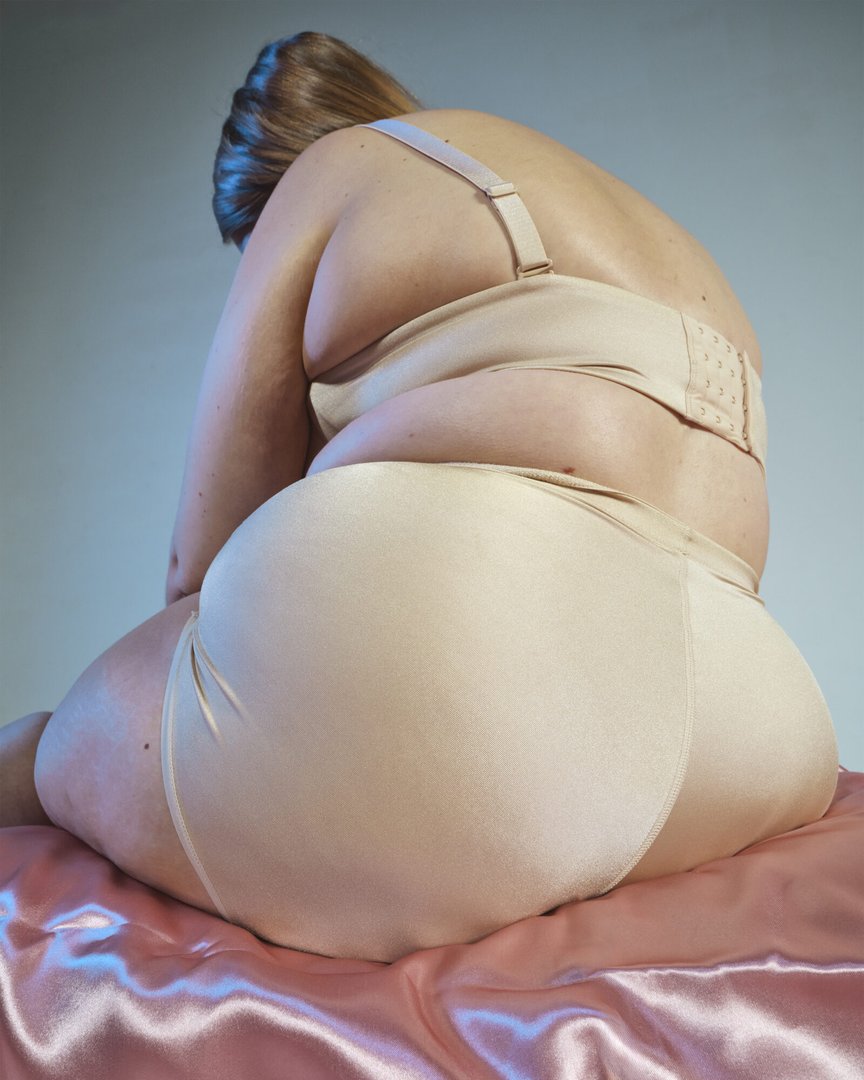
Grosse is a photographic book that combines self-portraits, documentary images, and fictional images exploring the contemporary body. By reclaiming the word "grosse", a term marked by shame and stigma, this project questions beauty standards and their hold over our relationship to the body. It draws on the artist's personal experience with Wegovy, a weight-loss treatment that intensified constant monitoring of her body. Grosse explores a central contradiction: the criticism of these norms while participating in them. The book questions how far we are willing to reshape our bodies in order to conform to socially constructed ideals.

Lee Eggenschwiler – Standard Values

PHOTOGRAPHY

Lee Eggenschwiler – Standard Values

by Lee Eggenschwiler

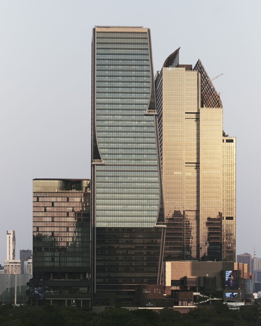
Standard Values explores the opaque economy of colored gemstones in Bangkok. Conceived as a visual investigation, this project focuses on the gray areas of this industry, capturing the precise moment when trust mechanisms and global flows transform a simple stone into a standardized ideal of luxury. The book confronts the raw materiality of the gems with the urban space, creating a dialogue between the facets of the crystals and the architecture of the skyscrapers to reveal their similarities and inclusions. Yet, the images also reveal a sense of solitude within an illusory opulence, moving between empty shops and anonymous bodies.

Vittorio Franzolini – Still still

PHOTOGRAPHY

Vittorio Franzolini – Still still

by Vittorio Franzolini

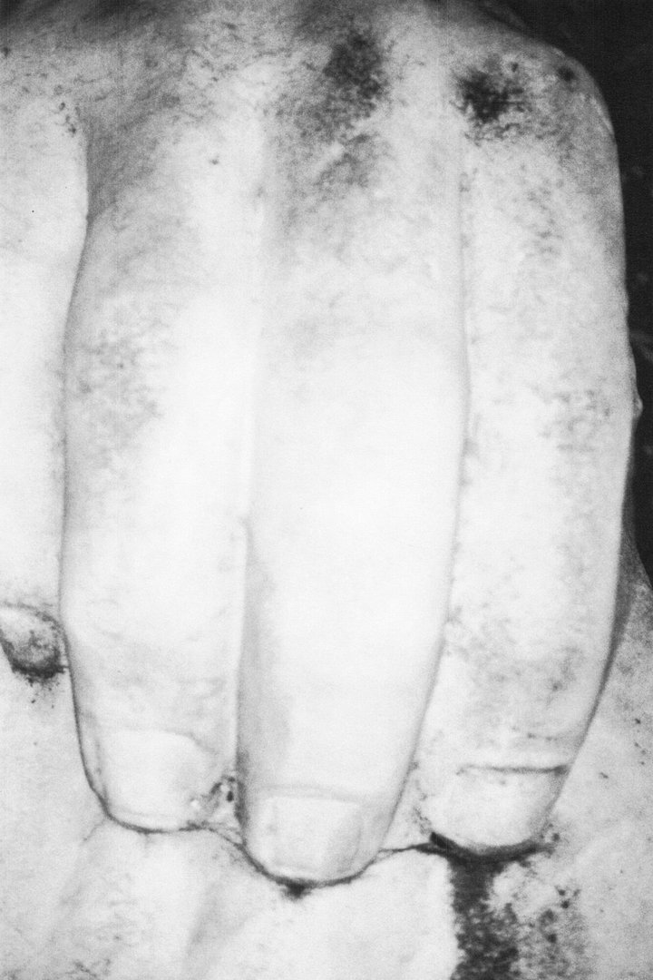
Still still investigates the legacy of Fascist-era architecture in Italy. Inspired by Futurist "parole in libertà", the title stems from the repetition of the same word, generating an ambiguity between stillness and movement. Produced between Milan and Rome using analogue photography, the project seeks to desacralize these buildings through close and displaced viewpoints, moving away from their monumental and celebratory representation. Walls and surfaces appear like skin marked by erosion, dust and traces of time, transforming symbols of power into fragile and vulnerable bodies. Still still reflects on the persistence of certain aesthetics of authority in the present and takes the form of a book and an installation printed in Comcolor.

Antoine Genoud – Galé j'armayi

PHOTOGRAPHY

Antoine Genoud – Galé j'armayi

by Antoine Genoud

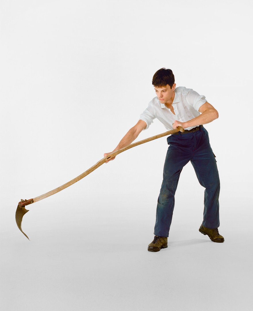
Galé j'armayi explores how the figure of the peasant is represented in Switzerland, where it is deeply intertwined with national identity. More broadly, the project invites viewers to question their relationship to an idealized and exploited past, as well as to the traditions to which they are attached, in order to reclaim them. Visually, this takes the form of a video piece and a series of self-portraits where pose, clothing, and objects combine to recreate traditional peasant imagery while introducing a certain dissonance in order to challenge it. Furthermore, the roles of men and women are played by the artist himself, questioning certain notions of gender and traditional, conservative values.

Morea Gërxhaliu – Petti Toes Grande

PHOTOGRAPHY

Morea Gërxhaliu – Petti Toes Grande

by Morea Gërxhaliu

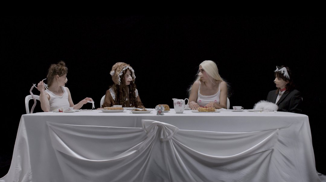
Petti Toes Grande is an experimental film and installation built from an overcrowded inner stage. Four animals gather for tea: a dog, a deer, a rat and a pig. Each embodies a different subpersona, transforming an inner monologue into a conversation between animal selves. Drawing from internet culture, furry culture, online animal archetypes and the emotional baggage humans attach to certain species, the work uses animal symbolism to explore different social versions of the self. Across three screens framed by stage curtains, reality television and theatre merge into an unstable spectacle where performance and authenticity become difficult to separate. The hierarchy of the scene never settles, shifting between those who serve, those who perform, those who watch and those who are overlooked.

Rose Graf – EVERYTHING FALLS QUIET

PHOTOGRAPHY

Rose Graf – EVERYTHING FALLS QUIET

by Rose Graf

There are moments no one sees. Not because they don't exist, but because no one ever really looks. EVERYTHING FALLS QUIET grew from an intimate memory, one of school bullying. Familiar places swallowed by an unnatural darkness, bodies sharing space without ever truly meeting, a tension that lingers without breaking. Between recollection and fiction, between the real and the dreamlike. A way of taking back what was once taken. Of holding still these invisible moments, and finally giving them a face.

Léa Isoard – Almost Marble

PHOTOGRAPHY

Léa Isoard – Almost Marble

by Léa Isoard

Almost Marble examines the circulation of contemporary female bodies within a visual and cultural landscape shaped by inherited representations. Using the Caryatids of the Acropolis as a reference, the project explores the persistence of ideals constructed through a masculine gaze, as well as the possibilities for their displacement. Within the Athenian labyrinth, portraits and architectural fragments come together to form a sensitive reading of a stratified city. The photographed figures can be understood as "displaced Caryatids": no longer bodies assigned to support a monument, but living presences that inhabit the city and constitute it from within.

Maël Le Guével – Liberté, Liberté ! C'est où ça ?

PHOTOGRAPHY

Maël Le Guével – Liberté, Liberté ! C'est où ça ?

by Maël Le Guével

Liberté, Liberté ! C'est où ça ? is a video inquiry into the world of gbakas, the collective minibuses that crisscross Abidjan from dawn to dusk. Covered in religious slogans and vivid colors, they are a striking visual landmark of the city. On board, apprentices hustle for passengers, collect fares and negotiate in an atmosphere of disorder and coded violence. Assert yourself, or lose your place. The film follows Kenzo, 32, an apprentice for ten years at the Adjamé Liberté station. Through an onboard camera, we witness his daily grind — calling out, pushing hard to fill the bus. Once the gbaka roars toward Yopougon, a quiet settles over the passengers only the noise of the traffic rolls on. A portrait of an urban theatre where virility, resourcefulness and chaos are forms of resistance.

Farah Mirzayeva – ANOMALIES

PHOTOGRAPHY

Farah Mirzayeva – ANOMALIES

by Farah Mirzayeva

Inspired by a background in chemistry, ANOMALIES explores the boundary between scientific imagery and visual construction. After photographing machines which process or store data in EPFL laboratories, the images are modified by using scanning as a tool of transformation, to alter, glitch and deform. The process mimics the machines themselves: the codified images are systematically rescanned to gain new materiality, they become textured, unstable, and paradoxically analogue. The installation recreates the skeleton of a microscope seen in a laboratory, becoming a modular photographic sculpture of metal. A book completes this project: through sequencing, zooms and accumulation, it mirrors data processing in order to reveal the immateriality and abstraction of scientific research.

Auriane Nicollier – Everything Will Remain Except the House

PHOTOGRAPHY

Auriane Nicollier – Everything Will Remain Except the House

by Auriane Nicollier

Everything Will Remain Except the House is a documentary project following the residents of a squatted building over the course of nearly a year. After their eviction, some found new places to live, while others were left homeless. The project explores how intimacy is shaped within temporary, collective, and precarious living spaces. Each occupied place must be adapted, shared, and reinvented. Through this instability, a sense of home is defined more by the relationships it fosters than by the space it occupies. Presented as a publication bringing together photographs and testimonies, Everything Will Remain Except the House preserves the memory of a place that has disappeared while offering a reflection on housing precarity, collective living, and mutual aid.

Colas Ravey – Un goût salé m'est resté en bouche

PHOTOGRAPHY

Colas Ravey – Un goût salé m'est resté en bouche

by Colas Ravey

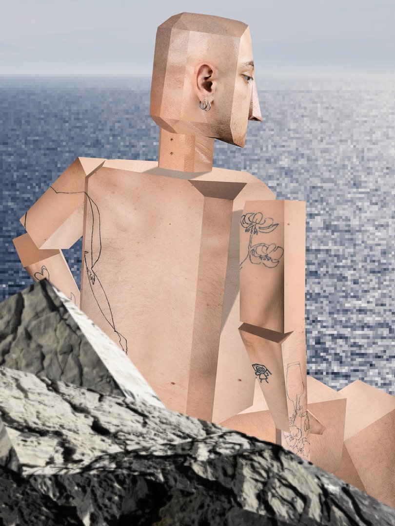
The beach, in video games as in real life, is a place dear to the artist. It is a space where people, sensations, and moments of life intertwine. A place where people's identities and sexuality are at the mercy of the sun and the heat. Un goût salé m'est resté en bouche is a reminiscence of childhood, a time when video games were pixelated worlds where anything seemed possible, free from questions about self-image and love. Drawing inspiration from low-poly aesthetics, the project evokes a suspended moment where voyeurism, sunbathing, and flirting coexist. A moment where the artist becomes the avatar of a multi-purpose game, navigating between desire and freedom, intimate and public, in a quest for something that might be love.

Aline Savioz – I feel slightly off

PHOTOGRAPHY

Aline Savioz – I feel slightly off

by Aline Savioz

Born out of a period of introspection, I feel slightly off transforms invisible emotions such as anxiety and a loss of meaning into carefully constructed scenes. Through portraits, group scenes, and still lifes, familiar situations subtly shift toward the uncanny. Inspired by the concepts of the uncanny (Sigmund Freud) and the uncanny valley (Masahiro Mori), the images play on subtle shifts that create a tension between the everyday and the unsettling. Bringing together nine large-format photographs and an image printed on a floor mat, the installation offers a reflection on the relationship to control, anxiety, and the perception of reality, while seeking to make visible intimate experiences that are often shared but rarely expressed.

Ashley Schneiter – AMUL RAGAL

PHOTOGRAPHY

Ashley Schneiter – AMUL RAGAL

by Ashley Schneiter

AMUL RAGAL is a documentary photographic project dedicated to lamb, a practice deeply rooted in Senegal's cultural, social, and spiritual traditions. Through this work, the artist questions the photographic representation of the Black male body and the imaginaries associated with it. Senegalese wrestling offers a field where rituals, beliefs, and contemporary culture intersect. As a woman working in an almost exclusively male environment, the artist developed a gaze sensitive to the gestures, nuances, moments of waiting, and vulnerability that escape the spectacle. The use of a shallow depth of field turns blur into a narrative tool, conveying the uncertain boundary between reality, belief, and representation.

Louise Tapponnier – Ce qu'elles partagent

PHOTOGRAPHY

Louise Tapponnier – Ce qu'elles partagent

by Louise Tapponnier

Ce qu'elles partagent explores photography as a relational and collaborative process centered on the notion of sorority. Through a system based on repetition and uniformity, the artist photographs women in a shared space in order to observe what emerges beyond individual singularities. The focus shifts toward gestures, attitudes, and forms of presence. The exchanges during the shoots lead to discussions about bodily habits, learned postures, and ways of presenting oneself or occupying space. The publication extends this research by bringing bodies together in a continuous flow where figures merge and respond to one another. The images gradually compose a form of "we," grounded in shared experience."

Shiny Vallenas – The Money Shot Always Tastes Like Bunnies And Donuts

PHOTOGRAPHY

Shiny Vallenas – The Money Shot Always Tastes Like Bunnies And Donuts

by Shiny Vallenas

The codes of pornography have profoundly reshaped the representation of women within contemporary imagery. From the porno chic aesthetic of the 2000s to the clean girl aesthetic that dominates social media today, the same close-ups and fragmented bodies continue to circulate. Desire, being inherent to the image itself, now takes on disguised forms in response to censorship, transforming into viral trends. This project combines staged photography and AI-generated imagery to reconstruct visual dispositifs drawn from porn casting videos, OnlyFans, and the language of advertising. By tracing formal correspondences between the body, the animal, and processes of objectification, it seeks to make visible what a continuous flow of images has taught us to stop seeing.

Master

MA Fine Arts

Hugo Baud – ALCOVE

FINE ARTS

Hugo Baud – ALCOVE

by Hugo Baud

ALCOVE is an installation located in the ECAL lobby that invites a reflection on such an exhibition space. It consists of the school's display walls, each measuring 2.06m by 2.8 0m. The structure, which is 6.18 m long, 4.12 m wide, and 2.80 m high, forms a rectangle on the floor with an area of 25.46 m². The exterior of the structure is painted in S 1502-R, the official color of the building's walls, and the interior in RAL 9016, the color designated for exhibition spaces. The name ALCOVE echoes that of the iconic sofas in the ECAL entrance hall.

Iulia Bucuresteanu – Somewhere in Draculaland

FINE ARTS

Iulia Bucuresteanu – Somewhere in Draculaland

by Iulia Bucuresteanu

Somewhere in Draculaland explores how the figure of Dracula shaped the Western construction of Eastern Europe through imperialist and neo-gothic frameworks. It examines how these narratives persist today through Hollywood-driven, pseudo-folkloric images that reinforce cultural hierarchies. Drawing on the figure of the vampire and its associations with contagion, otherness, and invasion, this project traces how these images emerge from late 19th-century anxieties and continue to circulate. Somewhere in Draculaland focuses on the way these representations detach from their literary origins and are reintroduced as pseudo-folkloric truths, creating a cycle in which identity is reduced to mere recognizability, to the benefit of Western cultural authority.

Hugo Cuenot – A strip of fruitful land of our own (Tereska Torres / Karim Kattan / Hugo Cuenot)

FINE ARTS

Hugo Cuenot – A strip of fruitful land of our own (Tereska Torres / Karim Kattan / Hugo Cuenot)

by Hugo Cuenot

Mixing sound and sculpture, A strip of fruitful land of our own is an installation of three paper windows with dedicated texts that can be heard near them. Made out of delicate Xuan paper, the frail windows are a reproduction of the artist's home windows, brining his fragile perception into the space. The three texts, read in three different voices and coming from three different timelines, weave stories of displacement, war, desire and queerness, bringing a vision of the world to be seen and heard through these veil-thin Swiss windows. As the fragility of our perception of the world is constantly challenged by the stories we are told, now is the time to listen to them.

Gaia Del Santo – nothing happens in the absence of repetition

FINE ARTS

Gaia Del Santo – nothing happens in the absence of repetition

by Gaia Del Santo

nothing happens in the absence of repetition is a series of works centered on quotes taken from press releases and exhibition texts for shows or works the artist saw over the course of their Master's degree. This series takes place within a research on how the necessity of branding under platform capitalism is accelerating the standardization of self-expression, and how this manifests in the arts, where the commercial ties of this indispensable tool are decried and denied. The citations were selected based on their ability to describe the artist's overall practice or a particular work of theirs. Through this selection, this project probes a double-bind: the expectation of an artist's indisputable originality and their need to locate themselves within a legible lineage.

Olive Godlee – Me and Other People's Children

FINE ARTS

Olive Godlee – Me and Other People's Children

by Olive Godlee

​​Me and Other People's Children is a triptych, made with graphite transferred onto raw canvas. The source images are photographs taken by the artist, with and of the children in their care. On the lower right appears a text message bubble, sent by the artist/nanny to the mother of the children. This piece is a continuation of a body of work that grapples with the triangulation of the nanny, the mother, and the child.

Taleb Lachheb – FRANCE FIST: EXPORAMA

FINE ARTS

Taleb Lachheb – FRANCE FIST: EXPORAMA

by Taleb Lachheb

FRANCE FIST: EXPORAMA is an installation composed of cardboard sculptures and a text read through a speaker. This project treats language as an unstable material, eroded by performativity. Sentences produce unexpected connections between distant subjects, such as body, family, work, sexuality, society, future. Meaning is not demonstrative: it emerges through successive collisions and shifts. The whole work proposes a fragmentary reading, close to a "Paranoid Reading", where relations between elements remain unstable and paradoxical.

Asia Lapai – ICI UNE PLANTE A ÉTÉ VOLÉE PAR UNE PERSONNE SANS SCRUPULE ET SANS RESPECT POUR NOTRE COLLECTION

FINE ARTS

Asia Lapai – ICI UNE PLANTE A ÉTÉ VOLÉE PAR UNE PERSONNE SANS SCRUPULE ET SANS RESPECT POUR NOTRE COLLECTION

by Asia Lapai

"THIS PLANT HAS BEEN STOLEN BY A PERSON WITHOUT SCRUPLES AND WITHOUT RESPECT FOR OUR COLLECTION" is a sentence taken from the signs in the greenhouse of the Geneva Botanical Garden, added when a plant goes missing. It opens a reflection on exoticism as a production of narratives and power relations, structured by the opposition between "here" and "elsewhere". Little Chewy is a meeting with a dock worker from Liverpool, a former major port of the transatlantic slave trade. These fragments give rise to contradictory or revised narratives, maintained in opacity. This project questions desire, power, and representation, as well as the colonial shaping of spaces and its lasting effects on living beings, through the hypothesis of a necro-aesthetic regime.

Charly Mirambeau – There Is No Memorial

FINE ARTS

Charly Mirambeau – There Is No Memorial

by Charly Mirambeau

Seats from the erotic cinema Le Moderne, wall, 5.6 mm hole, magnet-mounted photograph on steel plate with oak frame. There is no memorial for the person killed or for the two people injured in the far-right homophobic terrorist attack that took place on February 19, 2002, at the erotic cinema Le Moderne, located on Avenue William-Fraisse 2 in Lausanne, Switzerland.

Marta Morandini – Sponde

FINE ARTS

Marta Morandini – Sponde

by Marta Morandini

Sponde is a film that dwells on the passage between the end of childhood and the beginning of adolescence of three friends during a summer's day. The girls part from their friends and the crowded beach and set out along the banks of the river. The landscape gradually opens up, human voices give way to the sounds of nature and the animals that inhabit the river. In this silence, a vision of a metamorphosis of bodies and landscape unfolds in a unique symbiosis. As evening falls, one of them is seized by an inexplicable stirring of the soul and turns back, without warning her friends who have fallen asleep on the rocks. The other two, upon waking, continue walking in the direction of the water, becoming small figures lost on the horizon.

Matteo Pizzolante – make room for the miracle

FINE ARTS

Matteo Pizzolante – make room for the miracle

by Matteo Pizzolante

Based on the reiteration and development of seemingly simple combinations and alterations, make room for the miracle explores everyday matters, traditional techniques, and recycled objects stemming from ordinary actions. Pushed beyond their own form, these elements set the rhythm of a production driven by a contradictory and ubiquitous aesthetic flow that never allows itself to be fully fixed and remains exposed to continuous deviations. Inputs coming from multiple directions chase one another, overlap, and hybridize. Rather than offering a synthesis, the works attempt to stage a tension: that between the desire to inhabit multiple worlds simultaneously and the impossibility of fully belonging to any single one. It is in this friction that space shifts, expands, and cracks.

Matthias Reclus – Z to A & A to Z

FINE ARTS

Matthias Reclus – Z to A & A to Z

by Matthias Reclus

"they send you home with a bag full of yarn it's good therapy they say make something out of it months later when the ice breaks up in the bay and you reopen the sun porch it turns out to be a soft woollen purple and black thing a thing to wrap around you when you're cold when you're trying to warm up to the fact that this has got to stop the crocheting the crochety behavior hooking unravelling" "Vanity Shades", Mary Howes, 1990

Daniel Walcher – Familiar Structures

FINE ARTS

Daniel Walcher – Familiar Structures

by Daniel Walcher

The physical heart of Familiar Structures is a series of four oil paintings depicting financial diagrams. The artist painted entire simulated environments — gallery walls, shipping crates — surrounding the works. These nested layers expose a mise en abyme where the physical painting permanently houses a simulated performance of its own exhibition space. The project anticipates its own "afterlife": being digitally documented, the physical canvases return to data and into the algorithmic networks from which they were derived. The "digital mirror" — an interactive network graph — allows viewers to trace the exact algorithmic data paths that materialized these structures. Hence, Familiar Structures, engages the invisible networks we inherit, operate within, and replicate.

MA Cinema

Tabarak Allah Abbas – Spring Fugue (Production) – 2026

FILM STUDIES

Tabarak Allah Abbas – Spring Fugue (Production) – 2026

by Tabarak Allah Abbas

Spring Fugue is a short film following a 13-year-old Georgian girl living in Switzerland. Over the course of a single day, the film moves through family silence, cultural displacement, and political tensions inherited from the adult world. By deconstructing classical dramaturgical structures, Spring Fugue seeks to place the audience in the same position as the girl's mother: observing, interpreting, and questioning. Within the constraint of a ten-minute format, the film builds tension through gesture, gaze, and movement rather than dialogue or exposition.

Gabrielle Amapakabo – One Fine Evening In Santa Paura (Screenplay)

FILM STUDIES

Gabrielle Amapakabo – One Fine Evening In Santa Paura (Screenplay)

by Gabrielle Amapakabo

One Fine Evening in Santa Paura is a first draft of a feature-length fiction screenplay that blends a coming-of-age story with a fantasy epic. The story follows Craig Melville, a 10-year-old American boy, who spends the summer with his older sister Theo in a small village in Ticino. While the young boy dreams of being noticed by his father, Charles, an absent businessman, he befriends Otto, the mute gardener of the villa they are staying in, who introduces him to the beauty of nature. But Charles' plans for the valley could threaten their budding friendship. This project seeks to explore the staging of silence, childhood, and places as a narrative language in their own right.

Mariam Bitsadze – Spring Fugue (Directing) – 2026

FILM STUDIES

Mariam Bitsadze – Spring Fugue (Directing) – 2026

by Mariam Bitsadze

Spring Fugue is a short film following a 13-year-old Georgian girl living in Switzerland. Over the course of a single day, the film moves through family silence, cultural displacement, and political tensions inherited from the adult world. By deconstructing classical dramaturgical structures, Spring Fugue seeks to place the audience in the same position as the girl's mother: observing, interpreting, and questioning. Within the constraint of a ten-minute format, the film builds tension through gesture, gaze, and movement rather than dialogue or exposition.

Romane Demidoff – Ada s'en va (Screenplay)

FILM STUDIES

Romane Demidoff – Ada s'en va (Screenplay)

by Romane Demidoff

On the evening of August 1st, as her entire family prepares to celebrate the Swiss National Day, 20-year-old Ada receives a shock: she is pregnant. Reeling from the news, she flees her suffocating home. While waiting for a bus that never arrives, a car pulls over. Behind the wheel is a young man named Merlin, convinced he has just found Sandra, his long-lost first love. At first surprised, Ada quickly regains her composure and begins pretending to be her. Together, they set off toward Montreux. But their nighttime journey takes an unexpected turn when they discover a little girl hiding in the back seat. On the shores of Lake Geneva, this unlikely trio improvises a fragile, fleeting family, while Ada struggles to come to terms with a shifting identity that she can barely define herself.

Jacob Detwiler – Toilet (Editing) – 2026

FILM STUDIES

Jacob Detwiler – Toilet (Editing) – 2026

by Jacob Detwiler

Toilet tells the story of two women after the end of the world. The older one builds a toilet by stacking stones, almost like a ritual, while the younger one is drawn to her gestures and the rhythm of her work. The film explores what forms of humanity might remain in such a world, looking at the way someone's habits and sensations can be passed on to another person. As the film has almost no dialogue, it traces the shift from hostility to intimacy through the characters' gestures, gazes, and sound rather than through language. Sound, in particular, is an important element: it reveals emotions and changes in the relationship that the characters do not express through language, and supports the film's most delicate moments.

Michael Girod – Verseau Révolution (Sound) – 2026

FILM STUDIES

Michael Girod – Verseau Révolution (Sound) – 2026

by Michael Girod

Aquarius Revolution is a hybrid documentary that weaves together family history, investigation, and autofiction. Faced with the gradual loss of memory experienced by their grandmother — who was an astrologer — the director sets out to reconstruct the media landscape surrounding Élisabeth Teissier, a prominent astrologer of the same generation, in the hope of rekindling memories and reopening a family dialogue. Combining interviews with archival reenactments, the film deliberately blurs the line between documentary and fiction. In doing so, it reflects on memory, inheritance, and the stories we tell ourselves to give meaning to our lives. This project was developed in collaboration with the Image and Set Design departments at ZHdK.

Michael Girod – In Between (Sound) – 2026

FILM STUDIES

Michael Girod – In Between (Sound) – 2026

by Michael Girod

In Between is a fiction short film that explores the experience of migration through an intimate and sensitive perspective. In a world increasingly shaped by displacement, exile, and the pursuit of a better future, this project aims to examine the feelings of uprootedness, nostalgia, and not belonging that often accompany the act of leaving home. The film follows a young Peruvian dancer who has recently moved to Switzerland and finds herself caught between expectations, doubts, and the desire to find her place. Through visual contrasts, sound design, and the expressive use of the body in motion, In Between experiments with different narrative forms to convey this state of being "in between" and questions what it truly means to feel at home.

Michael Girod – Toilet (Sound) – 2026

FILM STUDIES

Michael Girod – Toilet (Sound) – 2026

by Michael Girod

Toilet tells the story of two women after the end of the world. The older one builds a toilet by stacking stones, almost like a ritual, while the younger one is drawn to her gestures and the rhythm of her work. The film explores what forms of humanity might remain after the end of the world, looking at the way someone's habits and sensations can be passed on to another person. As the film has almost no dialogue, it traces the shift from hostility to intimacy through the characters' gestures, gazes, and sound rather than through language. Sound, in particular, is an important element: it reveals emotions and changes in the relationship that the characters do not express through language, and supports the film's most delicate moments.

Alejandra Gomez Pinilla – In Between (Directing) – 2026

FILM STUDIES

Alejandra Gomez Pinilla – In Between (Directing) – 2026

by Alejandra Gomez Pinilla

In Between is a fiction short film that explores the experience of migration through an intimate and sensitive perspective. In a world increasingly shaped by displacement, exile, and the pursuit of a better future, this project aims to examine the feelings of uprootedness, nostalgia, and not belonging that often accompany the act of leaving home. The film follows a young Peruvian dancer who has recently moved to Switzerland and finds herself caught between expectations, doubts, and the desire to find her place. Through visual contrasts, sound design, and the expressive use of the body in motion, In Between experiments with different narrative forms to convey this state of being "in between" and questions what it truly means to feel at home.

Eunhyoung Ju – Toilet (Directing) – 2026

FILM STUDIES

Eunhyoung Ju – Toilet (Directing) – 2026

by Eunhyoung Ju

Toilet tells the story of two women after the end of the world. The older one builds a toilet by stacking stones, almost like a ritual, while the younger one is drawn to her gestures and the rhythm of her work. The film explores what forms of humanity might remain after the end of the world, looking at the way someone's habits and sensations can be passed on to another person. As the film has almost no dialogue, it traces the shift from hostility to intimacy through the characters' gestures, gazes, and sound rather than through language. Sound, in particular, is an important element: it reveals emotions and changes in the relationship that the characters do not express through language, and supports the film's most delicate moments.

Millan Kiptum – Keeper (Directing) – 2026

FILM STUDIES

Millan Kiptum – Keeper (Directing) – 2026

by Millan Kiptum

Keeper is an urban fantasy short film about two friends sharing their last moments together. One is a ghost, the other is a goalkeeper preparing to return home in Africa. Through football and farewell rituals, they drift between home and away, between life and death. Keeper is a reflection on the idea of home as more than just a place. This film shows that, despite living away from home, people always find ways to live, to love, and to care for one another.

Maël Mubalegh – Spring Fugue (Editing) – 2026

FILM STUDIES

Maël Mubalegh – Spring Fugue (Editing) – 2026

by Maël Mubalegh

Spring Fugue is a short film following a 13-year-old Georgian girl living in Switzerland. Over the course of a single day, the film moves through family silence, cultural displacement, and political tensions inherited from the adult world. By deconstructing classical dramaturgical structures, Spring Fugue seeks to place the audience in the same position as the girl's mother: observing, interpreting, and questioning. Within the constraint of a ten-minute format, the film builds tension through gesture, gaze, and movement rather than dialogue or exposition.

Johanna Pataud – Pétrel (Screenplay)

FILM STUDIES

Johanna Pataud – Pétrel (Screenplay)

by Johanna Pataud

Pétrel is a feature-length fiction film on the edge of the fantastic. Through the prism of grief, it investigates the porous boundary between human and animal life. Ouessant. An island lashed by wind and teeming with seabirds. Morgane, 28, a naturalist working in nature conservation, lives there in solitude until her younger brother Robin, 26, unexpectedly returns after years without contact. As they struggle to reconnect, tragedy strikes. During a hike along the island's fogbound cliffs, Robin disappears. Suicide? Accident? Morgane refuses to accept either explanation. The island she thought she knew has become strange and unfamiliar. To find the truth, she must follow in her brother's footsteps, crossing boundaries between worlds, shedding her former self, and risking losing herself.

Miguel Rodriguez-Viloria – Keeper (Editing) – 2026

FILM STUDIES

Miguel Rodriguez-Viloria – Keeper (Editing) – 2026

by Miguel Rodriguez-Viloria

Keeper is an urban fantasy short film about two friends sharing their last moments together. One is a ghost, the other is a goalkeeper preparing to return home in Africa. Through football and farewell rituals, they drift between home and away, between life and death. Keeper is a reflection on the idea of home as more than just a place. This film shows that, despite living away from home, people always find ways to live, to love, and to care for one another.

Lévana Schütz – Verseau Révolution (Directing) – 2026

FILM STUDIES

Lévana Schütz – Verseau Révolution (Directing) – 2026

by Lévana Schütz

Verseau Révolution is a hybrid documentary that weaves together family history, investigation, and autofiction. Faced with the gradual loss of memory experienced by their grandmother — who was an astrologer — the director sets out to reconstruct the media landscape surrounding Élisabeth Teissier, a prominent astrologer of the same generation, in the hope of rekindling memories and reopening a family dialogue. Combining interviews with archival reenactments, the film deliberately blurs the line between documentary and fiction. In doing so, it reflects on memory, inheritance, and the stories we tell ourselves to give meaning to our lives. This project was developed in collaboration with the Image and Set Design departments at ZHdK.

MA Product Design

Omar Bassil – Esplanade

PRODUCT DESIGN

Omar Bassil – Esplanade

by Omar Bassil

Esplanade is an exploration of how a flat-cut piece of leather can be transformed into a slip-on shoe through folding, wrapping, gathering, and minimal joining using simple tools. Stripping leather shoemaking down to its essentials, form emerges through tension and wear. Referencing the carbatina, a Roman shoe typology constructed from a single piece of leather, the design adapts its pattern principle to a contemporary slip-on. While the construction is reduced to a few essential operations, the making process still relies on the expertise of leather workers and techniques specific to their craft. This approach yields a simple, relaxed, and enduring object as a reflection on craftsmanship and material honesty.

Ehrat Lee – Lightworks

PRODUCT DESIGN

Ehrat Lee – Lightworks

by Ehrat Lee

Lightworks is a lighting system that gives images a fixed place in the home. Photographs, graphics and drawings are saved constantly but mostly stay hidden on phones, in books or in drawers. Built around existing industrial processes, a single UV-printed sheet of paper forms the curved shade, held by a lightweight aluminium structure and fixed with magnets. The lamp disassembles flat and ships inside its own print tube, the image rolled within. Available in three sizes, it turns each print into an illuminated object. Prints can be exchanged in seconds, from personal images to commissioned work.

Moritz Engel – CALYX

PRODUCT DESIGN

Moritz Engel – CALYX

by Moritz Engel

CALYX is a minimalist climbing sandal. Designed for optimal hygiene and maintenance, it reduces the conventional mixed-material, climbing shoe to a textile-free exoskeleton. It is built around a durable rubber core with replaceable, wear-indicating Vibram soles and features "Debond-on-Demand" adhesive, which allows for resoling during use and separation for downcycling at the end of its life. While the sticky climbing shoe rubber soles provide the usual performance, a secure and adjustable fit is made possible by easily interchangeable laces. Thanks to its foldable and packable design, CALYX is ideal for the purist climber who strives for maximum feel and feedback with minimum weight.

Carl Johan Jacobsen – Vaev

PRODUCT DESIGN

Carl Johan Jacobsen – Vaev

by Carl Johan Jacobsen

Vaev is chair made from a simple rigid frame that supports a custom made net. Normally used for fences, this net becomes a seat providing comfort while maintaining a light and open expression. The combination of these elements creates a chair that feels visually light yet structurally defined, allowing light, air and rain to pass freely through it. Durable enough for outdoor use and subtle enough for interior spaces.

Carolien Janssens – Alpen

PRODUCT DESIGN

Carolien Janssens – Alpen

by Carolien Janssens

Alpen is a trail running vest designed for runners with breasts. A trail running vest is a lightweight garment used to carry water, nutrition, and equipment during mountain runs while fitting tightly against the body. However, current products continue to be engineered with a single body type in mind: a relatively flat torso. Even women's models remain a shrunk version of men's products, causing pressure points across the bust. This project starts from a feminine body geometry. Conceived by experimentation with paper modelling and the 3D pattern-making software CLO, Alpen offers a volume-creating front panel, a dual closure system that allows independent adjustment above and below the bust, and a dual sizing system combining torso size and bust volume, similar to bra sizing.

Finn Johnson – Draft

PRODUCT DESIGN

Finn Johnson – Draft

by Finn Johnson

Draft is a sheet metal bicycle frame developed in collaboration with EPFL's Geometric Computing Laboratory. The frame is drafted from a flat pattern and assembled from six pieces of laser-cut aluminum. The shape is created through a computational tool that generates complex freeform geometry from flat sheet material. The bicycle is a medium to showcase this method, realized as a functional object for the first time.

Gunnar Kähler – Meadow Furniture

PRODUCT DESIGN

Gunnar Kähler – Meadow Furniture

by Gunnar Kähler

Meadow Furniture sits directly in the garden, present in the wild green around it. Surrounded by tall grass and flowers, the objects belong to the landscape. Sun, air and rain pass right through them, reducing their impact on the ground and the plants below. The welded assembly of steel rods makes for a lightweight and resistant structure: easy to carry around or to leave in a favourite spot for the season. For storing the pieces during winter, the chairs and table stack onto each other for a shared footprint. Meadow Furniture proposes an interface for the untamed garden, where a quiet human presence is welcomed and the landscape is allowed to remain itself.

Wouter Kellens – SETA

PRODUCT DESIGN

Wouter Kellens – SETA

by Wouter Kellens

As healthcare increasingly moves from the hospital into the home, patients are asked to accommodate complex medical equipment within their everyday lives. SETA is a home hemodialysis machine developed with NextKidney's dialysis technique that addresses this challenge by rethinking the relationship between treatment and the domestic environment. Functioning as a discreet side table when inactive, it unfolds into a complete dialysis station where all components are neatly organiseed. By reducing visual clutter and creating a more familiar presence within the living room, SETA aims to make long-term treatment feel less clinical and more compatible with daily life.

Xose Lois Piñeira – Stay Still

PRODUCT DESIGN

Xose Lois Piñeira – Stay Still

by Xose Lois Piñeira

Fatigue has become a background condition of contemporary life. While working environments tolerate resting in principle, they make it impossible in practice, with no room, nor object to perform it. Stay Still is a low chair designed for twenty-minute naps in productive environments. An injection moulded chair, it sits below standard office furniture height, holds the body in a position calibrated for brief conscious rest, and stacks flat when not in use. It is affordable to produce, avaliable and efficient, although its geometry is deliberatly purposeful, and generic enough to avoid belonging to a particular kind of worker. Stay Still assumes a culture of rest and productive procrastination is forming, and offers an honest object in return.

Paul Quentin – Drapé

PRODUCT DESIGN

Paul Quentin – Drapé

by Paul Quentin

Convertible sofas are transformed from a seating area into a sleeping area within a living room. While the furniture changes function, the room itself remains unchanged, often leaving guests feeling both exposed and intrusive to the host's daily routine. Drapé addresses this tension by reimagining the sofa's backrest as a spatial element rather than only a structural component. When the sofa is unfolded, the backrest pivots upward to become a support frame for a textile divider. The quilt, typically used as bedding, is repurposed as a curtain that drapes from the frame, creating a soft wall between the guest and the surrounding living area.

Cody Ramseyer – 1/2 Round

PRODUCT DESIGN

Cody Ramseyer – 1/2 Round

by Cody Ramseyer

1/2 Round is a material-led exploration developed from a single off-the-shelf timber profile: a half-round wooden bar measuring 8 cm in diameter and 5 m in length. Through a process of cutting, joining, balancing, and repetition, this common construction material becomes a series of objects that exist between tool, furniture, and sculpture. Inspired by the straightforward logic of farm and workshop structures, the project investigates how a single element can generate a diverse body of forms while maintaining a coherent visual language. Rather than prescribing a specific use, the objects suggest actions such as supporting, containing, carrying, and separating.

Luc Reinacher – Feltform

PRODUCT DESIGN

Luc Reinacher – Feltform

by Luc Reinacher

Feltform is a series of upholstery pieces exploring wool felt, a material with roots stretching back to the earliest known textile traditions. Drawing on a wet-felting method practised by Turkish shepherds to craft coats from loose wool fibres, the project translates an ancient craft into a contemporary design practice. Loose wool is felted around flat stencils, creating hollow cavities that allow the textile to wrap around volumes without any cutting or sewing. The resulting cushions achieve shapes and surfaces difficult to reach with conventional upholstery techniques.

Julia Siebert Cáceres – abril

PRODUCT DESIGN

Julia Siebert Cáceres – abril

by Julia Siebert Cáceres

abril is a raincoat that transforms into a full rain suit for cycling commuters. Driven by environmental and economic reasons, urban biking is booming, yet increasing unpredictable weather remains a constant obstacle. Traditional rain pants are awkward to change into publicly, visually out of place in professional environments and are an extra piece to carry. Crafted from natural Ventile cotton, abril features a hidden leg extension in the back and a two-layer construction that protects critical seams while ensuring freedom of movement. abril blends watertight functionality with an elegant aesthetic, acting as a personal shelter that integrates socially and visually into everyday city life.

Diego Soria – Plano

PRODUCT DESIGN

Diego Soria – Plano

by Diego Soria

Plano is a pair of furniture pieces exploring how simple, hand-operated actions can change an object's function. Made from Valchromat with aluminum and steel hardware details, the project consists of a shelf and a chair that transform through basic manual mechanisms. The furniture pieces can be used in different ways: either traditionally as a regular storage shelf and a relaxed lounge chair, or reconfigured into a small home office for light work, featuring a small desk and a task chair. Plano focuses on creating straightforward, adaptable pieces that let you easily adapte how you use your immediate space.

Hugo Von Hofsten – The Office Lamp

PRODUCT DESIGN

Hugo Von Hofsten – The Office Lamp

by Hugo Von Hofsten

What if, sitting at a desk, you had to build a lamp from what was around you? The Office Lamp is inspired by office objects that you can find on your desk. It is made from a 3 mm steel rod bent into a shape borrowed from a paper clip and connected through an eraser. The bulb hangs freely inside, suspended by rubber bands that hug the metal structure and connect to a socket modelled after a scotch tape roll. The Office Lamp comes in an envelope and is easy to assemble.

Timothy Widmer – Soft Response

PRODUCT DESIGN

Timothy Widmer – Soft Response

by Timothy Widmer

Soft Response explores the emotional and tactile potential of soft materials through a series of liquid-filled silicone objects inspired by the aesthetics of soft robotics. Beginning from a fascination with softness and the growing popularity of fidget toys, the designer questions how tactile objects could encourage calmness rather than constant stimulation. Through material experimentation, this project offers a collection of soft, deformable forms that respond slowly to pressure and movement. Soft Response investigates how softness, fluidity, and delayed reaction can create soothing sensory experiences and proposes a new approach to tactile interaction within contemporary product design.

Motong Yang – Terms of Trade

PRODUCT DESIGN

Motong Yang – Terms of Trade

by Motong Yang

From 17th century tea and porcelain to contemporary supply chains and social media feeds, China has been encountered through objects that circulate globally. These objects do not simply reflect this country; they produce ideas about it. Terms of Trade consists of lacquered cardboard boxes imposed with imagery assembled from export paintings, propaganda posters, and news media. By transforming disposable packaging with lacquer — a material historically associated with permanence, value, and decoration — Terms of Trade draws connections between crafts techniques and contemporary systems of circulation, asking how images of China are produced, consumed, and continually reconstructed.

MA Photography

Lóa Fenzy – Remy

PHOTOGRAPHY

Lóa Fenzy – Remy

by Lóa Fenzy

Remy is a hybrid short film that moves between constructed documentary and durational performance, using casting and rehearsal as both methodology and narrative structure. Starting from the question, “What happens if I hire actors to play my father?”, the film follows eight middle-aged men auditioning for the role of my absent father, before three are invited into increasingly intimate rehearsals and staged encounters. What initially resembles a familiar casting process slowly unfolds into a space where masculinity, authority, tenderness, and care are performed between strangers. Through repetition, direction, improvisation, and emotional negotiation, the film gradually exposes its own construction, blurring the line between sincerity and performance.

Xiao Fu – The Surrogate

PHOTOGRAPHY

Xiao Fu – The Surrogate

by Xiao Fu

The Surrogate is a mixed media project combining video installation and physical imagery. Inspired by the parallels between the controlled reproductive life of the giant panda and Chinese queer experiences of social pressure, these works explore the complexity of identity construction through synthetic images and tactile surfaces. Using a CGI panda as a digital avatar, The Surrogate weaves a narrative that is both absurd and emotional. Bodily materials attempt to physically deconstruct the image of the panda while introducing queer sensations linked to softness, eroticism, and unease that transcend the purely visual experience. Rather than seeking a stable truth about identity, the surrogate body remains in a state of perpetual rendering while maintaining a critical stance.

Elisa Hampe – Through My Hands, Broken into Fingers

PHOTOGRAPHY

Elisa Hampe – Through My Hands, Broken into Fingers

by Elisa Hampe

Through My Hands, Broken into Fingers is a photographic series addressing the detachment from reality through screens, from a digitally native perspective. The artist constructed painterly images by capturing objects, bodies, and spaces through photogrammetric scans made with a smartphone, and reassembling them into complex scenes using a 3D software. The resulting images depict exhausted figures suspended in states of waiting and immobility. Through the scanning process, surfaces and textures are transformed: blankets lose their softness and become rigid shells, bodies appear hollow and fragile, and familiar interiors collapse into unstable and claustrophobic environments. Alongside the wall-based images, a sculpture in printed aluminium reintroduces the mediated body back into physical space.

Binyu Lin – Still Cruising

PHOTOGRAPHY

Binyu Lin – Still Cruising

by Binyu Lin

Still Cruising restages the scenes that have shaped the artist's desire. These desires are built through the accumulation of a particular queer male imagery: a body that is exposed, trained, and performed. Repeatedly consumed, these images gradually slip into a state of exhaustion. Using staged photography, this project attempts to re-enter this imagery. Through the lens, between aiming and focusing, the desired body is propped up, suspended, or revealed in states of fatigue. As the gaze drifts, attention gradually shifts from the object of desire back toward the self. Through this repeated process of reconstruction and return, Still Cruising seeks to negotiate a space between obsession and the self, a space in which to dwell.

Zhiyue Liu – Crossing the River by Feeling the Stones

PHOTOGRAPHY

Zhiyue Liu – Crossing the River by Feeling the Stones

by Zhiyue Liu

Crossing the River by Feeling the Stones originates from a concealed childhood bodily experience and unfolding into an exploration of desire, sexuality, and fantasy shaped by migration. Borrowing from a Chinese metaphor for navigating uncertainty through instinct and touch, the project reflects a state of curiosity, confusion, and searching. Through staged photographs, the artist invites female friends to perform ordinary gestures of daily life: domestic, bodily, and playful actions moving between care, routine, intimacy, and the rituals through which a home is inhabited. Drawing on fantasies and desires repressed within the Chinese cultural context, the images complicate conventional ways of looking at the female body, inhabiting sapphic eroticism, exposure, curiosity, and strangeness.

Andrey Lopatin – Flies

PHOTOGRAPHY

Andrey Lopatin – Flies

by Andrey Lopatin

Flies is a short film built around the image of a plane crash. It blends AI-generated domestic environments and hallucinatory landscapes inhabited by puppets with archival footage from NASA's 1984 Controlled Impact Demonstration crash test, following a young dummy boy obsessed with aviation disasters. Its two visual registers work as metaphors for a world saturated with disaster imagery, and a condition in which reality and simulation grow indistinguishable. The puppets appear human and vulnerable, yet they are artificial things manipulated from outside. Moving between pilot, passenger, child, and impossible dream-like viewpoints, the film lets simulation, memory, fantasy, and documentation collapse into one another. The fly drifts across these realities as a fragile, persistent witness.

Thomas Martin – To Dream a Night, Gently, Through a Glass, Darkly

PHOTOGRAPHY

Thomas Martin – To Dream a Night, Gently, Through a Glass, Darkly

by Thomas Martin

To Dream a Night, Gently, Through a Glass, Darkly explores the fear of losing sight, rooted in a personal risk, and utilizes it as a metaphor for a broader loss of clarity, belief, and imagination. Through generative AI images and the appropriation of mass-media AI misinformation imagery, the work takes the form of both a book and a site-specific video installation. The project stages an unstable world where looking no longer guarantees understanding. It considers how neural media, political anxiety and apocalyptic narratives shape what we see, believe and imagine. This project asks whether blindness can become a form of protection, and what it means to keep looking when the future itself appears in collapse, obscured and hallucinatory.

Gaia Pierobon – Sara

PHOTOGRAPHY

Gaia Pierobon – Sara

by Gaia Pierobon

Sara is a photographic project that the artist developed with her cousin. Having grown up together before distance separated them, photography became a way to rebuild their relationship. The work follows a young woman whose world has gradually narrowed to the space of her bedroom, where screens, drawings, songs, and imagined worlds feel safer than the outside world. At its core, the project explores isolation, imagination, disability, and the complexity of navigating adulthood both physically and socially. Approaching photography as a space of care and collaboration, the project became a love letter to Sara, an attempt to show her the beauty, depth, and tenderness the artist sees in her.

Clara Stote – My Favorite Place on Earth Was Huntington, Long Island

PHOTOGRAPHY

Clara Stote – My Favorite Place on Earth Was Huntington, Long Island

by Clara Stote

My Favorite Place on Earth Was Huntington, Long Island is a project rooted in personal conflict and questions of identity. From Belgian and American heritage, the artist was born and raised in France. As a child, she idolized her American cousins, but over time diverging values have pulled them apart. Several of her family members align with far-right Christian politics. That estrangement became the central question of this project: had the artist grown up in the United States, would she have become like them? Between nostalgia, fascination, and reality, this project reaches towards something larger. In the current American political landscape, reality and truth have become distorted, and weaponized. My Favorite Place on Earth Was Huntington, Long Island sits inside that unease: What is real? What can you trust when truth has become a commodity?

Julieta Tarraubella – Archaeology of Birth

PHOTOGRAPHY

Julieta Tarraubella – Archaeology of Birth

by Julieta Tarraubella

The artist was born in 1991 in Tacna, southern Perú, in the Atacama Desert. Twenty kilometres away lies Miculla, a valley of petroglyphs dating from the 5th to the 15th centuries. A week after her birth, her mother baptised the artist there and offered her life to the universe. The starting point of Archaeology of Birth is the photographic archive of Miculla taken by the artist's mother. These images were used to train an AI that reimagines what travellers saw in the desert and carved into stone. Using different representations mediated by technology, the project takes the form of an installation composed of an audiovisual fiction, vibrating petroglyph-rock sculptures, and an embracing panoramic image of the Andes. Giving agency to the elements of the desert, Archaeology of Birth reconstructs a landscape that is at once historical, inherited, and imagined.

MA Type Design

Ruslan Abbas – Sekular

TYPE DESIGN

Ruslan Abbas – Sekular

by Ruslan Abbas

Sekular is a variable display typeface rooted in Gothic Cursive, the late-medieval script of merchants, notaries, accountants, and chancelleries. Rather than treating it as a historical revival, the project reactivates its logic for the present: an age of billionaires, platforms, rent extraction, and techno-feudal infrastructures. Developed through drawing, interpolation, typographic research, and newspaper-specimen design, Sekular connects a script born from the weakening of feudal literacy monopolies to today's new forms of economic enclosure. It is not a revival, but a reflection on power, writing, and transition.

Kriszta Bolcsik – Type Between Resolutions

TYPE DESIGN

Kriszta Bolcsik – Type Between Resolutions

by Kriszta Bolcsik

The visual language of 9-pin dot matrix printing is not obsolete but unresolved. TYPE BETWEEN RESOLUTIONS emerges from its mechanical output logic, focusing on the structure and behaviour of draft (SSL) printing. This project explores how these low-resolution, mechanically produced forms can inform contemporary type design. It combines historical research with practical experimentation, including the development of custom tools to generate and print glyphs. Through this process, TYPE BETWEEN RESOLUTIONS investigates questions of legibility, rhythm, and system-based construction, aiming to produce a typeface that translates the constraints of obsolete technologies into a contemporary typographic language.

Orlando Brunner – Kadenz Grotesk

TYPE DESIGN

Orlando Brunner – Kadenz Grotesk

by Orlando Brunner

Kadenz Grotesk explores the aspect of rhythm and how this influences how a typeface is perceived once set in text. Based on research conducted to follow-up on the written thesis, this project examines various interpretations of typographic rhythm and compares them to understand their impact on the appearance of text and on font design choices. Using the grotesque style as basis, the results of this research are translated into design practice, ultimately leading to the production of one typeface in four distinct styles: Optical, Metric, Syncope and Mono. Each style reflects a different approach to rhythm, and provides a visual representation of how it affects the appearance of text.

Yannick de Kalbermatten – Verso

TYPE DESIGN

Yannick de Kalbermatten – Verso

by Yannick de Kalbermatten

Verso is a typeface family composed of three upright styles: Left, Right, and Ambidextal, and a slanted axis ranging from backslanted to slanted. The project comes from a study of left-handed writing practices and how they adapt to systems designed for right-handed use. This often results in unusual writing positions, with shifts in wrist angle, page rotation, and overall gesture. Informed by a survey of around fifty participants, including twenty-one left-handed writers, Verso highlights recurring strategies such as inverted stroke directions and adjusted writing postures. Rather than opposing left- and right-handed writing, Verso builds a continuous space between them where gesture, direction, and form shift within a single family.

Katarzyna Friedrich – Material Type

TYPE DESIGN

Katarzyna Friedrich – Material Type

by Katarzyna Friedrich

Material Type is a research project at the intersection of multiple design disciplines that investigates the materiality of type. It examines typography across different materials and production technologies, from metal stamping to injection molding. This research analyzes their preparation, constraints, manufacturing processes, environmental factors and visual outcomes, as each process affects letterforms in unique ways. As knowledge in this area is fragmented, Material Type proposes a sample of instructive technological-typographic taxonomy: a comparative guide that supports informed decisions, improves collaboration, reduces prototyping, and encourages more sustainable design practices.

Chantal Hochuli – Campo

TYPE DESIGN

Chantal Hochuli – Campo

by Chantal Hochuli

Campo is a variable typeface that is optimized for setting exhibition texts. Developed for wall texts, captions, translations and spatial information, it responds to fixed formats filled with varying amounts of content through a controlled width range. The project addresses a recurring problem in exhibition graphics: finding ways to fit text into limited space without resorting to artificial compression or repeated manual adjustments. Weight and italic axes extend the system for hierarchy. In this research, museum labels and exhibition texts are compared to evaluate how width, spacing and stroke modulation affect text blocks. Campo gathers these observations in a variable Sans Serif with subtly flared terminals.

Lina Kaltenberg – Hypotax

TYPE DESIGN

Lina Kaltenberg – Hypotax

by Lina Kaltenberg

Hypotax is multiitalic type family composed of four textstyles: Roman, Slant, Cursive and Extracursive. The typesystem explores how typography can reveal textual structures before the content is fully read, easing visual comprehension of referenced material. Each style is assigned a specific relational function, such as indicating quotation depth, contextual information, or emphasis. By embedding relational information directly into the typeface, Hypotax proposes an alternative typographic hierarchy that makes textual connections perceptible at a glance.
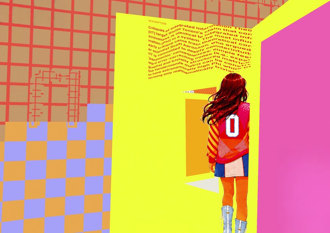
Jahn Koutrios – Drafting

TYPE DESIGN

Jahn Koutrios – Drafting

by Jahn Koutrios

Draft is a typeface, an app, and a method: an infinite plane where thinking can unfold nonlinearly. Ideas can spread out, pause, gather, connect, frame one another, and move as thought changes shape. The typeface carries the rhythm of the app, shifting between a monospaced structure for loose thinking on the grid and a proportional style for slower, more deliberate reflection. App and typeface grow together, exploring note-taking as a spatial practice: a way of working where a line can become text, path, boundary, gesture, or simply shape.

Odin Lowsley – Voyant

TYPE DESIGN

Odin Lowsley – Voyant

by Odin Lowsley

Form born from function, Voyant questions the current modalities of type drawn for various size contexts. Built on a foundation of character identification research, and polished through personal experimentation, its structure is redrawn from scratch for three separate size ranges, each with consideration of their respective contexts. The radically exaggerated shapes — required for recognition in the smallest applications — create a new source from which the design of larger cuts is informed. It produces unexpected moments that strike a balance between brutal simplification and the calligraphic traces of the human hand.

Mara Nolze – Mutual

TYPE DESIGN

Mara Nolze – Mutual

by Mara Nolze

Mutual investigates how seemingly opposing typographic categories — Sans and Serif — can coexist. Its starting point is a French typographic movement from the mid-twentieth century, Graphie Latine. In reaction to the growing dominance of Swiss neo-grotesque typefaces, french designers argued for a renewal of typographic tradition through preserving the presence of the human body within letterforms. Mutual asks how typography can retain traces of human presence and movement without rejecting technological progress. The type family consists of three related styles: Display, Sans, Serif. Conceptually, the project can be understood as a form of mutualism: an interaction between species within a shared living system, from which all sides can benefit through exchange and relation.

Marie Schuster – Pinto

TYPE DESIGN

Marie Schuster – Pinto

by Marie Schuster

Almost no writing exists outside of technology. Whether we write with a brush, a pencil or a keyboard, our writing is always mediated by tools. Yet we still tend to perceive handwriting as something more personal and more human than typing. A handwritten note often carries emotional weight that a typed message does not, even when the words are identical. Pinto is a monospace typeface that explores the space between the movement of the hand and typographic construction. Taking inspiration from early sketches by W. A. Dwiggins for the Underwood typewriter and handwriting models from the 16th century to the present day, it creates a dialogue between expression and standardisation, keeping a playful character while questioning conventional letter constructions.

Jacob Tegel – Syndikat

TYPE DESIGN

Jacob Tegel – Syndikat

by Jacob Tegel

Driven by the pursuit of a uniwidth (duplexed/multiplexed) superfamily, Syndikat builds upon the rich history of mid-century German type design. Designed for reading, the family contains both Sans and Serif styles across five weights with corresponding obliques, unified by identical character widths and font dimensions. This typeface allows for extensive flexibility in complex typographic systems, providing the freedom to interchangably use any of the styles without ever affecting the typesetting.

Mim Pornpiya Tejapaibul – Laisen

TYPE DESIGN

Mim Pornpiya Tejapaibul – Laisen

by Mim Pornpiya Tejapaibul

Laisen is a Thai-Latin display typeface inspired by the vernacular signage of Bangkok. It explores the harmony through two complementing styles designed to work independently and together across signage, posters, advertisements, and other display contexts. The Casual style draws from marker signwriting: fast, expressive, and shaped by the human hand, it captures qualities that emerge naturally from writing. The Poster style evolves directly from the Casual into a warm Sans Serif with open counters and narrow proportions, in multiple weights. Individually, the two styles embody contrasting voices – expressive and personal on the one hand, informative and objective on the other. However, Laisen still forms a unified voice expressing the diverse typography found in Bangkok's streetscape.

MAS

MAS Design for Luxury & Craftsmanship

Seoho Ahn – Cascade

DESIGN FOR LUXURY & CRAFTSMANSHIP

Seoho Ahn – Cascade

by Seoho Ahn

Jewellery is often seen as an ornamental object, yet it contains structural principles. A chain forms a continuous system of interconnected links that responds to gravity and distributes forces throughout its structure. Cascade explores how this logic can be translated from the body to space. When scaled up, the chain evolves from a decorative element into a load-bearing framework. Connections between links become structural joints, while the continuous flow of the chain becomes a path for transferring and balancing forces. Rather than borrowing the aesthetics of jewellery, Cascade translates its structural principles into a furniture system, transforming a decorative chain into an architectural structure.

Anna Andersson – LYSA

DESIGN FOR LUXURY & CRAFTSMANSHIP

Anna Andersson – LYSA

by Anna Andersson

LYSA is a portable lamp designed for outdoor rituals and small everyday adventures. Inspired by the emotional connection we have to bags and objects made to be carried, the project explores how light can become something intimate and mobile. The lamp is intended for picnics, gardens, balconies, and walks in nearby nature, bringing a sense of warmth and domesticity outdoors. It features dimmable light, USB-C charging, and a protected charging port. The materials — cork, dark brown suede, and linen fabric — were chosen for their tactile and atmospheric qualities. LYSA explores fabric translucency, color tones, light diffusion, and stabilization techniques to create an object that feels soft, warm, and made to accompany quiet moments outdoors.

Maxime Billoud – Lampe trois + 1

DESIGN FOR LUXURY & CRAFTSMANSHIP

Maxime Billoud – Lampe trois + 1

by Maxime Billoud

Lampe trois + 1 is rooted in material research and innovation. At the intersection of craftsmanship and design, this ceramic and porcelain lamp reflects both the artisan's gesture and the designer's approach. It is composed of three identical legs connected by a central technical component, while molded porcelain panels are integrated into the structure. The smoked clay elements, inspired by the Japanese raku technique, contrast with the delicacy and translucency of porcelain. Designed as a flat-pack lamp that can be easily assembled, Lampe trois + 1 embodies a process of material exploration while resulting in a functional and tangible object.

Martin Brouckaert – Brunch Service

DESIGN FOR LUXURY & CRAFTSMANSHIP

Martin Brouckaert – Brunch Service

by Martin Brouckaert

Brunch Service is a modular collection of objects that transforms Sunday brunch into an architectural landscape. It consists of containers, utensils, and cutlery that, when stacked, create abstract graphic silhouettes. Based on tubular forms, the objective of this project is to break away from industrial standards through a twist that forms sculptural compositions. This system was designed to elevate the ritual of brunch, acting as a reinterpretation of modern silverware that serves as a celebration.

Alice Brovarone – Soft Hidden Gesture

DESIGN FOR LUXURY & CRAFTSMANSHIP

Alice Brovarone – Soft Hidden Gesture

by Alice Brovarone

Soft Hidden Gesture is a stackable ceramic object composed of five elements. Assembled, they form a sculptural form inspired by the silhouette of a Japanese temple. Its true nature only emerges when it is taken apart: the object becomes a tea set. The contrast between exterior and interior colors reinforces this transition — the inside reveals a different color, visible only once the object is opened. Each element is designed digitally to ensure precise joints and formal continuity. The transition to ceramics introduces a fundamental tension, the material lives, shrinks, reacts. A further challenge is to develop a visual identity able to reflect the inner meaning of the project. The piece is intended in porcelain, a material whose delicacy suits the quiet character of the object.

Huisu Cho – BAN Lounge Collection

DESIGN FOR LUXURY & CRAFTSMANSHIP

Huisu Cho – BAN Lounge Collection

by Huisu Cho

BAN Lounge Collection is a sculptural furniture experiment inspired by the East Asian concept of "BAN / 盤," meaning vessel. Originally developed through a collaborative furniture project, the collection expands a model of recessed geometries into lounge chairs, completing a furniture series for hospitality and waiting. Through repeated carved forms, the table accommodates tea trays and objects, while the lounge chair supports moments of rest and pause. Inspired by the restrained reflections of East Asian lacquer culture, the matte black finish softly reveals light and shadow. The table's central slit organizes books and magazines, supporting conversation and waiting within lounge spaces.

Joelle Cifelli – Per Fumum

DESIGN FOR LUXURY & CRAFTSMANSHIP

Joelle Cifelli – Per Fumum

by Joelle Cifelli

Per Fumum is a project rooted in historical, anthropological and typological research into the objects through which scent is contained and diffused. By observing recurring forms and uses, it explores the relationship between fragrance, domestic space and ritual. This research gives rise to an editorial project, Taxonomy of Scented Forms, and to the design of an oil lamp that brings both light and fragrance. Ceramic pods hold the liquid perfume, diffused by the heat of the flame, reinterpreting historical archetypes in a contemporary language. Made of glass and ceramic, Per Fumum echoes the materials of antiquity, re-establishing a material continuity with the past while proposing a renewed sensory experience: to inhabit the object of light and scent.
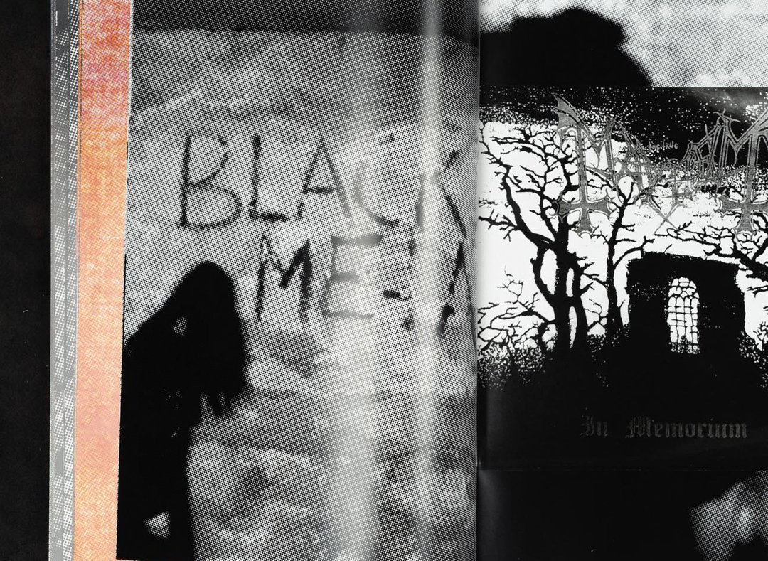
Júlia Claveria Baro – ONE SIXTY C — Melting Ribbons: working with discarded polypropylene

DESIGN FOR LUXURY & CRAFTSMANSHIP

Júlia Claveria Baro – ONE SIXTY C — Melting Ribbons: working with discarded polypropylene

by Júlia Claveria Baro

ONE SIXTY C, a fictional brand of home objects, explores how heated polypropylene ribbons can shift from soft textile to structural surface through a repeatable melting process. Rooted in a Catalan reference — the traditional espadrille — the project translates this logic into monomaterial home objects for the foot: house sandals and doormats. By fusing layers of ribbon into self supporting bases, ONE SIXTY C proposes a form of contemporary craftsmanship, where industrial leftovers are carefully reworked into precise, hand led objects for domestic use. All from a single humble ribbon.

Charlie Collet – CODE FORMEL

DESIGN FOR LUXURY & CRAFTSMANSHIP

Charlie Collet – CODE FORMEL

by Charlie Collet

CODE FORMEL explores the formal language of accessories and its translation into the realm of domestic objects. The project investigates the relationship between structure and ornament, restraint and expression, functionality and emotional presence. Through a collection of objects, the research examines how a detail, a tension, or an assembly system can become a carrier of character and identity. Positioned at the intersection of design, material culture, and contemporary luxury, CODE FORMEL explores how pieces designed for space can embody the same emotional, tactile, and personal qualities traditionally associated with accessories.
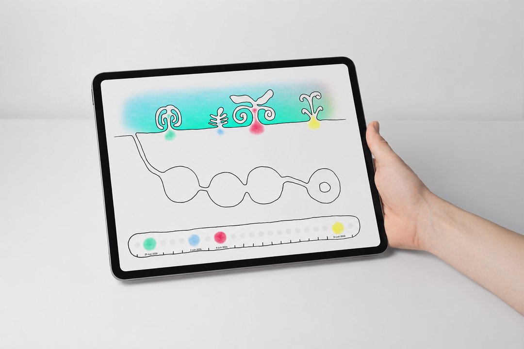
Chiara Corno – Acolyte

DESIGN FOR LUXURY & CRAFTSMANSHIP

Chiara Corno – Acolyte

by Chiara Corno

Acolyte is a collection of pouches designed to be added to various bags with handles. It is the ideal accessory for providing extra storage space to a bag that needs it. Ingenious and intuitive, this collection has been designed to be as simple as possible to use: simply slide the pouch over the bag, through the handles, and it will stay perfectly in place. These leather accessories are enhanced by stitching details reminiscent of the codes of leather goods. With their slightly rounded shapes, these pouches feature a sleek, functional and graphic design. The three models in the range have been designed to suit preferences and needs of the users: it is even possible to customise the colours of the materials.
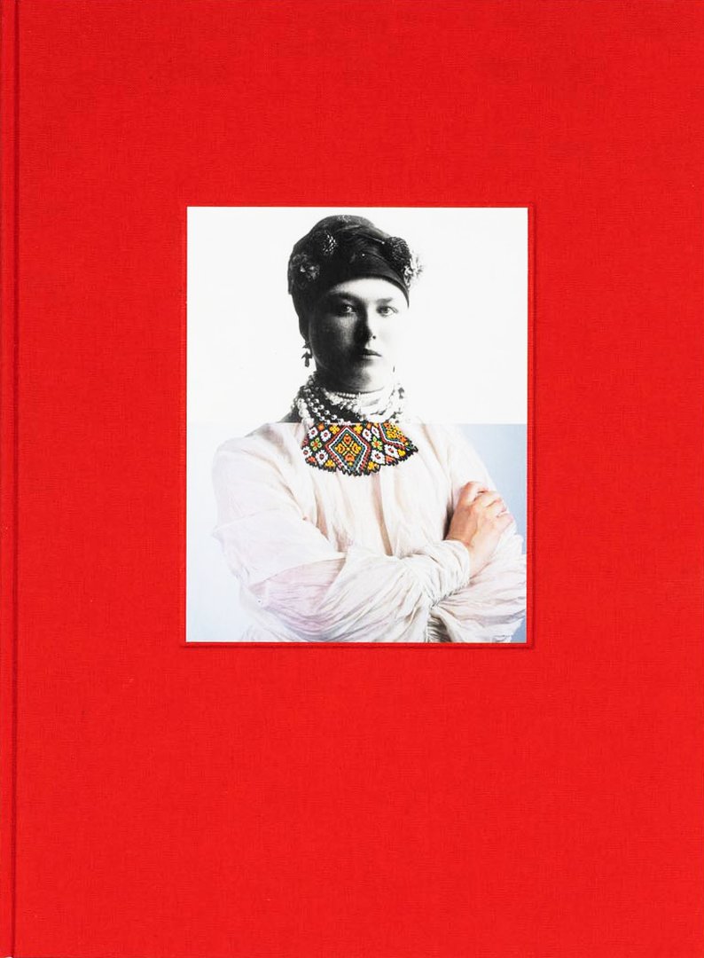
Chun Deng – Gaze

DESIGN FOR LUXURY & CRAFTSMANSHIP

Chun Deng – Gaze

by Chun Deng

Gaze explores the optical relationship between water, glass and graphic patterns. Composed of a carafe and a glass, the set is covered with precise, restrained parallel linear motifs. When water is poured into the vessels, the refraction of the liquid disturbs the apparent order of the graphics: the lines shift, overlap and intersect, creating a dynamic effect. The object is activated only through use: filling, pouring and drinking transform a static motif into a changing visual experience. Between scientific experiment and decorative table art, Gaze treats water not as a neutral content but as an optical medium, transforming an everyday gesture into a delicate moment of perception.

Jaekyoung Kim – Lines of Support

DESIGN FOR LUXURY & CRAFTSMANSHIP

Jaekyoung Kim – Lines of Support

by Jaekyoung Kim

Lines of Support is inspired by the ropes, nets, and container structures found in ports and coastal environments. Ropes and nets are used to connect, support, and secure objects, while containers are designed to hold, protect, and transport goods. This project explores how functional systems of connection can be transformed into a sculptural language. Using rope and stitching as main tools, it investigates how lines and connection points on flat surfaces can develop into forms and volumes in three dimensions. Stitching is not used as a decorative element, but as a structural method that joins ropes together and supports the form. Through repetition, stitching becomes a construction technique and a visual language, and the methods of connection themselves evolve into a structural textile.

Nayun Kwon – Crème Chantilly

DESIGN FOR LUXURY & CRAFTSMANSHIP

Nayun Kwon – Crème Chantilly

by Nayun Kwon

Crème Chantilly originates from a 1,300-year-old Japanese wax-working tradition. Composed of beeswax and pine resin, the material responds to the warmth of the hand: it is stretched, folded, and twisted rather than being carved. Its organic striations emerge through movement, leaving behind traces of gesture and time. Extending this material logic, this project develops an extrusion-based process that shapes the wax through compression, like piping cream. The resulting forms are translated into metal through lost-wax casting. What remains is not simply a form, but a record of movement. By preserving the fluid, viscous qualities of wax within a rigid material, Crème Chantilly challenges conventional notions of metal and proposes an alternative approach to jewelry making.

Alex Ortega – Shrine

DESIGN FOR LUXURY & CRAFTSMANSHIP

Alex Ortega – Shrine

by Alex Ortega

Shrine is a response to the dematerialization of contemporary audio equipment. As listening devices have increasingly become anonymous boxes, sound has become disconnected from the furniture, craftsmanship, and rituals that once shaped the domestic listening experience. Shrine is a wall-mounted cabinet designed to elevate listening into a deliberate act. The speaker is wrapped in vintage-treated fabric and minimally finished birch plywood, bringing warmth and tactility to an object category often defined by abstraction and utility. By treating audio equipment as a piece of furniture rather than a device, Shrine restores a sense of ritual, permanence, and presence to the act of listening.
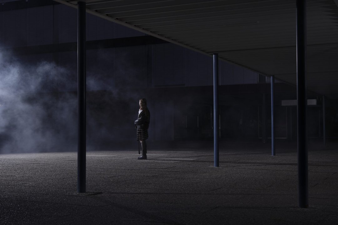
Julianna Probst – Light Standard

DESIGN FOR LUXURY & CRAFTSMANSHIP

Julianna Probst – Light Standard

by Julianna Probst

Light Standard continues the designer's ongoing exploration of craft within utilitarian systems. The design's key elements — poeticism, solitude, protection — were born from extensive study of the often-overlooked street lamp. The design process was one of observation and collection as much as creation. Thin cables nestled within a carbon fiber tube allows gravity to bend the pole in a familiar yet unexpected way. A torsion spring transforms the post lamp into a reading lamp with a playful and delicate gesture. Light Standard balances precision and craftsmanship with spontaneity.
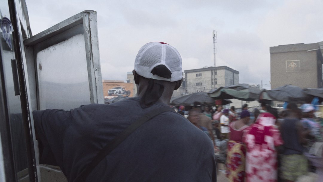
Vanessa Shababzadeh – With & Within

DESIGN FOR LUXURY & CRAFTSMANSHIP

Vanessa Shababzadeh – With & Within

by Vanessa Shababzadeh

A constellation of dots gives rise to a continuous line that unfolds into interconnected forms and objects. Marking the entry point of the home, With & Within creates a correspondence between inside and outside through rhythm, continuity, and a dialogue both with and within the form.

Yin Sheng – Montre à Tact – A Tactile Reading of Time

DESIGN FOR LUXURY & CRAFTSMANSHIP

Yin Sheng – Montre à Tact – A Tactile Reading of Time

by Yin Sheng

Inspired by the historical montre à tact and pocket watch culture in Europe, Montre à Tact – A Tactile Reading of Time explores a more intimate way of reading time through touch rather than sight. Historically, checking the time in social settings could be considered impolite — an impression that remains in contemporary social life, encouraging a discreet tactile reading of time. The watch consists of a closed upper dial and a tactile middle ring set with a diamond. The upper dial protects the movement and creates a restrained visual language. The tactile ring can be rotated by hand until a subtle resistance indicates the approximate hour. The diamond acts as both a precious material and a tactile anchor, creating a quiet and personal relation to time.

MAS Design Research in Digital Innovation

Sofia Lelis – Èvokâ II

Design Research for Digital Innovation (EPFL+ECAL Lab)

Sofia Lelis – Èvokâ II

by Sofia Lelis

Èvokâ II is an interactive installation that invites visitors to the Cantonal and University Library of Fribourg to enter into dialogue with the archives. Through an AI-based conversational interface, a presence living within the collections gathers memories connected to the canton and, in return, reveals fragments, stories and traces of Fribourg's heritage. This design research project explores how digital archives can become more accessible and resonant, questioning what connects us to a collective identity: places, emotions, stories and lived memories. Developed with the Swiss Data Science Center and supported by the Swiss National Library, Èvokâ II transforms archival consultation into an intimate experience, between personal memory and shared history.

Zeynep Erol – SWITCH – Sofra

Design Research for Digital Innovation (EPFL+ECAL Lab)

Zeynep Erol – SWITCH – Sofra

by Zeynep Erol

Sofra is a culturally adaptive conversational agent that supports dietary behaviour change by understanding how people relate to food. Developed within the EU SWITCH project, it builds a personal food culture from photos, mind maps, and voice notes that users provide to represent their everyday practices, motivations, and heritage. This profile shapes the agent's tone and suggestions, moving guidance from generic to grounded in each person's context. Developed through three user studies, the project shows how cultural resonance makes dietary support more relevant, respectful, and engaging. Combining interaction design and AI prompt engineering, Sofra challenges universal approaches to health technology and advocates for systems that adapt to, rather than flatten, cultural differences.

Côme Brocas – MountResilience

Design Research for Digital Innovation (EPFL+ECAL Lab)

Côme Brocas – MountResilience

by Côme Brocas

How can we facilitate dialogue, engagement, and decision-making in response to the challenges of water management and climate change in mountain regions? This replicable demonstrator from the European project MountResilience is the result of participatory and interdisciplinary research conducted in the heart of the Valais Alps. The web application brings together experts and the general public around three interconnected sections: relative indicators provide a shared overview of the situation in real time, participatory field observations foster engagement, and a catalog raises awareness of local solutions. The evaluative study of the tool identified several factors influencing engagement in the design of climate change adaptation solutions.

Graduates 2026

Ruslan Abbas
Tabarak Allah Abbas
Andreas Abbaszadeh
Seoho Ahn
Gabrielle Amapakabo
Anna Andersson
Damien Barman
Omar Bassil
Hugo Baud
Morgane Beslay
Clara Besson
Salomé Billato
Maxime Billoud
Joe Bionda
Mariam Bitsadze
Kriszta Bolcsik
Thibaud Kanty Boto
Steve Bouillant
Côme Brocas
Martin Brouckaert
Alice Brovarone
Orlando Brunner
Iulia Bucuresteanu
Alexandre Carruzzo
Maeva Chanson
Huisu Cho
Joelle Cifelli
Laura Cipriano
Benjamin Claus
Júlia Claveria Baro
Charlie Collet
Chiara Corno
Simon Cossy
Carolina Crivelli
Hugo Cuenot
Celia Cusanno
Mélissa Da Silva Nicolet
Da Silva Romão Caroline
Livia de Goumoëns
Yannick de Kalbermatten
Gaia Del Santo
Romane Demidoff
Chun Deng
Jacob Detwiler
Siméon Dubuis
Clea Dunand
Matheo Dusong
Lee Eggenschwiler
Ehrat Lee
Virginie Emonet
Moritz Engel
Zeynep Erol
Lóa Fenzy
Vittorio Franzolini
Katarzyna Friedrich
Xiao Fu
Damien Gabriel
Antoine Genoud
Charlyne Genoud
Laurine Gigandet
Alice Gillioz
Michael Girod
Olive Godlee
Nyria Graber
Rose Graf
Teo Grajqevci
Nicola Gut
Morea Gërxhaliu
Alejandra Gomez Pinilla
Chloé Hamel
Elisa Hampe
Maéna Hirt
Chantal Hochuli
Brikeld Hoxha
Clara Hoya
Avril Hélard
Léa Isoard
Carl Johan Jacobsen
Carolien Janssens
Noa Jetzer
Finn Johnson
Eunhyoung Ju
Lina Kaltenberg
Robin Kaufmann
Wouter Kellens
Jann Kessler
Jaekyoung Kim
Millan Kiptum
Darina Komm
Mattias Koskinen
Jahn Koutrios
Nayun Kwon
Gunnar Kähler
Taleb Lachheb
Asia Lapai
Nadia Laprés
Maël Le Guével
Gabrielle Lefèvre
Sofia Lelis
Zoé Letoucque
Dona Levy
Binyu Lin
Zhiyue Liu
Eloïse Llanca Bolivar
Xose Lois Piñeira
Andrey Lopatin
Niki Loroch
Odin Lowsley
Gion Luginbühl
Thomas Martin
Malou Martinelli
Amélie Matthey
Thaïs Matty
Valentin Meghit
Shana Meinecke
Joanna Metz
Jonas Meynet
Charly Mirambeau
Farah Mirzayeva
Séraphin Monnard
Marta Morandini
Arthur Moreillon
Félicie Morel
Anouck Morlon
Eliott Mouissat
Maël Mubalegh
Melchior Myard
Yann Müller
Auriane Nicollier
Leo Niksch
Mara Nolze
Mathys Nouspikel
Arthur Németh
Ielyzaveta Okhrimchuk
Alex Ortega
Johanna Pataud
Léa Perrelet
Romane Persoz
Pauline Pichard
Kathleen Pickavance
Nathan Pidoux
Gaia Pierobon
Matteo Pizzolante
Gabriel Polgar
Julianna Probst
Paul Quentin
Anouk Quillet
Cody Ramseyer
Colas Ravey
Matthias Reclus
Luc Reinacher
Flavia Renaud
Romain Ricci
Aurélie Richard
Matthieu Rigelo
Daniel Rocha
Miguel Rodriguez-Viloria
Floriane Roulin
Jonas Ruchti
Armine Salifu
Adam Saragoussi
Aline Savioz
Ashley Schneiter
Marie Schuster
Lévana Schütz
Vanessa Shababzadeh
Yin Sheng
Julia Siebert Cáceres
Archibald Simon
Diego Soria
Dalia Spichtig
Clara Stote
Louise Tapponnier
Julieta Tarraubella
Jacob Tegel
Mim Pornpiya Tejapaibul
Nafi Touré
Arthur Troisfontaine
Korakot Unasit
Clara Uzunovic
Shiny Vallenas
Léa Verboux
Hugo Von Hofsten
Jonathan Vögele
Daniel Walcher
Charlotte Waridel
Arnaud Wenger
Timothy Widmer
Motong Yang
Mathilda Zubek
David Zwicker