
GRAPHIC DESIGN
Type Design BA3 – S1 25–26
with Aurèle Sack
The third-year students had to develop a typeface and digitize it.
GRAPHIC DESIGN
with Aurèle Sack
The third-year students had to develop a typeface and digitize it.
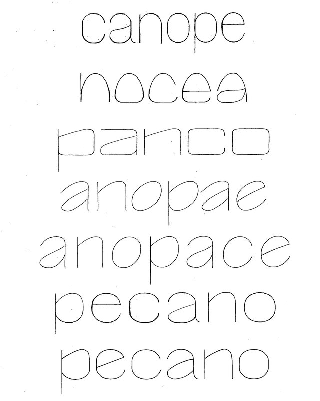
GRAPHIC DESIGN
with Aurèle Sack
Second-year students were required to manually develop the lowercase letters of two typefaces.
GRAPHIC DESIGN
with Robert Huber
First-year students were invited to manually sketch the typographic skeleton of lowercase alphabet letters. The objective was to maintain the proportions, curves, and characteristic axes of each letter while paying close attention to visual coherence and consistency in the drawing.
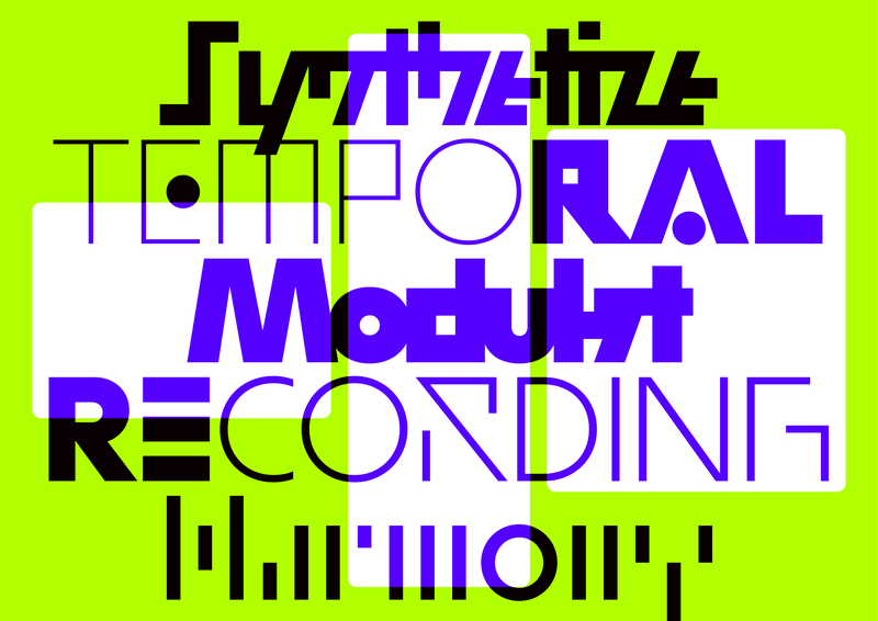
GRAPHIC DESIGN
by Hugo Scholl
MODULAT is a variable typeface designed around the concept of a musical visualizer. Starting from a neutral design, it branches out into multiple character sets, each allowing adaptation to different graphic and sonic worlds. Its variation axes enable it to adjust to a wide range of display formats, making it suitable for use across various digital platforms. Conceived as a modular tool, it questions how a typeface can accompany music while maintaining visual coherence. The project combines formal experimentation with a search for graphic adaptability.
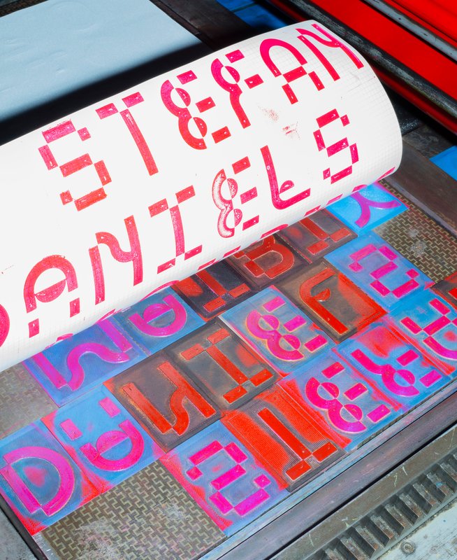
GRAPHIC DESIGN
by Diego Steiner
Hybrid Modules explores the link between traditional craftsmanship and contemporary technologies through the creation of a 3D-printed modular typographic tool for use with a manual letterpress. Designed on a grid, the modular alphabet becomes a set of physical dies, which can be inserted by hand into the press. The slow, repetitive process becomes an integral part of the visual language, making visible the time and care of the gesture. A series of A2 posters promotes a series of fictitious conferences entitled “ART, CRAFT & TECHNOLOGY - Guests in Switzerland”.

GRAPHIC DESIGN
by Cyprien Valenza
Patterna is an experimental variable typeface designed around two axes: Weight and Weaving. Inspired by Cassandre's Bifur from the 1930s and the arrangement of threads on Jacquard looms, Patterna is based on a rigorous grid that structures shapes and spacing. Its modular layering system allows for graphic experimentation with variations, making each composition dynamic. Numerous alternates reinforce its formal richness. Patterna challenges fashion conventions by offering a modular, dense typeface designed as both a graphic tool and a writing system.
TYPE DESIGN
by Stephanie Wilson
Iconic stands at the intersection of typography, social research, and inclusive design. It addresses a growing concern: making reading more accessible for senior readers. Through the development of a typeface named Iconic, the project aims to enhance reading comfort while offering an aesthetic, functional, and adaptable typeface suited to the changes associated with aging. The project was created in collaboration with senior-lab, a Swiss platform dedicated to enhancing the quality of life for seniors. Grounded in a participatory methodology, this collaboration enabled a reality-based approach: available in serif, sans serif, sans semibold, and italics, Iconic was designed based on feedback and testimonials gathered from seniors during sessions held at ECAL.

GRAPHIC DESIGN
with Robert Huber
Designing a logotype means defining a strong visual identity anchored in a specific context. First-year Graphic Design students developed a hand-drawn logotype based on a subject, theme, or environment of their own choosing. This creation was informed by prior research in typographic archives. Each student produced a reference booklet and a specimen system based on six or more typefaces, to ground their visual and conceptual exploration. Balancing typographic culture and contemporary expression, each project investigates what makes a visual identity truly distinctive.

GRAPHIC DESIGN
with Aurèle Sack
The second-year students had to vectorize a typeface they had drawn last semester.

GRAPHIC DESIGN
with Robert Huber
First-year students were invited to manually sketch the typographic skeleton of lowercase alphabet letters. The objective was to maintain the proportions, curves, and characteristic axes of each letter while paying close attention to visual coherence and consistency in the drawing.

GRAPHIC DESIGN
with Aurèle Sack
The second-year students had to develop the lower-case letters of two display fonts by hand.

GRAPHIC DESIGN
with Aurèle Sack
Third-year students had to develop a typography and digitise it.

MEDIA & INTERACTION DESIGN
with Angelo Benedetto
Beyond the screen - is a series of interactive machines developed by students in their first year of Bachelor Media & Interaction Design. These systems are inspired by the relationship between instructions and execution within a computer system. These machines create text through a modular typographic system.

GRAPHIC DESIGN
with Aurèle Sack
The second-year students had to develop the lower-case letters of two display fonts by hand.

GRAPHIC DESIGN
with Robert Huber
Type design research and developmen displayed on a specimen.

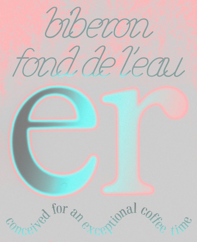
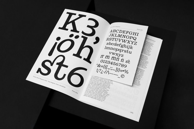
GRAPHIC DESIGN
with Aurèle Sack
Type design displayed on a specimen.

GRAPHIC DESIGN
with Aurèle Sack
The second-year students had to develop the lower-case letters of two display fonts by hand.

TYPE DESIGN
with Matthieu Cortat, Alice Savoie, Kai Bernau, Radim Pesko, Roland Früh
In the early age of digital type, several methods were explored to draw letterforms. One of them, the Bézier spline, an algorithm that generates curves with a small quantity of data, has the crucial advantage of sparing computer memory and processing resources. It is today the industry standard. This project aims to question and reevaluate it, to move beyond established trends, to develop innovative ideas by exploring alternative methods of drawing curves, and letterforms.

with Sophie Wietlisbach
Between the 1940s and the 1990s, three companies manufactured type components for typewriters in Switzerland: Caractères SA, Setag and Novatype. During more than fifty years, they supplied the biggest manufacturers of office machines in Europe and around the world, such as IBM, Remington, Olivetti, Paillard-Hermès or Triumph-Adler. Having held a leading position worldwide, the three manufacturers played a key role in the design, development, and production of type components and typefaces for typewriters, as well as for all kinds of impact printers.

GRAPHIC DESIGN
with Aurèle Sack
Type design displayed on a specimen.

GRAPHIC DESIGN
with Robert Huber
Type design displayed on a specimen.

TYPE DESIGN
with Kai Bernau, Matthieu Cortat
Amateur is a serif typeface that synthesises the calligraphic features derived from historical research. It evokes a niche sanctuary for a forgotten genre, exuding a sense of elegance. Inspired by the letterforms of early antique German models, Amateur cleverly plays with a distinctive form of horizontality, simultaneously revealing untamed strokes and meticulously crafted details. The uniform text styles provide robust, harmonised textures for optimal readability, while the display styles amplify the expressive qualities of each letter to the extreme, fearlessly embracing deliberate imperfections that blur conventional type systems and showcase captivating aesthetics.

TYPE DESIGN
with Kai Bernau, Julia Born
This editorial project embraces a new interpretation of the stereotypes of Femininity. The conscious reappropriation of its attributes becomes an act of awareness, subversion and empowerment. As a woman, being dissonant, allegedly vulgar and girly is a way to disrupt and challenge the established order and the agreed expectations of society. The publication gathers and highlights the works of a variety of female artists for this cause. It also features a custom-made font, Courtesy, with a neo-kitsch display cut that plays with proportions and consistency and a reader-friendly text cut – both sharing specific and sharp features. Finally, a monospace version allows for more freedom in compositions. It is used where traditional typesetting would favour italics.

TYPE DESIGN
with Kai Bernau, Alice Savoie
Substanz is a typeface that can be customised and adjusted to diverse artistic needs. The type family contains two single-line cuts (Upright and Italic), which act as a gateway into the typeface, as they only become usable when something is added, e.g. a stroke or a pen. They constitute an interface for graphic designers to engage with the typeface and add their own ideas and “handwriting” to the design. The typeface is completed by four text cuts (Regular, Italic, Bold and Bold Italic), which aim for good legibility and balanced text colour. They are designed for situations where legibility is favoured over expression – for example in small sizes.

TYPE DESIGN
with Julia Born, Radim Peško
This publication connects fashion with type design by simultaneously presenting the Russian Doll couture collection (Autumn/Winter,1999) and the Speira variable typeface family. The project juxtaposes photographic and typographic elements, visualising similar approaches to shapes, layers and proportions. Designed with particular attention to the interaction between the different weighs, the typeface family evolves and transforms from thin to bold, affecting the tone of the overall typeface. The typographic exploration includes several weights and corresponding italics, offering multiple typesetting possibilities.

GRAPHIC DESIGN
with Jonathan Hares, Aurèle Sack
Yours to Play and Win is a typeface promotion project on the theme of chess. Letters, just like the game’s pieces, are symbols which become meaningful once they have been activated by abstract human activity, i.e. thought. Referring to Duchamp, the ideographic representations of the cognitive process show their real potential, which goes beyond plain visual organisation. The font belongs to the Egyptian family, which hints to a modern mechanism, while honouring craftsmanship with the serifs. The monocase proportions adapt to the game’s modular elements and the rounded edges add an organic quality to recall the human mind. The text showcases the game’s principles and the ideas as a way to demonstrate the project’s message.

TYPE DESIGN
with Kai Bernau, Matthieu Cortat
Today, most typographic design is done in Latin script and type design software is geared towards Western scripts. Toujan is a contextual Arabic typeface that aims to explore the potential of this software to reintegrate versatility and connectivity in Arabic script, while preserving its dynamic nature. It is inspired by the Tawqii’ style, a hybrid of thuluth and naskh calligraphy and features ligatures that enhance the visual allure of the text but also serve a functional purpose, optimising the spacing and improving the text flow. Toujan pushes the boundaries of Arabic type by reintroducing one of its unique features, i.e. that of connecting all words in a sentence with a series of swashes that link the last letter of each word to the first letter of the following word.

TYPE DESIGN
by János Vári
What is a family? Are all families toxic? Who is the loudest at the table and what are the dynamics between those who are related? Contemporary type design relies heavily on interpolation methods, leading to a huge amount of styles. This often results in predictable type families. My work is an attempt to return to the roots of typesetting, when no superfamilies existed. Printers used to mix and match different typefaces when composing text. Instead of designing a family from a single source, I have constructed it from a variety of elements, a variety styles, which I have polished and modified until they work as a family. A type family of bold, regular and italic, text and display optical styles, designed for the catalogues and signage of a second-hand bookstore.

TYPE DESIGN
with Kai Bernau, Alice Savoie
Inspired by hand-painted Japanese station signs from the late 1950s, Kyū Maru Gothic interprets and expands their handmade heritage into a coherent rounded sans serif and multiscript Latin/Japanese typeface. It carefully considers the warm and individual character created by the brush of the original sign painters and integrates it coherently into a typeface that is aimed at contemporary use. Further following the source, the typeface comes on a width axis to allow for more flexible typesetting for its intended use at display sizes.

TYPE DESIGN
with Julia Born, Alice Savoie
Ktura is a biscriptual, humanistic Slab-serif, Hebrew-Latin type family aimed for use as a text and title face. It includes nine cuts for both scripts, with four upright and corresponding italic text weights, and a display cut for titles. Ktura was designed following research on the way in which multi-script typefaces, specifically Hebrew-Latin ones, should be designed. The design process emphasises the idea that the understanding of the cultural background of each of the scripts is a crucial part in the design of multiscriptual typefaces. By experimenting with notions of contrast, proportion, white space and more, a comprehensive solution is introduced in the design which allows the typeface to work optimally in different environments where an intersection of the scripts occurs.

TYPE DESIGN
with Kai Bernau, Alice Savoie
Sita is a family of sans and serif typefaces with origins in the Scotch Roman style. Sita Serif is a contemporary interpretation of Miller and Richard’s 1822 Double Pica Roman. Sita Sans is derived from its counterpart, with influences from early British grotesques from the same foundry. Designed to be set together, Sita Sans and Sita Serif are optically matched for optimal typesetting. While they share the same construction, they complement each other by retaining their unique characteristics. Sita’s harmonious texture and intricate details make it suitable for both small and large text sizes. Each style is available in five weights, from light to black, with corresponding italics. An additional display variant, Sans Black Condensed, completes the family.

TYPE DESIGN
with Radim Peško, Alice Savoie
Herk is a typeface that incorporates roman and gothic styles, inspired by the aesthetics of b-boying and the recurrence of blackletter on the clothing of its practitioners. The contrast between this centuries-old typography and the relatively young underground world of breaking intrigued me. Inspired by a mysterious letterform popular among b-boys and b-girls, I started by designing a new skeleton. This became the basis for the pencil, marker and brush versions. This early exploration led to the creation of the gothic and roman display variants, underlining a more refined development of Herk. Finally, with the addition of the text versions, Herk underwent its final metamorphosis, combining roman and gothic styles into a unified typeface family.

GRAPHIC DESIGN
with Aurèle Sack, Gilles Gavillet
Influenced by the rise of the metaverse, Varia is a metaphor of the early failure and absurdity of this technology, as well as research about typographic shapes. Mimicking the optimisation phenomena of object in 3D engines (Level of Detail), Varia is composed of three cuts of the same name: 0, 4, 8. While Level 0 seems closer to traditional typography, it is in fact a “smoothed out” version of the previous cuts, which already seeks to synthesise letters down to their most rudimentary forms. From the rigidity of the shapes, the existential constraints that the research brings to light illustrate the retrograde and dystopian vision of the metaverse, while at the same time offering a reassuring reflection of a future geometric transition of our bodies.

TYPE DESIGN
with Kai Bernau, Radim Peško
Solux is a typeface family that emerged from a study of an often-overlooked genre – the slab serif fonts. The goal of Solux Roman is to be functional and enduring, prioritising timelessness over trends, with its static construction and human-crafted details. On the other hand, Solux Italic has been designed to be narrower and more calligraphic, allowing for a broader range of typographic applications. The design of the family draws inspiration from slab-serif logos such as the ones on Honda’s cars, which often exhibit a sense of stability and confidence. Solux aims to offer a balanced and contemporary typographic solution, for both print and wayfinding.

TYPE DESIGN
with Julia Born, Alice Savoie
Imagine a remarkable companion who remains by your side every hour of the day, responding to your every whim, seamlessly blending cuteness with sensuality, someone who never cheats or lies. Would you be enticed to embark on a date with such an ideal partner? What if that companion happened to be an egg timer? This project delves into the profound themes of human connections, loneliness and the nature of love in an era dominated by digital advancements. Through the unconventional concept of marrying inanimate objects, Rongyi presents a narrative that is both absurd and humorous, inviting the audience to ask a fundamental question: where do we truly invest our emotions?

TYPE DESIGN
with Kai Bernau, Radim Peško
Quirk 85 started with the discovery by Kim Minjong of a fascinating Branding Manual from Korea dating from the late 70s and early 80s. Sharing a mutual fascination for logotypes and corporate items, he paired with Juan Jun Feng to embark on a journey that transcends cultural boundaries. Both born in the 90s, they unearthed striking similarities in their childhood experience, at a time when both China and Korea went through distinctive paths toward economic development, resulting in indelible impressions from brainwashing advertisement, the rapid transformation of cities, and the overwhelming wave of technological innovation. A time of iconic design, that the two type designers explored through cultural narratives and historical context. Quirk 85 is a fusion of those elements: impact of commercialisation, the intricate web of education, production, daily life, healthcare and more. By bridging their two distinct nations, they aspire to evoke a sense of shared identity and collective memory, inviting viewers to embark on a visual and intellectual journey.

GRAPHIC DESIGN
with Nicole Udry, Aurèle Sack
A flower is not just a flower, it is all living beings that depend on it to bloom. In the context of the biodiversity crisis, this book is a response to Gilles Clément's manifesto The Third Landscape. The landscaper calls for the revaluation of the spaces along our roads of cities. Between over-urbanisation and excessive agricultural monoculture, these forgotten marginal spaces are recolonised by pioneering, wild flora, regenerating ecosystems that are rich in biodiversity. Unlike the herbarium, which proceeds by fragmentary analysis, this project analyses relationships between living beings. Wild Tales is a book of atmospheric illustrations that invites us to draw from the varied colours and shapes of this space as well as the wild stories that make it up.

TYPE DESIGN
with Julia Born, Alice Savoie
This magazine aims to deconstruct, reinterpret and question Eastern and Western narratives through two distinct lenses: the West in the eyes of the East and the East in the eyes of the West. In a globalised and multi-cultural world, understanding identity disputes has become a crucial issue to end patterns of cross-border misrepresentations. It challenges the notion of “the other”, by documenting past, current and speculative future conflicts. Rather than persuading people, it conveys news from a two-sided narrative, acting as a cross-cultural bridging mechanism. It features a network of international contributors: writers, photographers and researchers. This project showcases my identity as an Lebanese/American, who belongs neither here nor there.

GRAPHIC DESIGN
with Diego Bontognali, Aurèle Sack
Is what we see real or subjective? Interpretation is always the result of individual apprehension. This is why space can be manipulated to exacerbate desired relationships. In connection with the perception of our environment, this work examines the principle of anamorphosis generated by typographic typefaces designed in three dimensions. Fluctuating between letters and abstraction, these visual structures offer different degrees of legibility depending on the point of view adopted.

GRAPHIC DESIGN
with Aurèle Sack, Jonathan Hares
Coemeter offers a reinterpretation of the Trajan typeface. This font is rich in history, from the Roman stones on which it first appeared to its various contemporary adaptations in stone engraving, predominantly found on funerary monuments in the Western world. This typographic work is showcased on a website. A digital cemetery awaits, where you can engrave your tombstone and personalise your mourning space. Coemeter plays on dualities, i.e. the sacred and the profane, history and anachronism, matter and consciousness. This unpretentious and poetic experience invites us to reconsider our connection with stone, memory and loss.

GRAPHIC DESIGN
with Aurèle Sack
Type design displayed on a specimen.

TYPE DESIGN
with Marie Lusa
Rasa is a modular stencil typeface designed by Mac Wang. It consists of two masters, Roman and Alien, with the possibility of complementing each other by overlaying them. Semester project mentored by Marie Lusa.

TYPE DESIGN
with Kai Bernau
Wallace is a semester project by Gabriela Jaime and Pauline Heppeler, developed during the course “Tools Make Shapes”, led by Kai Bernau. “We worked with the metaphor of dancing and how our body behaves when it moves. This led to experimentation with two types of mechanisms; the first prototype followed the scissors logic, while the later one (and final) followed the compass logic. This typology of object allowed us to translate dance movements like spin and pivot, drag and drag across (sliding along the floor) onto an open typographical stroke and structure. It was important for us to show the coordination and movement of two that becomes one – hence we chose to maintain the final output as an open stroke typeface.”

MEDIA & INTERACTION DESIGN
with Daniël Maarleveld
Break it Fix it is the workshop's result conducted under the direction of Daniel Maarleveld. Based on the music Technologic - Daft Punk, each group have reappropriated a phrase to enhance it graphically. The result is a series of posters, a video clip compiling the different typographic systems, and a series of interactive posters based on the same rules.

MEDIA & INTERACTION DESIGN
with Angelo Benedetto
Beyond the screen - is a series of interactive machines developed by students in their first year of Bachelor Media & Interaction Design. These systems are inspired by the relationship between instructions and execution within a computer system. These machines create text through a modular typographic system.

TYPE DESIGN
with Larissa Kasper
Following a collaboration with the Swiss avant-garde brand On, ECAL is proud to present the interdisciplinary work carried out jointly by the 2nd year students of the Product Design, Photography and Type Design Masters.

GRAPHIC DESIGN
by Marion Marquet
Like a typeface, Moving from Trisha offers a repertoire of ten choreographic signs generated based on an adaptation of Trisha Brown’s Glacial Decoy. The dancer’s movements serve as a support for the drawings of the characters. The vertical depth of the movements defines the thickness of the lines. These signs draw the trajectory of one of the dancers’ hands seen from above. Their feet are physically located in the centre of each sign, free to be interpreted according to a desired orientation and by the desired hand. The repertoire, which can be constantly developed, constitutes a methodology. A two-dimensional choreographic notation system and creates an applicable link to a three-dimensional performative interpretation.

GRAPHIC DESIGN
by Raphaël Carruzzo
Remote is a variable typeface born from a desire to recreate the link between movement and letters. Inspired by the body and choreographic notation, this typeface was designed for digital media. It helps interact with graphic content thanks to movement. Faced with an animated body, Remote interacts and transforms the typographic forms by following variations of movement. Passing easily from text to abstract typography, this variable font helps link movement and typographic compositions, thanks to a multitude of possible instances.

GRAPHIC DESIGN
by Hugo Le Corre
Are legibility and expressiveness incompatible terms in typography? Anchored in a context of digitalisation of communication media, Relativ is a typeface that questions the notion of distance in reading. Associated with an AI algorithm, this variable font adapts itself through an axis covering two extremes: from continuous reading to monumental titling, from micro to macro-typographic. Thus, this system automatically favours legibility and expressiveness, taking into account the reader’s distance. In a context where screens tend to replace printed media, Relativ opens new perspectives between typography, adaptive technologies and digital communication.

GRAPHIC DESIGN
with Aurèle Sack
Type design displayed on a specimen.