Família

János Hunor Vári – Família

What is a family? Are all families toxic? Who is the loudest at the table and what are the dynamics between those who are related?
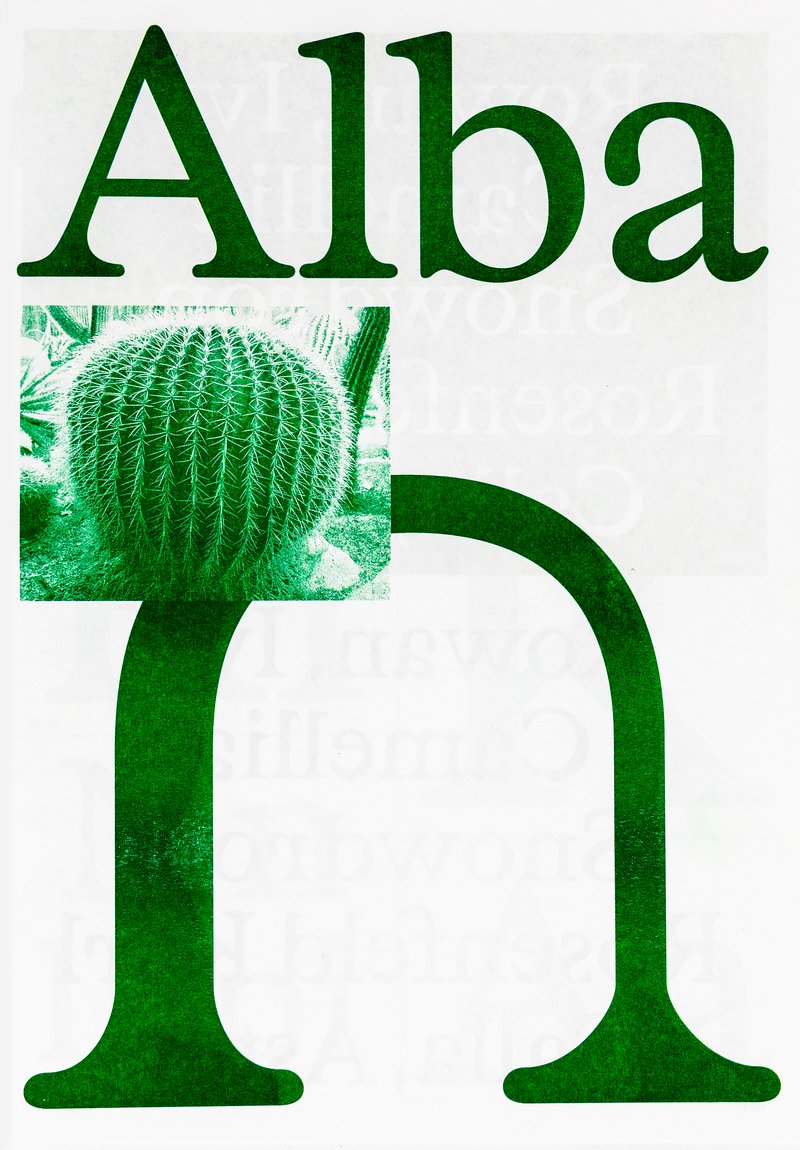
Contemporary type design relies heavily on interpolation methods, leading to a huge amount of styles. This often results in predictable type families. My work is an attempt to return to the roots of typesetting, when no superfamilies existed. Printers used to mix and match different typefaces when composing text. Instead of designing a family from a single source, I have constructed it from a variety of elements, a variety styles, which I have polished and modified until they work as a family. A type family of bold, regular and italic, text and display optical styles, designed for the catalogues and signage of a second-hand bookstore.

Diploma project (2023) by János Hunor Vári

Mention
Très Bien
Know-how
Type design
Specimen

1/2

Specimen
Specimen
Specimen
Specimen

1/4

Projects related to Type design

Type Design  BA2 – S2 2026

BA GRAPHIC DESIGN

Type Design BA2 – S2 2026

with Aurèle Sack

Second-year students were required to develop the whole alphabet for one typeface.

Type Design BA3 – S1 25–26

BA GRAPHIC DESIGN

Type Design BA3 – S1 25–26

with Aurèle Sack

The third-year students had to develop a typeface and digitize it.

Diego Steiner – Hybrid Modules

BA GRAPHIC DESIGN

Diego Steiner – Hybrid Modules

by Diego Steiner

Hybrid Modules explores the link between traditional craftsmanship and contemporary technologies through the creation of a 3D-printed modular typographic tool for use with a manual letterpress. Designed on a grid, the modular alphabet becomes a set of physical dies, which can be inserted by hand into the press. The slow, repetitive process becomes an integral part of the visual language, making visible the time and care of the gesture. A series of A2 posters promotes a series of fictitious conferences entitled “ART, CRAFT & TECHNOLOGY - Guests in Switzerland”.

Type Design  BA2 – S1 2025

BA GRAPHIC DESIGN

Type Design BA2 – S1 2025

with Aurèle Sack

Second-year students were required to manually develop the lowercase letters of two typefaces.

Type Design - BA1 S1 2025-2026

BA GRAPHIC DESIGN

Type Design - BA1 S1 2025-2026

with Robert Huber

First-year students were invited to manually sketch the typographic skeleton of lowercase alphabet letters. The objective was to maintain the proportions, curves, and characteristic axes of each letter while paying close attention to visual coherence and consistency in the drawing.

Related courses