TYPE DESIGN
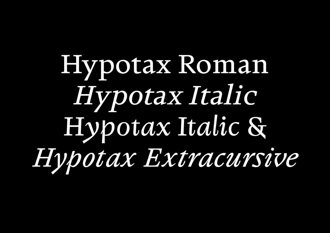
Ruslan Abbas – Sekular
by Ruslan Abbas
Sekular is a variable display typeface rooted in Gothic Cursive, the late-medieval script of merchants, notaries, accountants, and chancelleries. Rather than treating it as a historical revival, the project reactivates its logic for the present: an age of billionaires, platforms, rent extraction, and techno-feudal infrastructures. Developed through drawing, interpolation, typographic research, and newspaper-specimen design, Sekular connects a script born from the weakening of feudal literacy monopolies to today's new forms of economic enclosure. It is not a revival, but a reflection on power, writing, and transition.