MA TYPE DESIGN
Chandra Sperle – Gradual
by Chandra Sperle
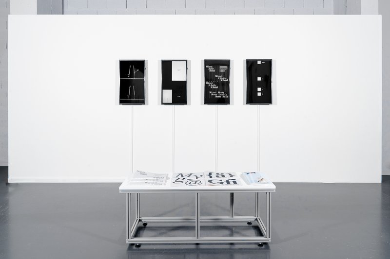
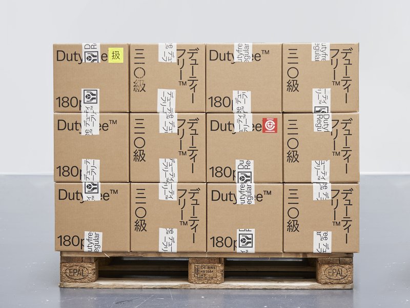
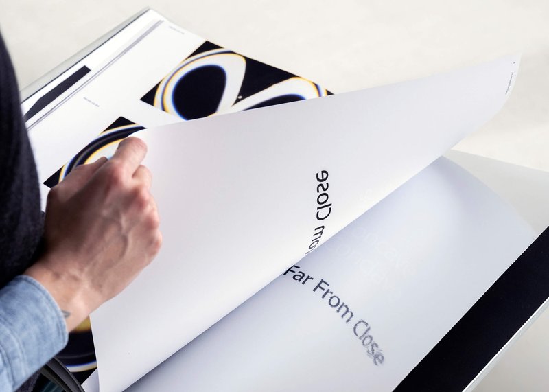
How we perceive and interpret the world is influenced by scale—by the distance, size, and the spatial relationship between observer and object. This project explores how scale influences meaning and perception through an experimental dialogue of type design, photography, and visual art. At its core is Gradual, a typeface that remixes Ladislas Mandel’s Galfra and Adrian Frutiger’s Roissy, reversing their original scale of habitat. In collaboration with artist Pai Litzenberger and the design duo Scinema (Leidy Karina Gómez Montoya and Tonda Budszus), the project expands the typographic concept of optical sizes from nano to macro dimensions. Together, Gradual offer a multi-layered reflection on our spatial interactions with the world.


