MA TYPE DESIGN
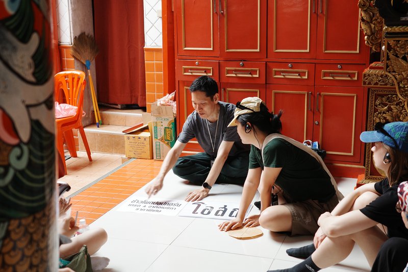
Summer University to Bangkok
with Matthieu Cortat
Summer University to Bangkok with first year ECAL Master Type Design students.

Diploma project (2017) by Arve Båtevik
A research project examining the wave of geometric typefaces from the early 20th century; reconstructing twenty of them using a simplified grid, to see if it was possible to recreate their distinctive atmospheres, despite unifying the strokes, weights and matrixes.


1/6


1/7
MA TYPE DESIGN
with Matthieu Cortat
Summer University to Bangkok with first year ECAL Master Type Design students.

MA TYPE DESIGN
with Eddy Bennett
In this analogue workshop, students merged the ornate lettering styles of the late 19th century and the meticulous craft of reverse glass painting and gilding with their personal perspectives on type design. Thanks to Gold Leaf Supplies for supporting us with material!
MA TYPE DESIGN
by Chandra Sperle
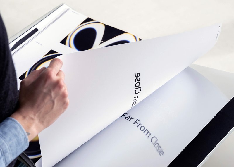
How we perceive and interpret the world is influenced by scale—by the distance, size, and the spatial relationship between observer and object. This project explores how scale influences meaning and perception through an experimental dialogue of type design, photography, and visual art. At its core is Gradual, a typeface that remixes Ladislas Mandel’s Galfra and Adrian Frutiger’s Roissy, reversing their original scale of habitat. In collaboration with artist Pai Litzenberger and the design duo Scinema (Leidy Karina Gómez Montoya and Tonda Budszus), the project expands the typographic concept of optical sizes from nano to macro dimensions. Together, Gradual offer a multi-layered reflection on our spatial interactions with the world.
MA TYPE DESIGN
by Giulia Zanzarella
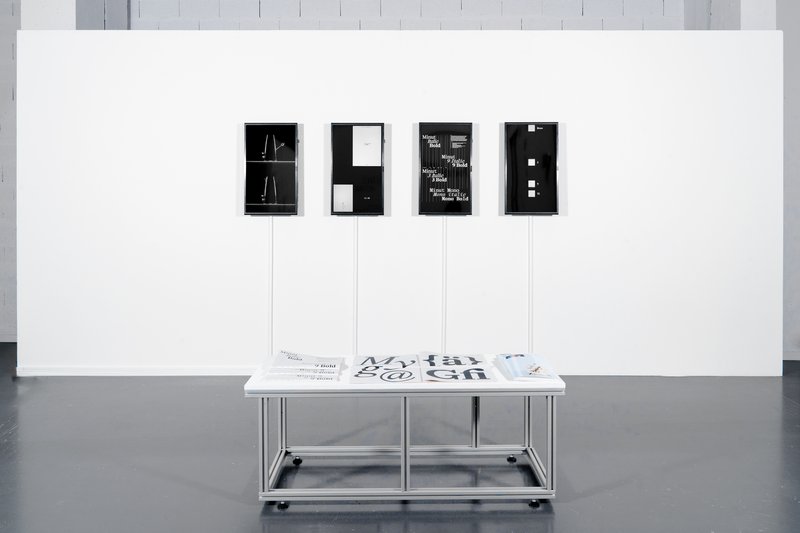
How long does a Minut last? Time is standardized, but its experience follows no rules, being mathematically equal for all, but felt differently by each. Minut explores this gap: a play on words between “minute” and “unit,” it is a type family built around four styles defined by width constraints—72 units (proportional), 9, 3, and 1 (monospace). Each style reflects a degree of mechanization, inspired by unit systems used in proportional spacing typewriters. Celebrating the beauty of constraint, the characters of Minut find their own rhythm, generating textures with subtle variations. Rather than being interpolated, each style of Minut is drawn individually, prioritizing the overall texture of each font—going against the limitless flexibility of digital design.
MA TYPE DESIGN
by Jamie Michiki
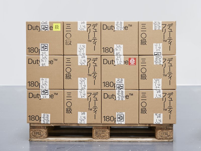
Dutyfree is a bi-script sans-serif typeface that supports both the Latin alphabet and Japanese scripts. It includes eight weights and covers the full range of Hiragana, Katakana, and Kanji characters. Designed to harmonize the atmosphere of both writing systems through shared skeletal structure, detail, and contextual nuance, Dutyfree bridges two distinct typographic origins: the Latin typeface Venus and the Japanese Ishi Chu-Futo Gothic. With a theme of overlap and crossover between writing systems and design cultures, the project was developed under the concept of "logistics graphics." Beyond just a typeface, Dutyfree also includes symbols and signage elements designed for use in logistics and packaging contexts.