The Derby Club

The Derby Club

My project is a small family of typefaces which tries to embed into a type design project the contrasted and idiosyncratic sides of football and its supporters, oscillating between two sides of the same coin. With the San Siro stadium as a frame, it becomes a snapshot of the relationship between the two extremes of the same audience, in form of a publication and a series of custom-made scarves. This research allowed me to grasp the importance of building a narrative platform that goes beyond the sum of its different parts: type, photography and installation.

My project is a small family of typefaces which tries to embed into a type design project the contrasted and idiosyncratic sides of football and its supporters, oscillating between two sides of the same coin. With the San Siro stadium as a frame, it becomes a snapshot of the relationship between the two extremes of the same audience, in form of a publication and a series of custom-made scarves.

This research allowed me to grasp the importance of building a narrative platform that goes beyond the sum of its different parts: type, photography and installation.

ma-ad.ch master art direction website
Website ma-ad.ch
ma-ad.ch master art direction website
Website ma-ad.ch
ma-ad.ch master art direction website
Website ma-ad.ch
ma-ad.ch master art direction website
Website ma-ad.ch
ma-ad.ch master art direction website
Website ma-ad.ch
ma-ad.ch master art direction website
Website ma-ad.ch
ma-ad.ch master art direction website
Website ma-ad.ch
ma-ad.ch master art direction website
Website ma-ad.ch
ma-ad.ch master art direction website
Website ma-ad.ch
ma-ad.ch master art direction website
Website ma-ad.ch
ma-ad.ch master art direction website
Website ma-ad.ch
ma-ad.ch master art direction website
Website ma-ad.ch
ma-ad.ch master art direction website
Website ma-ad.ch

1/13

Projets similaires

Messe

MA ART DIRECTION

Messe

by Héloïse Schwab

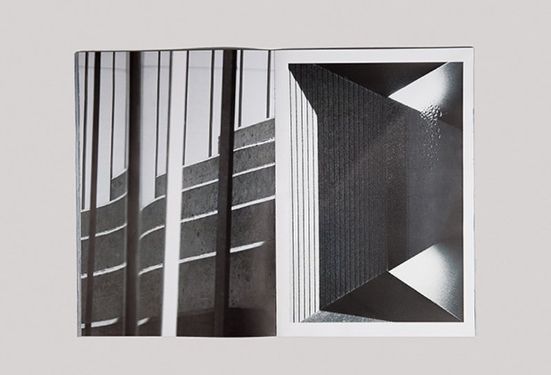
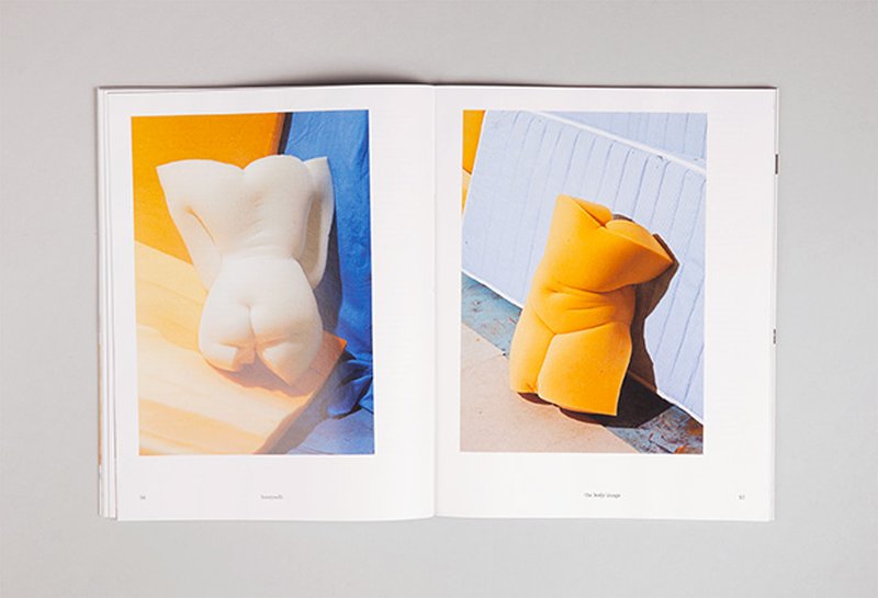
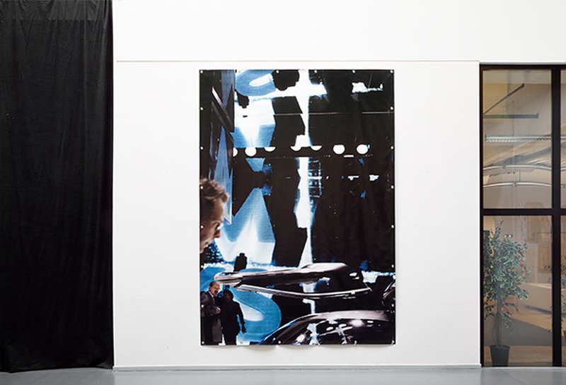
This photography book explores five Swiss fairs. The artificial textures, the objects and the stands are the heart of the project. Human beings are squashed by blurred, pixilated and scaled effects. The amount of pictures is huge and the layout is dense in order to give the reader a feeling of immersion into this artificial world, close to claustrophobia. In my life, I have really struggled between fascination with and rejection of this luxury world you can meet in Baselworld for example. And this diploma project was a way to explore that in a totally different manner.

The everyday

MA ART DIRECTION

The everyday

by Leonoor Knulst

During this Master, I have worked on two photography projects where I search for the illusion in everyday life versus a series of sets and objects I build in the studio. In my publication, I look for the boundary between a real and a fictional space. Where do these worlds meet and how do they interact with each other? From the boundaries of the real world to the carte blanche in the studio, this non-existent space is what interests me. In the process of building and making, I worked together with a set designer. As a still life photographer, this was an interesting collaboration and it gave me new ideas on props and set building. The technical process, the composition, the light, every item needs to be found from scratch and brought together in order to enhance the studio.

Pícara

MA ART DIRECTION

Pícara

by Sandra Carrera

Pícara is a bookish text typeface, a tool for graphic designers, which draws its roots from 18th century Spanish type design. It’s a 12 cuts family. The 6 text cuts: Pícara Regular , Pícara Sans Regular have both their matching italic and bold. The 6 extravagant display cuts: Pícara Display , Stripes , Dual have their matching italic. This project allowed me to define my tastes, give personality to a shape, create a design with its own constraints, decide that the curves of the letters would be tight and the endings “cut with a knife”, giving the typeface a contemporary and digital texture.

Bootycelli

MA ART DIRECTION

Bootycelli

by Anaïs Schrameck

Bootycelli is a one shot magazine focused on the body and beauty. It depicts a world without any rules or politics. Everything revolves around the ego. Narcissism, a growing value of our century, is treated in a humorous rather than a sanctimonious way. I learnt that outer beauty is the most important here.

Alberto&Claudia

MA ART DIRECTION

Alberto&Claudia

by Filippo Pellini

Alberto&Claudia is a type design project specifically aimed at the contemporary editorial scene. In recent years magazines rapidly evolved from physical products to real brands and services accessible throughout different media. More than ever they need strong identities. Alberto&Claudia started in order to meet this requirement. The project consists of four typefaces: Alberto Editor and Claudia Shouter for display and headline use; Claudia Columnist and Claudia Insider for bodytext and small sizes. The last two also include matching italics.

Related courses