Music made visual

Music made visual

Workshop with Brian Roettinger

This workshop was a typographic exploration/exercise on how typography can express musical feeling/tone.

The students used the lyrics as a graphic material. With the as their only source material they had to create one poster.


Workshop (2023) by Rebecca Alfandary, Valentin Bonzon, Jonas Buxcel, Camille Choquard, Alexandra Cupsa, Sacha Décoppet, Morgane Gilliéron, Flaurant Kadrija, Yohann Kampmann, Simon Maurer, Delphine Moënnat, Monica Müller, Océane Pasteur, Luca Reichenbach, Luca Riva, Angeline Rossetti, Pierre Teissier, Baptiste Torrent, Elsa Trummer, Chloé Vandewalle

Assistants
Inés Barrionuevo
Know-how
Imagemaking, Illustration

Projects related to Imagemaking

Noa Jetzer – Alula

BA GRAPHIC DESIGN

Noa Jetzer – Alula

by Noa Jetzer

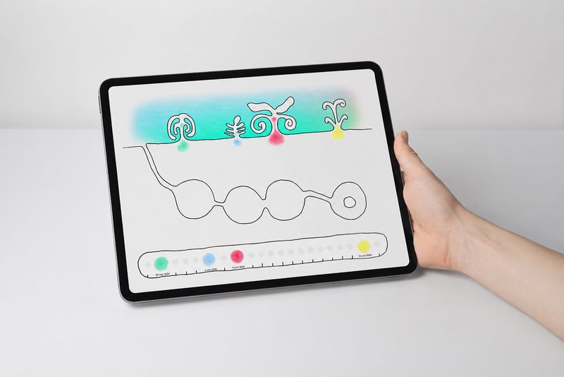
Born from an interest in animation, digital media and accessibility, Alula is a project developed in collaboration with occupational therapist Romain Savioz. It explores the following question: what might a digital environment designed to foster autonomy in emotional self-regulation among young people look like? Conceived as a resource space alongside therapy, the project envisions its visual universe through a stop-motion animation, pen-and-ink illustrations and interactive prototypes. Together, they outline an evolving digital garden where each action contributes to shaping a unique landscape. By combining analogue techniques with interactive design, Alula develops a sensitive, narrative and accessible approach to digital graphic design.
Adam Saragoussi – La Soupe

BA GRAPHIC DESIGN

Adam Saragoussi – La Soupe

by Adam Saragoussi

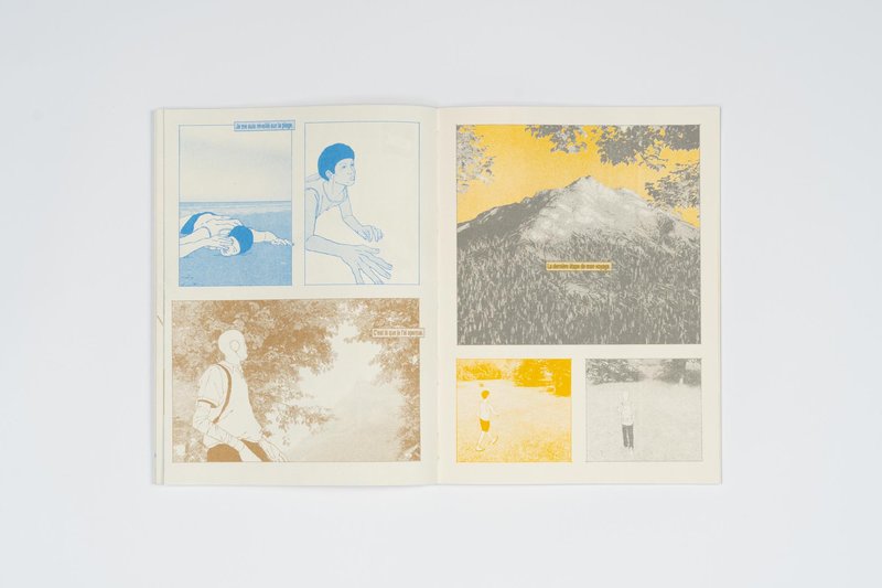
How can new narrative mechanics emerge in comics? La Soupe follows the surreal journey of Clarence and Ludwig in their quest toward the Nucleus of the world. Although they share the same pages, the two characters evolve within distinct parallel realities, each associated with a different printing layer. Developed as a space for narrative exploration, the project investigates the possibilities offered by the coexistence of multiple stories and multiple levels of reading within a single page. The images, combining hand-drawn elements with 3D-set designs, build a universe oscillating between science fiction and dreamlike imagery. Entirely printed in risograph, La Soupe deploys various narrative devices in which realities intersect, contaminate one another, and evolve throughout the story.

Clara Besson – L'Or du Transvaal / L'Or des DuBois

BA GRAPHIC DESIGN

Clara Besson – L'Or du Transvaal / L'Or des DuBois

by Clara Besson

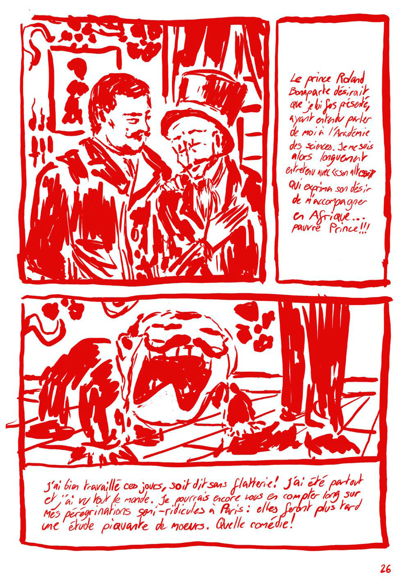
L'Or du Transvaal / L'Or des DuBois is the first volume of the Recto / Verso collection, which aims to encourage Swiss people, and especially young people, to question the history of their country. This volume explores how Switzerland has been and remains imperialist, through the story of the DuBois family from Le Locle, who left to exploit gold in Transvaal in the 19th century. Each double page mirrors two simultaneous realities: the imperialist narrative on the left and its multidimensional critique on the right, the same events told from radically different points of view, by entities that coexist without ever directly interacting. In a context of rising far-right politics across the West, L'Or du Transvaal / L'Or des DuBois intends to fight by the transmission of knowledge beyond academic circles.

Da Silva Romão Caroline – Ce qui nos fica

BA GRAPHIC DESIGN

Da Silva Romão Caroline – Ce qui nos fica

by Da Silva Romão Caroline

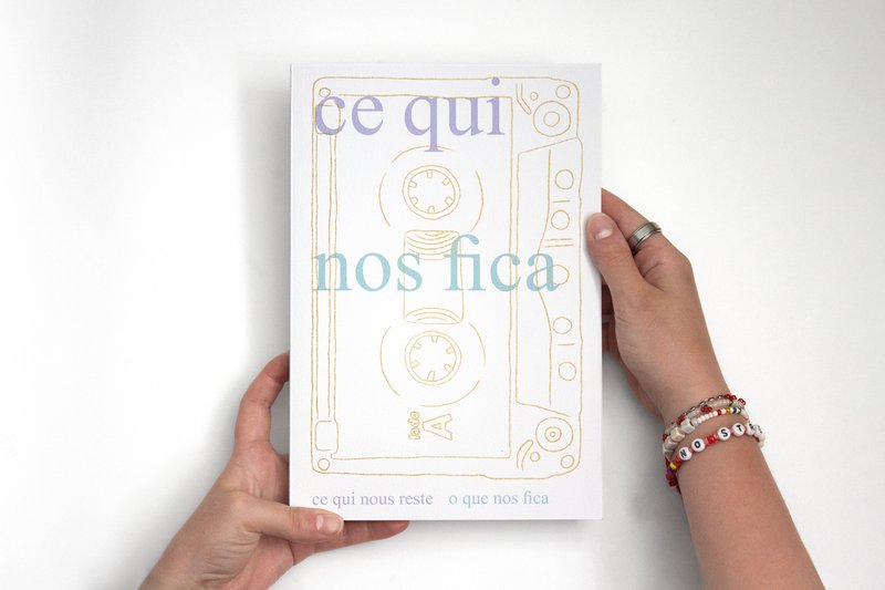
The book Ce qui nos fica brings together Frentuguese, a hybrid French-Portuguese language that emerged within Portuguese immigrant families in French-speaking Switzerland. Through words that were never written down but passed on orally, it captures a memory that is both collective and personal: that of a linguistic, cultural, and familial in-between. The book offers a snapshot of this language, frozen in time as it exists in 2026. What we are left with are not only these words and expressions, but also the memories of the annual journeys between Switzerland and Portugal: the long trips by car or autobus, which are, like us, suspended between two countries. Este livro reúne o frantuguês, uma língua híbrida franco-portuguesa nascida nas famílias da imigração portuguesa na Suíça (França). Através de palavras nunca escritas, mas transmitidas oralmente, ele capta uma memória ao mesmo tempo coletiva e pessoal: a de um entre-dois linguístico, cultural e familiar. A obra propõe assim uma fotografia desta linguagem, fixada no tempo, no seu estado de 2026. O que nos fica são essas palavras, mas também as memórias das viagens anuais entre a Suíça e Portugal: as longas viagens de carro ou de autocarro, que são também elas, como nós, um entre-dois países.

Eliot Dubi – JUST IN CASE

BA GRAPHIC DESIGN

Eliot Dubi – JUST IN CASE

by Eliot Dubi

At the individual level, we can neither predict nor prevent the next disaster; we can only arm ourselves with the right reflexes to face it. JUST IN CASE is a website that gathers, through four scenarios — large wildfires, dam failures, industrial accidents and earthquakes — the key actions to remember when everything turns upside down. A clear tree-like navigation, concise texts and flat-style illustrations keep learning accessible without resorting to sensationalism. A triptych of posters promotes the site to the wider public. Designed for a generation flooded with anxiety-fuelled alerts, the project turns worry into simple, immediate actions — just in case.

Related courses