BA GRAPHIC DESIGN
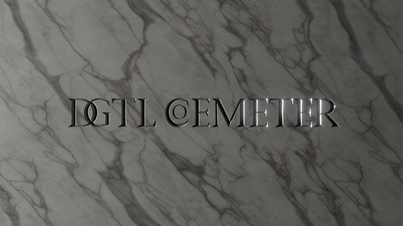
Antonin Maudry – Coemeter
with Aurèle Sack, Jonathan Hares
Coemeter offers a reinterpretation of the Trajan typeface. This font is rich in history, from the Roman stones on which it first appeared to its various contemporary adaptations in stone engraving, predominantly found on funerary monuments in the Western world. This typographic work is showcased on a website. A digital cemetery awaits, where you can engrave your tombstone and personalise your mourning space. Coemeter plays on dualities, i.e. the sacred and the profane, history and anachronism, matter and consciousness. This unpretentious and poetic experience invites us to reconsider our connection with stone, memory and loss.