The Manufacture of Type for Typewriters in Switzerland

The Manufacture of Type for Typewriters in Switzerland

Between the 1940s and the 1990s, three companies manufactured type components for typewriters in Switzerland: Caractères SA, Setag and Novatype. During more than fifty years, they supplied the biggest manufacturers of office machines in Europe and around the world, such as IBM, Remington, Olivetti, Paillard-Hermès or Triumph-Adler. Having held a leading position worldwide, the three manufacturers played a key role in the design, development, and production of type components and typefaces for typewriters, as well as for all kinds of impact printers.

Research project (2024) with Sophie Wietlisbach

Know-how
Type design

By looking in details at their production methods, the research observes what influence did the manufacturing processes and the mechanical characteristics of the typewriter have on the design of the typefaces. Additionally, it takes interest into the surprising role played by the criminal police. Specialized in the dating and identification of typewriter typefaces for judicial and criminal purposes, forensic experts developed over the years specific methods and compiled rich documentations on typewriter typefaces. Being in direct contact with the type manufacturers to gain first-hand information, they even interfered in the design of some lettershapes. Based on oral history and archival research, this project aims to shed light on this little-known part of the industrial and typographic history.

Main applicant

Sophie Wietlisbach, researcher

Research team

Davide Fornari, scientific supervisor
Roland Früh, scientific supervisor

Period

01.01.2023–31.12.2024

Supported by

ECAL / University of Art and Design, internal research grant
DNP Foundation for Cultural Promotion, DNP Graphic Culture Research Grant 

Unknown.jpeg
Measurement of the height of a typewriter typeface with a magnification tool. © ECAL/Sophie Wietlisbach
Unknown-2.jpeg
Digging through the Federal Archives in Bern. © ECAL/Sophie Wietlisbach
Unknown-1.jpeg
IBM Typeball produced by Setag. ©ECAL/Sophie Wietlisbach

Projects related to Type design

Type Design BA1 S1 2024/2025 – 2025 #2

BA GRAPHIC DESIGN

Type Design BA1 S1 2024/2025 – 2025 #2

with Robert Huber

  Designing a logotype means defining a strong visual identity anchored in a specific context. First-year Graphic Design students developed a hand-drawn logotype based on a subject, theme, or environment of their own choosing. This creation was informed by prior research in typographic archives. Each student produced a reference booklet and a specimen system based on six or more typefaces, to ground their visual and conceptual exploration. Balancing typographic culture and contemporary expression, each project investigates what makes a visual identity truly distinctive.  

Cyprien Valenza – Patterna

BA GRAPHIC DESIGN

Cyprien Valenza – Patterna

by Cyprien Valenza

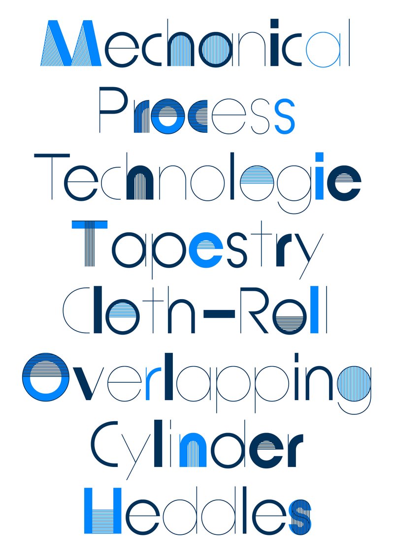
Patterna is an experimental variable typeface designed around two axes: Weight and Weaving. Inspired by Cassandre's Bifur from the 1930s and the arrangement of threads on Jacquard looms, Patterna is based on a rigorous grid that structures shapes and spacing. Its modular layering system allows for graphic experimentation with variations, making each composition dynamic. Numerous alternates reinforce its formal richness. Patterna challenges fashion conventions by offering a modular, dense typeface designed as both a graphic tool and a writing system.

Stephanie Wilson – Iconic

MA TYPE DESIGN

Stephanie Wilson – Iconic

by Stephanie Wilson

Iconic stands at the intersection of typography, social research, and inclusive design. It addresses a growing concern: making reading more accessible for senior readers. Through the development of a typeface named Iconic, the project aims to enhance reading comfort while offering an aesthetic, functional, and adaptable typeface suited to the changes associated with aging. The project was created in collaboration with senior-lab, a Swiss platform dedicated to enhancing the quality of life for seniors. Grounded in a participatory methodology, this collaboration enabled a reality-based approach: available in serif, sans serif, sans semibold, and italics, Iconic was designed based on feedback and testimonials gathered from seniors during sessions held at ECAL.

Hugo Scholl – Modulat – 2025

BA GRAPHIC DESIGN

Hugo Scholl – Modulat – 2025

by Hugo Scholl

MODULAT is a variable typeface designed around the concept of a musical visualizer. Starting from a neutral design, it branches out into multiple character sets, each allowing adaptation to different graphic and sonic worlds. Its variation axes enable it to adjust to a wide range of display formats, making it suitable for use across various digital platforms. Conceived as a modular tool, it questions how a typeface can accompany music while maintaining visual coherence. The project combines formal experimentation with a search for graphic adaptability.

Diego Steiner – Hybrid Modules

BA GRAPHIC DESIGN

Diego Steiner – Hybrid Modules

by Diego Steiner

Hybrid Modules explores the link between traditional craftsmanship and contemporary technologies through the creation of a 3D-printed modular typographic tool for use with a manual letterpress. Designed on a grid, the modular alphabet becomes a set of physical dies, which can be inserted by hand into the press. The slow, repetitive process becomes an integral part of the visual language, making visible the time and care of the gesture. A series of A2 posters promotes a series of fictitious conferences entitled “ART, CRAFT & TECHNOLOGY - Guests in Switzerland”.

Related courses