Coemeter

Antonin Maudry – Coemeter

Coemeter offers a reinterpretation of the Trajan typeface. This font is rich in history, from the Roman stones on which it first appeared to its various contemporary adaptations in stone engraving, predominantly found on funerary monuments in the Western world. This typographic work is showcased on a website. A digital cemetery awaits, where you can engrave your tombstone and personalise your mourning space.

Coemeter plays on dualities, i.e. the sacred and the profane, history and anachronism, matter and consciousness. This unpretentious and poetic experience invites us to reconsider our connection with stone, memory and loss.

Diploma project (2023) by Antonin Maudry

Know-how
Type design, Web
coemeter_1.jpg
coemeter_2.jpg

1/3

Projects related to Web

Hugo Le Corre – Relativ

BA GRAPHIC DESIGN

Hugo Le Corre – Relativ

by Hugo Le Corre

Are legibility and expressiveness incompatible terms in typography? Anchored in a context of digitalisation of communication media, Relativ is a typeface that questions the notion of distance in reading. Associated with an AI algorithm, this variable font adapts itself through an axis covering two extremes: from continuous reading to monumental titling, from micro to macro-typographic.  Thus, this system automatically favours legibility and expressiveness, taking into account the reader’s distance. In a context where screens tend to replace printed media, Relativ opens new perspectives between typography, adaptive technologies and digital communication.

Alexis Gargaloni – Varia

BA GRAPHIC DESIGN

Alexis Gargaloni – Varia

with Aurèle Sack, Gilles Gavillet

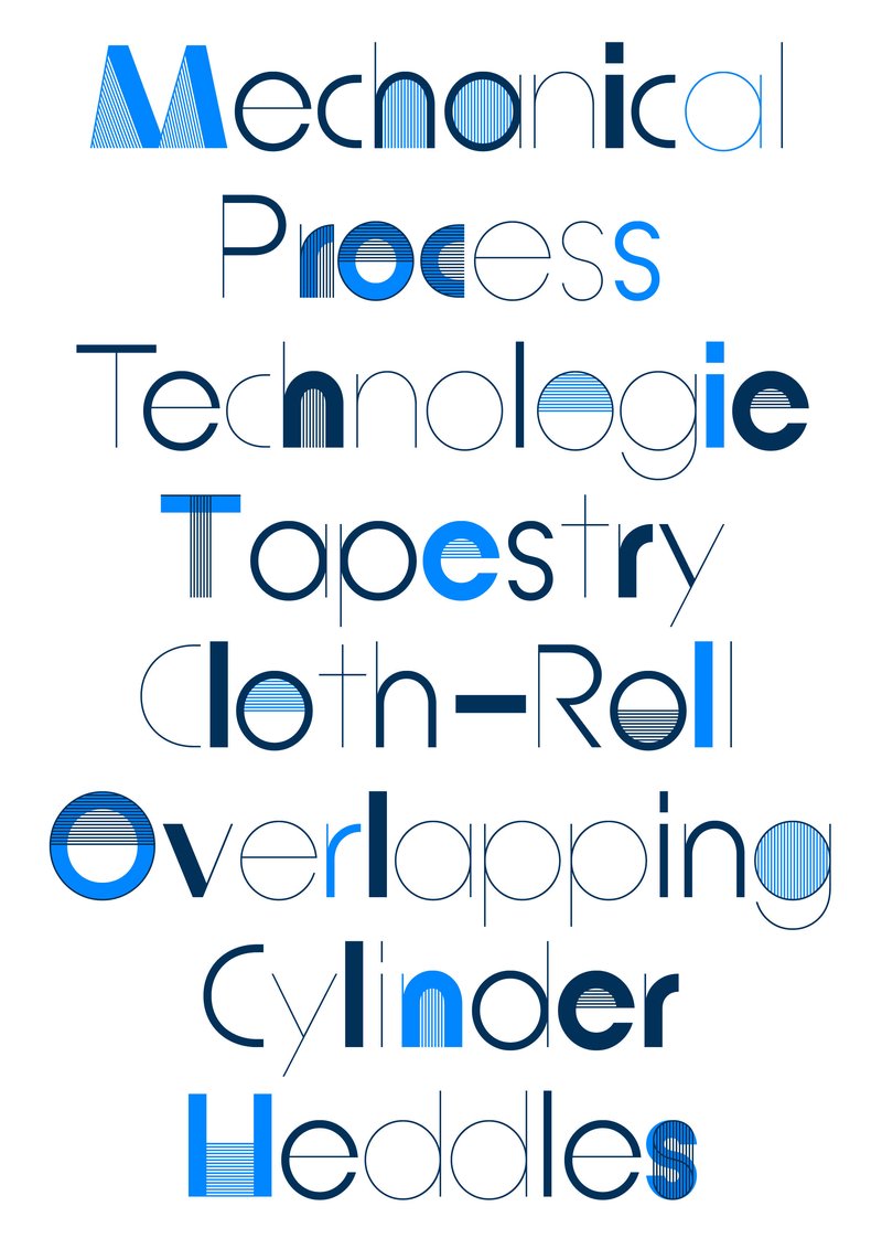
Influenced by the rise of the metaverse, Varia is a metaphor of the early failure and absurdity of this technology, as well as research about typographic shapes. Mimicking the optimisation phenomena of object in 3D engines (Level of Detail), Varia is composed of three cuts of the same name: 0, 4, 8. While Level 0 seems closer to traditional typography, it is in fact a “smoothed out” version of the previous cuts, which already seeks to synthesise letters down to their most rudimentary forms. From the rigidity of the shapes, the existential constraints that the research brings to light illustrate the retrograde and dystopian vision of the metaverse, while at the same time offering a reassuring reflection of a future geometric transition of our bodies.

Marion Marquet – Moving from Trisha

BA GRAPHIC DESIGN

Marion Marquet – Moving from Trisha

by Marion Marquet

Like a typeface, Moving from Trisha offers a repertoire of ten choreographic signs generated based on an adaptation of Trisha Brown’s Glacial Decoy.  The dancer’s movements serve as a support for the drawings of the characters. The vertical depth of the movements defines the thickness of the lines. These signs draw the trajectory of one of the dancers’ hands seen from above. Their feet are physically located in the centre of each sign, free to be interpreted according to a desired orientation and by the desired hand.  The repertoire, which can be constantly developed, constitutes a methodology. A two-dimensional choreographic notation system and creates an applicable link to a three-dimensional performative interpretation.

Thomas Neyroud – Yours to Play and Win

BA GRAPHIC DESIGN

Thomas Neyroud – Yours to Play and Win

with Jonathan Hares, Aurèle Sack

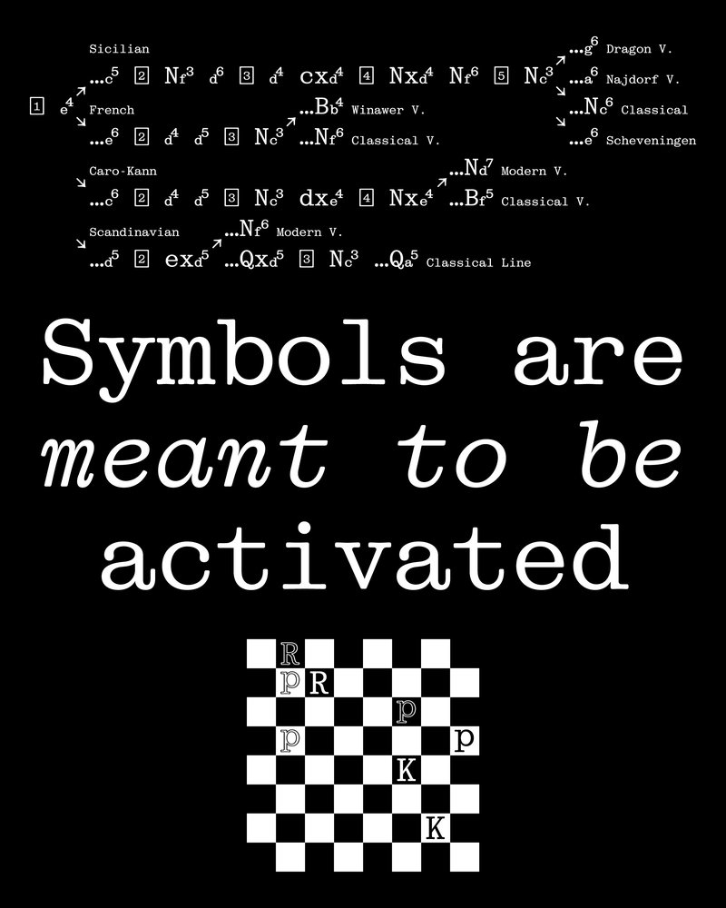
Yours to Play and Win is a typeface promotion project on the theme of chess. Letters, just like the game’s pieces, are symbols which become meaningful once they have been activated by abstract human activity, i.e. thought. Referring to Duchamp, the ideographic representations of the cognitive process show their real potential, which goes beyond plain visual organisation. The font belongs to the Egyptian family, which hints to a modern mechanism, while honouring craftsmanship with the serifs. The monocase proportions adapt to the game’s modular elements and the rounded edges add an organic quality to recall the human mind. The text showcases the game’s principles and the ideas as a way to demonstrate the project’s message.

Raphaël Carruzzo – Remote

BA GRAPHIC DESIGN

Raphaël Carruzzo – Remote

by Raphaël Carruzzo

Remote is a variable typeface born from a desire to recreate the link between movement and letters. Inspired by the body and choreographic notation, this typeface was designed for digital media. It helps interact with graphic content thanks to movement. Faced with an animated body, Remote interacts and transforms the typographic forms by following variations of movement. Passing easily from text to abstract typography, this variable font helps link movement and typographic compositions, thanks to a multitude of possible instances.

Related courses