Beyond Bézier. Explorations of drawing methods in type design

Beyond Bézier. Explorations of drawing methods in type design

In the early age of digital type, several methods were explored to draw letterforms. One of them, the Bézier spline, an algorithm that generates curves with a small quantity of data, has the crucial advantage of sparing computer memory and processing resources. It is today the industry standard. This project aims to question and reevaluate it, to move beyond established trends, to develop innovative ideas by exploring alternative methods of drawing curves, and letterforms.

Research project (2024) with Matthieu Cortat, Alice Savoie, Kai Bernau, Radim Peško, Roland Früh

Know-how
Type design

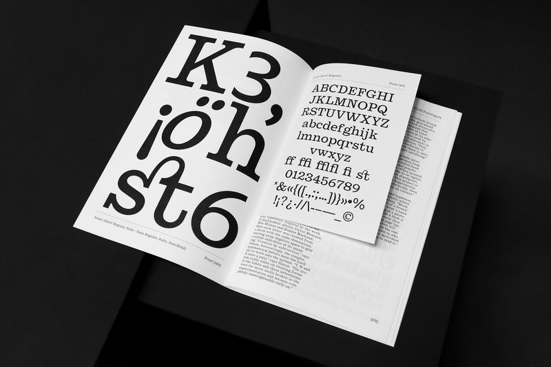
Beyond Bézier is an investigation of the existing approaches to letter drawing. It is also the experimentation of new methods to draw and to create.

As type designers and type educators, we have felt the past few years the dead-ends that vector drawing and contemporary software brings, generating more and more fonts that just look the same. By researching and experimenting with different approaches of drawing, our design pedagogy will be nourished by this experience and shared with a larger audience through a dedicated website. If the vector is the current frontier of type design, new perspectives will be opened if we overcome that frontier.

According to the Israeli-American psychologist and Nobel Laureate Daniel Kahneman, thinking operates within two systems: ‘System 1 operates automatically and quickly, with little or no effort and no sense of voluntary control. System 2 allocates attention to the effortful mental activities that demand it, including complex computations. The operations of System 2 are often associated with the subjective experience of agency, choice, and concentration.’1 One could argue that designers are working within System 1, whereas good designers make a larger use of System 2.

Fighting automatism is indeed an important aspect of creativity. When one works solely with vectors, only one System is at work. Drawing with different approaches can trigger new ideas and shapes, such as the physical limitations of your tools bring new forms.2 When vector drawing becomes automatic (by muscular memory of the designer, or software-induced choices), a whole area of creativity disappears. It may also be that the ability of switching between two systems improves creativity. This is comparable to Jean-François Billeter’s hypothesis about how creativity functions: he compares it to a gear change when driving a car. The moment when tension is released between two different operating regimes is the moment of revelation, of creation.3

Another and very important aspect is the collaborative approach. Type design has long been – and still is – seen as a solitary practice, with the designers in their ivory tower. The approach of Beyond Bézier is collaborative. It shares materials and approaches. Beyond Bézier is a project that can nourish designers, design students, and those interested in the way humans can create. It opens the door to further development, such as a digital tool – software based neither on vectors, bitmaps, or parametric systems. The group works simultaneously on five different axes which map different methodologies of drawing type. Each researcher is in charge of coordinating an axis while contributing to other axes simultaneously. The five axes are: 
1    The Stroke
2    The Surface
3    The Collective
4    The Robot
5    The Mathematics
Axes 1 and 2 are questioning traditional ways of creating fonts, mostly looking at the tools and instruments used for the creation. 3 and 4 are rather looking at who designs, in which contexts, through collaboration and exchange. Axis 5 is transversal.


References

1. KAHNEMAN 2011, Daniel Kahneman, Thinking, Fast and Slow, Farrar, Straus and Giroux, New York, 2011.
2. BERNAU 2022, Kai Bernau, ‘Every Tool Leaves a Trace’, Ecal-Typefaces, 2022. https://ecal-typefaces.ch/everytoolleavesatrace. Last accessed 20 February 2023.
3. BILLETER 2012, Jean-François Billeter, Un Paradigme, Allia, Paris, 2012.
 

Main applicant

Matthieu Cortat-Roller

Research team

Alice Savoie (ECAL)
Kai Bernau (ECAL)
Radim Peško (ECAL)
Roland Früh (ECAL)
Florence Yerly (HE-FR)
Micha Wasem (HE-FR)

Assistants

Raphaela Haefliger (ECAL)
Nicolas Bernklau (ECAL)

Students

ECAL MATD 1 and 2 (workshops)

Period

01.09.2023 – 28.02.2025

Supported by

HES-SO, Réseau de Compétences Design et Arts Visuels 

ECAL_BB_web_TheStroke.jpg
The Stroke: Students experimenting with string calligraphy during the Tools Make Shape class by Kai Bernau.
ECAL_BB_web_TheSurface.jpg
The Surface: Experience in drawing counterforms with lines by Matthieu Cortat.
ECAL_BB_web_TheRobot.jpg
The Robot: Experimentations with autotracing algorithms by Alice Savoie.
ECAL_BB_web_TheMathematics.jpg
The Mathematics: Deformations of a letter using a Fourier-type approach by Micha Wasem.
ECAL_BB_web_TheCollective.jpg
TheCollective: Typografting (2023), by Radim Peško

Projects related to Type design

Stephanie Wilson – Iconic

MA TYPE DESIGN

Stephanie Wilson – Iconic

by Stephanie Wilson

Iconic stands at the intersection of typography, social research, and inclusive design. It addresses a growing concern: making reading more accessible for senior readers. Through the development of a typeface named Iconic, the project aims to enhance reading comfort while offering an aesthetic, functional, and adaptable typeface suited to the changes associated with aging. The project was created in collaboration with senior-lab, a Swiss platform dedicated to enhancing the quality of life for seniors. Grounded in a participatory methodology, this collaboration enabled a reality-based approach: available in serif, sans serif, sans semibold, and italics, Iconic was designed based on feedback and testimonials gathered from seniors during sessions held at ECAL.

Diego Steiner – Hybrid Modules

BA GRAPHIC DESIGN

Diego Steiner – Hybrid Modules

by Diego Steiner

Hybrid Modules explores the link between traditional craftsmanship and contemporary technologies through the creation of a 3D-printed modular typographic tool for use with a manual letterpress. Designed on a grid, the modular alphabet becomes a set of physical dies, which can be inserted by hand into the press. The slow, repetitive process becomes an integral part of the visual language, making visible the time and care of the gesture. A series of A2 posters promotes a series of fictitious conferences entitled “ART, CRAFT & TECHNOLOGY - Guests in Switzerland”.

Type Design BA1 S1 2024/2025 – 2025 #2

BA GRAPHIC DESIGN

Type Design BA1 S1 2024/2025 – 2025 #2

with Robert Huber

  Designing a logotype means defining a strong visual identity anchored in a specific context. First-year Graphic Design students developed a hand-drawn logotype based on a subject, theme, or environment of their own choosing. This creation was informed by prior research in typographic archives. Each student produced a reference booklet and a specimen system based on six or more typefaces, to ground their visual and conceptual exploration. Balancing typographic culture and contemporary expression, each project investigates what makes a visual identity truly distinctive.  

Hugo Scholl – Modulat – 2025

BA GRAPHIC DESIGN

Hugo Scholl – Modulat – 2025

by Hugo Scholl

MODULAT is a variable typeface designed around the concept of a musical visualizer. Starting from a neutral design, it branches out into multiple character sets, each allowing adaptation to different graphic and sonic worlds. Its variation axes enable it to adjust to a wide range of display formats, making it suitable for use across various digital platforms. Conceived as a modular tool, it questions how a typeface can accompany music while maintaining visual coherence. The project combines formal experimentation with a search for graphic adaptability.

Cyprien Valenza – Patterna

BA GRAPHIC DESIGN

Cyprien Valenza – Patterna

by Cyprien Valenza

Patterna is an experimental variable typeface designed around two axes: Weight and Weaving. Inspired by Cassandre's Bifur from the 1930s and the arrangement of threads on Jacquard looms, Patterna is based on a rigorous grid that structures shapes and spacing. Its modular layering system allows for graphic experimentation with variations, making each composition dynamic. Numerous alternates reinforce its formal richness. Patterna challenges fashion conventions by offering a modular, dense typeface designed as both a graphic tool and a writing system.

Related courses