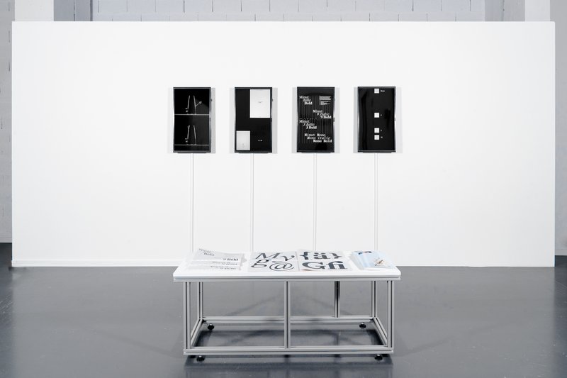
Dutyfree

Jamie Michiki – Dutyfree

Dutyfree is a bi-script sans-serif typeface that supports both the Latin alphabet and Japanese scripts. It includes eight weights and covers the full range of Hiragana, Katakana, and Kanji characters. Designed to harmonize the atmosphere of both writing systems through shared skeletal structure, detail, and contextual nuance, Dutyfree bridges two distinct typographic origins: the Latin typeface Venus and the Japanese Ishi Chu-Futo Gothic. With a theme of overlap and crossover between writing systems and design cultures, the project was developed under the concept of "logistics graphics." Beyond just a typeface, Dutyfree also includes symbols and signage elements designed for use in logistics and packaging contexts.

Diploma project (2025)

Students
Jamie Michiki
Mention
Bien

Specimen

Specimen

Specimen

Specimen

Specimen

Specimen

Specimen

Specimen

1/8

Exhibition

Exhibition

Exhibition

Exhibition

Exhibition

Exhibition

1/6

Dutyfree_ExhibitionView_10.jpg
Exhibition detail
Dutyfree_ExhibitionView_20.jpg
Specimen detail
Dutyfree_ExhibitionView_24.jpg
Exhibition detail

Projets similaires

Chandra Sperle – Gradual

MA TYPE DESIGN

Chandra Sperle – Gradual

by Chandra Sperle

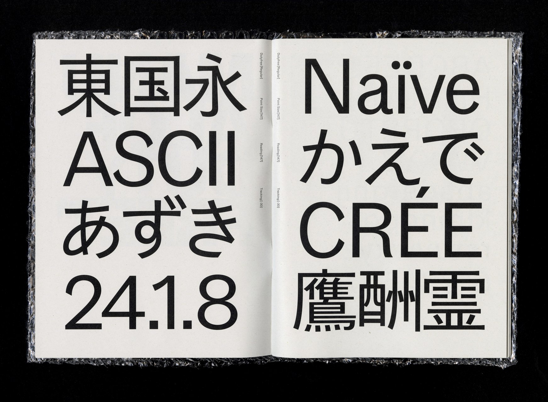
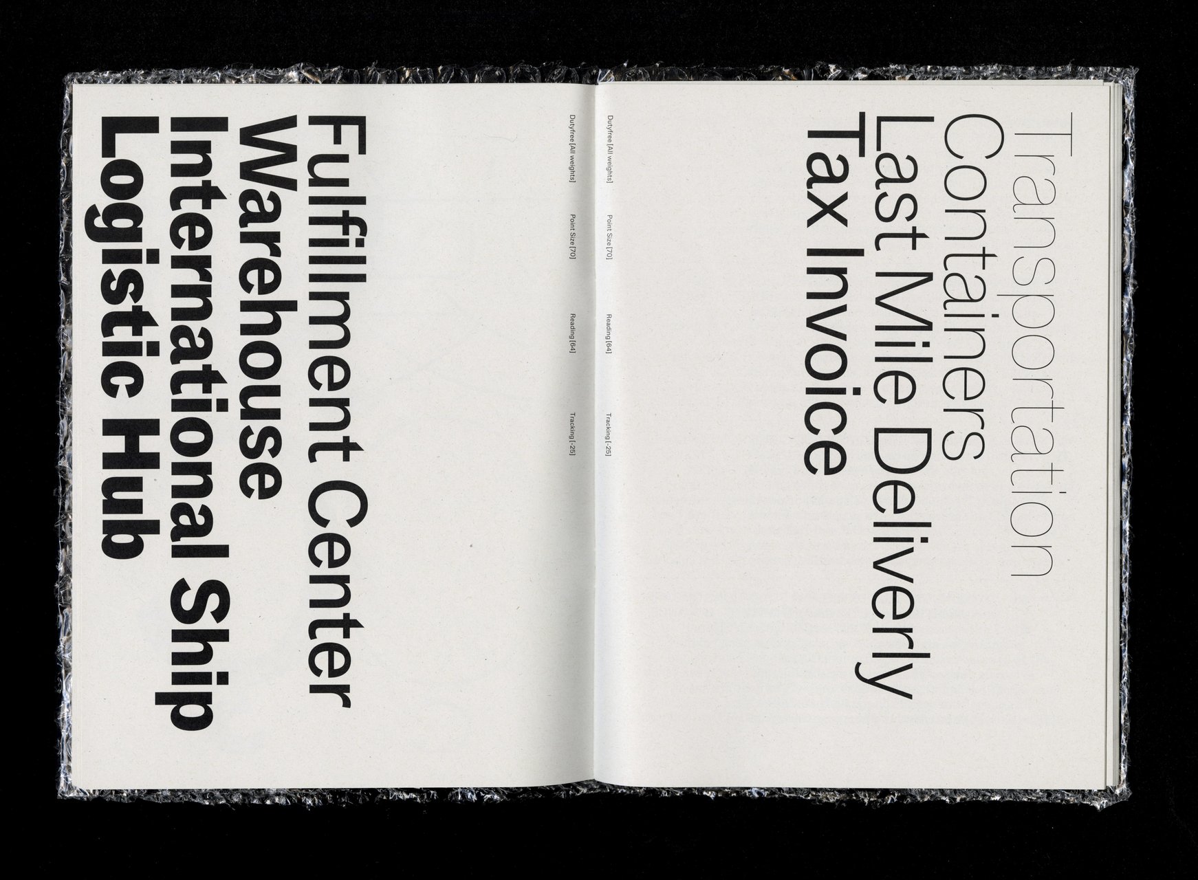
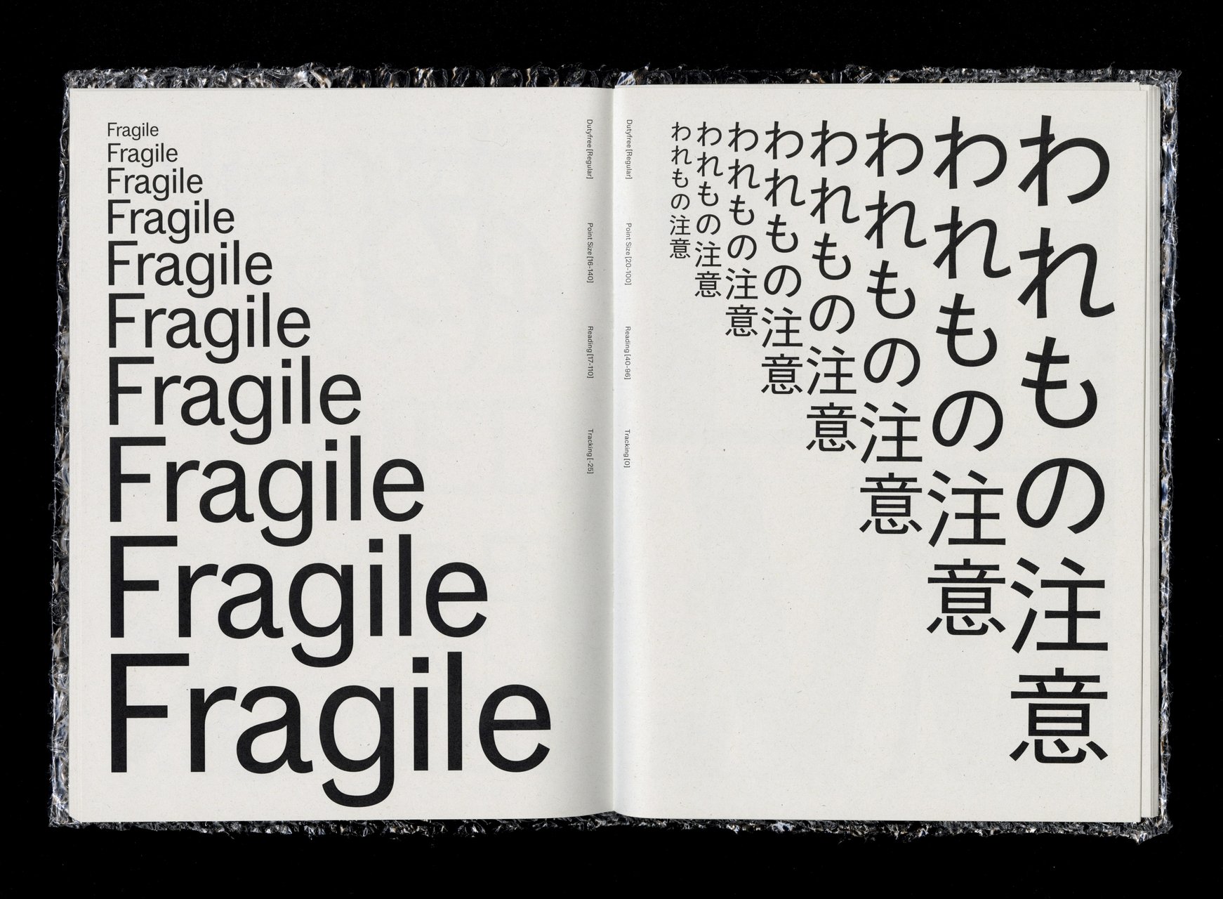
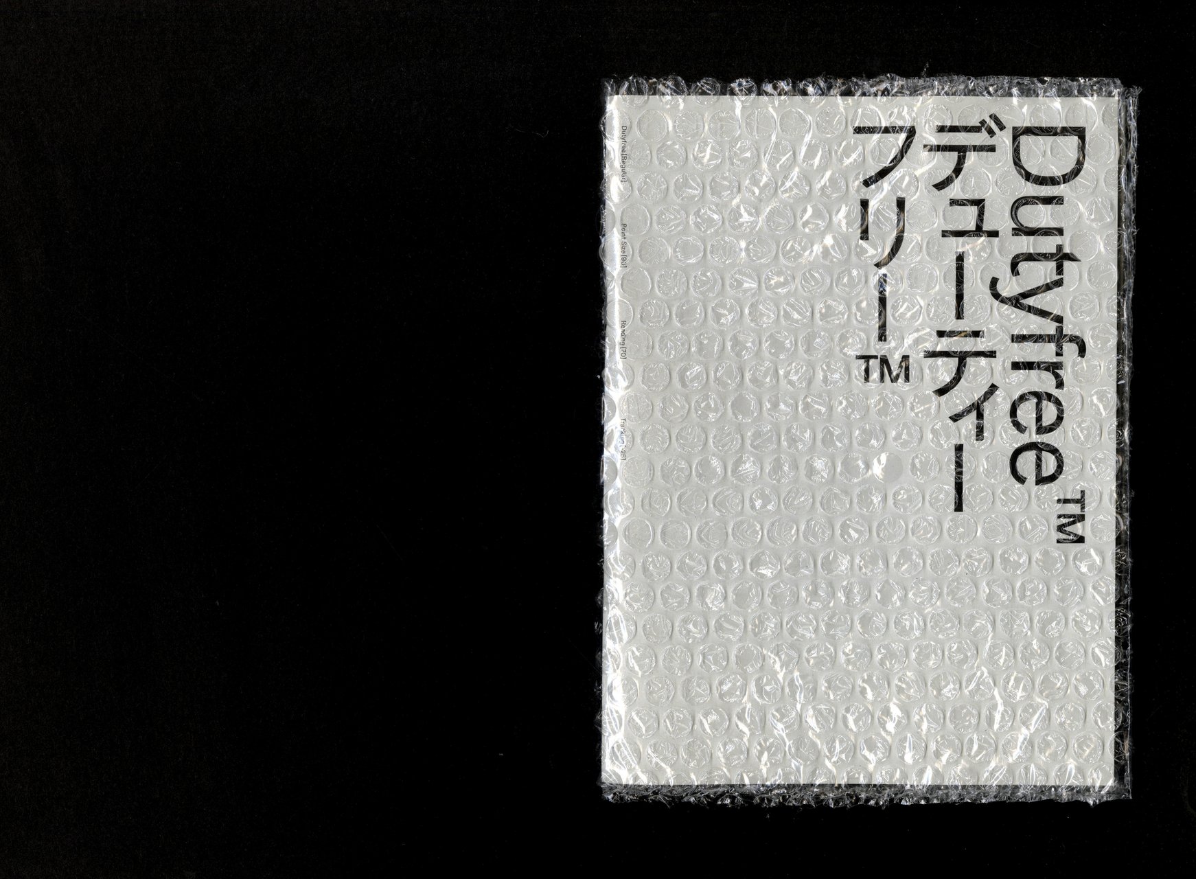
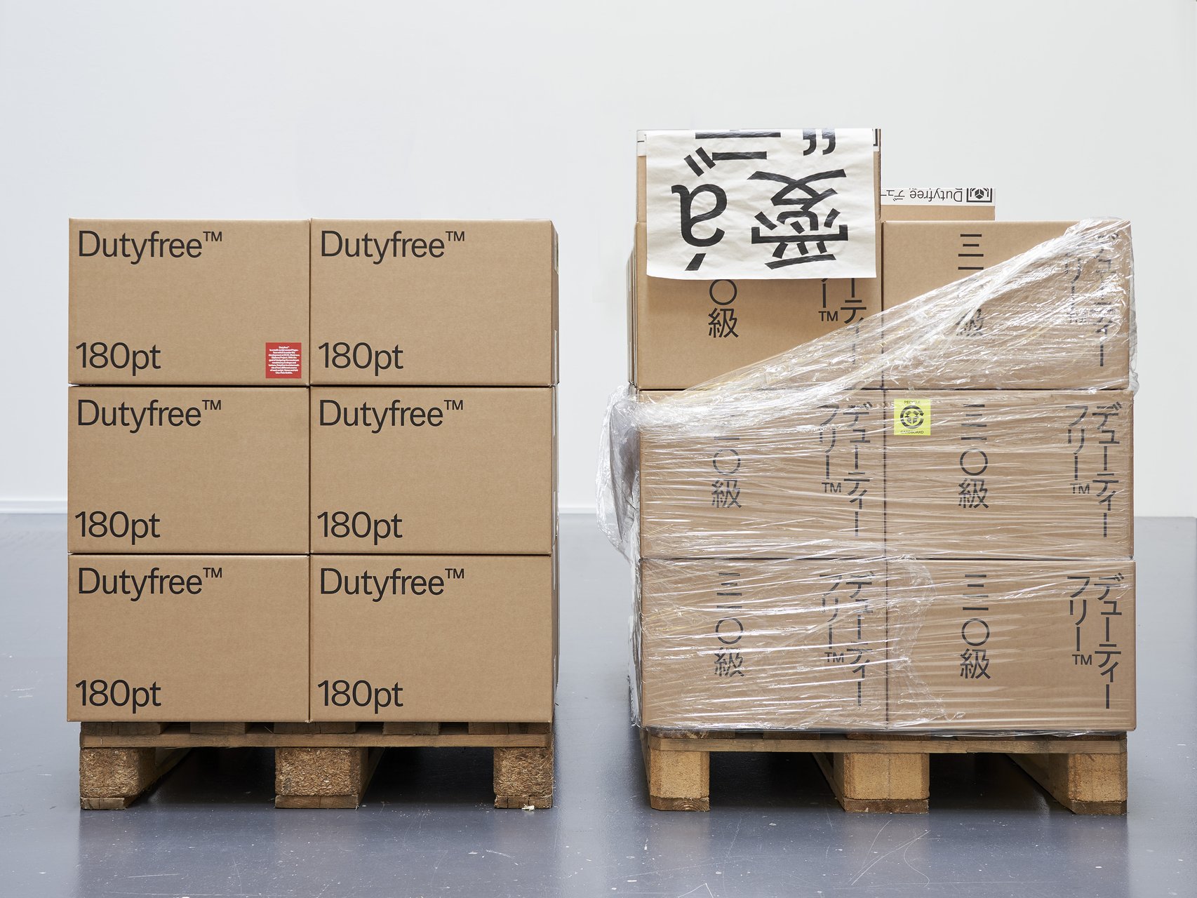
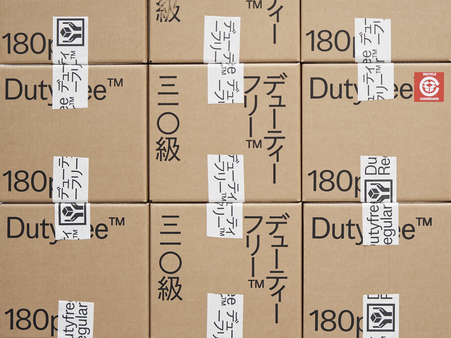
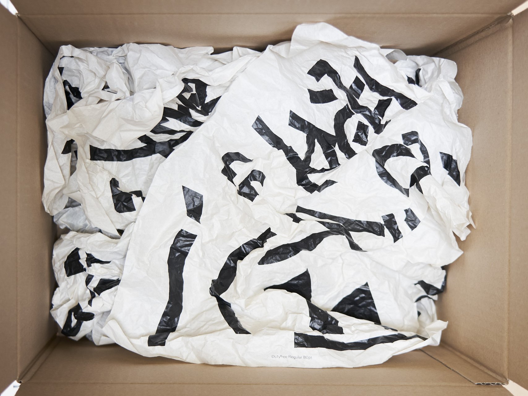
How we perceive and interpret the world is influenced by scale—by the distance, size, and the spatial relationship between observer and object. This project explores how scale influences meaning and perception through an experimental dialogue of type design, photography, and visual art. At its core is Gradual, a typeface that remixes Ladislas Mandel’s Galfra and Adrian Frutiger’s Roissy, reversing their original scale of habitat. In collaboration with artist Pai Litzenberger and the design duo Scinema (Leidy Karina Gómez Montoya and Tonda Budszus), the project expands the typographic concept of optical sizes from nano to macro dimensions. Together, Gradual offer a multi-layered reflection on our spatial interactions with the world.

Giulia Zanzarella – Minut

MA TYPE DESIGN

Giulia Zanzarella – Minut

by Giulia Zanzarella

How long does a Minut last? Time is standardized, but its experience follows no rules, being mathematically equal for all, but felt differently by each. Minut explores this gap: a play on words between “minute” and “unit,” it is a type family built around four styles defined by width constraints—72 units (proportional), 9, 3, and 1 (monospace). Each style reflects a degree of mechanization, inspired by unit systems used in proportional spacing typewriters. Celebrating the beauty of constraint, the characters of Minut find their own rhythm, generating textures with subtle variations. Rather than being interpolated, each style of Minut is drawn individually, prioritizing the overall texture of each font—going against the limitless flexibility of digital design.

Jonathan Bruun – Sekvens

MA TYPE DESIGN

Jonathan Bruun – Sekvens

by Jonathan Bruun

Sekvens is a typeface family of five weights with corresponding italics shaped by a continuous dialogue between perceptions of time and the design of letterforms. Revisiting early digital aesthetics and humanist sans serifs, Sekvens balances a standardized structure with subtle, idiosyncratic details. It navigates the familiar, embracing defaults, norms, and conventions, while simultaneously questioning how the inherited connotations of these forms are aging within the current landscape of type design. Embracing this duality, Sekvens represents both a documentation of past tendencies and a search for new proposals.

Lucas Portron – Dialectic

MA TYPE DESIGN

Lucas Portron – Dialectic

by Lucas Portron

Dialectic is a multi-script typeface family supporting, Latin, Greek, Cyrillic, designed to allow different writing systems to coexist in harmony. Developed side by side, the scripts share a common design foundation, encouraging a visual dialogue that respects their individual identities. With seven weights and matching italics, the family explores a balance between controlled visual disruption, within the letterforms themselves, and a consistent text color. These subtle tensions challenge established norms of legibility and reading habits, opening a critical reflection on legibility and readability. In doing so, Dialectic invites us to reconsider our relationship with text and how we engage with written form.

Lynn Birrer – Brienz

MA TYPE DESIGN

Lynn Birrer – Brienz

by Lynn Birrer

Important opinion: WE AINT BOYZ. Brienz examines “Swiss Style” in graphic and type design and its legacy which is learned and appreciated but doesn’t feel relatable to everyone. Brienz is a type family consisting of 4 styles ranging from Buch to Kursiv and from Schmal to Schmalfett. A typeface that feels more human, vernacular, and rooted in a different set of values. Like mash-up culture in music, it mixes contrasting influences to create something that feels familiar but new, responsive, moving and with its own voice. Construction, deconstruction, and then reconstruction. Kisses from Brienz. Type beat!

Related courses