Stone Carving Workshop

Stone Carving Workshop

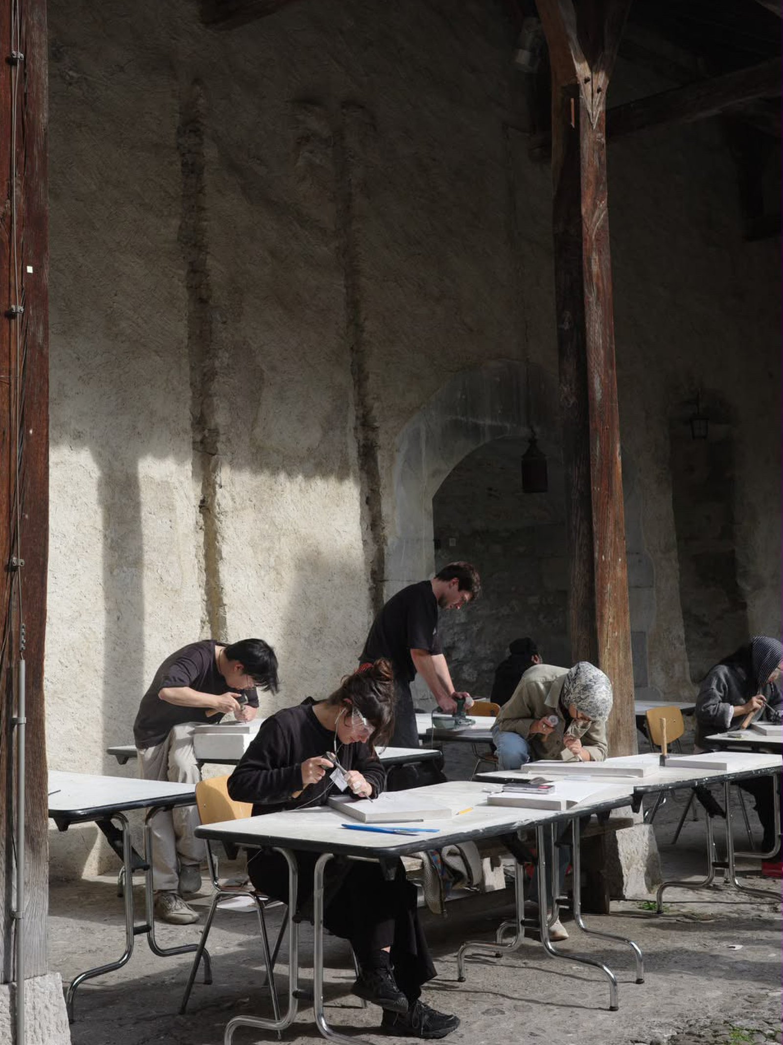
Stone carving workshop at the castle of Chillon as part of the exhibition Relices du Futur following the question: what will the RELICS OF THE FUTURE look like? ECAL students take a fresh look at the castle to imagine the traces our time might leave behind.

Workshop (2026)

What traces will our era leave behind?

This question inspired Relics of the Future, a collaboration between ECAL and Chillon Castle, a massive medieval fortress located on a small rocky island on the shores of Lake Geneva, near Montreux. As part of the project, Master Type Design students explored the centuries-old craft of stone carving during a three-day workshop at the castle. Guided by programme head Matthieu Cortat Roller, twelve students experimented with tools and techniques, transforming limestone into a space for exploration in lettering design, and engaging visitors with the timeless art of stone carving.

Chillon_export_2.jpg
Chillon_export_3.jpg
Chillon_export_4.jpg
Chillon_export_6.jpg
Chillon_export_7.jpg
Chillon_export_8.jpg
Chillon_export_9.jpg
Chillon_export_10.jpg
Chillon_export_11.jpg
Chillon_export_12.jpg
Chillon_export_13.jpg
Chillon_export_14.jpg

Projets similaires

Ruslan Abasov – Sekular

MA TYPE DESIGN

Ruslan Abasov – Sekular

by Ruslan Abasov

Sekular is a variable display typeface rooted in Gothic Cursive, the late-medieval script of merchants, notaries, accountants, and chancelleries. Rather than treating it as a historical revival, the project reactivates its logic for the present: an age of billionaires, platforms, rent extraction, and techno-feudal infrastructures. Developed through drawing, interpolation, typographic research, and newspaper-specimen design, Sekular connects a script born from the weakening of feudal literacy monopolies to today's new forms of economic enclosure. It is not a revival, but a reflection on power, writing, and transition.

Kriszta Bolcsik – Type Between Resolutions

MA TYPE DESIGN

Kriszta Bolcsik – Type Between Resolutions

by Kriszta Bolcsik

The visual language of 9-pin dot matrix printing is not obsolete but unresolved. TYPE BETWEEN RESOLUTIONS emerges from its mechanical output logic, focusing on the structure and behaviour of draft (SSL) printing. This project explores how these low-resolution, mechanically produced forms can inform contemporary type design. It combines historical research with practical experimentation, including the development of custom tools to generate and print glyphs. Through this process, TYPE BETWEEN RESOLUTIONS investigates questions of legibility, rhythm, and system-based construction, aiming to produce a typeface that translates the constraints of obsolete technologies into a contemporary typographic language.

Orlando Brunner – Kadenz Grotesk

MA TYPE DESIGN

Orlando Brunner – Kadenz Grotesk

by Orlando Brunner

Kadenz Grotesk explores the aspect of rhythm and how this influences how a typeface is perceived once set in text. Based on research conducted to follow-up on the written thesis, this project examines various interpretations of typographic rhythm and compares them to understand their impact on the appearance of text and on font design choices. Using the grotesque style as basis, the results of this research are translated into design practice, ultimately leading to the production of one typeface in four distinct styles: Optical, Metric, Syncope and Mono. Each style reflects a different approach to rhythm, and provides a visual representation of how it affects the appearance of text.

Yannick de Kalbermatten – Verso

MA TYPE DESIGN

Yannick de Kalbermatten – Verso

by Yannick de Kalbermatten

Verso is a typeface family composed of three upright styles: Left, Right, and Ambidextal, and a slanted axis ranging from backslanted to slanted. The project comes from a study of left-handed writing practices and how they adapt to systems designed for right-handed use. This often results in unusual writing positions, with shifts in wrist angle, page rotation, and overall gesture. Informed by a survey of around fifty participants, including twenty-one left-handed writers, Verso highlights recurring strategies such as inverted stroke directions and adjusted writing postures. Rather than opposing left- and right-handed writing, Verso builds a continuous space between them where gesture, direction, and form shift within a single family.

Katarzyna Friedrich – Material Type

MA TYPE DESIGN

Katarzyna Friedrich – Material Type

by Katarzyna Friedrich

Material Type is a research project at the intersection of multiple design disciplines that investigates the materiality of type. It examines typography across different materials and production technologies, from metal stamping to injection molding. This research analyzes their preparation, constraints, manufacturing processes, environmental factors and visual outcomes, as each process affects letterforms in unique ways. As knowledge in this area is fragmented, Material Type proposes a sample of instructive technological-typographic taxonomy: a comparative guide that supports informed decisions, improves collaboration, reduces prototyping, and encourages more sustainable design practices.

Related courses