

BA GRAPHIC DESIGN
Contextual Design – BA2 S2 2026
with Adeline Mollard
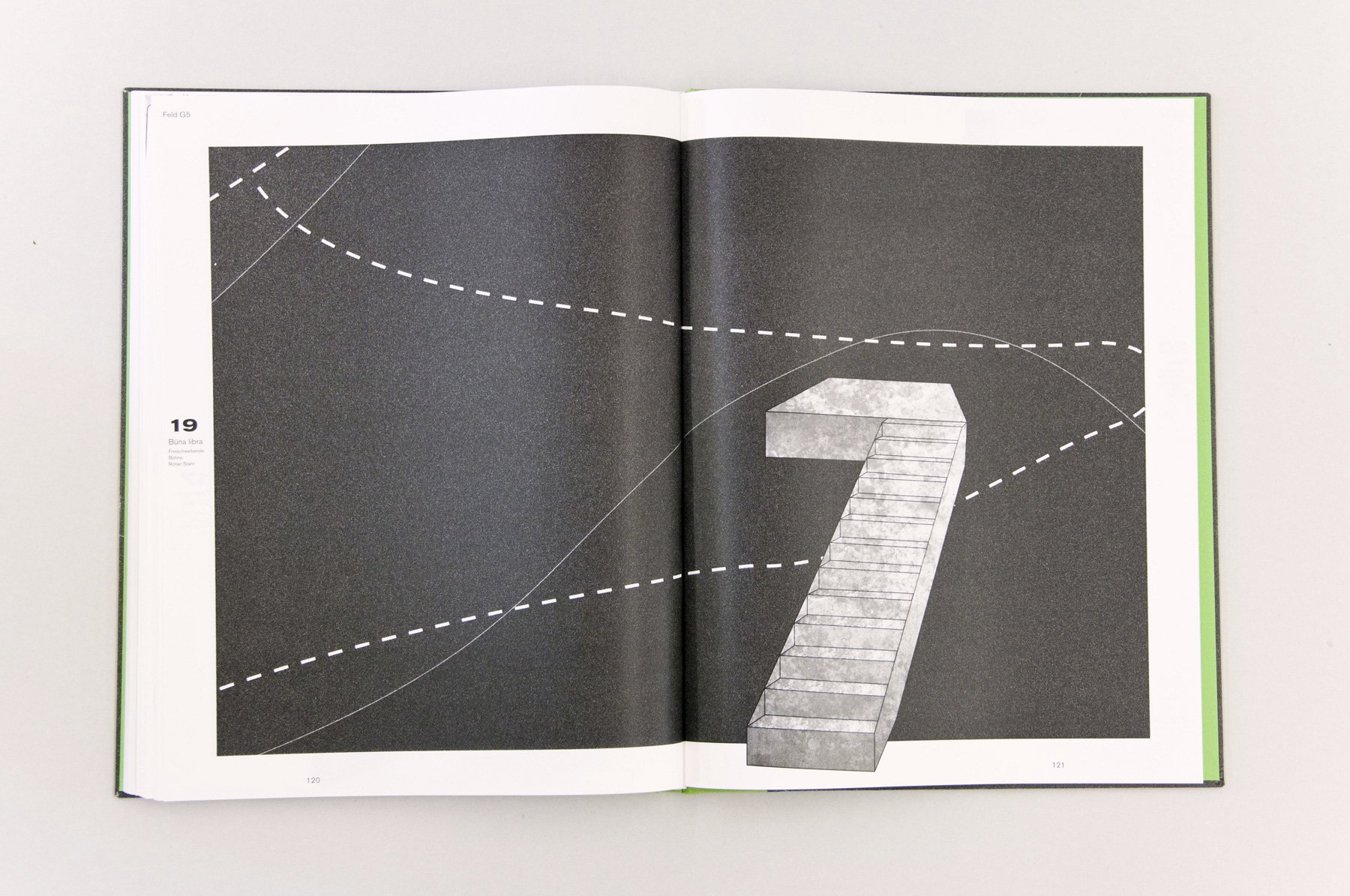
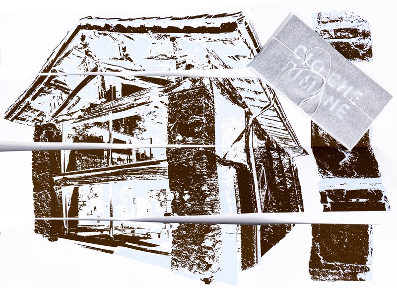
Genius Loci, or the spirit of the place, refers to the unique identity or essence of a location. In architecture, this principle suggests that the specific characteristics of a place should be reflected and extended in a design. In the case of the second-year graphic design students, they have applied this principle to communication projects focused on promoting or extending the identity of a particular place through design. Their work likely explores how to visually capture and communicate the essence of a space, using graphic design elements that resonate with the architectural features or history of the place.