
BA GRAPHIC DESIGN
Type Design BA3 – S1 25–26
with Aurèle Sack
The third-year students had to develop a typeface and digitize it.


1/7


1/2
BA GRAPHIC DESIGN
with Aurèle Sack
The third-year students had to develop a typeface and digitize it.

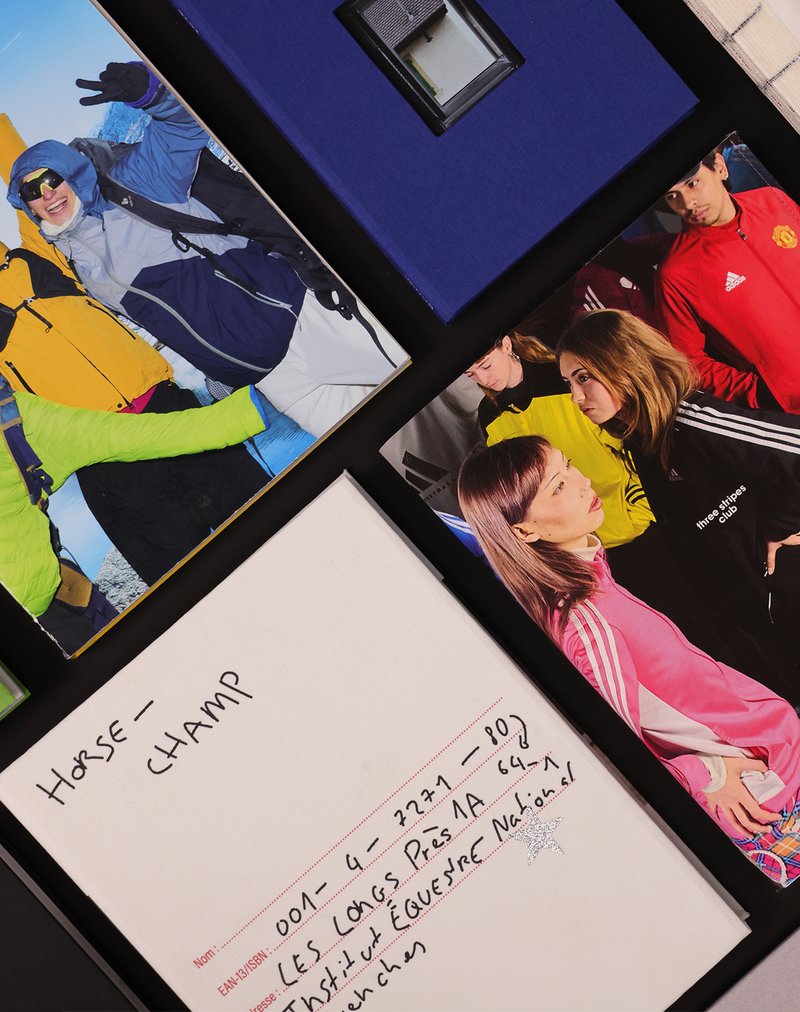
BA GRAPHIC DESIGN
with Guy Meldem
Third-year students had to produce an edition over half a semester, discovering as their subject an event that appeared in the newspaper on the date of the first lesson.

BA GRAPHIC DESIGN
with Yanis Carnal, Raphaël Verona
The Swiss style, also known as the International Style, established itself as the symbol of a radical approach to graphic design and typography. It embodies an ideal of efficiency and rationality. Omnipresent more than half a century after its emergence, does it still hold the same relevance today? What is its influence on our imaginations and our practice? Doesn't Switzerland have other facets through which to communicate, and what new graphic and typographic languages could represent them?
BA GRAPHIC DESIGN
BA PHOTOGRAPHY
with Anouk Schneider Agabekov, Nicolas Polli
As part of the magazine course led by Anouk Schneider and Emmanuel Crivelli, second-year Visual Communication students had the opportunity to design a magazine during the second semester. Students were encouraged to fully embrace their artistic freedom at every level of creation, whether in terms of format, paper choice, binding, layout, illustration, text, or typography. In this course, the magazine can take shape through various forms of illustration, such as photography, reproduction, contextualization, drawing, 3D, and more. The focus is placed on the author’s artistic vision and the means used to bring it to life. Students take on multiple roles as editor, curator, and architect, assuming the responsibilities of art director, designer, photographer, stylist, illustrator, typographer, editor-in-chief, and editorial secretary. This course highlights contemporary editorial design by exploring the narrative potential of a carefully crafted content sequence.

BA GRAPHIC DESIGN
BA MEDIA & INTERACTION DESIGN
BA PHOTOGRAPHY
with Jean-Vincent Simonet, Léonard Guyot, Florian Pittet (Sigmasix), Vincent Jacquier, Julien Gurtner
During a week of collaborative work, first-year students in the Visual Communication department at ECAL were given the ambitious task of creating a complete audiovisual experience, designing a light and sound architecture based solely on five original musical compositions. Using a central totem-like screen installation and projections on the surrounding walls, enhanced with lasers, they created a visual environment, broadcast in real time, which was presented as a performance to the public at the end of the week. The aim was to construct a universe capable of fully utilizing the space and the various stage elements, inviting the audience to move around and experience the live performance in its entirety. Five cross-functional creative groups, each with a different sound base, were supervised by Jean-Vincent Simonet and Léonard Guyot to produce images and test them throughout the week on the device, which was developed, set up and operated by a sixth group under the supervision of Florian Pittet, Matthieu Minguet and Achille Masson.