
BA GRAPHIC DESIGN
Type Design BA3 – S1 25–26
with Aurèle Sack
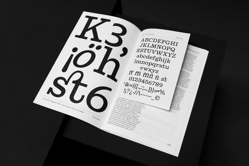
The third-year students had to develop a typeface and digitize it.

Inspired by hand-painted Japanese station signs from the late 1950s, Kyū Maru Gothic interprets and expands their handmade heritage into a coherent rounded sans serif and multiscript Latin/Japanese typeface. It carefully considers the warm and individual character created by the brush of the original sign painters and integrates it coherently into a typeface that is aimed at contemporary use. Further following the source, the typeface comes on a width axis to allow for more flexible typesetting for its intended use at display sizes.
Diploma project (2023) by Niklas Herrmann


1/5


1/7
BA GRAPHIC DESIGN
with Aurèle Sack
The third-year students had to develop a typeface and digitize it.
MA TYPE DESIGN
by Stephanie Wilson
Iconic stands at the intersection of typography, social research, and inclusive design. It addresses a growing concern: making reading more accessible for senior readers. Through the development of a typeface named Iconic, the project aims to enhance reading comfort while offering an aesthetic, functional, and adaptable typeface suited to the changes associated with aging. The project was created in collaboration with senior-lab, a Swiss platform dedicated to enhancing the quality of life for seniors. Grounded in a participatory methodology, this collaboration enabled a reality-based approach: available in serif, sans serif, sans semibold, and italics, Iconic was designed based on feedback and testimonials gathered from seniors during sessions held at ECAL.

BA GRAPHIC DESIGN
with Robert Huber
First-year students were invited to manually sketch the typographic skeleton of lowercase alphabet letters. The objective was to maintain the proportions, curves, and characteristic axes of each letter while paying close attention to visual coherence and consistency in the drawing.
BA GRAPHIC DESIGN
with Aurèle Sack
Second-year students were required to manually develop the lowercase letters of two typefaces.

BA GRAPHIC DESIGN
by Diego Steiner
Hybrid Modules explores the link between traditional craftsmanship and contemporary technologies through the creation of a 3D-printed modular typographic tool for use with a manual letterpress. Designed on a grid, the modular alphabet becomes a set of physical dies, which can be inserted by hand into the press. The slow, repetitive process becomes an integral part of the visual language, making visible the time and care of the gesture. A series of A2 posters promotes a series of fictitious conferences entitled “ART, CRAFT & TECHNOLOGY - Guests in Switzerland”.