Contextual Design – BA2 S1 2025

Contextual Design – BA2 S1 2025

Genius Loci, or the spirit of the place, refers to the unique identity or essence of a location. In architecture, this principle suggests that the specific characteristics of a place should be reflected and extended in a design.

In the case of the second-year graphic design students, they have applied this principle to communication projects focused on promoting or extending the identity of a particular place through design. Their work likely explores how to visually capture and communicate the essence of a space, using graphic design elements that resonate with the architectural features or history of the place.

Studio project (2026) with Nicole Udry

Assistants
Olympe Boutaghane
Students
Leandra Adler, Cansu Celen, Layana Comte, Anaïs Dermont, Camille Genoud, Eve Gremaud, Eloïse Guillod, Mathis Harmant, Marie Hintzy, Matteo Lucca, Gaëtan Mauclair
Know-how
Editorial

Le Pavillion de musique Sihlhölzli

This sequence proposes to read the Sihlhölzli pavilion not as a fixed architectural object, but as a sensitive structure, through the metaphor "Muschel ist Muskel" (the shell as muscle).The building has undergone several states of use and atmosphere, which the video approaches as a cycle composed of four phases: music, sonic saturation, abandonment, and reactivation through the body.The choice of a looped format refers to breathing, to music, and to a non-linear sense of time, where past uses continue to influence the perception of the place. In this video, architecture is therefore understood as a body that reacts to the flows surrounding it, proposing a sensitive reading of space.

By Eve Gremaud

1/4


Matteo Lucca
Matteo Lucca
Matteo Lucca
Matteo Lucca
Matteo Lucca
Matteo Lucca
Matteo Lucca
Matteo Lucca
Matteo Lucca

1/9

A House with a tree

This editorial project graphically translates the architectural approach developed by Sauter von Moos in A House with a Tree (Basel, 2013). Based on the notions of module, fragmentation, and the reciprocal activation between the existing structure and the extension, it takes the form of a journal composed of abstract typographic structures derived from the words HOUSE and TREE, transformed into modular architectural forms. Folded and placed in relation to one another, these compositions generate dynamic sequences in which each spread activates the next, echoing the dialogue between past and present established by the architects. A mini-edition inserted within the journal gathers fragments of the original text, reorganized into a narrative core. Acting as a key to reading the project, it provides access to the gestures, intentions, and ethics behind it, while connecting the abstract graphic compositions to their architectural origin. Together, the project forms an editorial device in which text and image, autonomy and interdependence, respond to and activate one another.


Par Matteo Lucca


Leandra Adler
Leandra Adler
Leandra Adler
Leandra Adler
Leandra Adler
Leandra Adler
Leandra Adler
Leandra Adler
Leandra Adler
Leandra Adler
Leandra Adler
Leandra Adler
Leandra Adler
Leandra Adler
Leandra Adler
Leandra Adler

1/16

Sette Interventi a Monte

Like the architectural office, I wanted to carry out an intervention in the village and contribute to its revitalization. Before my visit, I therefore developed a marble game inspired by a local story that children used to play marbles on the village square, using four holes in the ground. I spent one day in Monte, during which I had seven encounters with people who agreed to play the game. From these interactions, ink traces made by the marbles emerged, capturing the movements and exchanges between the players.

At the same time, I collected archival materials, which I curated and selected in response to the conversations I had with the inhabitants. The project thus takes the form of an associative ping-pong between myself and the people I met. On the one hand, my aim was to animate and enliven both the people and the village through my own graphic intervention. On the other hand, because the people and our conversations guided my subsequent selection of content, I allowed myself to be led by this direct contact in the construction of the book. In the same way, the architectural interventions also emerged from the conversations and encounters with the inhabitants.

Par Leandra Adler


De la graine à l’architecture

The cycle of wood through the history of the Gässli House

This edition narrates the cycle of wood in three phases. Wurzeln Schlagen (taking root) evokes the seed and the slow growth of the tree. Verwandlung (metamorphosis) marks human intervention and the construction of the first house in 1666, when wood becomes a structural element while still carrying the memory of its origin. Gässlihuß (Maison Gässli) traces its deconstruction and reconstruction from 2019 to the present, highlighting the movement of the place and the circulation of memory.Positioned between an edition and a series of posters, the object is based on a graphic system inspired by tree rings. A grid proportional to a timeline from 1500 to tomorrow structures the whole, with texts radiating from the center in a gradual movement of zooming in and out through the different phases.

The images translate the state of the material: 165 outlined circles represent growth; a transition to gradients and then to solid circles marks the phase of metamorphosis; and archival images, screened into circular patterns, evoke movement and memory. Time thus becomes a tangible material, visually expressing the continuity of a cycle in which matter circulates and reinscribes itself over time.

Par Layana Comte


Layana Comte
Layana Comte
Layana Comte
Layana Comte
Layana Comte
Layana Comte
Layana Comte
Layana Comte
Layana Comte
Layana Comte

1/10


Gaëtan Mauclair
Gaëtan Mauclair
Gaëtan Mauclair
Gaëtan Mauclair
Gaëtan Mauclair
Gaëtan Mauclair
Gaëtan Mauclair
Gaëtan Mauclair
Gaëtan Mauclair
Gaëtan Mauclair
Gaëtan Mauclair
Gaëtan Mauclair

1/12

Lè Medz-vin Couâi

This graphic project draws on the communal hall of Bussy-sur-Moudon to highlight the role of community spaces in rural areas. Based on its uses, memories, and the photographic and written archives related to the building, it develops graphic systems that propose a reading of the social functioning of Bussy and, more broadly, of rural communities.Often barely visible from an external perspective, these places are nevertheless essential to collective life. They host both ordinary moments and significant events, and contribute to the social cohesion of the territory.


Par Gaëtan Mauclair


Jazz Campus de Bâle

After analyzing and visiting the building, I chose to develop an animation based on a central idea: in this place, architecture and jazz are inseparable. The project is intended for students, teachers, and enthusiasts of architecture and music, and aims both to inform and to spark curiosity by inviting viewers to discover the building through sound as much as through image.The tone, both informative and poetic, makes the space resonate like a living narrative. The animation draws on the acoustic modules, architectural forms, vaults, the diversity of rooms, and the inner courtyard, which are animated like a dance in response to the music.Structured in four stages, situation, learning, cooperation, and diffusion, it reveals a campus that lives, learns, and creates through jazz. Designed for learning and experimentation, this architecture forms an intimate universe nourished by music and opened to the city through the jazz club.


Par Eloïse Guillod


HOUSE WITH A TREE

This edition graphically translates the principle of renovation through layering: the existing structure is never erased, but becomes the foundation for transformations. It takes the form of a serialized journal composed of four folded sheets, creating a 16-page journal or, when unfolded, four posters. The project relies on three layers of printing. The base layer is a Swiss architecture journal from 1930, contemporary with the construction of the house, whose original layout is preserved to anchor the past. A transparent gold screen print is then superimposed without covering the underlying layer, evoking a gentle renovation. Finally, an inkjet print presents the house today and the interventions carried out.

Each half-page addresses a specific modification (roof, water, windows, etc.). For each theme, the 1930 journal is recomposed from period images and advertisements, creating a dialogue between past and present. A second navigation layer, dated 2013, materializes the overlap of temporalities. On the verso, a minimalist drawing represents each intervention. The screen print produces a subtle embossing, introducing a tactile dimension perceptible while reading. The accumulation of these prints on a single sheet thus becomes the heart of the project, directly echoing the architectural approach: building with what exists rather than replacing it.


Par Camille Genoud


Camille Genoud
Camille Genoud
Camille Genoud
Camille Genoud
Camille Genoud
Camille Genoud
Camille Genoud
Camille Genoud
Camille Genoud

1/9

Projects related to Editorial

Création d'image - Double Reading - BA1 2025-2026

BA GRAPHIC DESIGN

Création d'image - Double Reading - BA1 2025-2026

with Guy Meldem

First-year students were invited to design a 16-page publication. By experimenting with duotone through various printing techniques, they structured a dual reading experience dependent on the printed colors.

Editorial Design - Great Expectations - BA1 S1 2025-2026

BA GRAPHIC DESIGN

Editorial Design - Great Expectations - BA1 S1 2025-2026

with Harry Bloch

During the editorial design course with Harry Bloch, the first-year students each laid out a chapter of Charles Dickens' Great Expectations. A final edition compiling all the chapters was produced for the occasion.

GEOFF HAN – WORK AND TURN

BA GRAPHIC DESIGN

GEOFF HAN – WORK AND TURN

by Leandra Adler, Cansu Celen, Layana Comte, Anaïs Dermont, Camille Genoud, Eve Gremaud, Eloïse Guillod, Mathis Harmant, Marie Hintzy, Matteo Lucca, Maxime Manera, Gaëtan Mauclair, Mathys Mauron, Emma Morisseau, Sara Pedersoli, Lucie Pittet, Hélène Prongué, Leonardo Mariucci, Alice Refachinho, Justine Renevey, Gaspard Schlatter, Laura Simons, Vu Toni Thien Duc, Maïa Yassin, Jonas Zesiger

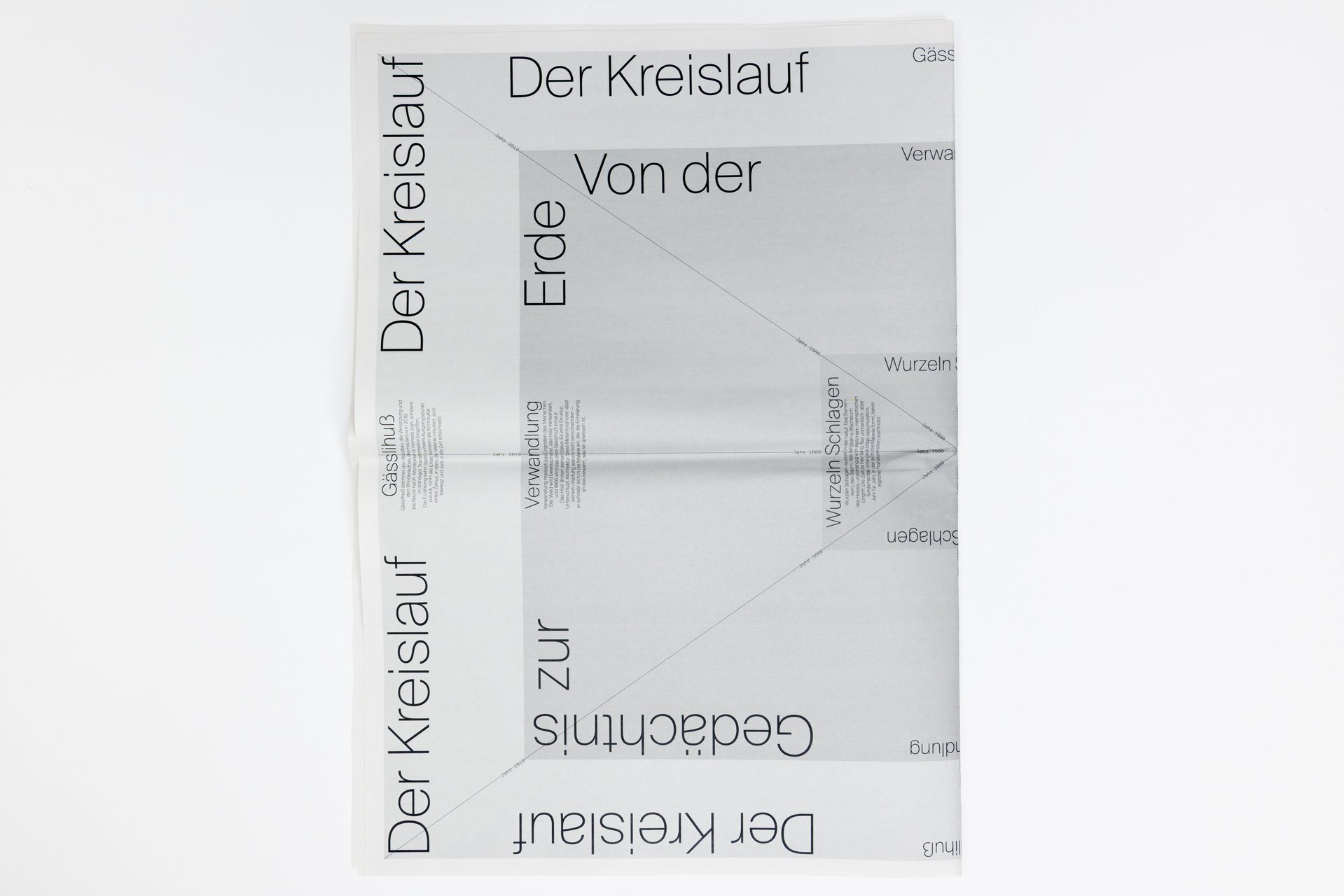
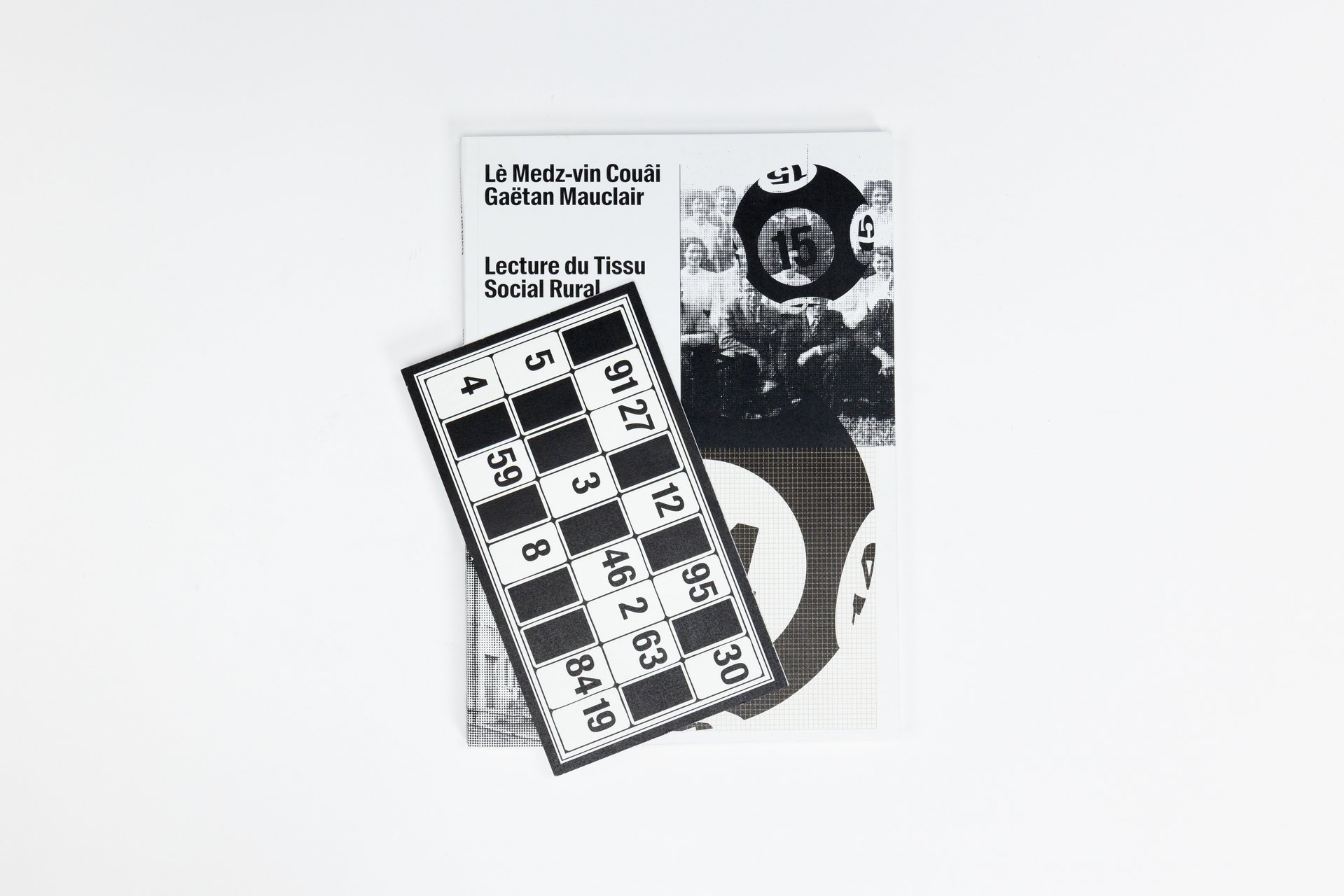
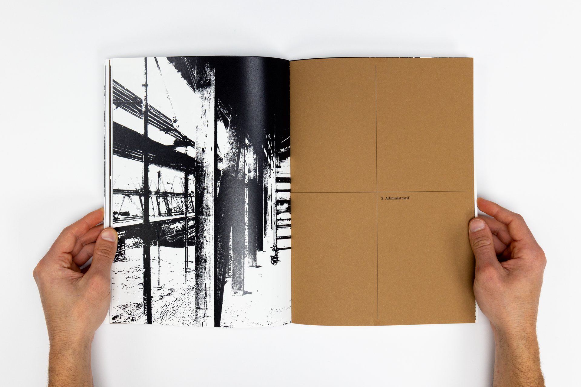
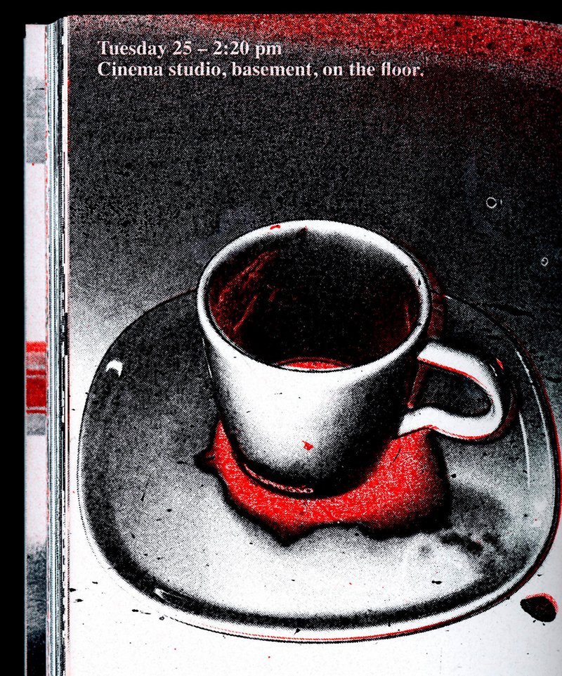
In November 2025, 27 ECAL students took part in Work and Turn, a workshop led by Geoff Han exploring the theme of labor and the often overlooked work that sustains the school. Located in a former IRIL knitwear factory in the industrial area of Renens, ECAL occupies a vast building whose daily functioning depends on many visible and invisible forms of labor. 
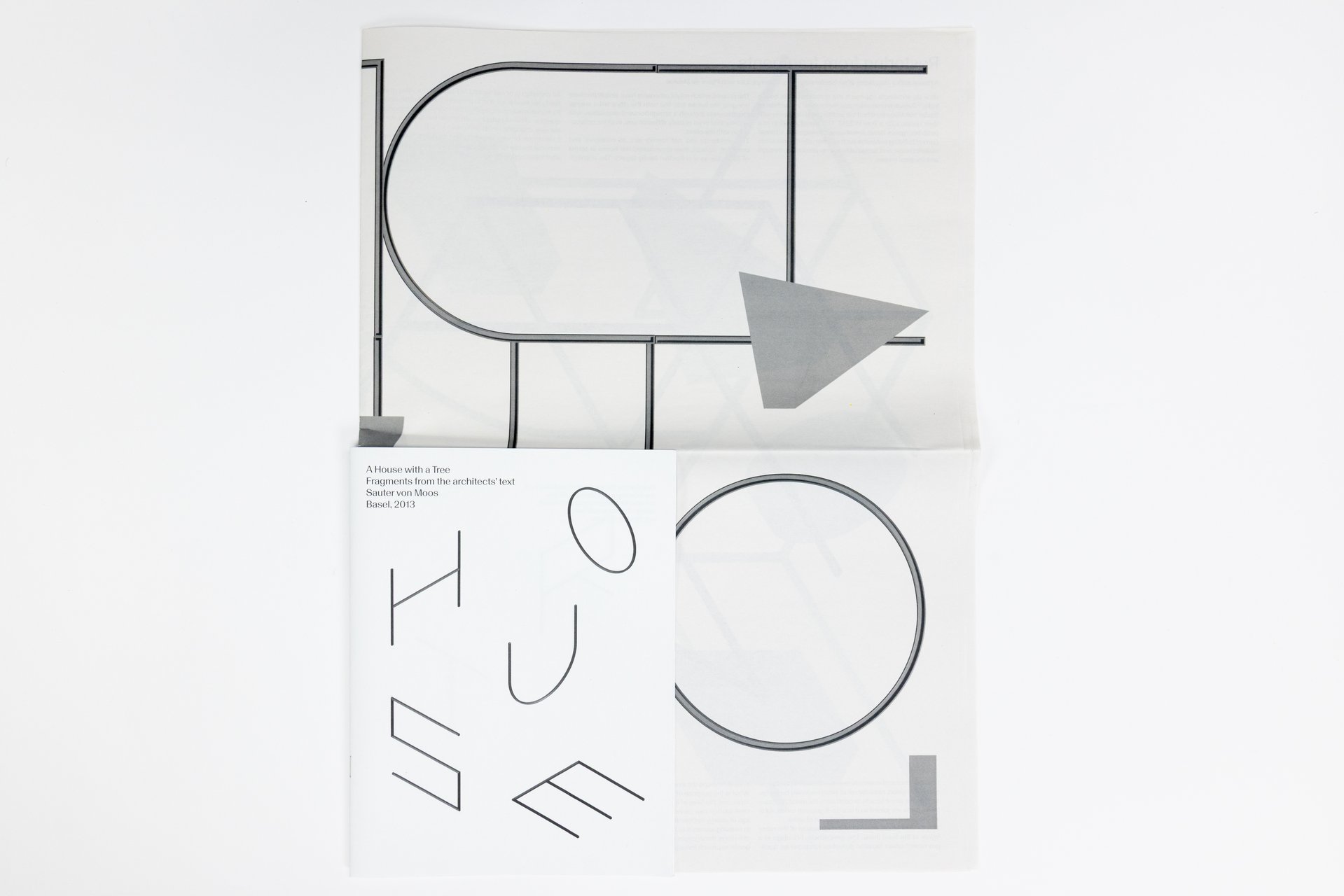
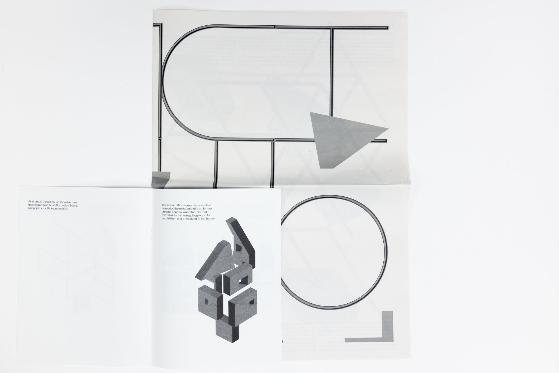
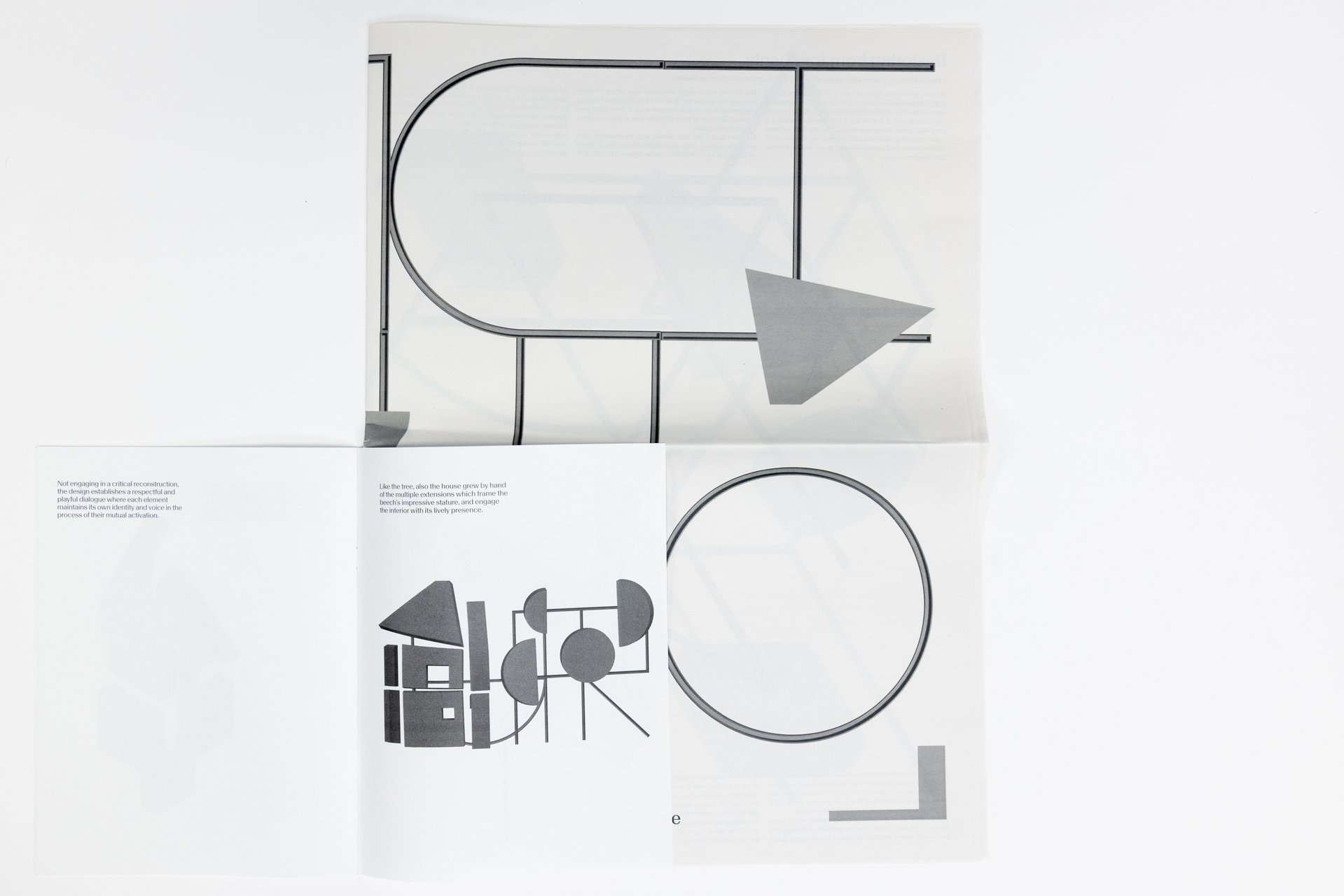
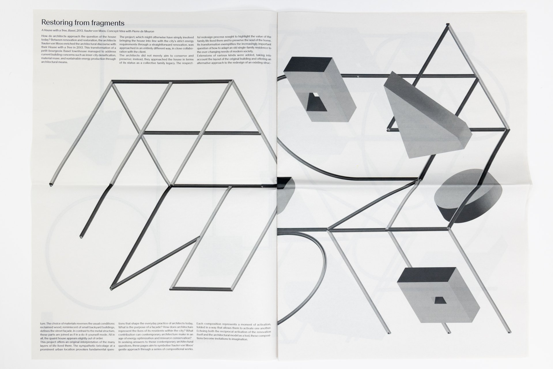
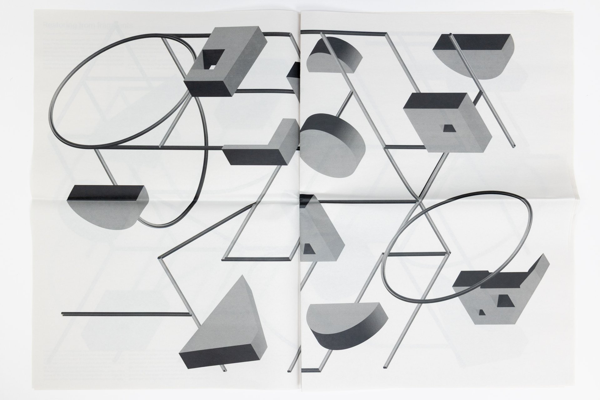
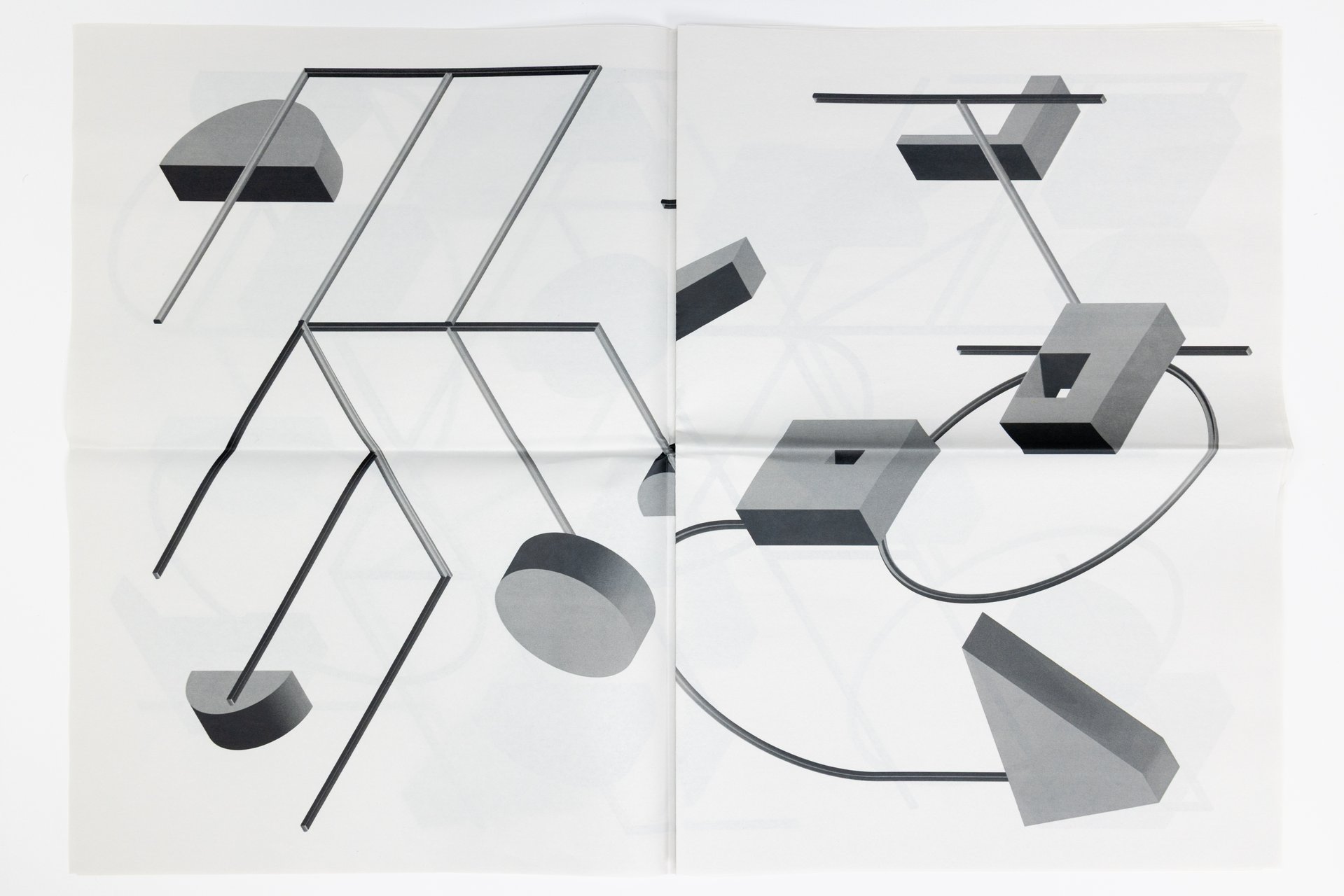
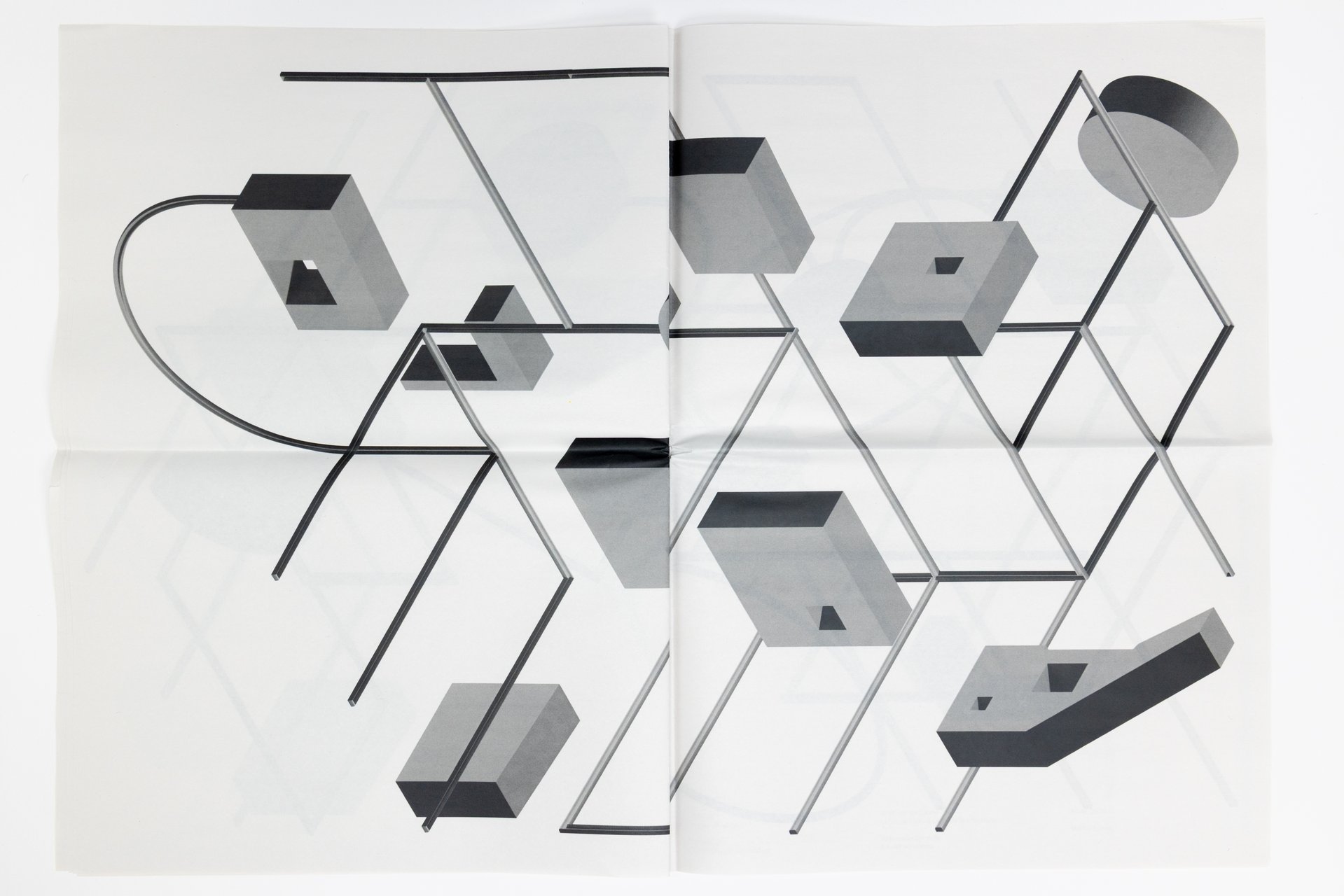
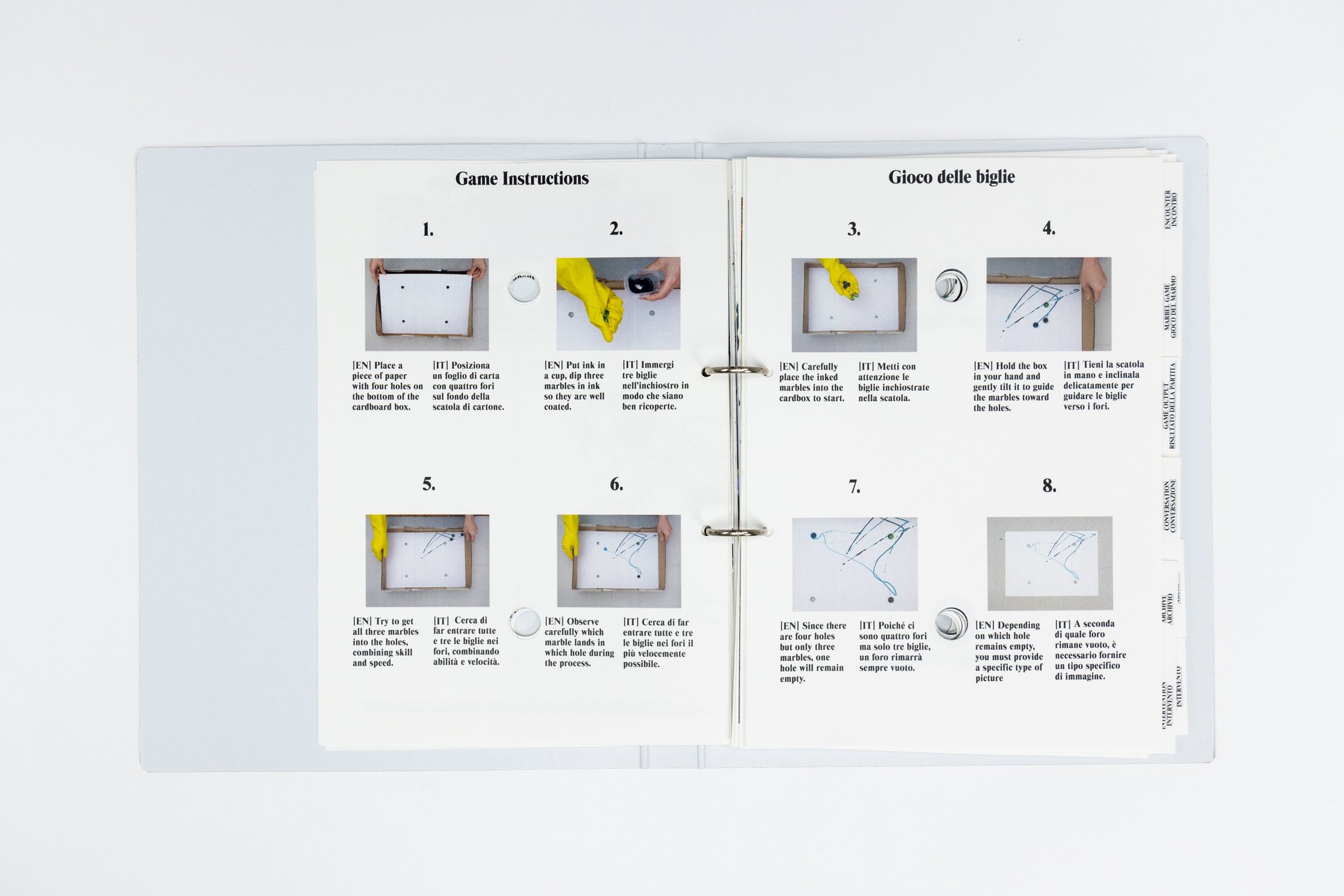
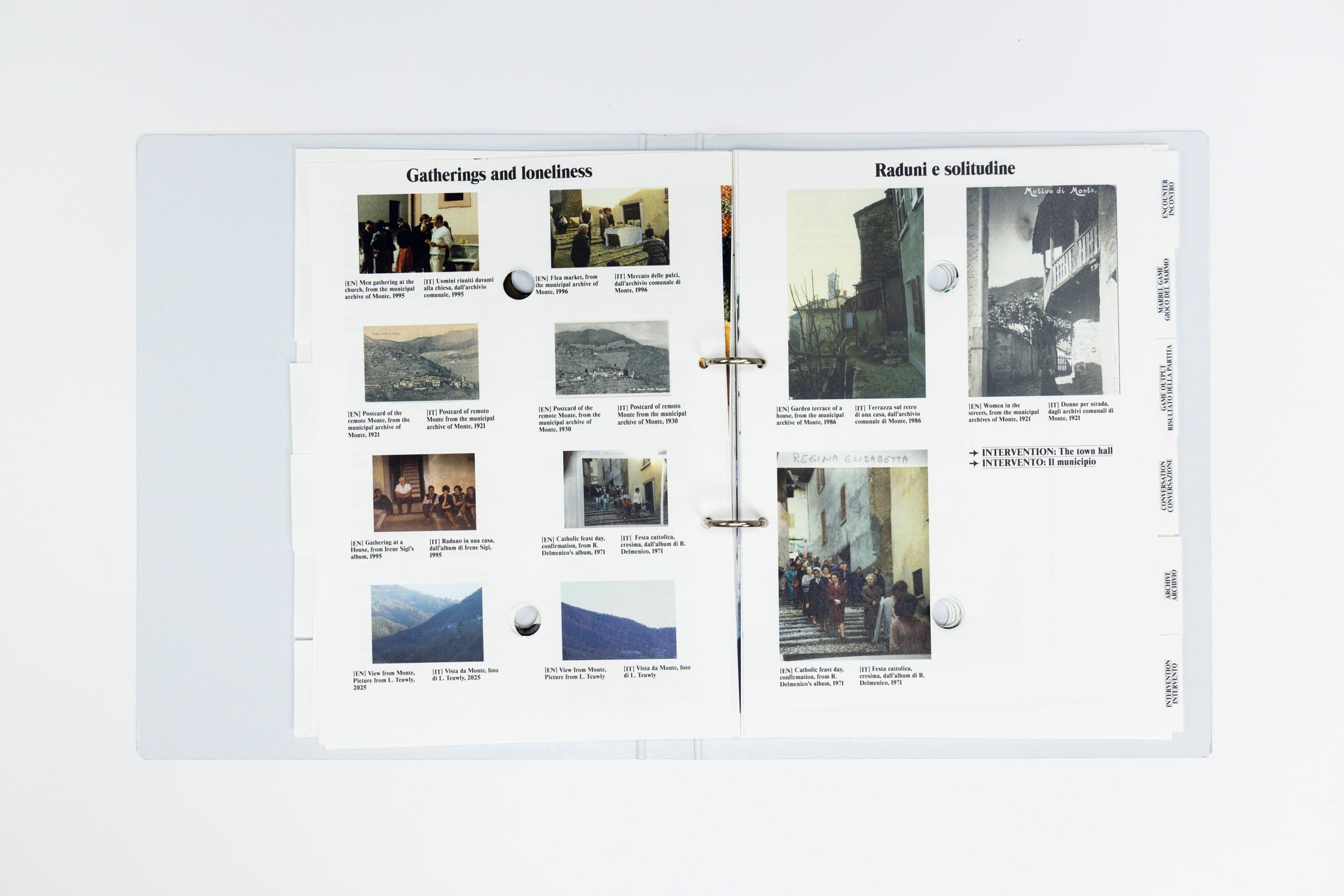
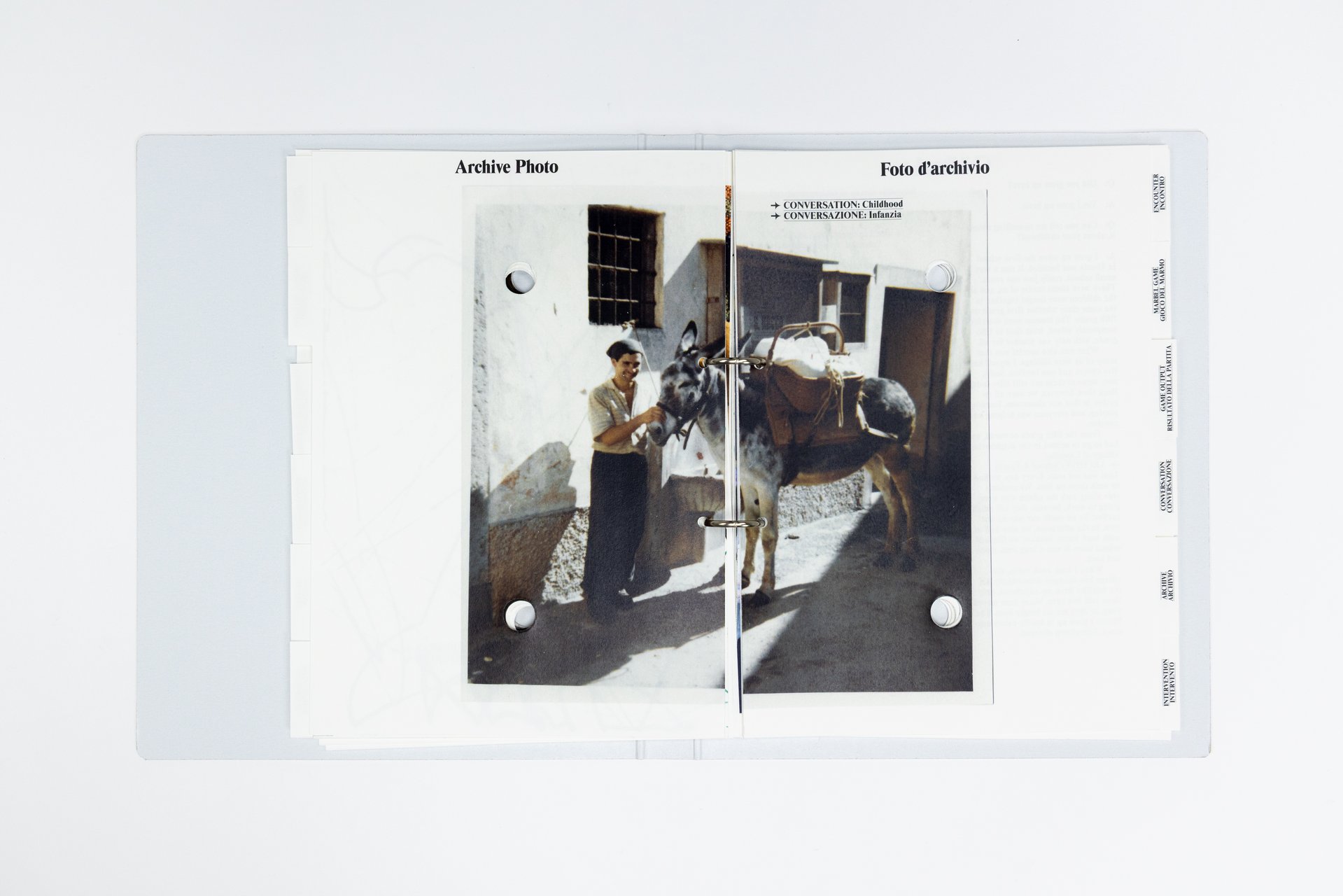
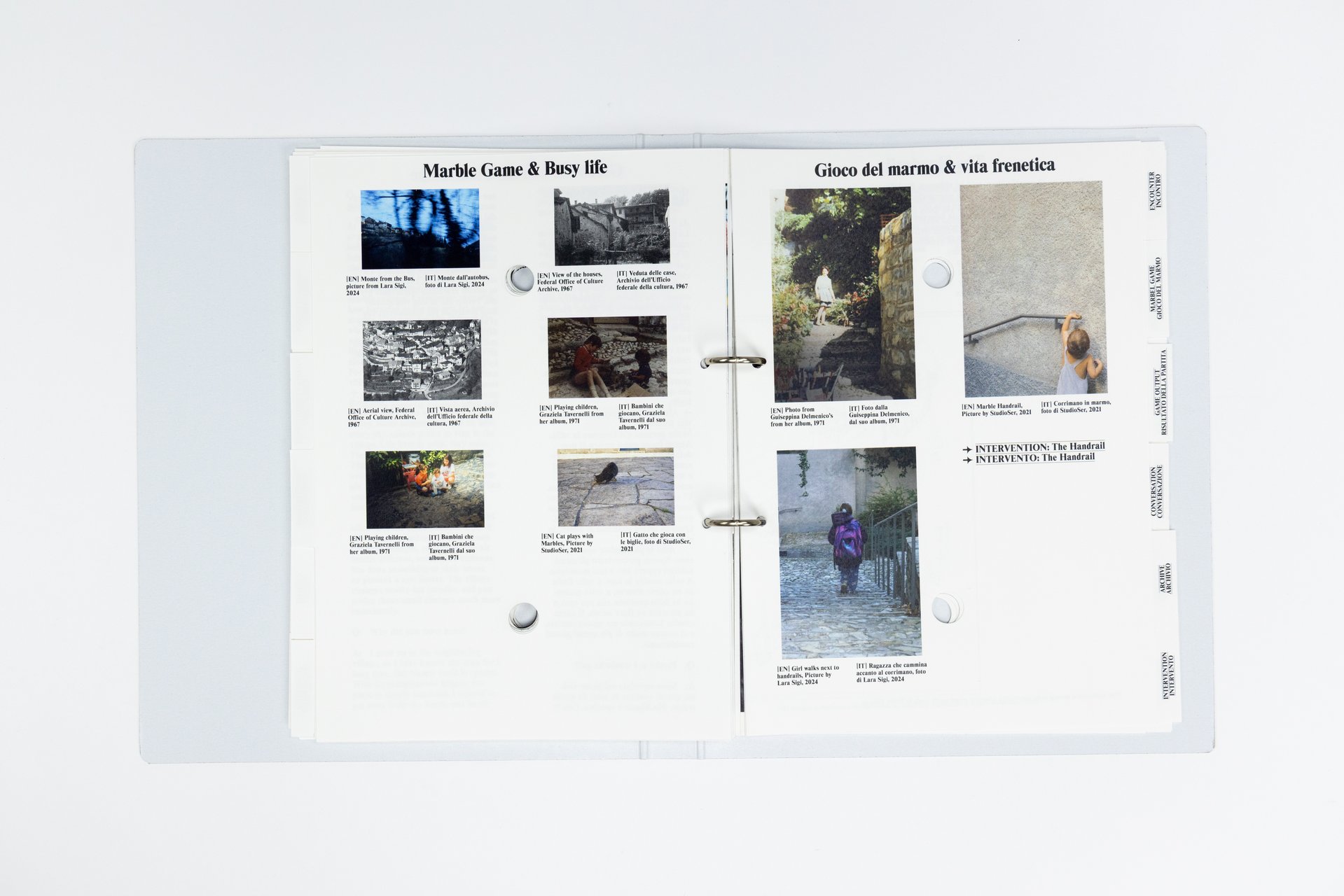
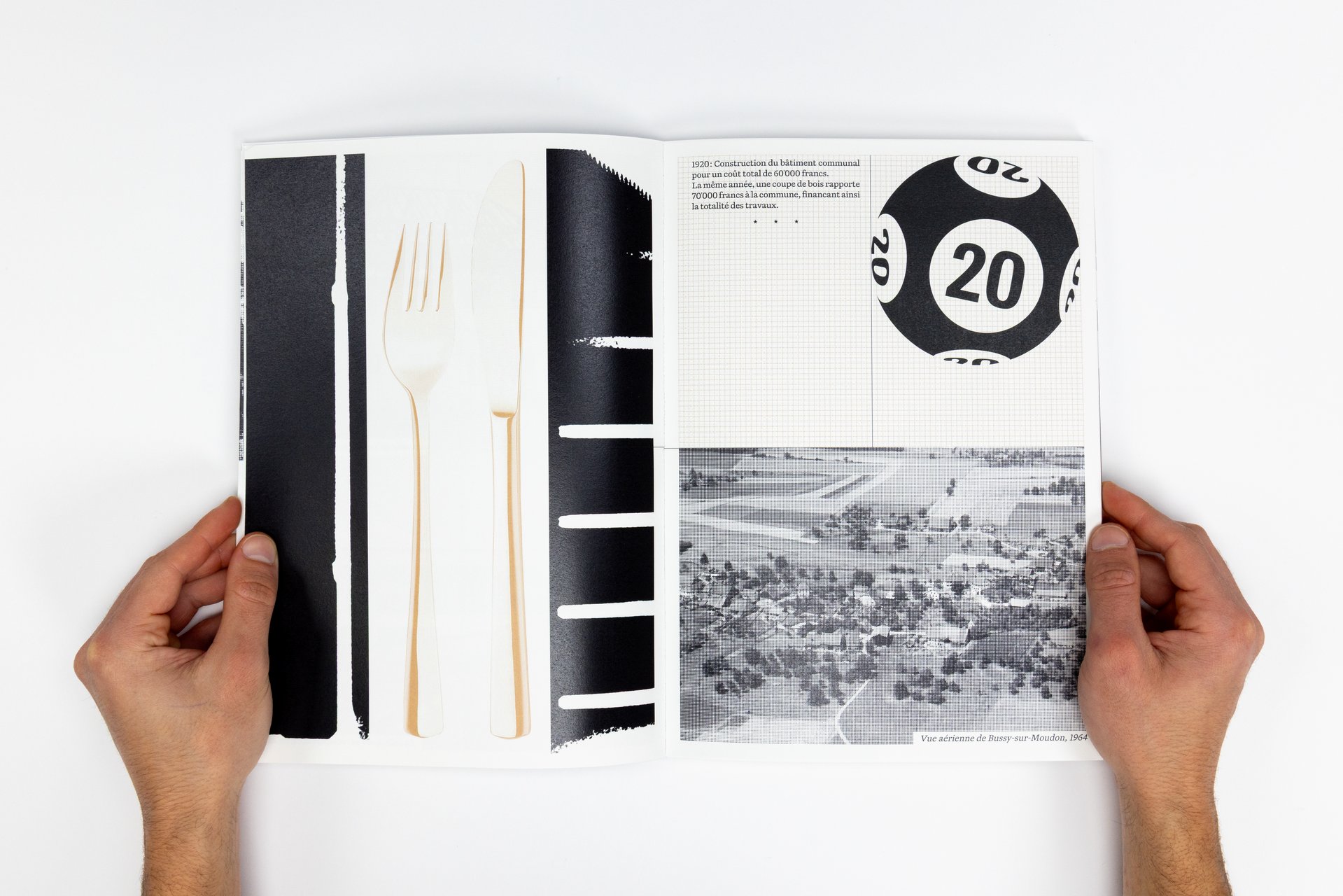
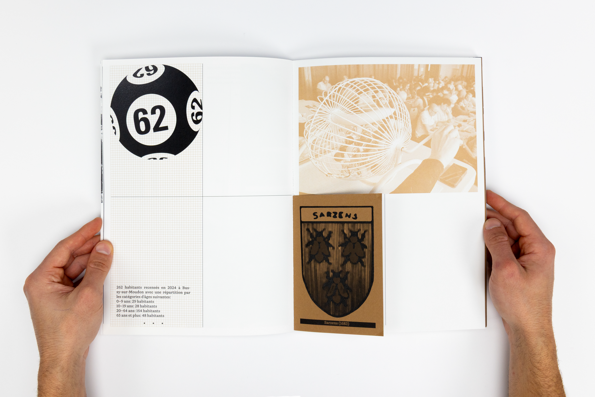
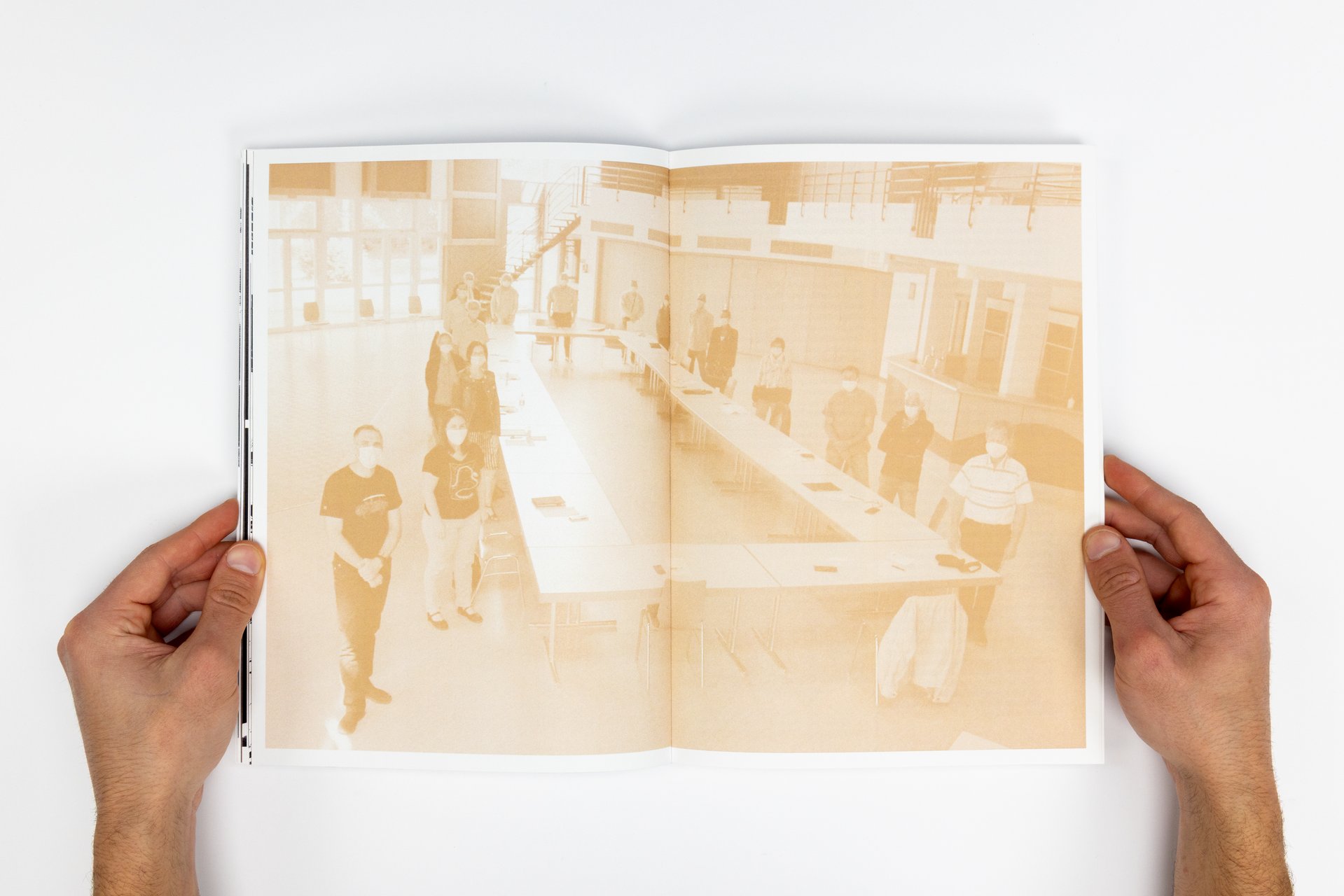
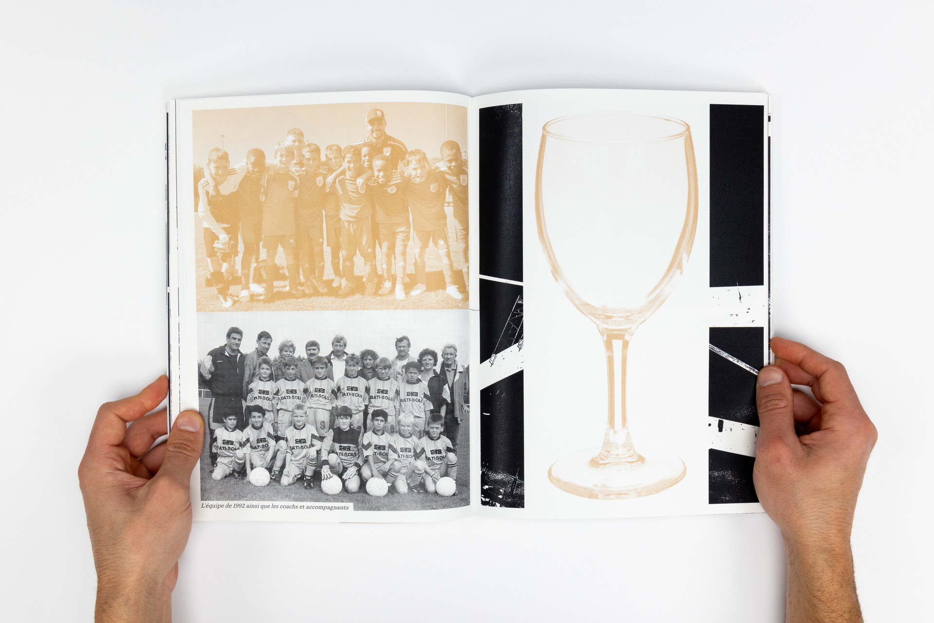
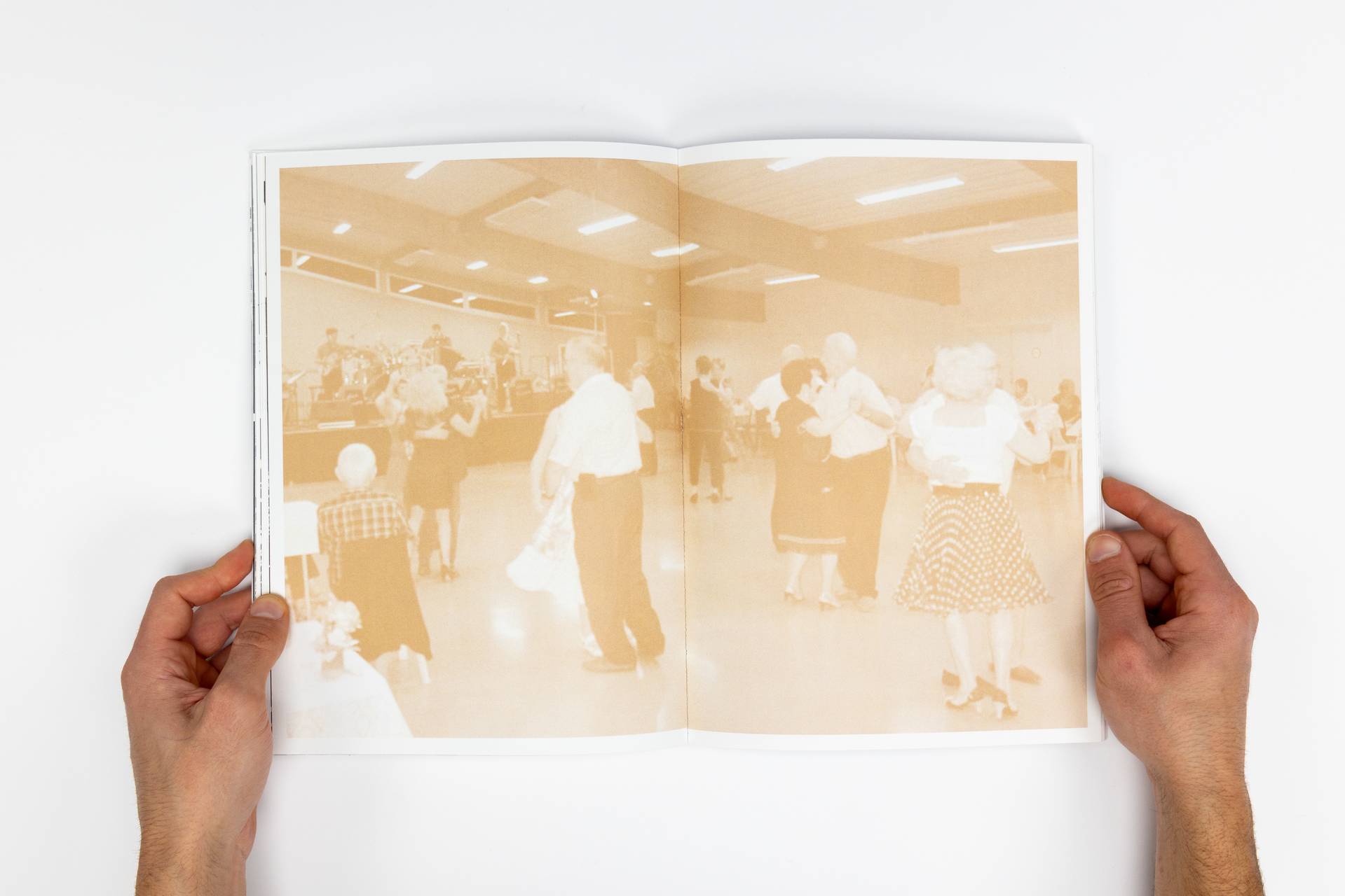
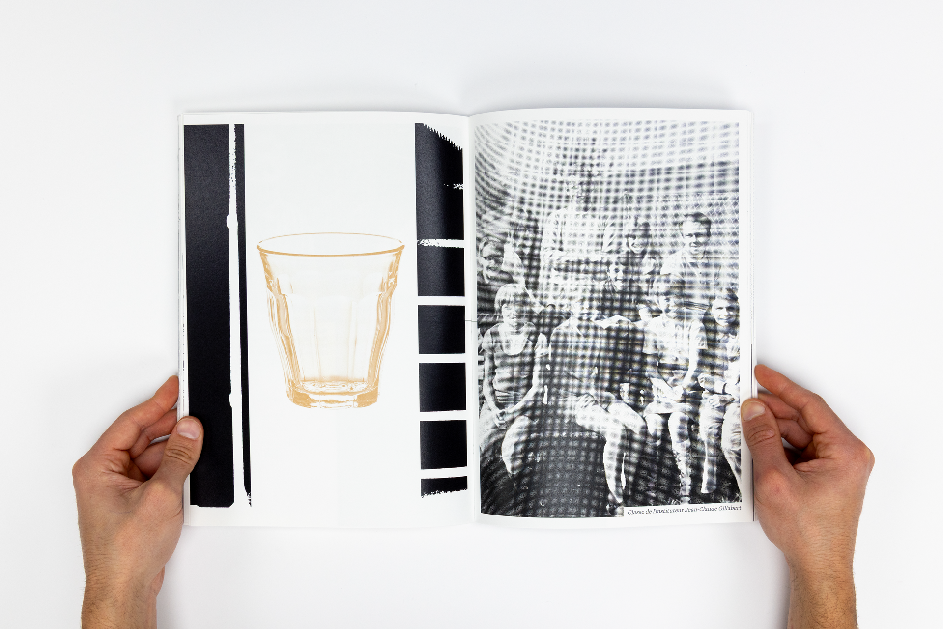
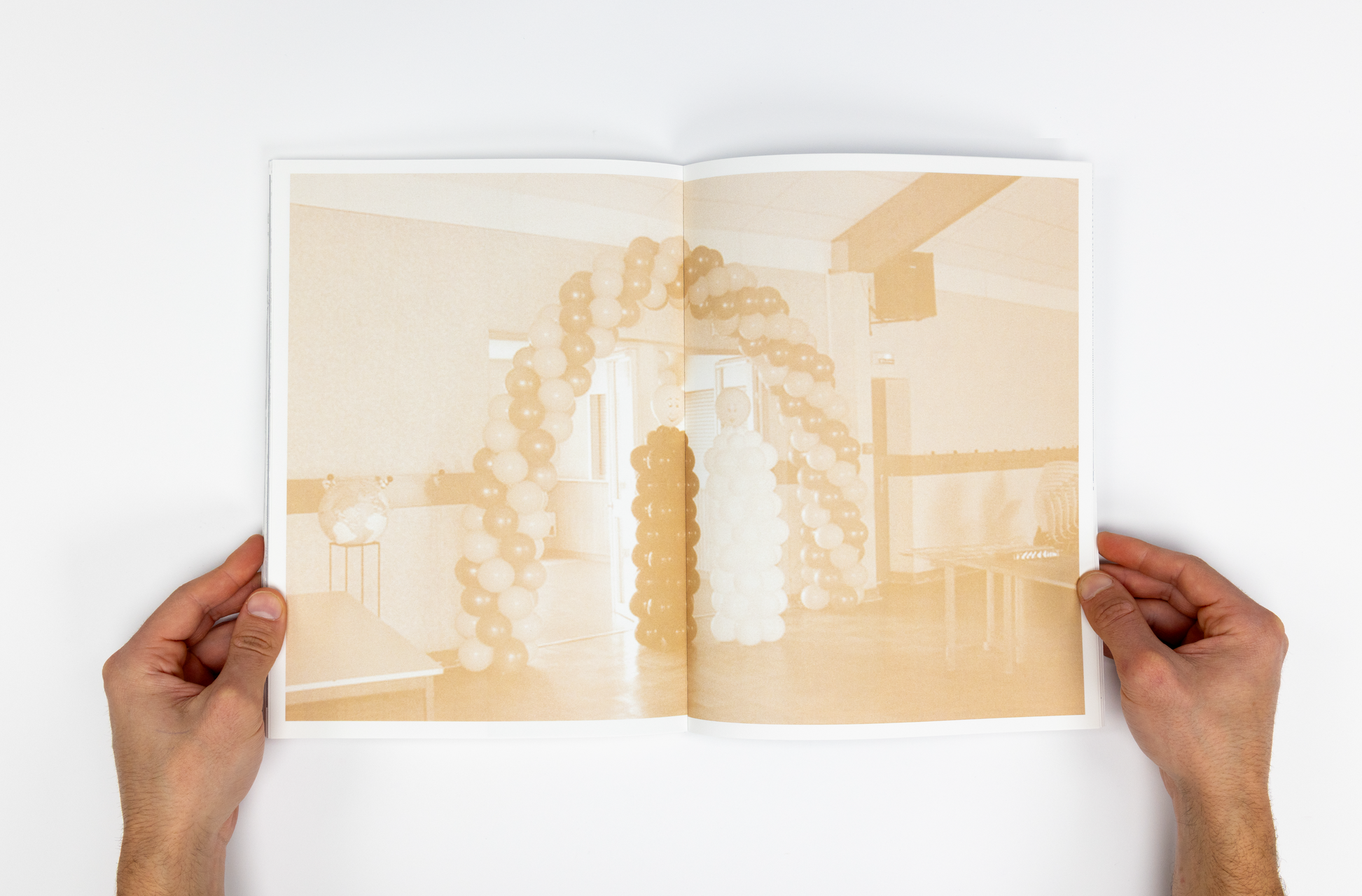
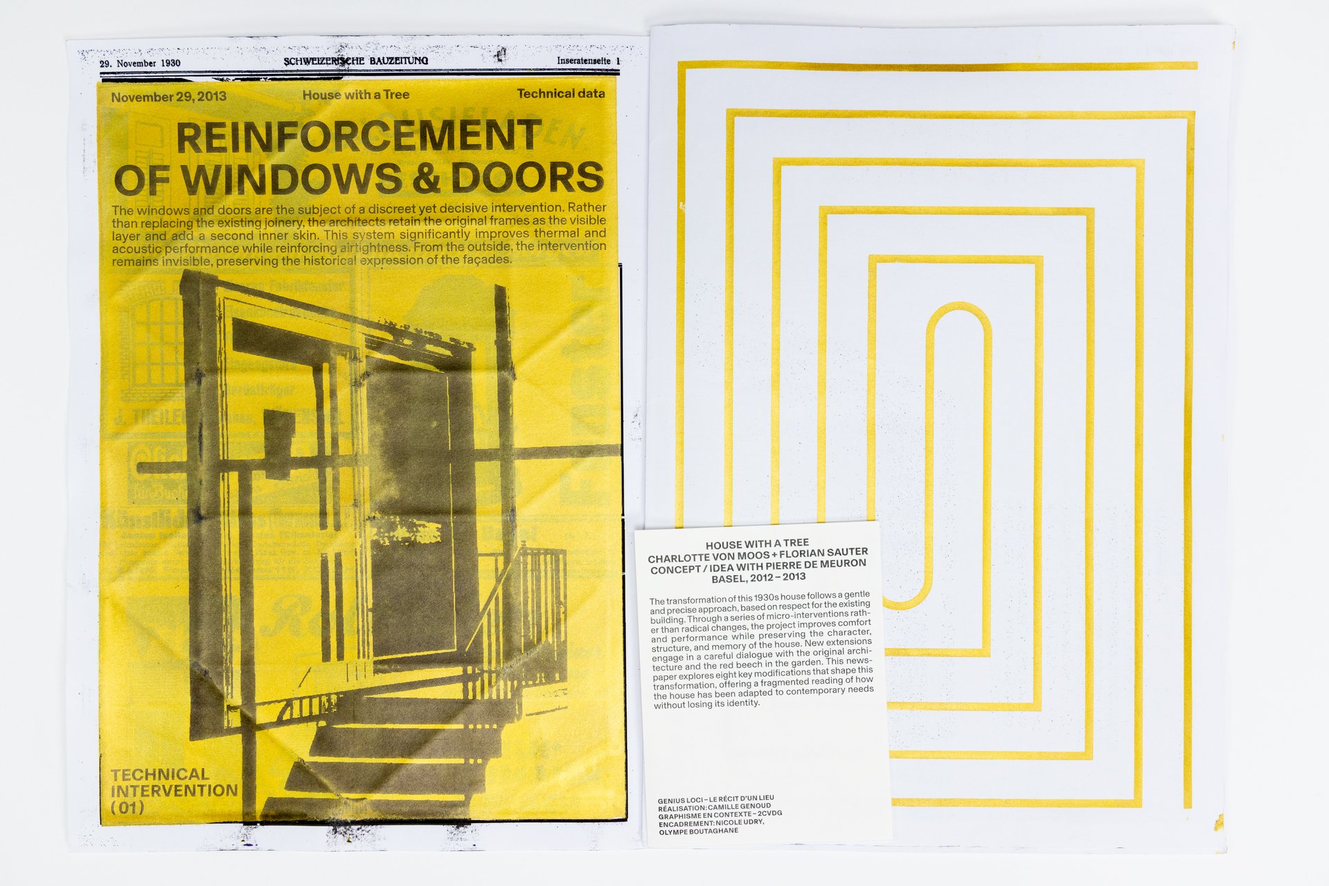
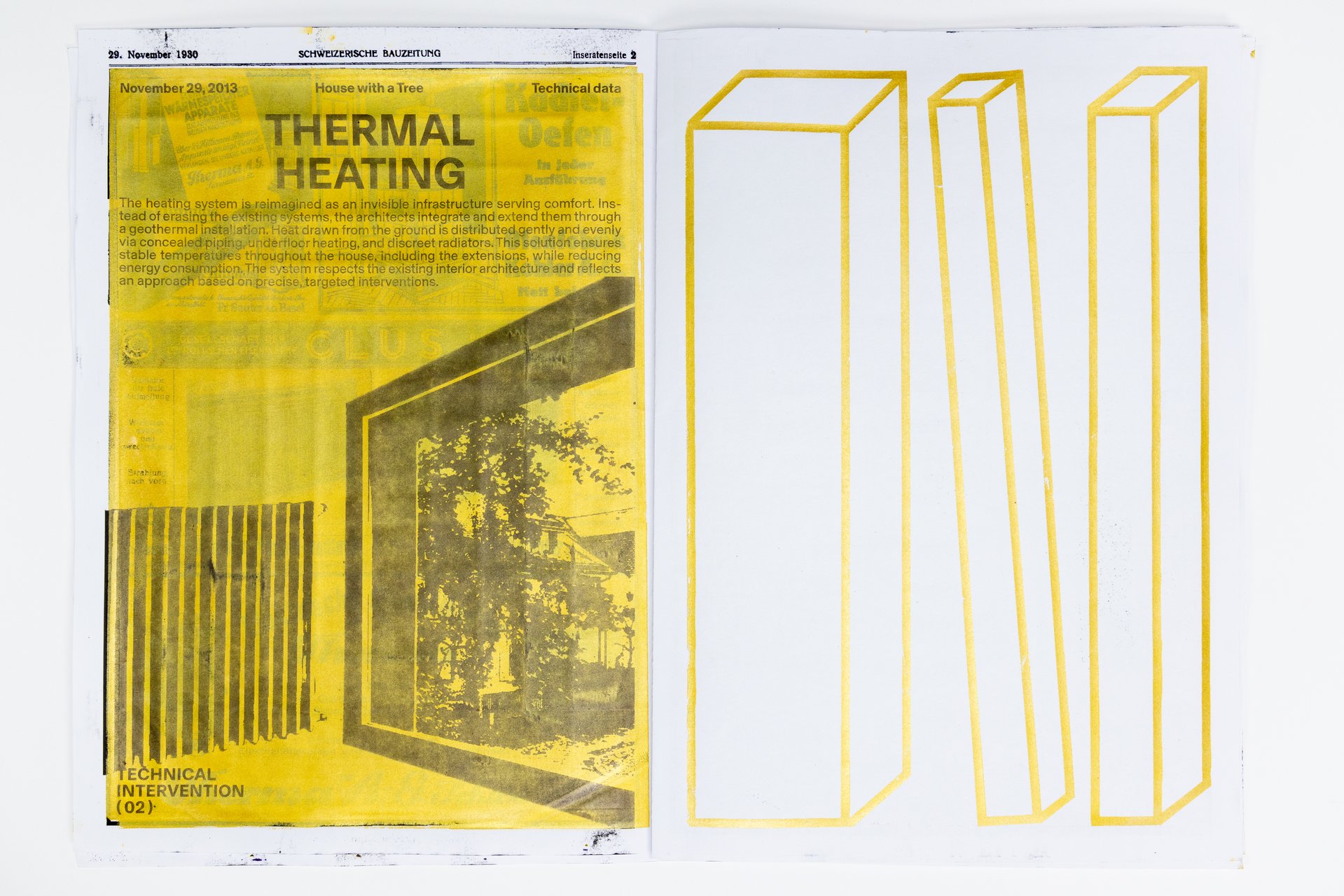
Over five days, students worked in small teams to produce a collective 96-page pocket-sized publication. Each pair created an 8-page photographic visual essay focusing on a specific aspect of labor at ECAL. Rather than relying on traditional portraits, the projects explored more poetic and indirect ways of documenting traces of work through spaces, gestures, materials, and infrastructures. 
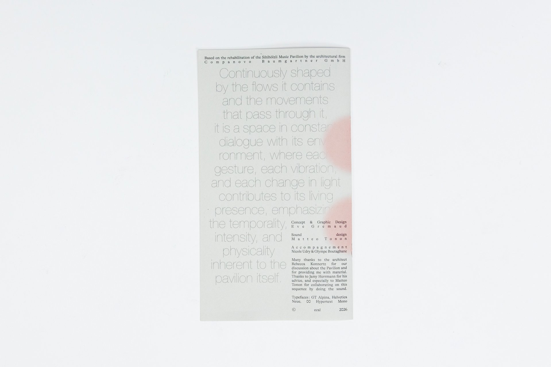
The entire publication was manually printed on an offset press by the students themselves, in either black or red and black. The printing process was a central part of the workshop: participants prepared the plates, set up the press, and ran the prints. This hands-on production process echoed the theme of labor explored throughout the publication.  

Editorial Design – BA2 S1 2025

BA GRAPHIC DESIGN

Editorial Design – BA2 S1 2025

with Diego Bontognali

As part of this editorial design course, students developed a research-based project focused on the selection and design of texts around a shared theme. Based on a curated set of sources, each project presents two editions with identical content, produced in both a large and a small format.

Visual Identity - Cut & Paste  - BA1 S1 2025-2026)

BA GRAPHIC DESIGN

Visual Identity - Cut & Paste - BA1 S1 2025-2026)

with Adeline Mollard

During the visual identity course, the 1st year of the Graphic Design bachelor had to carry out a poster project from a random event. They had to define their own visual system and explored a search for hand-made typographic posters. The visual identity of the event was developed through a poster and a flyer, accompanied by a research notebook grouping their entire creative process.

Related courses