
GRAPHIC DESIGN
Image Creation BA3 – S1 25–26
with Guy Meldem
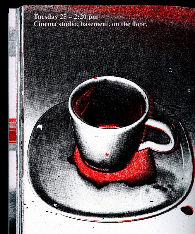
Third-year students had to produce an edition over half a semester, discovering as their subject an event that appeared in the newspaper on the date of the first lesson.
GRAPHIC DESIGN
with Guy Meldem
Third-year students had to produce an edition over half a semester, discovering as their subject an event that appeared in the newspaper on the date of the first lesson.

PHOTOGRAPHY
with Nicolas Poillot
By conceptualizing and producing visual content as part of an editorial series, students will explore the concept of applied photography in a practical, creative, and professional manner, working closely with Art Director Nicolas Poillot.
GRAPHIC DESIGN
PHOTOGRAPHY
with Anouk Schneider Agabekov, Nicolas Polli
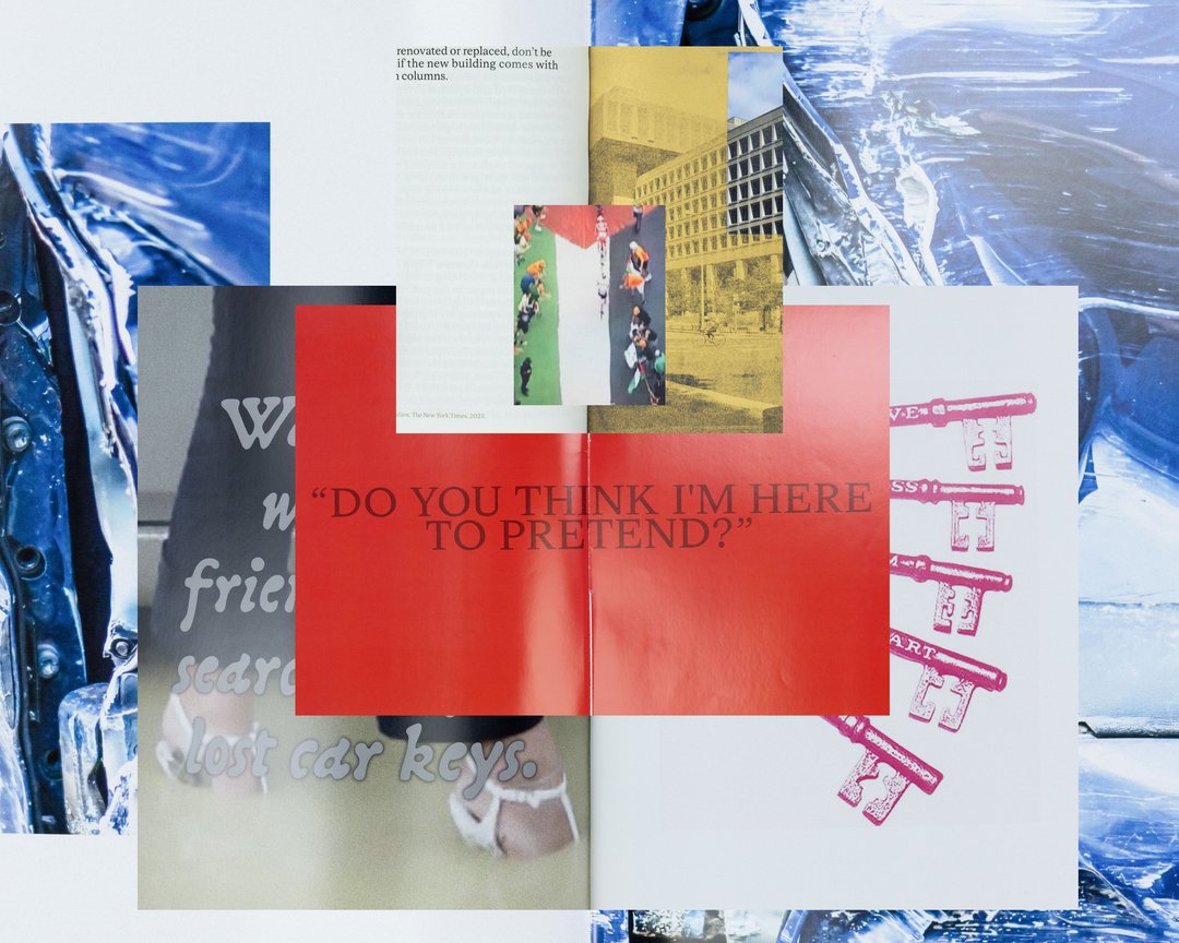
As part of the magazine course led by Anouk Schneider and Emmanuel Crivelli, second-year Visual Communication students had the opportunity to design a magazine during the second semester. Students were encouraged to fully embrace their artistic freedom at every level of creation, whether in terms of format, paper choice, binding, layout, illustration, text, or typography. In this course, the magazine can take shape through various forms of illustration, such as photography, reproduction, contextualization, drawing, 3D, and more. The focus is placed on the author’s artistic vision and the means used to bring it to life. Students take on multiple roles as editor, curator, and architect, assuming the responsibilities of art director, designer, photographer, stylist, illustrator, typographer, editor-in-chief, and editorial secretary. This course highlights contemporary editorial design by exploring the narrative potential of a carefully crafted content sequence.
GRAPHIC DESIGN
with Jonathan Hares
Third-year students had to produce an edition over half a semester, discovering as their subject an event that appeared in the newspaper on the date of the first lesson.

GRAPHIC DESIGN
with Gilles Gavillet
Through the lens of visual identity, this project explores issues related to graphic language and art direction. Each stage of the project examines a different aspect of visual identity development: research, concept, visual language, design, and communication.
GRAPHIC DESIGN
with Nicole Udry
Genius Loci, or the spirit of the place, refers to the unique identity or essence of a location. In architecture, this principle suggests that the specific characteristics of a place should be reflected and extended in a design. In the case of the second-year graphic design students, they have applied this principle to communication projects focused on promoting or extending the identity of a particular place through design. Their work likely explores how to visually capture and communicate the essence of a space, using graphic design elements that resonate with the architectural features or history of the place.
GRAPHIC DESIGN
with Diego Bontognali
As part of this editorial design course, students developed a research-based project focused on the selection and design of texts around a shared theme. Based on a curated set of sources, each project presents two editions with identical content, produced in both a large and a small format.
GRAPHIC DESIGN
by Leandra Adler, Cansu Celen, Layana Comte, Anaïs Dermont, Camille Genoud, Eve Gremaud, Eloïse Guillod, Mathis Harmant, Marie Hintzy, Matteo Lucca, Maxime Manera, Gaëtan Mauclair, Mathys Mauron, Emma Morisseau, Sara Pedersoli, Lucie Pittet, Hélène Prongué, Leonardo Mariucci, Alice Refachinho, Justine Renevey, Gaspard Schlatter, Laura Simons, Vu Toni Thien Duc, Maïa Yassin, Jonas Zesiger
In November 2025, 27 ECAL students took part in Work and Turn, a workshop led by Geoff Han exploring the theme of labor and the often overlooked work that sustains the school. Located in a former IRIL knitwear factory in the industrial area of Renens, ECAL occupies a vast building whose daily functioning depends on many visible and invisible forms of labor. Over five days, students worked in small teams to produce a collective 96-page pocket-sized publication. Each pair created an 8-page photographic visual essay focusing on a specific aspect of labor at ECAL. Rather than relying on traditional portraits, the projects explored more poetic and indirect ways of documenting traces of work through spaces, gestures, materials, and infrastructures. The entire publication was manually printed on an offset press by the students themselves, in either black or red and black. The printing process was a central part of the workshop: participants prepared the plates, set up the press, and ran the prints. This hands-on production process echoed the theme of labor explored throughout the publication.
GRAPHIC DESIGN
with Guy Meldem
First-year students were invited to design a 16-page publication. By experimenting with duotone through various printing techniques, they structured a dual reading experience dependent on the printed colors.

GRAPHIC DESIGN
with Harry Bloch
During the editorial design course with Harry Bloch, the first-year students each laid out a chapter of Charles Dickens' Great Expectations. A final edition compiling all the chapters was produced for the occasion.

GRAPHIC DESIGN
with Adeline Mollard
During the visual identity course, the 1st year of the Graphic Design bachelor had to carry out a poster project from a random event. They had to define their own visual system and explored a search for hand-made typographic posters. The visual identity of the event was developed through a poster and a flyer, accompanied by a research notebook grouping their entire creative process.

PHOTOGRAPHY
with Philippe Jarrigeon
Drawing on Moncler’s Alpine heritage, its timeless style, and its technical mastery, the ECAL Bachelor Photography students developed their own interpretation of the brand’s visual language, blending documentary photography with staged scenes, and merging reality with fiction, under the artistic direction of French photographer Philippe Jarrigeon. As part of Paris Photo 2025, the students’ work was showcased at the Moncler boutique on the Champs-Élysées.
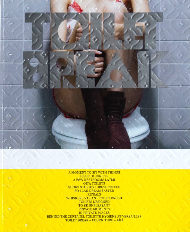
GRAPHIC DESIGN
by Lidia Molina González
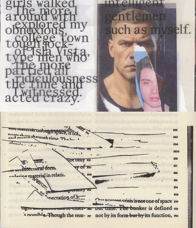
It all started with taking a break. A pause. A moment alone in a shared space: quiet, ordinary, a little strange. Toilets might not be the first place you’d look for big ideas, but that’s why we chose them. Toilet Break uses this overlooked space to explore how we live together, take space, and connect. This first issue is about in-betweens: between public and private, inside and outside. It gathers voices from Switzerland, Belgium, Japan, across generations and practices. A place where ideas circulate freely, where serious things can be said with a wink. A collective and personal space to test new editorial forms, listen more carefully, and believe in detours as a way forward. To take, quite literally, a moment to reflect and sit with things.
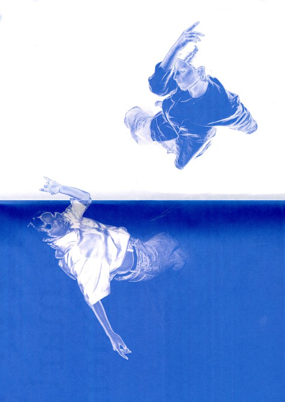
GRAPHIC DESIGN
by Flora Hayoz
FACE À FACE is an exploration of loneliness through two mediums: dance and graphic design. This project brings together two practices to give shape to a hybrid creation. On one hand, a choreographic piece co-choreographed with Gaia Menchini, centred on states of loneliness and then captured on video. The second medium is a publication that extends the piece. By questioning the book as an object, it is designed to be read by two people and becomes a tool for dialogue and listening. The publication thus diverts from its usual uses, creating a sensory experience. The two media interact with each other, inviting us to experience solitude both in movement and in the sharing of reading. Thus, FACE À FACE offers an experience where solitude becomes the starting point for an encounter.
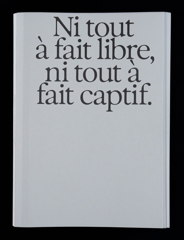
GRAPHIC DESIGN
by Léa Corin
Neither Fully Free, Nor Fully Captive explores the theme of day parole. Through a video installation and a book, this project archives and documents the activities of an association dedicated to reintegration. The projection, conceived as an emotional archive, combines experimental videos with sound testimonies from individuals on day parole supported by the association, revealing the complexity of this transition. The book, as a complement, adopts a documentary and sensitive approach, blending stories and visual creations. This project transcends graphic form to foster social dialogue and shed light on an essential yet often overlooked issue.
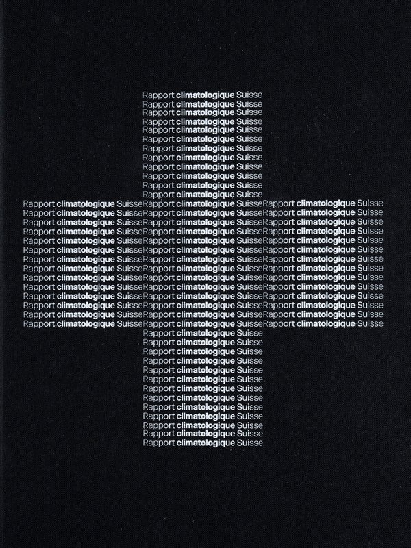
GRAPHIC DESIGN
by Marc Facchinetti
The Swiss Climate Report is an editorial design project that explores climate change through data. Based on recent meteorological records, put into perspective with historical averages sometimes dating back more than 150 years, the book is supported by plugins custom-developed for InDesign. These tools translate scientific data such as temperatures, UV radiation and Dobson units into typographic variations and ASCII forms. This experimental approach offers an alternative reading of climate information. The project offers a raw and precise computer graphics perspective.
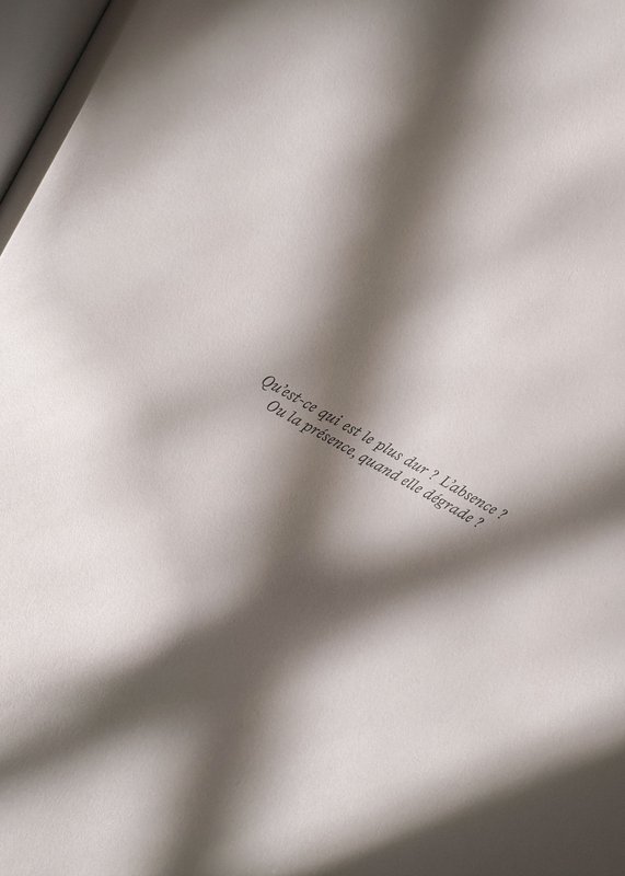
GRAPHIC DESIGN
by Mathilde Driebold
This book exists for what remains of us—and perhaps, of you. Fragments of an intimate past inscribed in, and lost within, a social context that goes beyond us. This diploma project takes the form of an editorial narrative, blending personal stories and social archives. Through this work, I explore the traces left by addiction within a family setting, bringing individual and collective memory into dialogue. Ce qu'il reste de nous also demonstrates that graphic design can be used as a tool to question social realities, give shape to sensitive subjects, and break the silence.
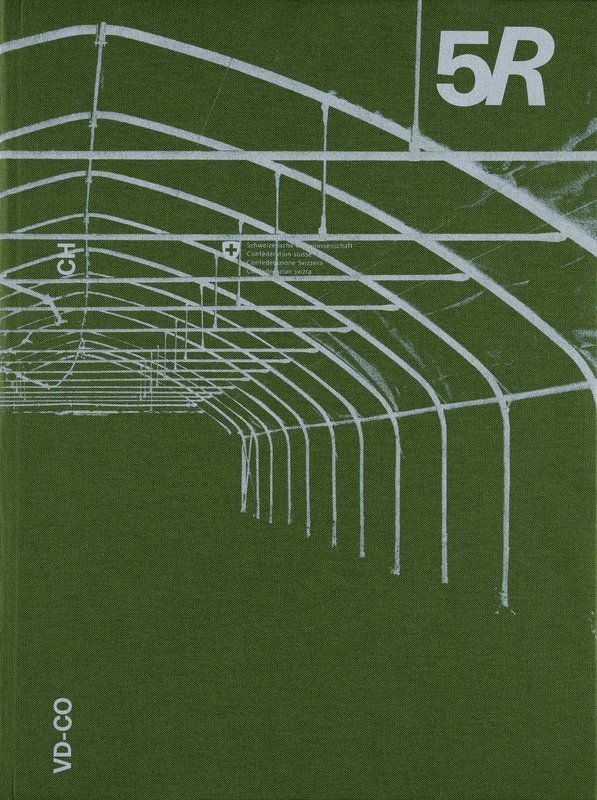
GRAPHIC DESIGN
by Coraline Beyeler
5R is a documentary book explores the contrast between urban and rural agriculture, focusing on developments driven by new generations. It addresses issues related to pollution as well as social, health, and economic challenges.
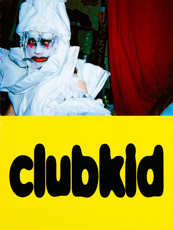
GRAPHIC DESIGN
by Constance Mauler
My project explores the Club Kid scene. Born in the 1980s in New York, this movement emerged as a radical response to artistic and social elitism. Led by queer and marginalized individuals, it transformed nightlife into a space of freedom, resistance, and self-invention. This publication aim to create a dialogue between the original generation of Club Kids and the contemporary scene, to show how this movement continues to challenge norms, invent new codes, and assert liberated identities. An immersion into a flamboyant and deeply political subculture.
GRAPHIC DESIGN
by Amélie Bertholet
a room of our own is an editorial project born from the relationship between my flatmate, Flavia, and myself. This book explores how a relationship lives and evolves within a shared space: our apartment. Often seen as a transitional phase, cohabitation here becomes a long-term space of emancipation and sisterhood. Nurtured by feminist references—beginning with its title, borrowed from "A Room of One’s Own" by Virginia Woolf—the project questions the place of women within spaces of creation and intimacy. Through symmetry and collection, the book translates the experience of a lived space into an editorial object. The layout's grid, drawn from the apartment’s floor plan, creates shifts in scale and layout to reflect the transformation of 3D space into the 2D printed page.
TYPE DESIGN
by Stephanie Wilson
Iconic stands at the intersection of typography, social research, and inclusive design. It addresses a growing concern: making reading more accessible for senior readers. Through the development of a typeface named Iconic, the project aims to enhance reading comfort while offering an aesthetic, functional, and adaptable typeface suited to the changes associated with aging. The project was created in collaboration with senior-lab, a Swiss platform dedicated to enhancing the quality of life for seniors. Grounded in a participatory methodology, this collaboration enabled a reality-based approach: available in serif, sans serif, sans semibold, and italics, Iconic was designed based on feedback and testimonials gathered from seniors during sessions held at ECAL.

GRAPHIC DESIGN
with Nicole Udry
Genius Loci, or the spirit of the place, refers to the unique identity or essence of a location. In architecture, this principle suggests that the specific characteristics of a place should be reflected and extended in a design. In the case of the second-year graphic design students, they have applied this principle to communication projects focused on promoting or extending the identity of a particular place through design. Their work likely explores how to visually capture and communicate the essence of a space, using graphic design elements that resonate with the architectural features or history of the place.

GRAPHIC DESIGN
with Diego Bontognali
Development of an editorial system deployed across three publication formats, centered on the theme of prohibition.

GRAPHIC DESIGN
with Adeline Mollard
During the visual identity course with Adeline Mollard, the students had to develop an identity project promoting a collection chosen by them. Each project includes the design of a catalogue contextualising and presenting the collection, together with the design of a poster.

GRAPHIC DESIGN
with Guy Meldem
In the age of social media, Instagram has become a true space for graphic experimentation. This semester, first-year Graphic Design students created a printed edition of at least 100 pages, exploring the question: what does it mean to design for Instagram? Through this investigation, they examined the platform’s visual codes, its attention-driven dynamics, and the graphic forms it inspires. Each project reflects on how these creations can be translated, extended, or reinterpreted in the digital space. Balancing printed matter and online presence, these works outline new ways of inhabiting both images and networks.

MEDIA & INTERACTION DESIGN
PHOTOGRAPHY
with Giliane Cachin
As part of the course given by Giliane Cachin, 1st year students are required to produce an edition by examining the different axes that make it up. The course offers a study of various grid systems and the fundamentals of micro-typography. During the semester, students will look for the best way to structure and arrange the content they have chosen (or which has been assigned to them, depending on the semester's data). Some essential rules to know in terms of printing and bindings will be reviewed at the end of the semester, in order to bring the conceptualized object to life.
GRAPHIC DESIGN
MEDIA & INTERACTION DESIGN
PHOTOGRAPHY
with Anouk Schneider Agabekov, Emmanuel Crivelli
As part of the magazine course led by Anouk Schneider and Emmanuel Crivelli, second-year Visual Communication students had the opportunity to design a magazine during the second semester. Students were encouraged to fully embrace their artistic freedom at every level of creation, whether in terms of format, paper choice, binding, layout, illustration, text, or typography. In this course, the magazine can take shape through various forms of illustration, such as photography, reproduction, contextualization, drawing, 3D, and more. The focus is placed on the author’s artistic vision and the means used to bring it to life. Students take on multiple roles as editor, curator, and architect, assuming the responsibilities of art director, designer, photographer, stylist, illustrator, typographer, editor-in-chief, and editorial secretary. This course highlights contemporary editorial design by exploring the narrative potential of a carefully crafted content sequence.
FOUNDATION YEAR
with Tatiana Rihs, Violène Pont
Semester 1 Course with Tatiana Rihs: Visual Identity Course with Violène Pont: Flyers for an event Semester 2 Course with Violène Pont: Bookmark and animation for an event

GRAPHIC DESIGN
MEDIA & INTERACTION DESIGN
PHOTOGRAPHY
with Angelo Benedetto, Vincent Jacquier, Pauline Saglio, Calypso Mahieu
During the Service Design course, the 3rd year of the Graphic Design, Photography and Media & Interaction Design bachelors had to create multi-media projects. A collaboration of the Visual Communication department which had as subject the SDGs (*Sustainable Development Goals). The theme was called "For a good cause, make the SDGs a reality" and its objective was to allow students to develop a cause that is close to their hearts. Each project consists of at least two different media, one primary and one secondary. These projects could take any form that the students deemed relevant, be it a website, editions, posters, a video sequence or virtual reality.

GRAPHIC DESIGN
PHOTOGRAPHY
with Anouk Schneider Agabekov, Nicolas Polli
As part of the editorial design course led by Anouk Schneider and Nicolas Polli, second-year Visual Communication students had the opportunity to design an artist’s book during the first semester. This book project stands out for its contemporary approach, aiming to create an editorial object that harmoniously integrates form and content within today’s publishing landscape. Students were encouraged to fully embrace their artistic freedom at every stage of the creative process—whether in terms of format, paper choice, binding, layout, illustrations, text, or typography. Within this course, the artist’s book can take shape through various modes of illustration, such as photography, reproduction, contextualization, drawing, 3D, and more. The emphasis is placed on the author’s artistic vision and the means implemented to bring it to life. Students take on multiple roles as editor, curator, and architect, thereby covering the responsibilities of art director, designer, photographer, stylist, illustrator, typographer, editor-in-chief, and copy editor. This course highlights contemporary editorial design by exploring the narrative potential of a carefully constructed content sequence.

PHOTOGRAPHY
with Charlotte Krieger
SCREENPLAY This course introduces students to the creation of a seven-image series built around the theme Screenplay. They will learn to combine set design, characters, and lighting to produce strong, coherent staged images. Through a practical and technical approach, the course develops their ability to conceive and manage a complete photographic project, direct models, work with natural and artificial light, and collaborate under conditions similar to professional editorial or commercial shoots. Students will refine their photographic vision while preparing for the creative and technical demands of the industry.

GRAPHIC DESIGN
with Harry Bloch
During the editorial design course with Harry Bloch, the 1st year students developed, during the fall semester, an edition around a personal survey.

GRAPHIC DESIGN
with Adeline Mollard
During the visual identity class, first-year Bachelor's students in Graphic Design were tasked with creating a poster project based on a randomly assigned event. They had to define their own visual system and explore a series of hand-drawn typographic posters. The visual identity of the event was developed through a poster and a flyer, accompanied by a research booklet documenting their entire creative process.

MEDIA & INTERACTION DESIGN
PHOTOGRAPHY
with Giliane Cachin
As part of the course given by Giliane Cachin, 1st year students are required to produce an edition by examining the different axes that make it up. The course offers a study of various grid systems and the fundamentals of micro-typography. During the semester, students will look for the best way to structure and arrange the content they have chosen (or which has been assigned to them, depending on the semester's data). Some essential rules to know in terms of printing and bindings will be reviewed at the end of the semester, in order to bring the conceptualized object to life.

GRAPHIC DESIGN
with Jonathan Hares
The third-year students had to produce an edition over half a term, choosing as their subject an event that had appeared in the newspaper on the date of the first lesson.

with Jonas Berthod, Davide Fornari
This project investigates the work of the graphic designer and artist, Warja Lavater, an internationally recognised Swiss graphic designer, illustrator, bookmaker, filmmaker and artist.
GRAPHIC DESIGN
with Guy Meldem
Third-year students had to complete an image creation project based on a free subject and medium.

GRAPHIC DESIGN
with Diego Bontognali
This editorial project, "1 dépêche, 10 secondes, 100 pages", is divided into three formats: the book, the poster, and the animation. The students are tasked with creating content and defining an editorial line based on a current news dispatch or brief.

GRAPHIC DESIGN
with Nicole Udry
Genius Loci, or the spirit of the place, refers to the unique identity or essence of a location. In architecture, this principle suggests that the specific characteristics of a place should be reflected and extended in a design. In the case of the second-year graphic design students, they have applied this principle to communication projects focused on promoting or extending the identity of a particular place through design. Their work likely explores how to visually capture and communicate the essence of a space, using graphic design elements that resonate with the architectural features or history of the place.

PHOTOGRAPHY
with RVB Books/Matthieu Charon & Rémi Faucheux
Using pre-produced images, the students created one or more book models. How do you transform a series of photographs into a book? The Photographic Editions course introduces students to the selection of images, their order, format, graphics, ink, paper and binding. It addresses the specificities of the book as a medium and as a market.

GRAPHIC DESIGN
with Adeline Mollard
During the visual identity course with Adeline Mollard, the students had to develop an identity project promoting a collection chosen by them. Each project includes the design of a catalogue contextualising and presenting the collection, together with the design of a poster.

GRAPHIC DESIGN
with Diego Bontognali
The semester project consists of two editions with identical content but different formats. Construct content from a news report, to produce two editions.

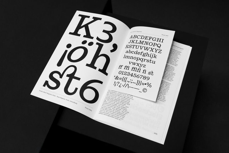
GRAPHIC DESIGN
with Robert Huber
Type design research and developmen displayed on a specimen.

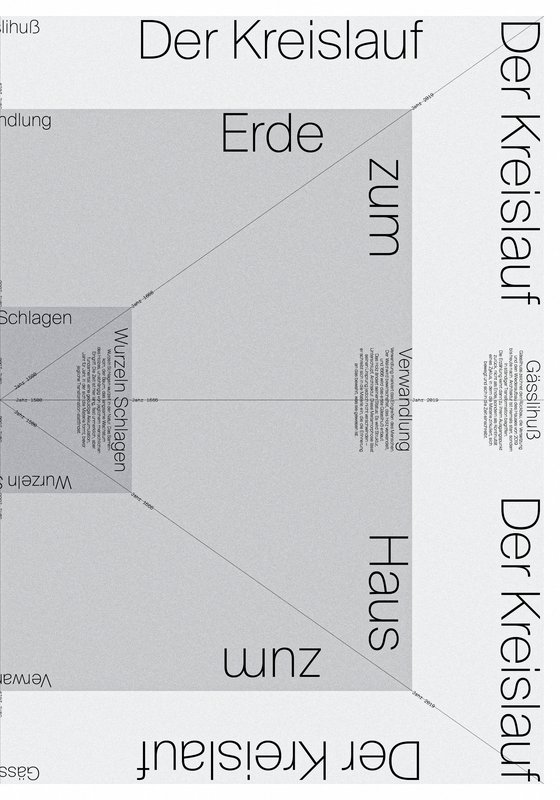
GRAPHIC DESIGN
with Nicole Udry
Beyond questions of functionality, comfort and individual or collective well-being, the built environment is capable of responding in a stimulating way to societal, energy and environmental challenges. Workplaces, homes, public spaces, interiors and streets are all driven by real statements of intent that motivate their design. The 2nd year Graphic Design students worked on a communication based on one of these principles (or others) and on the architectural creation that refers to it in order to promote it.

GRAPHIC DESIGN
with Adeline Mollard
During the visual identity course, the 2nd year Graphic Design bachelors had to produce a communication project based on a translation. They had to define their own translation system and develop a visual language based on these rules.

GRAPHIC DESIGN
MEDIA & INTERACTION DESIGN
PHOTOGRAPHY
with Anouk Schneider Agabekov, Chi-Long Trieu
As part of the publishing course led by Anouk Schneider and Chi-Long Trieu, 2nd year Visual Communication students had the opportunity to design an artist's book during the first semester. This book project stands out for its contemporary approach aimed at creating an editorial object that harmoniously integrates form and content in the current context of the editorial landscape. Students were encouraged to exploit their artistic freedom at all levels of creation, whether in terms of format, choice of paper, binding, layout, illustrations, text or typography. As part of this course, the artist's book can take shape through various illustration modalities, such as photography, reproduction, contextualization, drawing, 3D, etc. The emphasis is on the author's artistic vision and the means implemented to realize it. Students take on multiple roles as editor, curator and architect, covering the responsibilities of artistic director, designer, photographer, stylist, illustrator, typographer, editor-in-chief, and editorial secretary. This course highlights contemporary editorial design by exploring the narrative potential of a sequence of controlled content.

MEDIA & INTERACTION DESIGN
PHOTOGRAPHY
with Giliane Cachin
As part of the course given by Giliane Cachin, 1st year students are required to produce an edition by examining the different axes that make it up. The course offers a study of various grid systems and the fundamentals of micro-typography. During the semester, students will look for the best way to structure and arrange the content they have chosen (or which has been assigned to them, depending on the semester's data). Some essential rules to know in terms of printing and bindings will be reviewed at the end of the semester, in order to bring the conceptualized object to life.

GRAPHIC DESIGN
MEDIA & INTERACTION DESIGN
PHOTOGRAPHY
with Angelo Benedetto, Vincent Jacquier, Pauline Saglio, Calypso Mahieu
During the Service Design course, the 3rd year of the Graphic Design, Photography and Media & Interaction Design bachelors had to create multi-media projects. A collaboration of the Visual Communication department which had as subject the SDGs (*Sustainable Development Goals). The theme was called "For a good cause, make the SDGs a reality" and its objective was to allow students to develop a cause that is close to their hearts. Each project consists of at least two different media, one primary and one secondary. These projects could take any form that the students deemed relevant, be it a website, editions, posters, a video sequence or virtual reality.

GRAPHIC DESIGN
with Guy Meldem
During the Image Creation course with Guy Meldem, students explored the benefits of AI. Feeding the machine with their own illustrative style, they were able to generate a certain quantity of images, enabling them to produce a graphic novel, a collection of images or other types of illustrated editorial work.

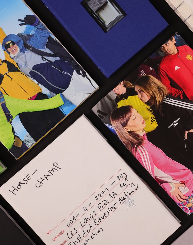
PHOTOGRAPHY
with Nicolas Poillot
The "Commission & Photography" course aims to conceptualize and produce visual content for an editorial series, emphasizing applied photography and collaboration with an Art Director. It allows students to explore various photographic territories such as editorial, documentary, fashion, still life, and fiction. Objectives include understanding editorial commissions, conceptualizing and presenting ideas, as well as effectively collaborating with an Art Director. Students are required to produce a series of images while adhering to the given theme and constraints, while also developing preliminary research, a structured methodology, series architecture, and finding solutions to creative problems encountered. The theme involves each student selecting and photographing three personal objects that are particularly meaningful to them.