GRAPHIC DESIGN
Type Design BA2 – S2 2026
with Aurèle Sack
Second-year students were required to develop the whole alphabet for one typeface.
GRAPHIC DESIGN
with Aurèle Sack
Second-year students were required to develop the whole alphabet for one typeface.

GRAPHIC DESIGN
with Aurèle Sack
The third-year students had to develop a typeface and digitize it.
GRAPHIC DESIGN
with Aurèle Sack
Second-year students were required to manually develop the lowercase letters of two typefaces.

GRAPHIC DESIGN
with Aurèle Sack
The second-year students had to vectorize a typeface they had drawn last semester.

GRAPHIC DESIGN
with Aurèle Sack
The second-year students had to develop the lower-case letters of two display fonts by hand.

GRAPHIC DESIGN
with Aurèle Sack
Third-year students had to develop a typography and digitise it.

GRAPHIC DESIGN
with Aurèle Sack
The second-year students had to develop the lower-case letters of two display fonts by hand.

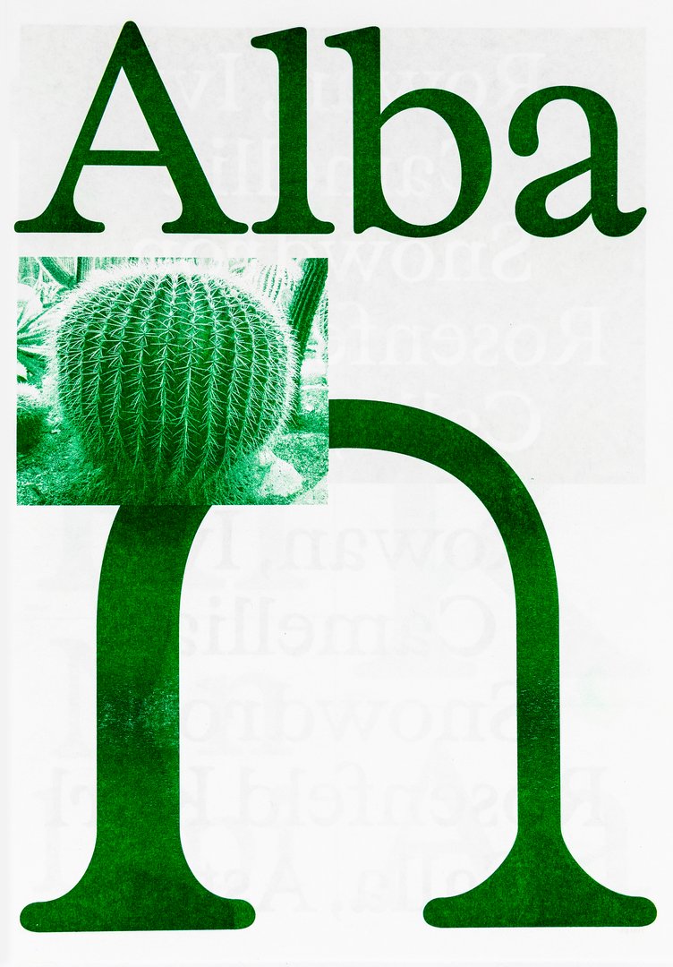
GRAPHIC DESIGN
with Aurèle Sack
Type design displayed on a specimen.

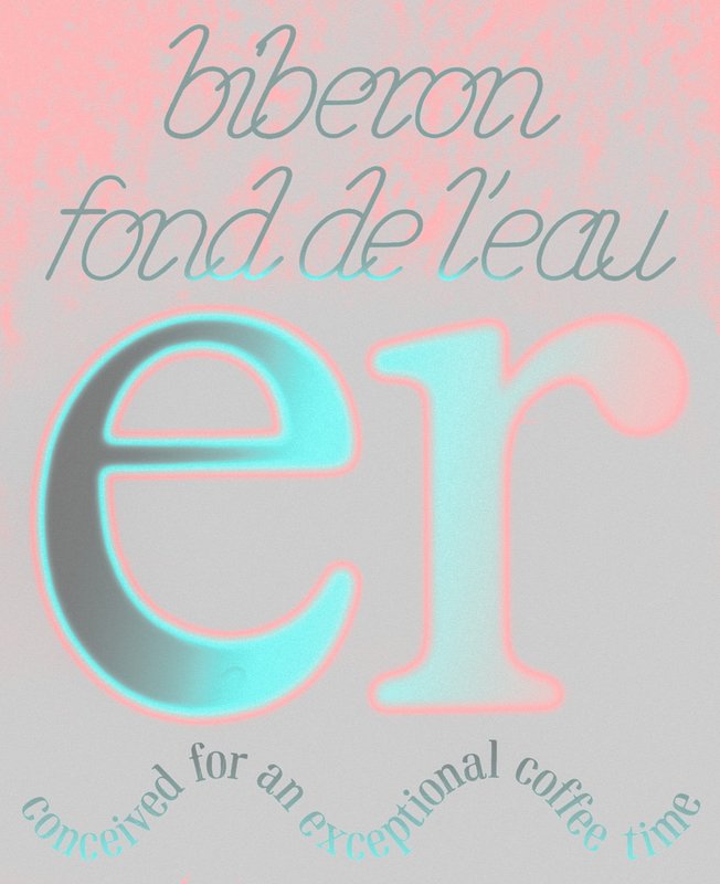
GRAPHIC DESIGN
with Aurèle Sack
The second-year students had to develop the lower-case letters of two display fonts by hand.

GRAPHIC DESIGN
with Aurèle Sack
Type design displayed on a specimen.

GRAPHIC DESIGN
with Jonathan Hares, Aurèle Sack
Yours to Play and Win is a typeface promotion project on the theme of chess. Letters, just like the game’s pieces, are symbols which become meaningful once they have been activated by abstract human activity, i.e. thought. Referring to Duchamp, the ideographic representations of the cognitive process show their real potential, which goes beyond plain visual organisation. The font belongs to the Egyptian family, which hints to a modern mechanism, while honouring craftsmanship with the serifs. The monocase proportions adapt to the game’s modular elements and the rounded edges add an organic quality to recall the human mind. The text showcases the game’s principles and the ideas as a way to demonstrate the project’s message.

GRAPHIC DESIGN
with Nicole Udry, Aurèle Sack
A flower is not just a flower, it is all living beings that depend on it to bloom. In the context of the biodiversity crisis, this book is a response to Gilles Clément's manifesto The Third Landscape. The landscaper calls for the revaluation of the spaces along our roads of cities. Between over-urbanisation and excessive agricultural monoculture, these forgotten marginal spaces are recolonised by pioneering, wild flora, regenerating ecosystems that are rich in biodiversity. Unlike the herbarium, which proceeds by fragmentary analysis, this project analyses relationships between living beings. Wild Tales is a book of atmospheric illustrations that invites us to draw from the varied colours and shapes of this space as well as the wild stories that make it up.

GRAPHIC DESIGN
with Aurèle Sack, Guy Meldem
Baraonda is a playful system designed to help run creative activities. The workshop is based on a wheel of fortune made up of several circles that determine the characteristics and rules that will be put in place. Nine stages have been devised, starting with the widest circle and working down to the narrowest. A working theme is determined, followed by a technique, different materials, colours, and so on. In addition to the series of circles, I developed various materials to support the workshops: wooden stencils, a collection of images and self-adhesive letters. The development of the project and the results of the activities carried out in primary school classes in Lausanne have been brought together in a printed edition. The whole package comes in a cloth-covered cardboard box.

GRAPHIC DESIGN
with Aurèle Sack, Jonathan Hares
Coemeter offers a reinterpretation of the Trajan typeface. This font is rich in history, from the Roman stones on which it first appeared to its various contemporary adaptations in stone engraving, predominantly found on funerary monuments in the Western world. This typographic work is showcased on a website. A digital cemetery awaits, where you can engrave your tombstone and personalise your mourning space. Coemeter plays on dualities, i.e. the sacred and the profane, history and anachronism, matter and consciousness. This unpretentious and poetic experience invites us to reconsider our connection with stone, memory and loss.

GRAPHIC DESIGN
with Aurèle Sack, Gilles Gavillet
Influenced by the rise of the metaverse, Varia is a metaphor of the early failure and absurdity of this technology, as well as research about typographic shapes. Mimicking the optimisation phenomena of object in 3D engines (Level of Detail), Varia is composed of three cuts of the same name: 0, 4, 8. While Level 0 seems closer to traditional typography, it is in fact a “smoothed out” version of the previous cuts, which already seeks to synthesise letters down to their most rudimentary forms. From the rigidity of the shapes, the existential constraints that the research brings to light illustrate the retrograde and dystopian vision of the metaverse, while at the same time offering a reassuring reflection of a future geometric transition of our bodies.

GRAPHIC DESIGN
with Aurèle Sack, Diego Bontognali
Ici Prochainement Votre Appartement is the transition from private property to public space. On the eve of moving out of the family home, but especially in view of its imminent demolition, I have placed La Maison (The House) in a brand-new space, i.e. a book. This book, more than a personal monologue, is an invitation to enter through text and image. From the gate to the garden to the door, all the way to the attic, where the library lies. Iconography drawn from this library has an impact on the layout of the entire volume. The space of the book is my playground. The quarto format conceals half of the content between the pages. It is up to the readers to decide whether or not they want to enter each room of La Maison when they visit. Welcome to my home, soon to be yours…

GRAPHIC DESIGN
with Diego Bontognali, Aurèle Sack
Is what we see real or subjective? Interpretation is always the result of individual apprehension. This is why space can be manipulated to exacerbate desired relationships. In connection with the perception of our environment, this work examines the principle of anamorphosis generated by typographic typefaces designed in three dimensions. Fluctuating between letters and abstraction, these visual structures offer different degrees of legibility depending on the point of view adopted.

GRAPHIC DESIGN
with Aurèle Sack
Type design displayed on a specimen.

GRAPHIC DESIGN
with Aurèle Sack
Type design displayed on a specimen.

GRAPHIC DESIGN
with Aurèle Sack

GRAPHIC DESIGN
with Aurèle Sack
Type design displayed on a specimen.

GRAPHIC DESIGN
with Aurèle Sack

GRAPHIC DESIGN
with Aurèle Sack
Type design displayed on a specimen.

GRAPHIC DESIGN
with Guy Meldem, Aurèle Sack
Blackest Ever Black, a British record label, announced it was shutting down in 2019. This project pays tribute to the label through a post-mortem cassette reissue of its ten most outstanding musical releases. These feature two levels of information, a listing of how the tracks make the listeners feel and the barely visible metadata of the releases. The font used is my revival of a typographic drawing by Peter Behrens, which, just like the label did, enables me to take things from the past and make them contemporary.

GRAPHIC DESIGN
with Diego Bontognali, Aurèle Sack
Mention Excellent “La librairie magique” features an optimised reading experience for dyslexic children thanks to a website. The project offers modular personalisation of the texts using the “Dyslexia Variable” font as well as many specific functions to meet their needs. In order to provide ideal reading comfort, the site enables users to adjust the form, the differentiation of letters between them and the layout of the texts. It opens up a new path to provide these children with better access to reading and to help them enjoy it.

GRAPHIC DESIGN
with Guy Meldem, Aurèle Sack
“Riondaz Colours” is a range of inks made from natural and local products for screen printing. The inks are created in a laboratory located west of Veyras in the district of Sierre in central Valais. Some of the products used in these inks come from the garden next door. The others are available locally, which means within a radius of fifty kilometres.

GRAPHIC DESIGN
with Aurèle Sack, Nicole Udry
Rohny is back & horny! Attractive, spiky yet smooth. Genuine stunner. 16 styles. Geared 4 action. Skinny 2 xtra large. L B R M SBL BL EBL & BLK. Can be tilted. 500 glyphs/style. Well-equipped. Non-binary, chat on paper & screen. Versatile and Latin. Connoisseurs only. Take me anywhere. Soon ready in xtreme & low contrast. Born in the USA. Previous location: 606–614 Sansom Street, Philadelphia. For an experience you won’t forget. Contact me at rohny20@icloud.com for a good deal.

GRAPHIC DESIGN
with Aurèle Sack

GRAPHIC DESIGN
with Aurèle Sack

GRAPHIC DESIGN
with Guy Meldem, Aurèle Sack
Ripley considers how to optimize legibility in an on-screen environment; the idea is to transpose the legibility rules of body text from print to new media. This typeface is a toolbox that combines a multitude of axes to provide the reader with ideal reading comfort. Furthermore, the font itself is programmed to respond to light sources. It adapts to ambient surrounding light changes throughout the day, increasing readability, in order to protect the reader from eye strain. This project confirmed my ambition to continue my career in the fi eld of typography.

GRAPHIC DESIGN
with Jonathan Hares, Aurèle Sack
Mundaka is a family of fonts inspired by the expressive and vernacular forms of Basque fonts. Originating from a pre-Antiquity language that remains the last living isolate and the oldest language in Western Europe, Basque typography embodies the local identity. Halfway between regionalism and global openness, Mundaka questions the notion of heritage and its cultural propagation in a globalised era. I found it very motivating to work in this cultural context and to get to grips with these specific fonts; this experience has given me ideas for the future.

GRAPHIC DESIGN

GRAPHIC DESIGN
with Aurèle Sack

GRAPHIC DESIGN
Type design displayed on a specimen. Second year course supervised by Aurèle Sack.

GRAPHIC DESIGN
with Aurèle Sack
Type design displayed on a specimen. Second year course supervised by Aurèle Sack.

GRAPHIC DESIGN
with Aurèle Sack
Type design displayed on a specimen. Third year course supervised by Aurèle Sack.

GRAPHIC DESIGN
with Guy Meldem, Aurèle Sack
«I believe in the country America used to be. I believe in the person I want to become, I believe in the freedom of the open road. Who are you? Are you in touch with all of your darkest fantasies? Have you created a life for yourself where you’re free to experience them? I have. I am fucking crazy.» My project is a bootleg of the album Sirens, by May Jailer, an american folk singer.

GRAPHIC DESIGN
with Nicole Udry, Aurèle Sack
Permanent Culture is a guide about Permaculture, which is a systemic and global method of conceiving agricultural systems and housing environments, but also any other systems, inspired by natural ecology, biomimicry and tradition. The challenge of the publication was to promote this new method of economical, social and cultural organisation. Through the book, Graphic Design and Permaculture meet, creating links on hierarchy, organisation and optimisation of space.

GRAPHIC DESIGN
with Aurèle Sack, Guy Meldem
Misophonia is an hypersensitivity to a certain type of trigger sounds. The rage and the distress that it provokes are extremely violent and sudden. It is hard for somebody who doesn't have the condition to understand this suffering. «Misophonia» carries the reader into nine concrete situations of crisis, mixing both the narrative aspect and the expression of the extreme sensations experienced by the misophones. This graphic novel hopes to allow their surroundings to have a better understanding of the disorder as well as to invite the Misophones to identify themselves in the illustrated cases.

GRAPHIC DESIGN
with Gilles Gavillet, Jonathan Hares, Aurèle Sack
27.03.1977 ((1706:50)) aims to analyse forty years later, the different factors which led to the deadliest accident in aviation history—the Tenerife Airport Disaster—which occured in Los Rodeos Airport, in March 27, 1977 in the Canary Islands, in Spain. Gathering official and documentary sources of references, it is a visualization of the interferences, present under multiple sorts: temporal, visual, behavioral and audio. We wish by this book not only to investigate factors of danger in aeronautics, but also to shape a better future for Aviation Security and Air Traffic Control.

GRAPHIC DESIGN
with Gilles Gavillet, Jonathan Hares, Aurèle Sack

GRAPHIC DESIGN
with Gilles Gavillet, Jonathan Hares, Aurèle Sack

GRAPHIC DESIGN
with Aurèle Sack
The students had to choose an event and make an editorial project.

GRAPHIC DESIGN
with Aurèle Sack
Tavail sur le thème du rituel.

GRAPHIC DESIGN
with Aurèle Sack
Après s’être vu attribuer une année, les étudiants ont dû choisir un événement et en faire un projet éditorial. Format imposé, une police de caractères, une couleur.