Rocklub 

Alexandre Grognuz – Rocklub 

Through my diploma work, I became interested in creating a visual identity for a rock club. So I thought about the kind of support a club needed. This is how I began production of a newspaper that goes out every month and contains the programme of events and concerts. I also found it interesting to make posters that would be used as a communication support for the club. Creating the newspaper, I therefore anticipated that if one removes the staples, the newspaper turns into posters. It has a dual utility (programme and posters) to better encounter the needs of a music club. To avoid having too smooth a visual identity, and therefore to have something that matches with to the place I chose, I started to create a typography by hand using the photocopy machine and a cutter. I cut shapes and letters in order to create a typeface. This technique allowed me to experiment and discover new forms. So I kept this technique for the creation of the newspaper and posters. I tried to take advantage of the photocopy machine and paper cutter, and to turn the defects, disadvantages and contingencies of both techniques into assets. I really love this technique which allowed me to work differently and as little as possible with my computer. A technique which allowed me to experiment and discover more things with very few props. Alexandre Grognuz

Diploma project (2012) by Alexandre Grognuz

1/2

Projets similaires

Contextual Design – BA2 S2 2026

BA GRAPHIC DESIGN

Contextual Design – BA2 S2 2026

with Adeline Mollard

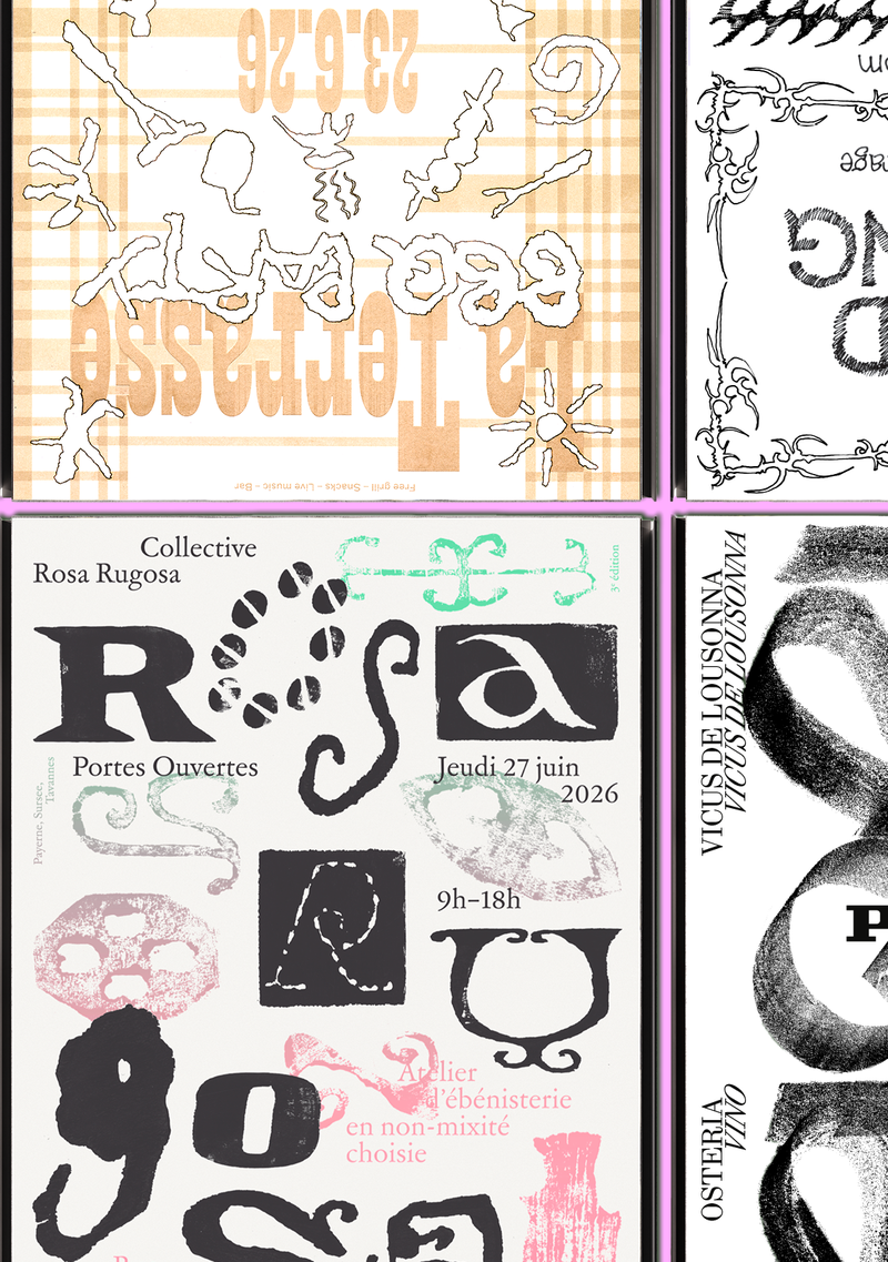
  Genius Loci, or the spirit of the place, refers to the unique identity or essence of a location. In architecture, this principle suggests that the specific characteristics of a place should be reflected and extended in a design. In the case of the second-year graphic design students, they have applied this principle to communication projects focused on promoting or extending the identity of a particular place through design. Their work likely explores how to visually capture and communicate the essence of a space, using graphic design elements that resonate with the architectural features or history of the place.    
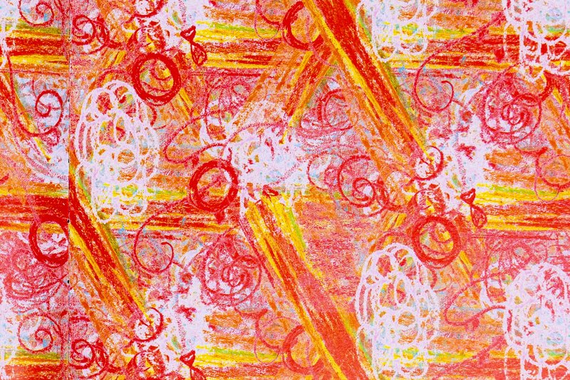
Image Creation - Mirrored Motifs (ECAL × Chillon) - BA1 2025-2026

BA GRAPHIC DESIGN

Image Creation - Mirrored Motifs (ECAL × Chillon) - BA1 2025-2026

with Guy Meldem

As part of the ECAL x Chillon exhibition, which will take place at the eponymous castle, the students of the Bachelor in Graphic Design have created patterns inspired by the castle’s features. Under the supervision of Guy Meldem, they developed a variety of graphic systems. These patterns will be printed as hangings in the armory hall of Chillon Castle.

Visual Identity – BA2 S2 2026

BA GRAPHIC DESIGN

Visual Identity – BA2 S2 2026

with Adeline Mollard

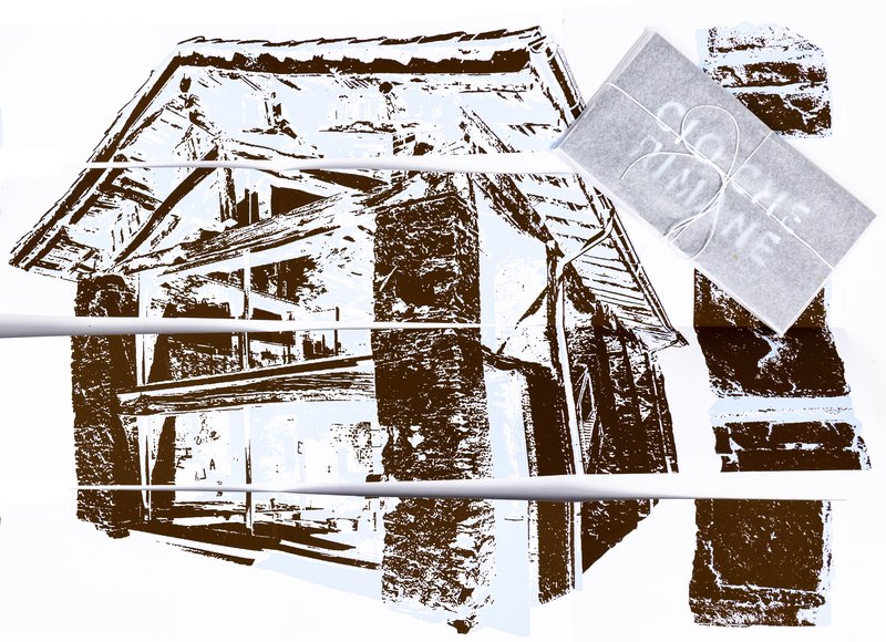
As part of the visual identity course with Adeline Mollard, the students developed a visual identity based on a randomly drawn business card. By appropriating a graphic element and its title, each project offers a singular interpretation of it. Each proposal also involves the selection of a tool linked to the associated event (tattoo machine, sander, lithography equipment, etc.), used as a conceptual and graphic extension of the project. The identity is deployed across a range of formats, from business card to F4 size, including posters, flyers, business cards, as well as an animated poster.

Editorial Design – BA2 S2 2026

BA GRAPHIC DESIGN

Editorial Design – BA2 S2 2026

with Diego Bontognali

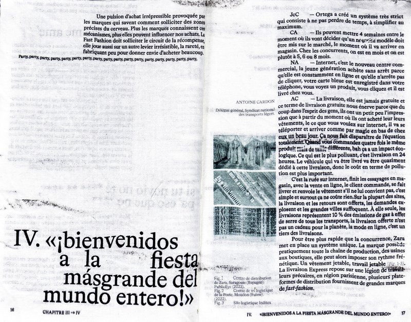
As part of this editorial design course, students developed a research-based project focused on the selection and design of texts around a shared theme. Based on a curated set of sources, each project presents two editions with identical content, produced in both a large and a small format.  

Type Design  BA2 – S2 2026

BA GRAPHIC DESIGN

Type Design BA2 – S2 2026

with Aurèle Sack

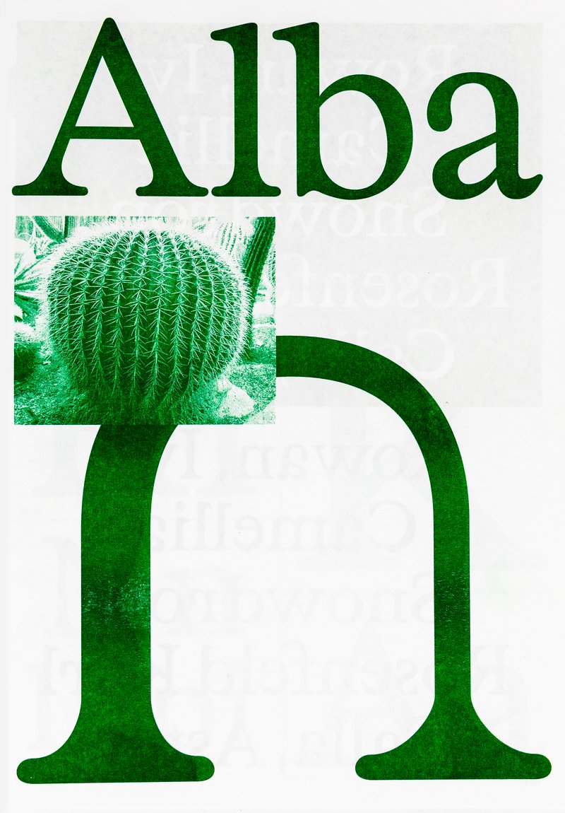
Second-year students were required to develop the whole alphabet for one typeface.

Related courses