BA GRAPHIC DESIGN
Diego Steiner – Hybrid Modules
by Diego Steiner
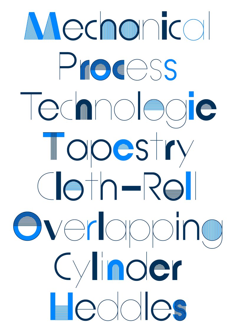
Hybrid Modules explores the link between traditional craftsmanship and contemporary technologies through the creation of a 3D-printed modular typographic tool for use with a manual letterpress. Designed on a grid, the modular alphabet becomes a set of physical dies, which can be inserted by hand into the press. The slow, repetitive process becomes an integral part of the visual language, making visible the time and care of the gesture. A series of A2 posters promotes a series of fictitious conferences entitled “ART, CRAFT & TECHNOLOGY - Guests in Switzerland”.


