BA GRAPHIC DESIGN
Emma Chapuis – Typeswing
by Emma Chapuis
This project offers a typographic approach to express emotions in digital communication.
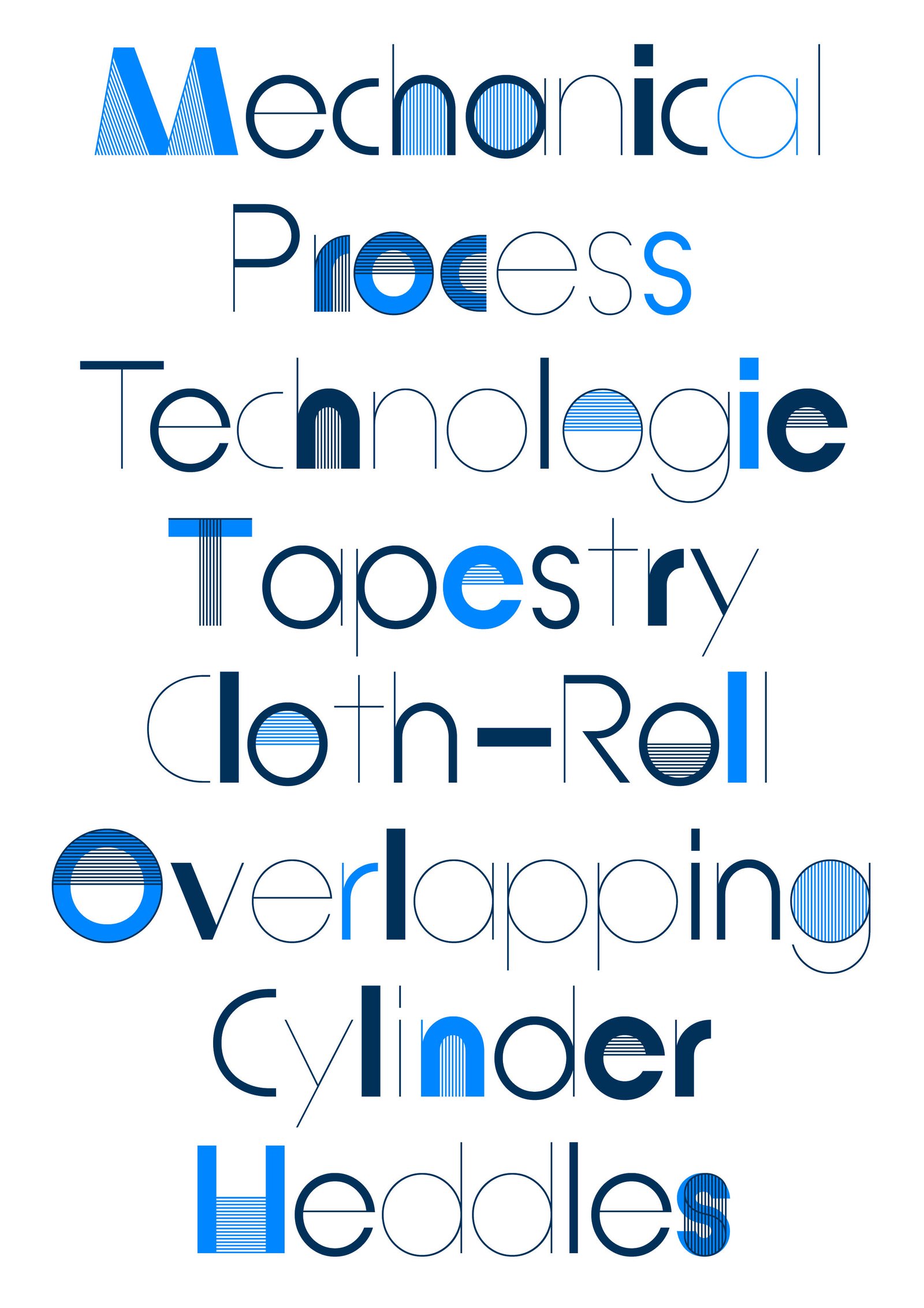
Patterna is an experimental variable typeface designed around two axes: Weight and Weaving. Inspired by Cassandre's Bifur from the 1930s and the arrangement of threads on Jacquard looms, Patterna is based on a rigorous grid that structures shapes and spacing. Its modular layering system allows for graphic experimentation with variations, making each composition dynamic. Numerous alternates reinforce its formal richness. Patterna challenges fashion conventions by offering a modular, dense typeface designed as both a graphic tool and a writing system.
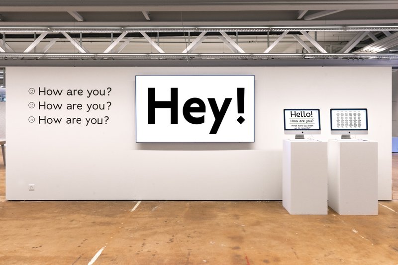
BA GRAPHIC DESIGN
by Emma Chapuis
This project offers a typographic approach to express emotions in digital communication.

BA GRAPHIC DESIGN
by Hugo Le Corre
Are legibility and expressiveness incompatible terms in typography? Anchored in a context of digitalisation of communication media, Relativ is a typeface that questions the notion of distance in reading. Associated with an AI algorithm, this variable font adapts itself through an axis covering two extremes: from continuous reading to monumental titling, from micro to macro-typographic. Thus, this system automatically favours legibility and expressiveness, taking into account the reader’s distance. In a context where screens tend to replace printed media, Relativ opens new perspectives between typography, adaptive technologies and digital communication.

BA GRAPHIC DESIGN
with Aurèle Sack, Gilles Gavillet
Influenced by the rise of the metaverse, Varia is a metaphor of the early failure and absurdity of this technology, as well as research about typographic shapes. Mimicking the optimisation phenomena of object in 3D engines (Level of Detail), Varia is composed of three cuts of the same name: 0, 4, 8. While Level 0 seems closer to traditional typography, it is in fact a “smoothed out” version of the previous cuts, which already seeks to synthesise letters down to their most rudimentary forms. From the rigidity of the shapes, the existential constraints that the research brings to light illustrate the retrograde and dystopian vision of the metaverse, while at the same time offering a reassuring reflection of a future geometric transition of our bodies.

BA GRAPHIC DESIGN
by Raphaël Carruzzo
Remote is a variable typeface born from a desire to recreate the link between movement and letters. Inspired by the body and choreographic notation, this typeface was designed for digital media. It helps interact with graphic content thanks to movement. Faced with an animated body, Remote interacts and transforms the typographic forms by following variations of movement. Passing easily from text to abstract typography, this variable font helps link movement and typographic compositions, thanks to a multitude of possible instances.
BA MEDIA & INTERACTION DESIGN
with Gaël Hugo
Project developed as part of the Network Related Design course led by Gaël Hugo.