


BA MEDIA & INTERACTION DESIGN
Screen Design – 2025
with Harry Bloch
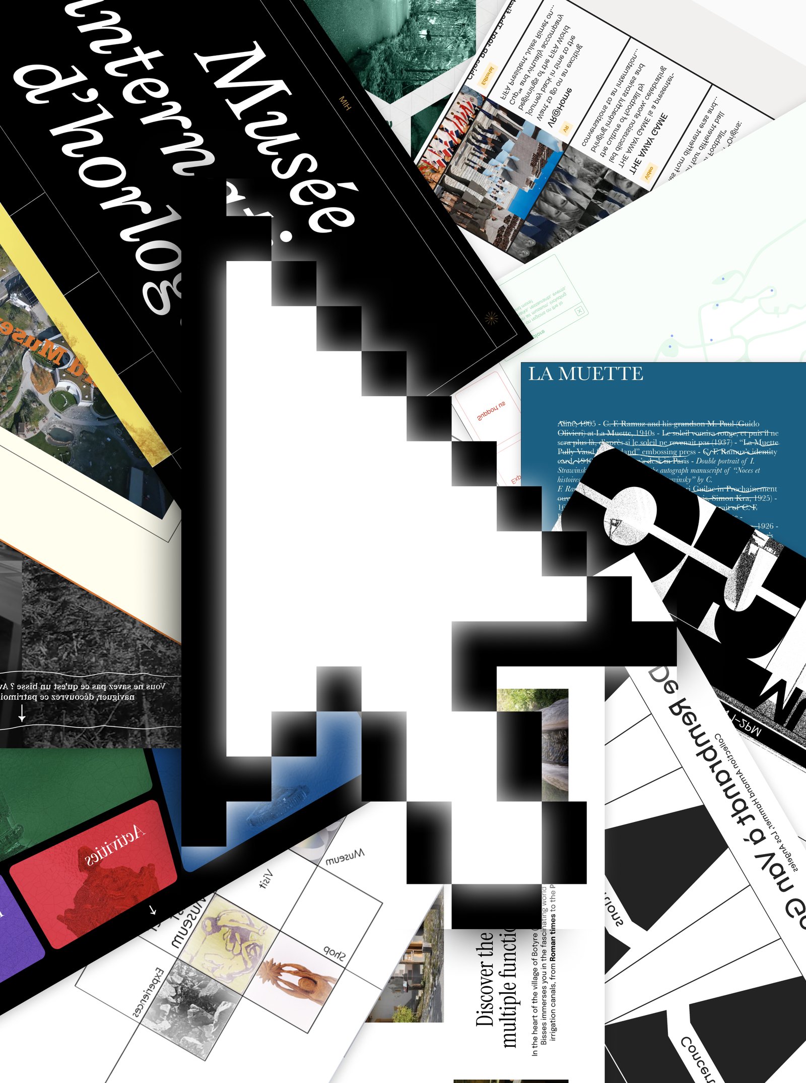
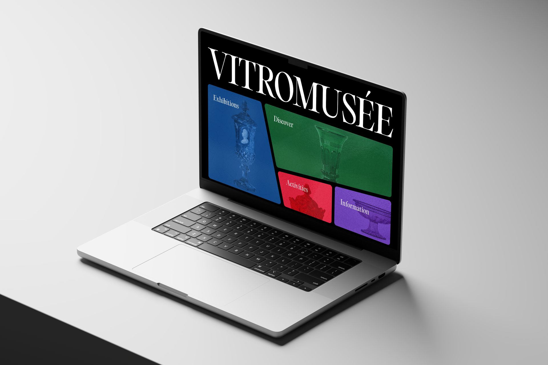
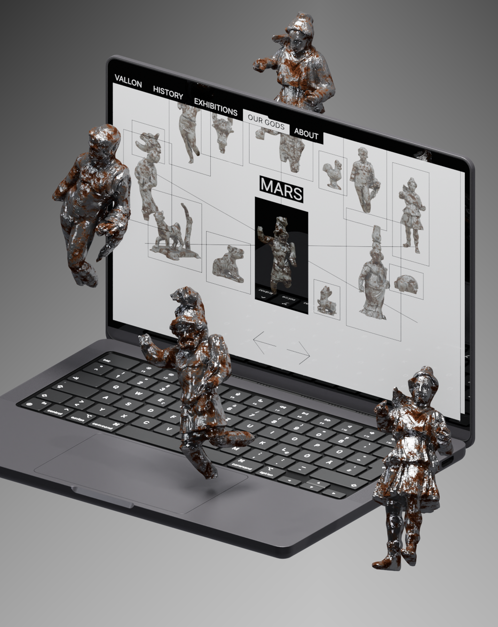
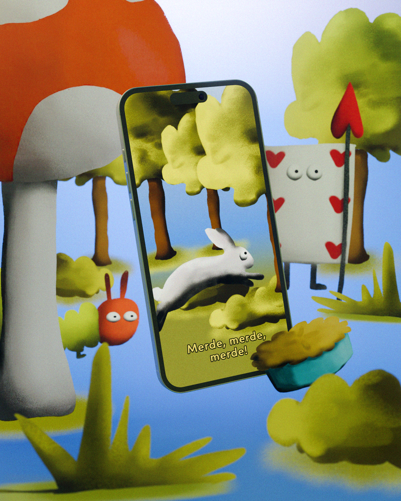
Websites developed over the course of a semester based on books chosen by students, which they adapted into web experiences as part of Harry Bloch's Screen Design course, second year of the Bachelor's degree in Visual Communication.