Giseigo

Giseigo

Project developed as part of the Network Related Design course led by Gaël Hugo.

Studio project (2019) by Evan Kelly

Know-how
Sculpture, Scenography, Type design, Web, Installation, Motion design

1/3

Projects related to Scenography

Raphaël Carruzzo – Remote

BA GRAPHIC DESIGN

Raphaël Carruzzo – Remote

by Raphaël Carruzzo

Remote is a variable typeface born from a desire to recreate the link between movement and letters. Inspired by the body and choreographic notation, this typeface was designed for digital media. It helps interact with graphic content thanks to movement. Faced with an animated body, Remote interacts and transforms the typographic forms by following variations of movement. Passing easily from text to abstract typography, this variable font helps link movement and typographic compositions, thanks to a multitude of possible instances.

Cyprien Valenza – Patterna

BA GRAPHIC DESIGN

Cyprien Valenza – Patterna

by Cyprien Valenza

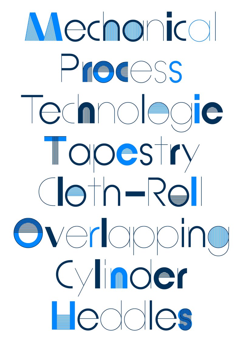
Patterna is an experimental variable typeface designed around two axes: Weight and Weaving. Inspired by Cassandre's Bifur from the 1930s and the arrangement of threads on Jacquard looms, Patterna is based on a rigorous grid that structures shapes and spacing. Its modular layering system allows for graphic experimentation with variations, making each composition dynamic. Numerous alternates reinforce its formal richness. Patterna challenges fashion conventions by offering a modular, dense typeface designed as both a graphic tool and a writing system.

Folklore Fusion

BA MEDIA & INTERACTION DESIGN

Folklore Fusion

with Pauline Saglio

Folklore Fusion – a CGI character project developed by students in Bachelor Media & Interaction Design at ECAL, exploring the creative collision between Japanese and Swiss folklore through the lens of contemporary visual storytelling.

Romain Oederlin – Archetype

BA GRAPHIC DESIGN

Romain Oederlin – Archetype

with Diego Bontognali, Aurèle Sack

Is what we see real or subjective? Interpretation is always the result of individual apprehension. This is why space can be manipulated to exacerbate desired relationships. In connection with the perception of our environment, this work examines the principle of anamorphosis generated by typographic typefaces designed in three dimensions. Fluctuating between letters and abstraction, these visual structures offer different degrees of legibility depending on the point of view adopted.

Alexis Gargaloni – Varia

BA GRAPHIC DESIGN

Alexis Gargaloni – Varia

with Aurèle Sack, Gilles Gavillet

Influenced by the rise of the metaverse, Varia is a metaphor of the early failure and absurdity of this technology, as well as research about typographic shapes. Mimicking the optimisation phenomena of object in 3D engines (Level of Detail), Varia is composed of three cuts of the same name: 0, 4, 8. While Level 0 seems closer to traditional typography, it is in fact a “smoothed out” version of the previous cuts, which already seeks to synthesise letters down to their most rudimentary forms. From the rigidity of the shapes, the existential constraints that the research brings to light illustrate the retrograde and dystopian vision of the metaverse, while at the same time offering a reassuring reflection of a future geometric transition of our bodies.

Related courses