Quirk85

Quirk85

Quirk 85 started with the discovery by Kim Minjong of a fascinating Branding Manual from Korea dating from the late 70s and early 80s. Sharing a mutual fascination for logotypes and corporate items, he paired with Juan Jun Feng to embark on a journey that transcends cultural boundaries. Both born in the 90s, they unearthed striking similarities in their childhood experience, at a time when both China and Korea went through distinctive paths toward economic development, resulting in indelible impressions from brainwashing advertisement, the rapid transformation of cities, and the overwhelming wave of technological innovation. A time of iconic design, that the two type designers explored through cultural narratives and historical context. Quirk 85 is a fusion of those elements: impact of commercialisation, the intricate web of education, production, daily life, healthcare and more. By bridging their two distinct nations, they aspire to evoke a sense of shared identity and collective memory, inviting viewers to embark on a visual and intellectual journey.

Diploma project (2023) by Feng Juan Jun, Minjong Kim

Know-how
Type design
Exhibition

1/1

Specimen
Specimen

1/2

Projects related to Type design

Cyprien Valenza – Patterna

BA GRAPHIC DESIGN

Cyprien Valenza – Patterna

by Cyprien Valenza

Patterna is an experimental variable typeface designed around two axes: Weight and Weaving. Inspired by Cassandre's Bifur from the 1930s and the arrangement of threads on Jacquard looms, Patterna is based on a rigorous grid that structures shapes and spacing. Its modular layering system allows for graphic experimentation with variations, making each composition dynamic. Numerous alternates reinforce its formal richness. Patterna challenges fashion conventions by offering a modular, dense typeface designed as both a graphic tool and a writing system.

Diego Steiner – Hybrid Modules

BA GRAPHIC DESIGN

Diego Steiner – Hybrid Modules

by Diego Steiner

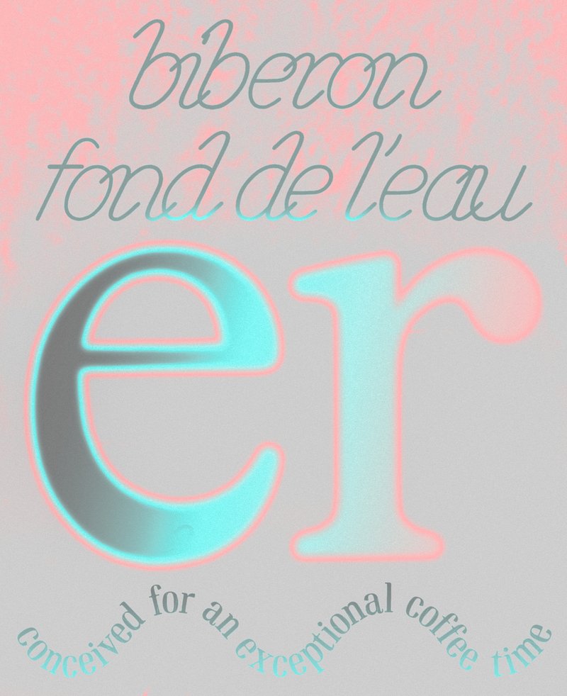
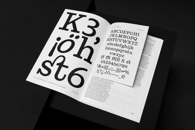
Hybrid Modules explores the link between traditional craftsmanship and contemporary technologies through the creation of a 3D-printed modular typographic tool for use with a manual letterpress. Designed on a grid, the modular alphabet becomes a set of physical dies, which can be inserted by hand into the press. The slow, repetitive process becomes an integral part of the visual language, making visible the time and care of the gesture. A series of A2 posters promotes a series of fictitious conferences entitled “ART, CRAFT & TECHNOLOGY - Guests in Switzerland”.

Type Design  BA2 – S1 2025

BA GRAPHIC DESIGN

Type Design BA2 – S1 2025

with Aurèle Sack

Second-year students were required to manually develop the lowercase letters of two typefaces.

Stephanie Wilson – Iconic

MA TYPE DESIGN

Stephanie Wilson – Iconic

by Stephanie Wilson

Iconic stands at the intersection of typography, social research, and inclusive design. It addresses a growing concern: making reading more accessible for senior readers. Through the development of a typeface named Iconic, the project aims to enhance reading comfort while offering an aesthetic, functional, and adaptable typeface suited to the changes associated with aging. The project was created in collaboration with senior-lab, a Swiss platform dedicated to enhancing the quality of life for seniors. Grounded in a participatory methodology, this collaboration enabled a reality-based approach: available in serif, sans serif, sans semibold, and italics, Iconic was designed based on feedback and testimonials gathered from seniors during sessions held at ECAL.

Type Design - BA1 S1 2025-2026

BA GRAPHIC DESIGN

Type Design - BA1 S1 2025-2026

with Robert Huber

First-year students were invited to manually sketch the typographic skeleton of lowercase alphabet letters. The objective was to maintain the proportions, curves, and characteristic axes of each letter while paying close attention to visual coherence and consistency in the drawing.

Related courses