FILM STUDIES
Documentary Film Workshop with Marie-Eve Hildbrand - 2026
with Marie-Eve Hildbrand
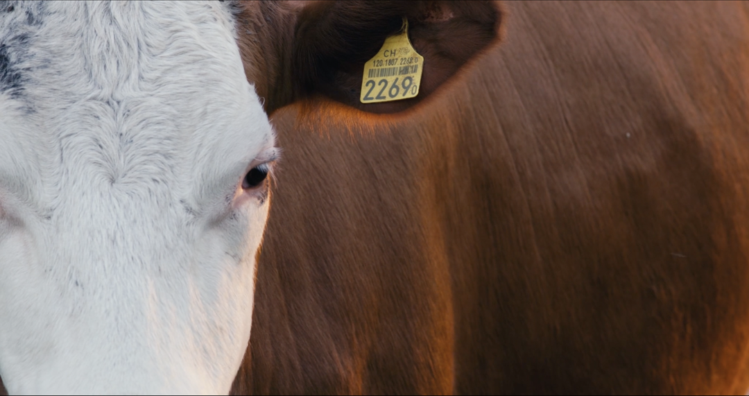
The 2026 documentary film workshop for 1st year students was lead by swiss director Marie-Eve Hildbrand.
FILM STUDIES
with Marie-Eve Hildbrand
The 2026 documentary film workshop for 1st year students was lead by swiss director Marie-Eve Hildbrand.
FILM STUDIES
with Verena Paravel
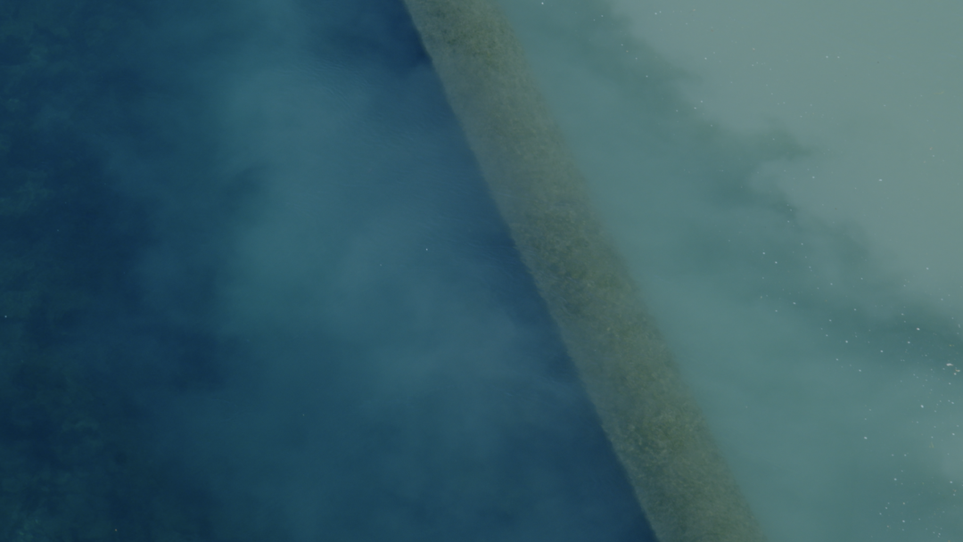
The 2026 documentary film workshop for 2nd year students was lead by french director and visual anthropologist Verena Paravel.
GRAPHIC DESIGN
with Adeline Mollard
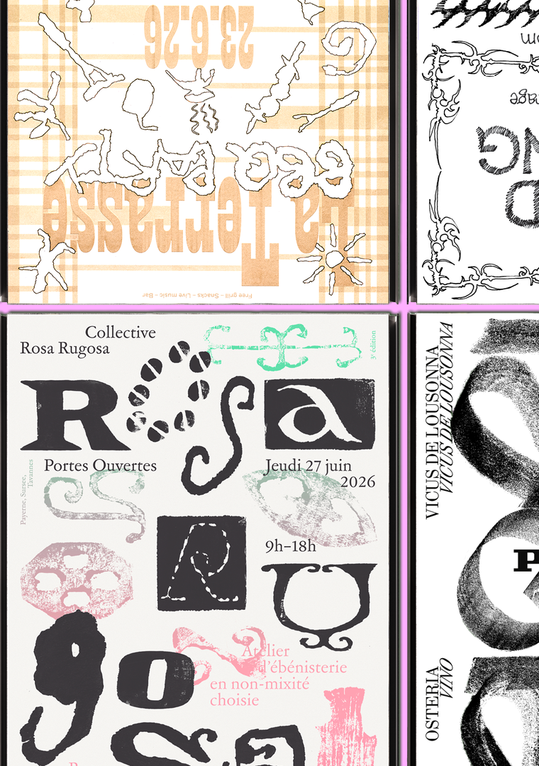
As part of the visual identity course with Adeline Mollard, the students developed a visual identity based on a randomly drawn business card. By appropriating a graphic element and its title, each project offers a singular interpretation of it. Each proposal also involves the selection of a tool linked to the associated event (tattoo machine, sander, lithography equipment, etc.), used as a conceptual and graphic extension of the project. The identity is deployed across a range of formats, from business card to F4 size, including posters, flyers, business cards, as well as an animated poster.
GRAPHIC DESIGN
with Aurèle Sack
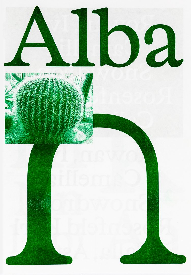
Second-year students were required to develop the whole alphabet for one typeface.

GRAPHIC DESIGN
with Harry Bloch
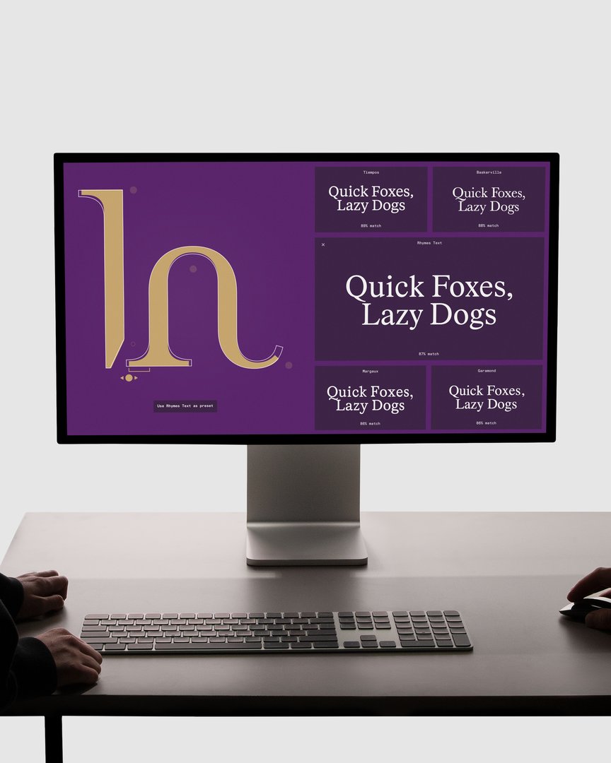
As part of the Screen Design course with Harry Bloch, students freely chose an event as the starting point for their project. Using documentary, textual, and iconographic research, each student developed a digital edition conceived as an interactive and flexible poster, responsive to changes in screen format and dimensions. The project thus explores layout as a living system rather than a fixed composition. Each proposal is accompanied by conceptual and formal reflection, connecting event content with experimentation in the screen medium.
GRAPHIC DESIGN
with Nicole Udry
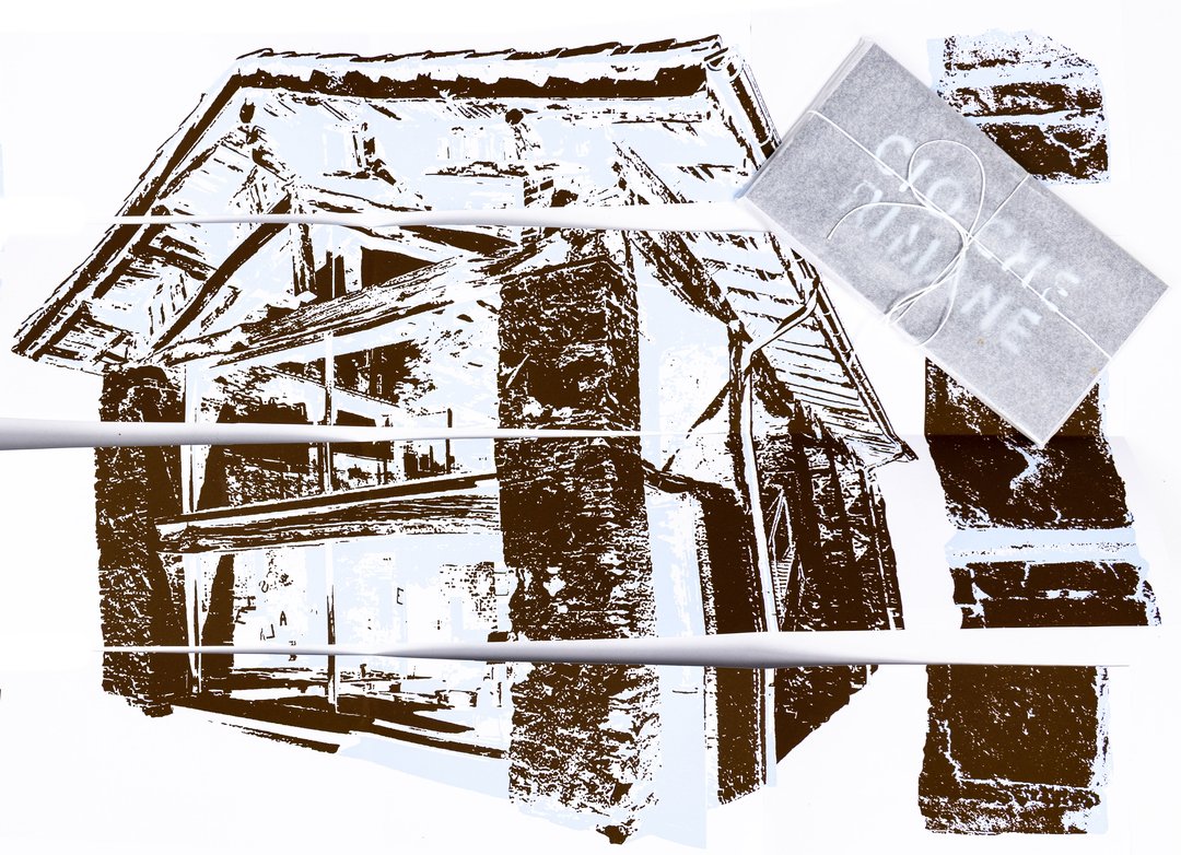
Genius Loci, or the spirit of the place, refers to the unique identity or essence of a location. In architecture, this principle suggests that the specific characteristics of a place should be reflected and extended in a design. In the case of the second-year graphic design students, they have applied this principle to communication projects focused on promoting or extending the identity of a particular place through design. Their work likely explores how to visually capture and communicate the essence of a space, using graphic design elements that resonate with the architectural features or history of the place.

GRAPHIC DESIGN
with Robert Huber
The creation of a logotype involves establishing a distinct visual identity, embedded in a clearly defined universe. First-year Graphic Design students designed a fully hand-drawn logotype, connected to a subject, a concept, or an environment of their own choice. This work was based on thorough research in typographic archives. Each student compiled a reference notebook and developed a set of specimens, in order to enrich and structure their graphic and formal thinking.
GRAPHIC DESIGN
with Guy Meldem
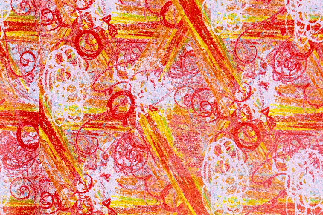
As part of the ECAL x Chillon exhibition, which will take place at the eponymous castle, the students of the Bachelor in Graphic Design have created patterns inspired by the castle’s features. Under the supervision of Guy Meldem, they developed a variety of graphic systems. These patterns will be printed as hangings in the armory hall of Chillon Castle.

GRAPHIC DESIGN
with Adeline Mollard
Last year, the Marché du Temple, an iconic grocery store located in front of ECAL, closed its doors, leaving behind precious memories and a warm atmosphere that had enlivened the neighborhood for decades. This semester, students had the opportunity to reinvent this space by designing a complete visual identity for a new fictional business. Their work resulted in a poster and its animated version, a booklet, and a proposal for a new storefront. To celebrate the end of the semester, an exhibition was organized in the former premises of the Marché du Temple.
GRAPHIC DESIGN
with Diego Bontognali
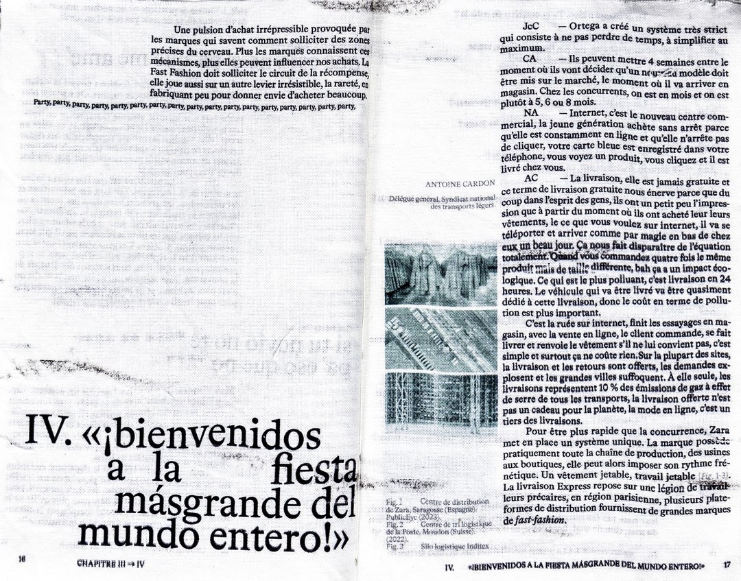
As part of this editorial design course, students developed a research-based project focused on the selection and design of texts around a shared theme. Based on a curated set of sources, each project presents two editions with identical content, produced in both a large and a small format.
DIGITAL EXPERIENCE DESIGN
with Romain Collaud, Alain Bellet
Micro UI is the term project for the Interface Design introductory module in Term II. It invites students to explore how affordances and micro-animations shape the usability of digital interfaces, by analysing the principles that guide users’ behaviour even before they are aware of them. Based on a study of the visual and interactive cues that shape user expectations, the project encourages students to design subtle yet effective animations capable of improving feedback, engagement and accessibility. The challenge lies in striking a balance between aesthetics and function, so that movement and affordance work together to create fluid, responsive and meaningful interactions. The course also addresses, as a complementary topic, the issue of ‘dark patterns’ – those same principles misused for the purpose of manipulation rather than guidance.
MEDIA & INTERACTION DESIGN
with Angelo Benedetto
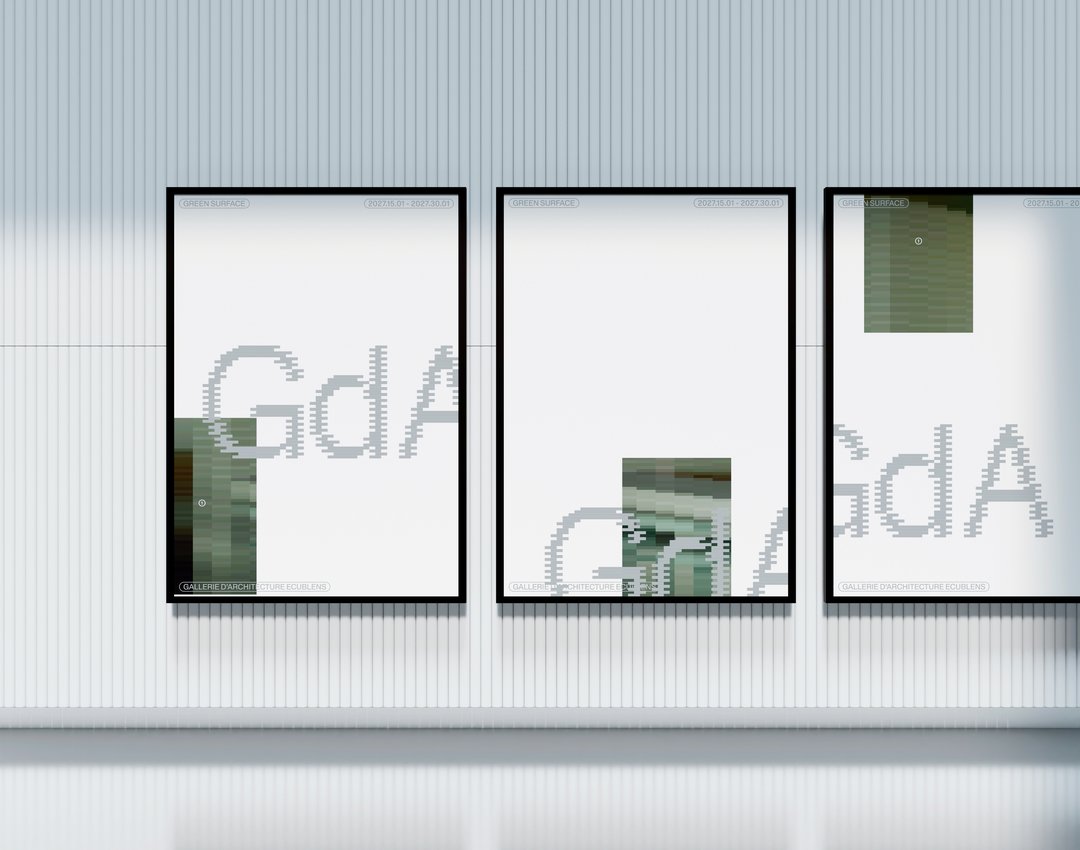
First-year students designed visual identities for fictional museums. As part of the Dynamic Display course led by Angelo Benedetto, this project led them to create graphic universes that that express the character of each imaginary exhibition site.
DIGITAL EXPERIENCE DESIGN
with Gaël Hugo, Paul Lëon
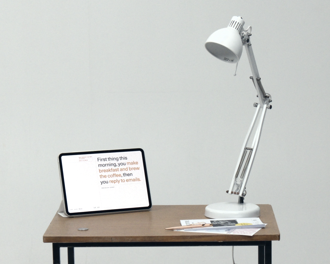
The Mind Reader Interface shifts computing from the reactive to the proactive: from a system that obeys commands to one that anticipates them. Where smart environments cast their users as pilots issuing constant instructions, this project removes the friction of instruction altogether. Intention is no longer declared through a screen or a button. It is inferred. Reading context, habit and the signals of presence, the interface acts before it is asked. It sheds the form of the device to become a Ghost in the Room that senses rather than obeys. The user no longer pilots the space; they inhabit it. The system does not read thoughts, only traces, and stages the distance between anticipation and understanding: what we gain, and what we quietly surrender, when a space begins to act on our behalf.
PHOTOGRAPHY
with Charlotte Krieger
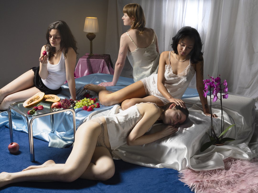
Unseen This course introduces students to the creation of a seven-image series built around the theme Unseen. They will learn to combine set design, characters, and lighting to produce strong, coherent staged images. Through a practical and technical approach, the course develops their ability to conceive and manage a complete photographic project, direct models, work with natural and artificial light, and collaborate under conditions similar to professional editorial or commercial shoots. Students will refine their photographic vision while preparing for the creative and technical demands of the industry.

PHOTOGRAPHY
with Anoush Abrar
Deconstructed Portrait The goal of this workshop, led by photographer Anoush Abrar, is to explore the meaning of the contemporary portrait. Working with the concept of the “deconstructed portrait,” the students created an image in pairs. The Digital Medium Format workshop week serves as an introduction to both photography equipment and specialized software.
PHOTOGRAPHY
with Orsola Valenti
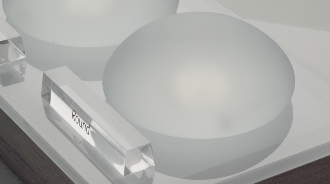
Off-camera By exploring what lies outside the frame, students develop a sensitive and reflective approach to audiovisual creation. Throughout the semester, students are encouraged to reflect on the political and formal issues surrounding the moving image, as well as the relationship between the visible and the invisible.
PHOTOGRAPHY
with Natacha Lesueur
Documentary, the power of make-believe Based on projects developed around a common theme, the students develop a personal, in-depth project around the theme of pretense. They build a project that plays with the limits of veracity in photography, using it as an artifice of deception.
MEDIA & INTERACTION DESIGN
with Gaël Hugo
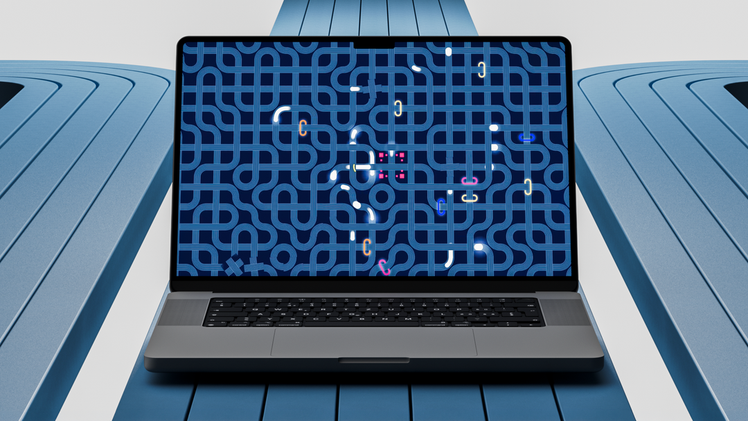
Soundtoys coded by 1st year Bachelor students in Media & Interaction Design as part of a semester project led by Gaël Hugo.
MEDIA & INTERACTION DESIGN
by Steve Bouillant
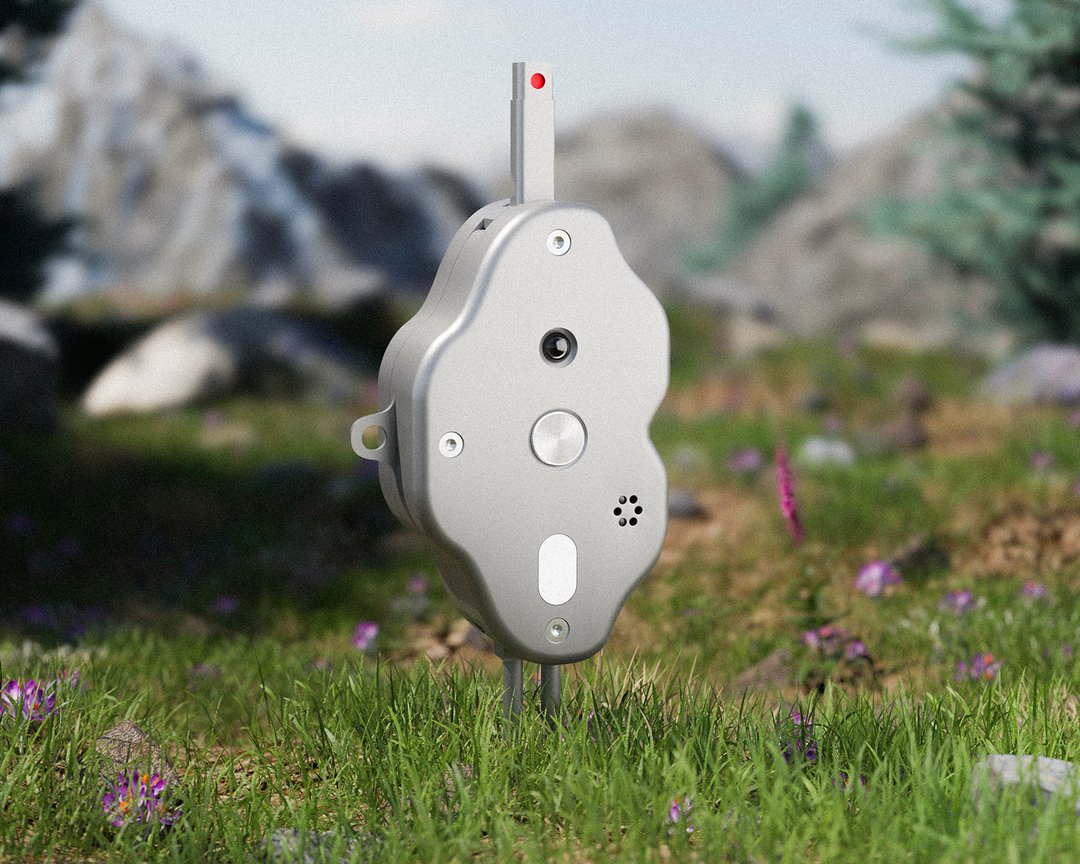
The smartphone has turned a trip to the mountains into an exercise in documentation. We take photos, tag our location, and post them: the natural world becomes content before it becomes a moment of reconnection. Re:soil offers a compact outdoor device whose sensors continuously measure humidity, light, and the transitions between environments. Its probe, planted in the ground, measures the earth's heat and compares it to that of the user's hand. Its microphone captures the soundscape of the location. Re:soil conveys these connections through vibration and light, without a screen, without performance, and without a phone. Upon the user's return, a linked app generates an ephemeral journal blending sensory interpretations, the geology of the site, and likely flora and fauna.
MEDIA & INTERACTION DESIGN
by Jonathan Vögele
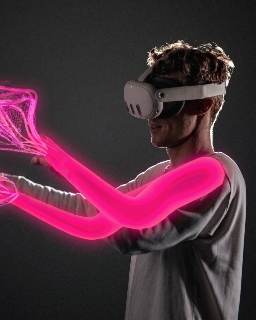
Siphonophores is an immersive experience in which two participants learn to share a single virtual body. The siphonophore, this marine animal that seems to be but a single gelatinous creature, is in fact a colony of organisms. We too, who believe ourselves separate, are already multiplicities and together we form bodies vaster still. Linked by a device that captures and synchronizes their movements, the participants feel their gestures seek one another out, meet, and at times work against each other. An arm rises without our quite knowing who willed it. How far can we feel ourselves extended, displaced, shared?
MEDIA & INTERACTION DESIGN
by Teo Grajqevci
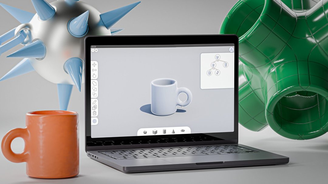
reform responds to a context in which designers are gradually losing control over their tools: creative software is becoming more automated, closed and dependent on cloud-based services. Today, generative AI can produce 3D models with ease, but often at the cost of control, understanding and ownership of the creative process. reform offers another approach: making 3D modelling easier to access, in a field that is usually complex and difficult to learn. The project takes the form of free and open-source software, built around a simplified interface, intuitive interactions and guides that support the learning of these tools. Through demonstrations and didactic exercises, reform restores the designers' motivation and means to model 3D shapes themselves.
MEDIA & INTERACTION DESIGN
by Yann Müller
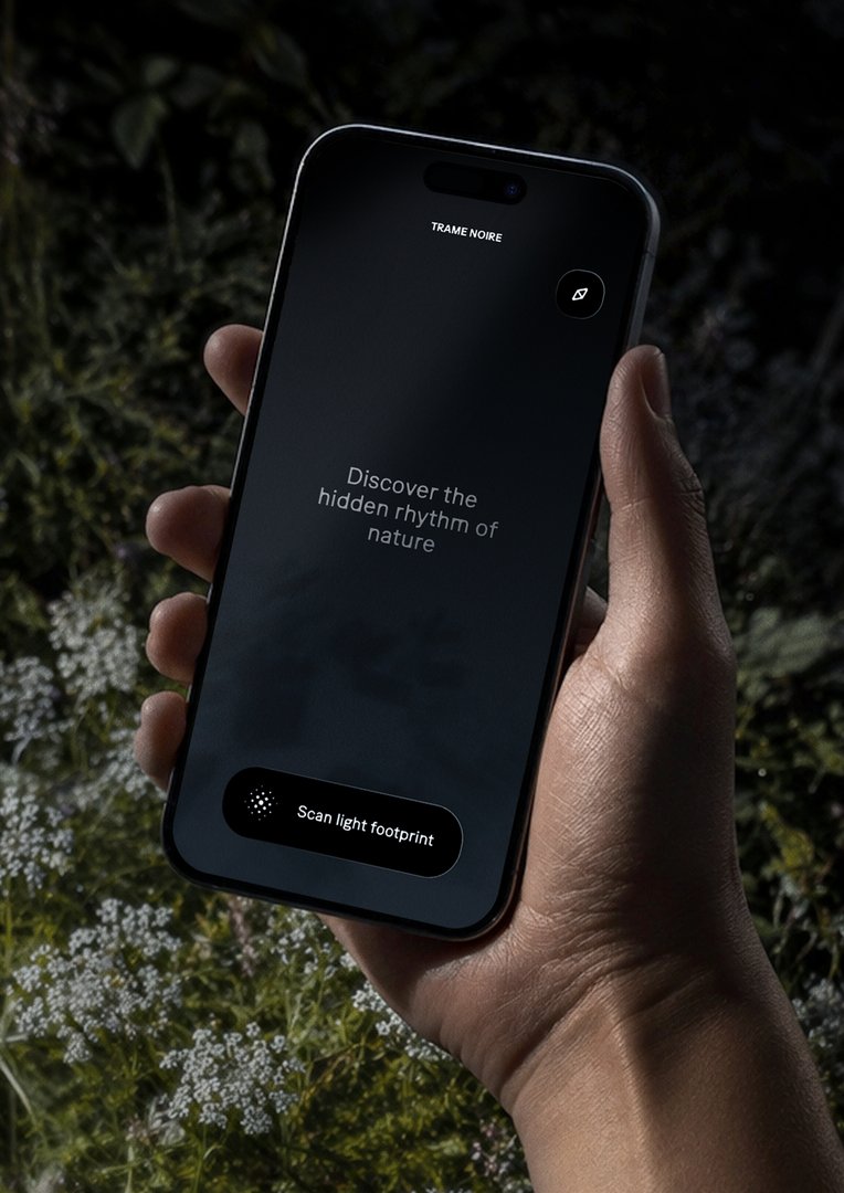
As cities light up, the night fades from our sight. Trame Noire is a night-exploration mobile app designed to raise public awareness about the impacts of light pollution on the wildlife and flora that come alive at dusk. Combining immersive experience and citizen science, the project offers a new way to observe and understand our coexistence with the living world. Guided by the seasons and natural cycles, the app invites users to explore the urban environment and capture, from one location to the next, the unique light footprint of each space. Through these explorations, Trame Noire maps a sensitive geography of the dark, bringing to light how artificial illumination alters the behavior of nocturnal life.

FILM STUDIES
by Tabarak Allah Abbas
Spring Fugue is a short film following a 13-year-old Georgian girl living in Switzerland. Over the course of a single day, the film moves through family silence, cultural displacement, and political tensions inherited from the adult world. By deconstructing classical dramaturgical structures, Spring Fugue seeks to place the audience in the same position as the girl's mother: observing, interpreting, and questioning. Within the constraint of a ten-minute format, the film builds tension through gesture, gaze, and movement rather than dialogue or exposition.

FILM STUDIES
by Mariam Bitsadze
Spring Fugue is a short film following a 13-year-old Georgian girl living in Switzerland. Over the course of a single day, the film moves through family silence, cultural displacement, and political tensions inherited from the adult world. By deconstructing classical dramaturgical structures, Spring Fugue seeks to place the audience in the same position as the girl's mother: observing, interpreting, and questioning. Within the constraint of a ten-minute format, the film builds tension through gesture, gaze, and movement rather than dialogue or exposition.

FILM STUDIES
by Alejandra Gomez Pinilla
In Between is a fiction short film that explores the experience of migration through an intimate and sensitive perspective. In a world increasingly shaped by displacement, exile, and the pursuit of a better future, this project aims to examine the feelings of uprootedness, nostalgia, and not belonging that often accompany the act of leaving home. The film follows a young Peruvian dancer who has recently moved to Switzerland and finds herself caught between expectations, doubts, and the desire to find her place. Through visual contrasts, sound design, and the expressive use of the body in motion, In Between experiments with different narrative forms to convey this state of being "in between" and questions what it truly means to feel at home.
MEDIA & INTERACTION DESIGN
by Laurine Gigandet
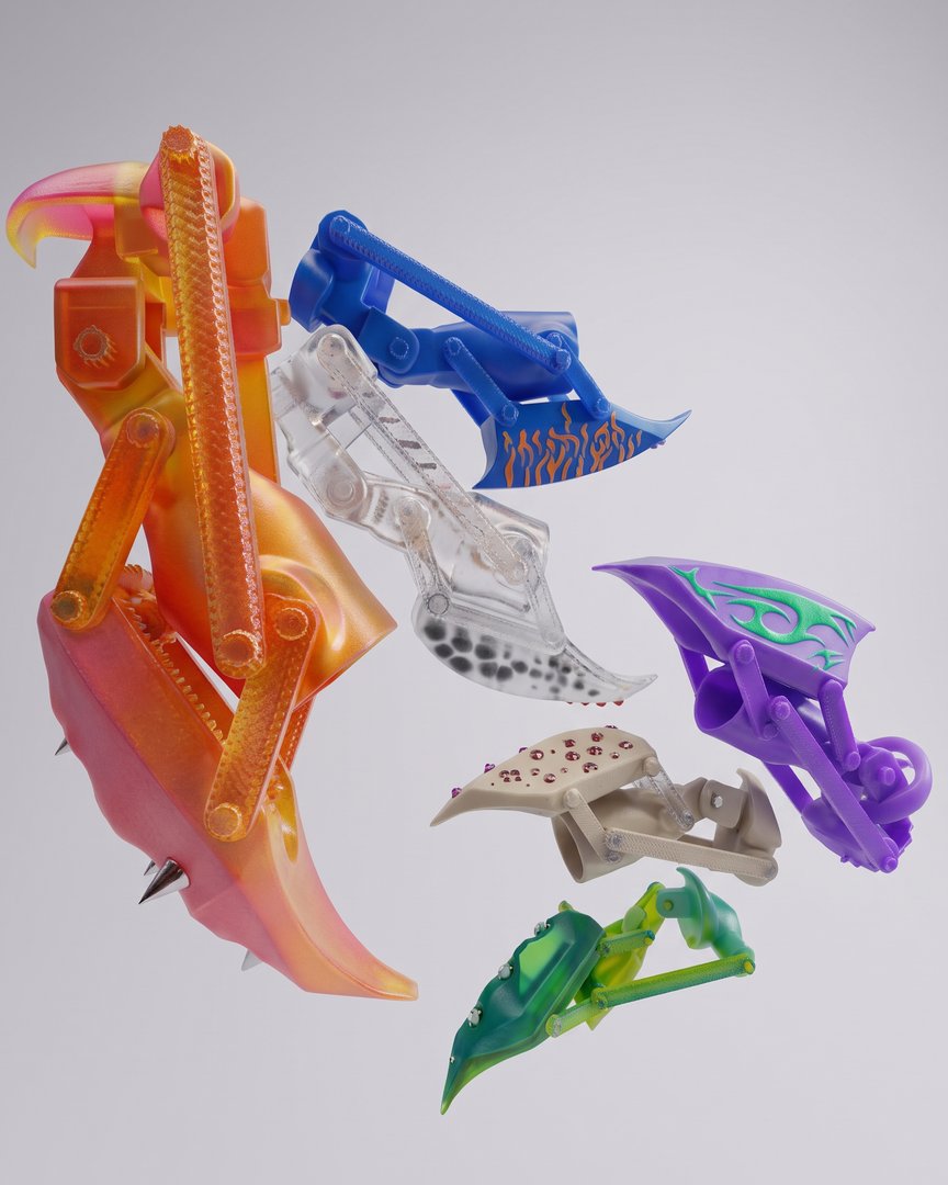
CLAWS is a collection of interactive accessories designed for a connected community. Worn on the fingertips, these devices enable users to assert their presence and engage with their surroundings on their own terms. Blurring the line between prosthetics and augmented nail art, the project explores how bodily ornamentation can transform the body into an interface with the physical, digital, and social worlds. Each CLAW is customizable : textures, colors, and patterns become symbols of identity and belonging. Inspired by Afrofuturist visions, the project centers on the concept of "digital marronage" through fugitive, self-organizing technologies. CLAWS acts as a political and cultural extension that resists the standardization of mainstream contemporary technology.
DESIGN FOR LUXURY & CRAFTSMANSHIP
by Charlie Collet
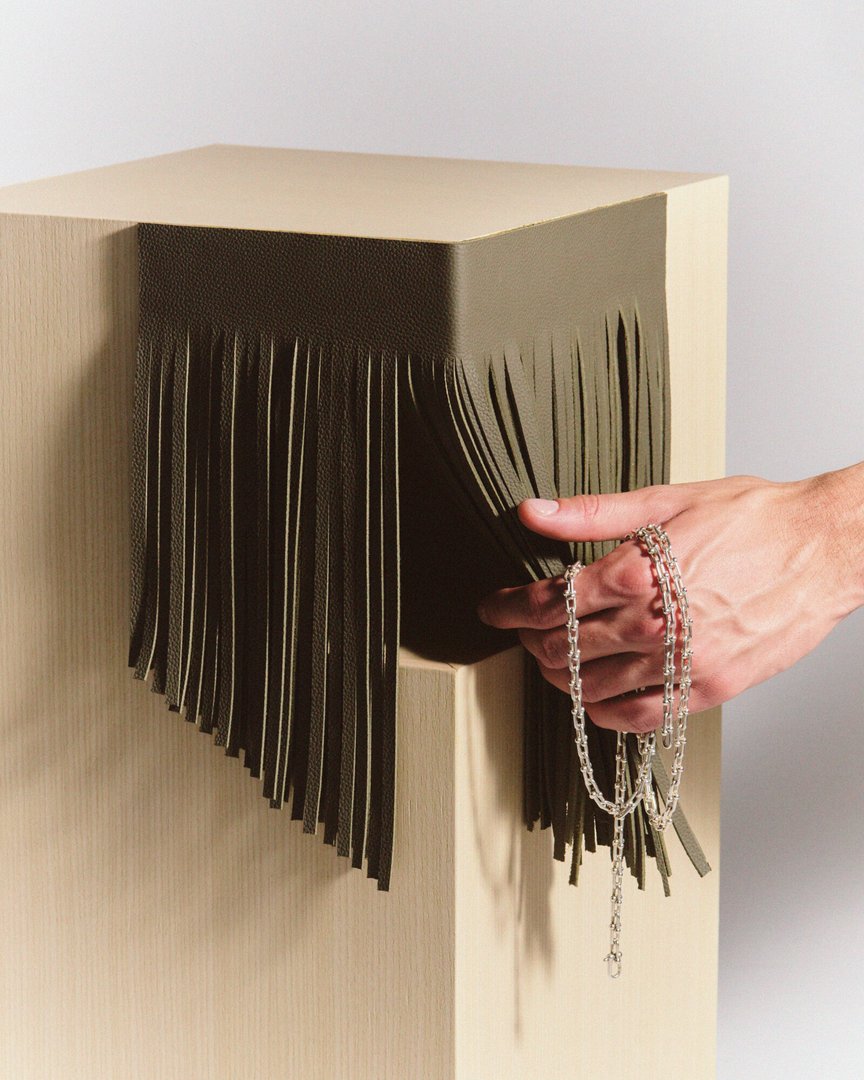
CODE FORMEL explores the formal language of accessories and its translation into the realm of domestic objects. The project investigates the relationship between structure and ornament, restraint and expression, functionality and emotional presence. Through a collection of objects, the research examines how a detail, a tension, or an assembly system can become a carrier of character and identity. Positioned at the intersection of design, material culture, and contemporary luxury, CODE FORMEL explores how pieces designed for space can embody the same emotional, tactile, and personal qualities traditionally associated with accessories.

TYPE DESIGN
by Kriszta Bolcsik
The visual language of 9-pin dot matrix printing is not obsolete but unresolved. TYPE BETWEEN RESOLUTIONS emerges from its mechanical output logic, focusing on the structure and behaviour of draft (SSL) printing. This project explores how these low-resolution, mechanically produced forms can inform contemporary type design. It combines historical research with practical experimentation, including the development of custom tools to generate and print glyphs. Through this process, TYPE BETWEEN RESOLUTIONS investigates questions of legibility, rhythm, and system-based construction, aiming to produce a typeface that translates the constraints of obsolete technologies into a contemporary typographic language.
FILM STUDIES
by Michael Girod
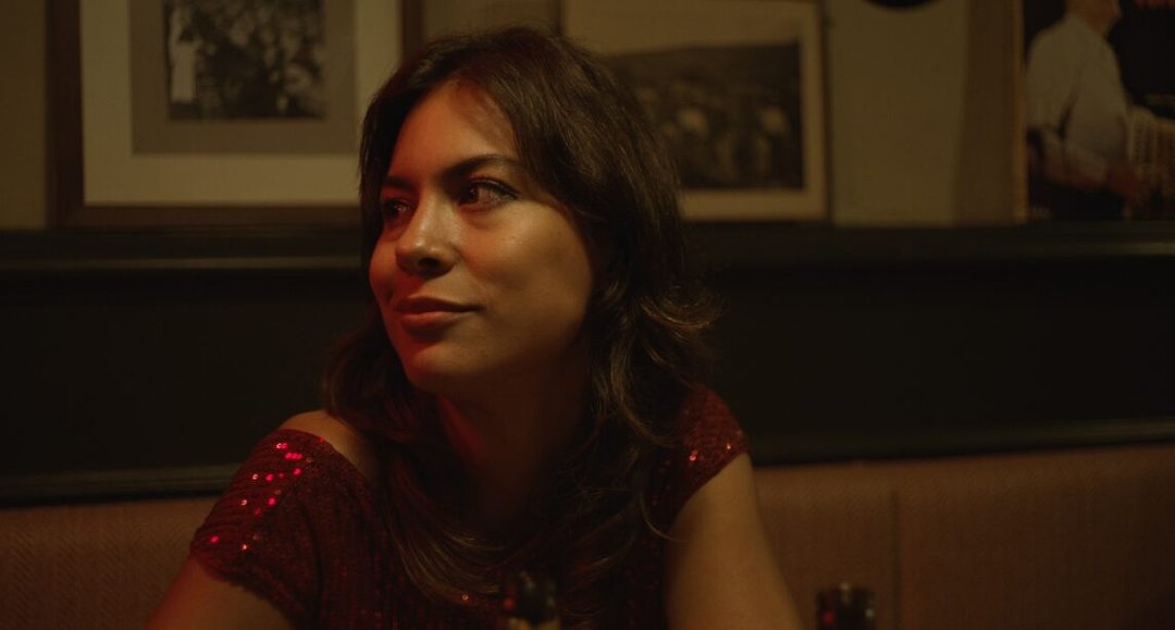
In Between is a fiction short film that explores the experience of migration through an intimate and sensitive perspective. In a world increasingly shaped by displacement, exile, and the pursuit of a better future, this project aims to examine the feelings of uprootedness, nostalgia, and not belonging that often accompany the act of leaving home. The film follows a young Peruvian dancer who has recently moved to Switzerland and finds herself caught between expectations, doubts, and the desire to find her place. Through visual contrasts, sound design, and the expressive use of the body in motion, In Between experiments with different narrative forms to convey this state of being "in between" and questions what it truly means to feel at home.

FILM STUDIES
by Millan Kiptum
Keeper is an urban fantasy short film about two friends sharing their last moments together. One is a ghost, the other is a goalkeeper preparing to return home in Africa. Through football and farewell rituals, they drift between home and away, between life and death. Keeper is a reflection on the idea of home as more than just a place. This film shows that, despite living away from home, people always find ways to live, to love, and to care for one another.

FILM STUDIES
by Gabrielle Amapakabo
One Fine Evening in Santa Paura is a first draft of a feature-length fiction screenplay that blends a coming-of-age story with a fantasy epic. The story follows Craig Melville, a 10-year-old American boy, who spends the summer with his older sister Theo in a small village in Ticino. While the young boy dreams of being noticed by his father, Charles, an absent businessman, he befriends Otto, the mute gardener of the villa they are staying in, who introduces him to the beauty of nature. But Charles' plans for the valley could threaten their budding friendship. This project seeks to explore the staging of silence, childhood, and places as a narrative language in their own right.
FILM STUDIES
by Pauline Pichard
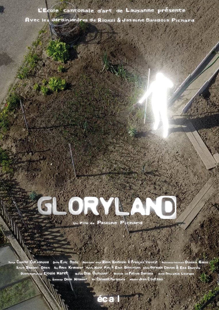
Last spring, unknown lights appeared in the sky above Lausanne. In a garden, the last fragment of an ordinary Eden, tales blur with rumours after a series of strange disappearances.

DESIGN FOR LUXURY & CRAFTSMANSHIP
by Seoho Ahn
Jewellery is often seen as an ornamental object, yet it contains structural principles. A chain forms a continuous system of interconnected links that responds to gravity and distributes forces throughout its structure. Cascade explores how this logic can be translated from the body to space. When scaled up, the chain evolves from a decorative element into a load-bearing framework. Connections between links become structural joints, while the continuous flow of the chain becomes a path for transferring and balancing forces. Rather than borrowing the aesthetics of jewellery, Cascade translates its structural principles into a furniture system, transforming a decorative chain into an architectural structure.
FINE ARTS
by Arthur Troisfontaine
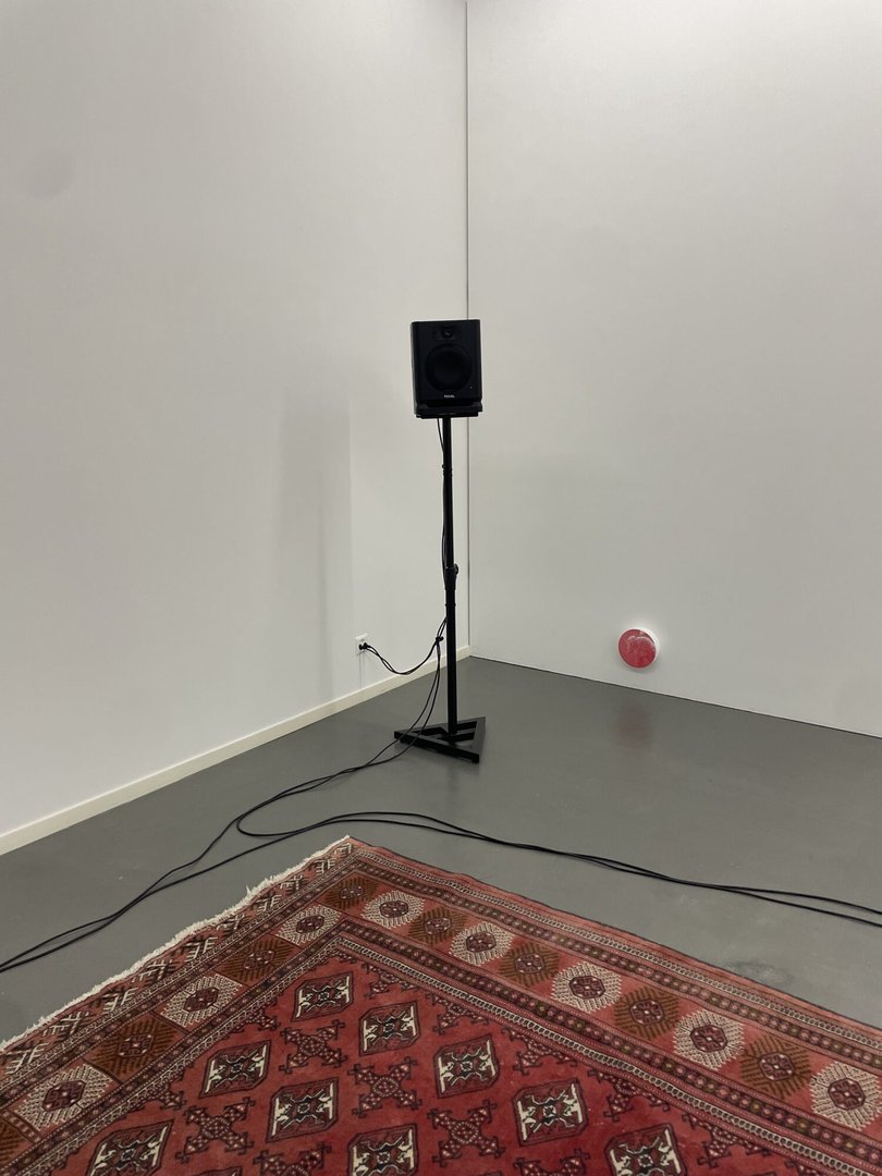
Piezo is an interactive sound installation activated by the movements of its audience. Hidden beneath a carpet, piezoelectric microphones capture the pressure, vibrations, and motions of visitors. This information is sent to a modular synthesizer, which transforms it into sound material and broadcasts it through four independent sound sources. Conceived as a work that can adapt to different architectural and acoustic contexts, the installation reconfigures itself according to the space in which it is presented. Fully reusable and generating no waste, Piezo offers an experience in which the body becomes simultaneously an interface, an instrument, and a generator of sonic landscapes.
FINE ARTS
by Armine Salifu
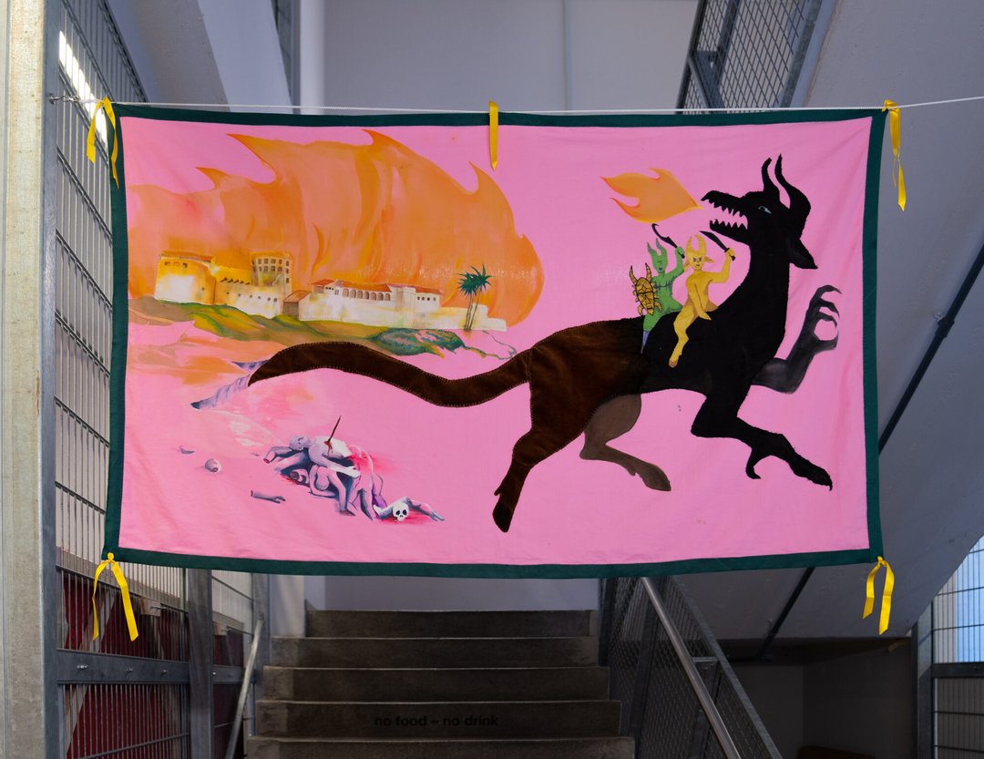
The oldest European building and first trading post of the Atlantic slave trade built in sub-Saharan Africa is a white fort on the coast of Elmina in Ghana, built in 1482 by the Portuguese and called Saint George's Castle. On a pink background, Let it fly! illustrates a white fort standing on a coast, burning. Next to it, a Dragon spits fire, in celebration with two of its friends. This flag is a retelling of the myth of Saint George and the Dragon. The several techniques and materials used to make this picture, which was slowly stitched together and painted by hand, are fully visible. The back is neither covered nor hidden; it is a part of the narrative, showcasing the complex relationship between the myth and the material reality that inspires it.

FILM STUDIES
by Eunhyoung Ju
Toilet tells the story of two women after the end of the world. The older one builds a toilet by stacking stones, almost like a ritual, while the younger one is drawn to her gestures and the rhythm of her work. The film explores what forms of humanity might remain after the end of the world, looking at the way someone's habits and sensations can be passed on to another person. As the film has almost no dialogue, it traces the shift from hostility to intimacy through the characters' gestures, gazes, and sound rather than through language. Sound, in particular, is an important element: it reveals emotions and changes in the relationship that the characters do not express through language, and supports the film's most delicate moments.
FILM STUDIES
by Michael Girod
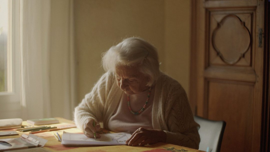
Aquarius Revolution is a hybrid documentary that weaves together family history, investigation, and autofiction. Faced with the gradual loss of memory experienced by their grandmother — who was an astrologer — the director sets out to reconstruct the media landscape surrounding Élisabeth Teissier, a prominent astrologer of the same generation, in the hope of rekindling memories and reopening a family dialogue. Combining interviews with archival reenactments, the film deliberately blurs the line between documentary and fiction. In doing so, it reflects on memory, inheritance, and the stories we tell ourselves to give meaning to our lives. This project was developed in collaboration with the Image and Set Design departments at ZHdK.
FILM STUDIES
by Jann Kessler
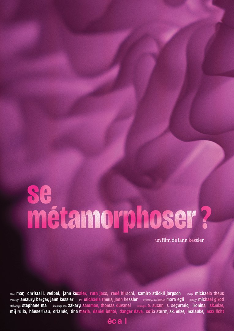
How do I build healthy, equal relationships? An intimate cinematic-therapeutic journey of discovery.
TYPE DESIGN
by Chantal Hochuli
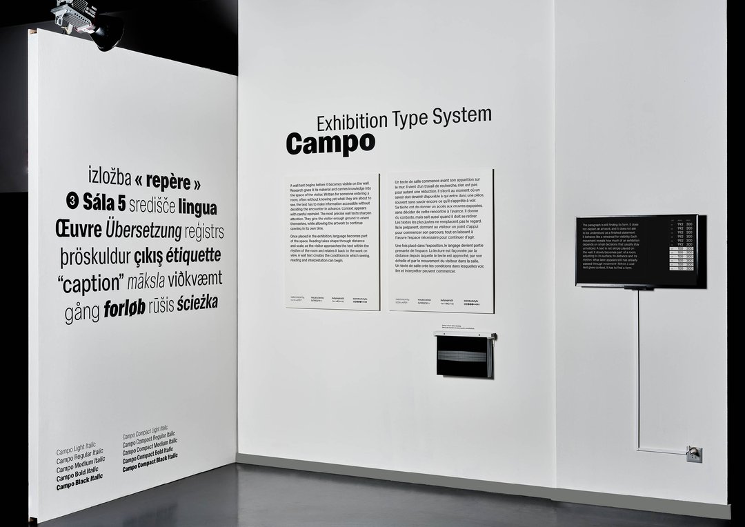
Campo is a variable typeface that is optimized for setting exhibition texts. Developed for wall texts, captions, translations and spatial information, it responds to fixed formats filled with varying amounts of content through a controlled width range. The project addresses a recurring problem in exhibition graphics: finding ways to fit text into limited space without resorting to artificial compression or repeated manual adjustments. Weight and italic axes extend the system for hierarchy. In this research, museum labels and exhibition texts are compared to evaluate how width, spacing and stroke modulation affect text blocks. Campo gathers these observations in a variable Sans Serif with subtly flared terminals.

PRODUCT DESIGN
by Omar Bassil
Esplanade is an exploration of how a flat-cut piece of leather can be transformed into a slip-on shoe through folding, wrapping, gathering, and minimal joining using simple tools. Stripping leather shoemaking down to its essentials, form emerges through tension and wear. Referencing the carbatina, a Roman shoe typology constructed from a single piece of leather, the design adapts its pattern principle to a contemporary slip-on. While the construction is reduced to a few essential operations, the making process still relies on the expertise of leather workers and techniques specific to their craft. This approach yields a simple, relaxed, and enduring object as a reflection on craftsmanship and material honesty.

PRODUCT DESIGN
by Ehrat Lee
Lightworks is a lighting system that gives images a fixed place in the home. Photographs, graphics and drawings are saved constantly but mostly stay hidden on phones, in books or in drawers. Built around existing industrial processes, a single UV-printed sheet of paper forms the curved shade, held by a lightweight aluminium structure and fixed with magnets. The lamp disassembles flat and ships inside its own print tube, the image rolled within. Available in three sizes, it turns each print into an illuminated object. Prints can be exchanged in seconds, from personal images to commissioned work.
Design Research for Digital Innovation (EPFL+ECAL Lab)
by Côme Brocas
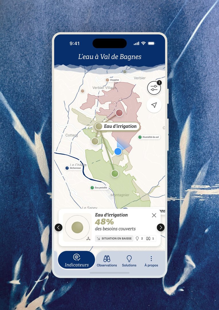
How can we facilitate dialogue, engagement, and decision-making in response to the challenges of water management and climate change in mountain regions? This replicable demonstrator from the European project MountResilience is the result of participatory and interdisciplinary research conducted in the heart of the Valais Alps. The web application brings together experts and the general public around three interconnected sections: relative indicators provide a shared overview of the situation in real time, participatory field observations foster engagement, and a catalog raises awareness of local solutions. The evaluative study of the tool identified several factors influencing engagement in the design of climate change adaptation solutions.
Design Research for Digital Innovation (EPFL+ECAL Lab)
by Zeynep Erol
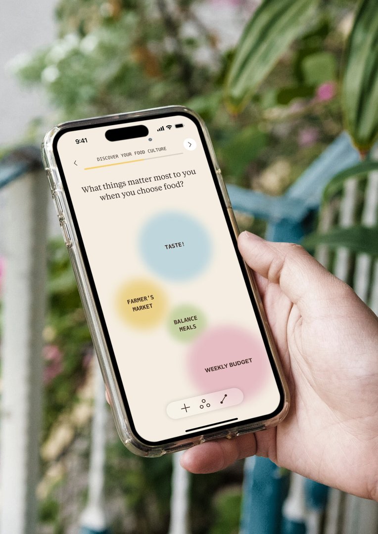
Sofra is a culturally adaptive conversational agent that supports dietary behaviour change by understanding how people relate to food. Developed within the EU SWITCH project, it builds a personal food culture from photos, mind maps, and voice notes that users provide to represent their everyday practices, motivations, and heritage. This profile shapes the agent's tone and suggestions, moving guidance from generic to grounded in each person's context. Developed through three user studies, the project shows how cultural resonance makes dietary support more relevant, respectful, and engaging. Combining interaction design and AI prompt engineering, Sofra challenges universal approaches to health technology and advocates for systems that adapt to, rather than flatten, cultural differences.
GRAPHIC DESIGN
by Clea Dunand
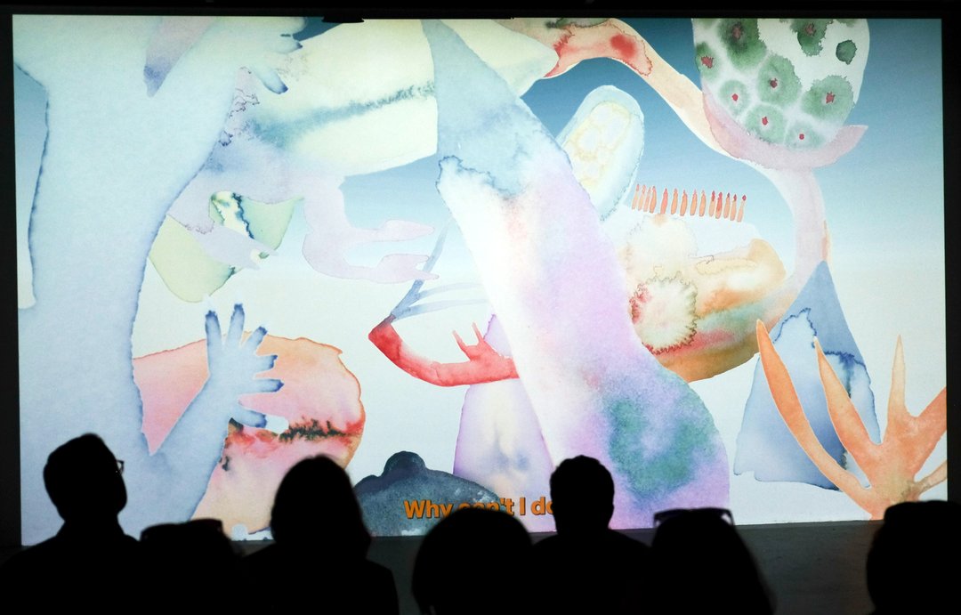
Il faut se perdre pour se retrouver est un court-métrage d'animation qui retrace un voyage intérieur : le cheminement sensible vers la guérison d'une dépression. Entièrement réalisé à l'aquarelle, le concept utilise la fluidité et les fusions de l'eau pour traduire visuellement l'évolution des états d'âme, de la sombre stagnation vers la reconnexion à la lumière. Ce projet constitue un défi de développement personnel majeur, transformant une expérience intime en une œuvre universelle. Sa particularité réside dans l'expérimentation de cette technique traditionnelle exigeante, où chaque frame peinte à la main apporte une texture vibrante et organique. Une quête artistique et thérapeutique menée de bout en bout.
GRAPHIC DESIGN
by Eliott Mouissat
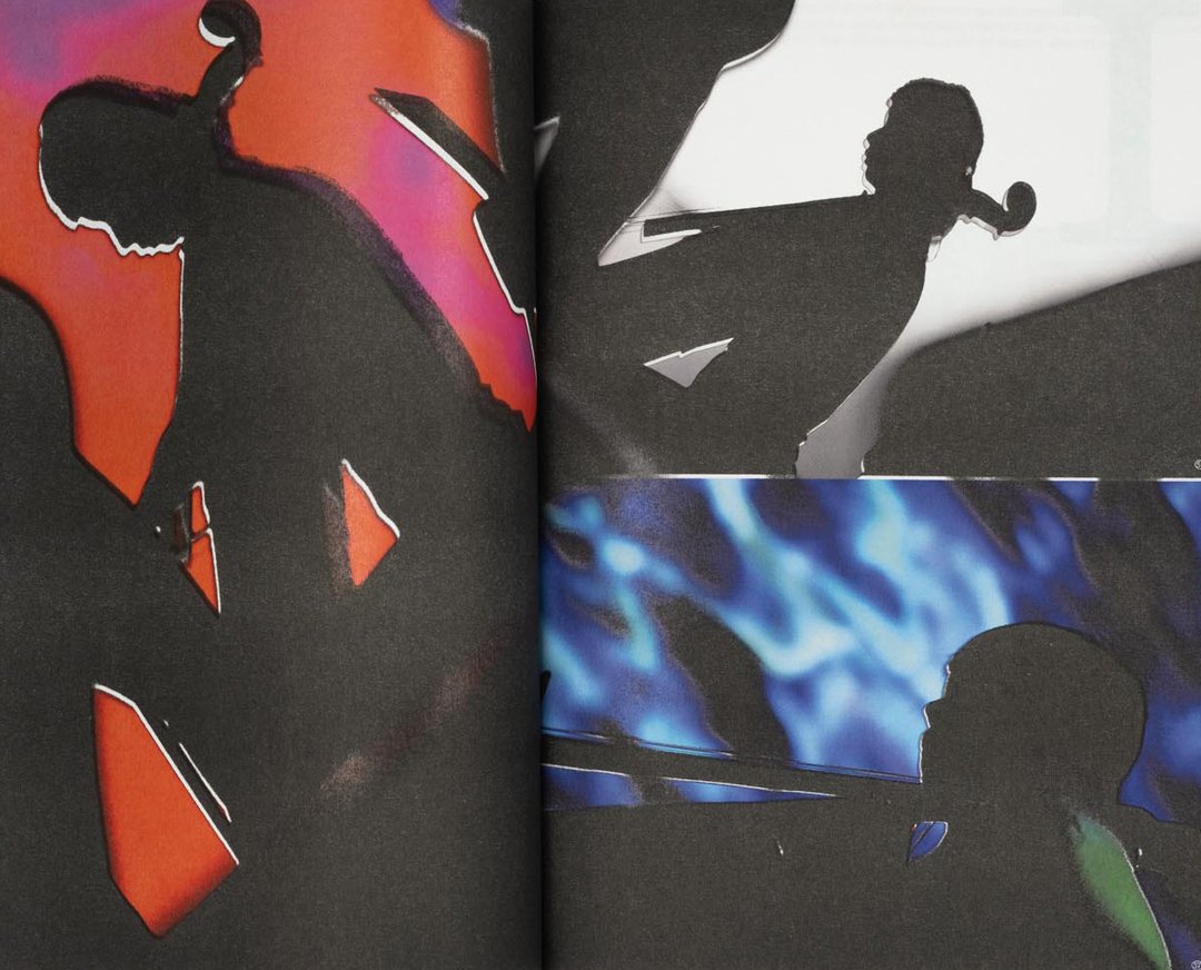
Face Z is a publication dedicated to the festival of the same name, which is committed to musical discovery and showcasing emerging artists. Drawing on archives, interviews, and testimonials, this publication seeks to capture the festival's identity and the values that underpin it: horizontality, exchange, and openness to the diversity of musical practices. The project also relies on a handmade production process using an old Riso printer, whose technical limitations defined the layout. Conceived as an evolving archive, this publication preserves a record of the history, memories, and relationships that have shaped Face Z.
FINE ARTS
by Nathan Pidoux
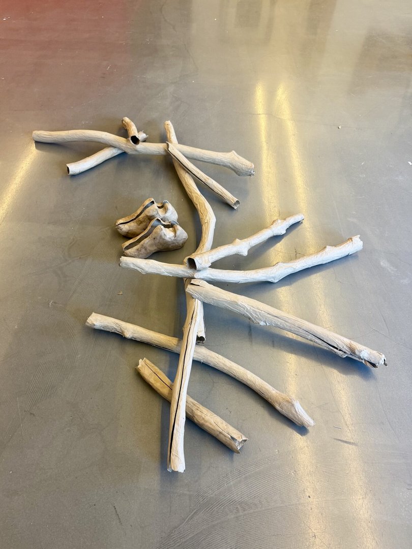
Reste does not tell a story. This project presents the traces of a passage, the remains of an action that has already come to an end. Somewhere between waste, relic, and fiction, the forms occupy the space as stubborn presences: awkward, vulnerable, irreducible. The hollow branches imitate wood without possessing its density. They are skins, tubes, simulacra. Their presence oscillates between prop and debris, between construction and collapse. The shoes and the backpack evoke an absent body, an interrupted journey, the possibility of departure or abandonment. In this installation, the exhibition space is envisionned as a site where objects can negotiate with one another. Forms collide, support one another, and occasionally meet.
GRAPHIC DESIGN
by Gabriel Polgar
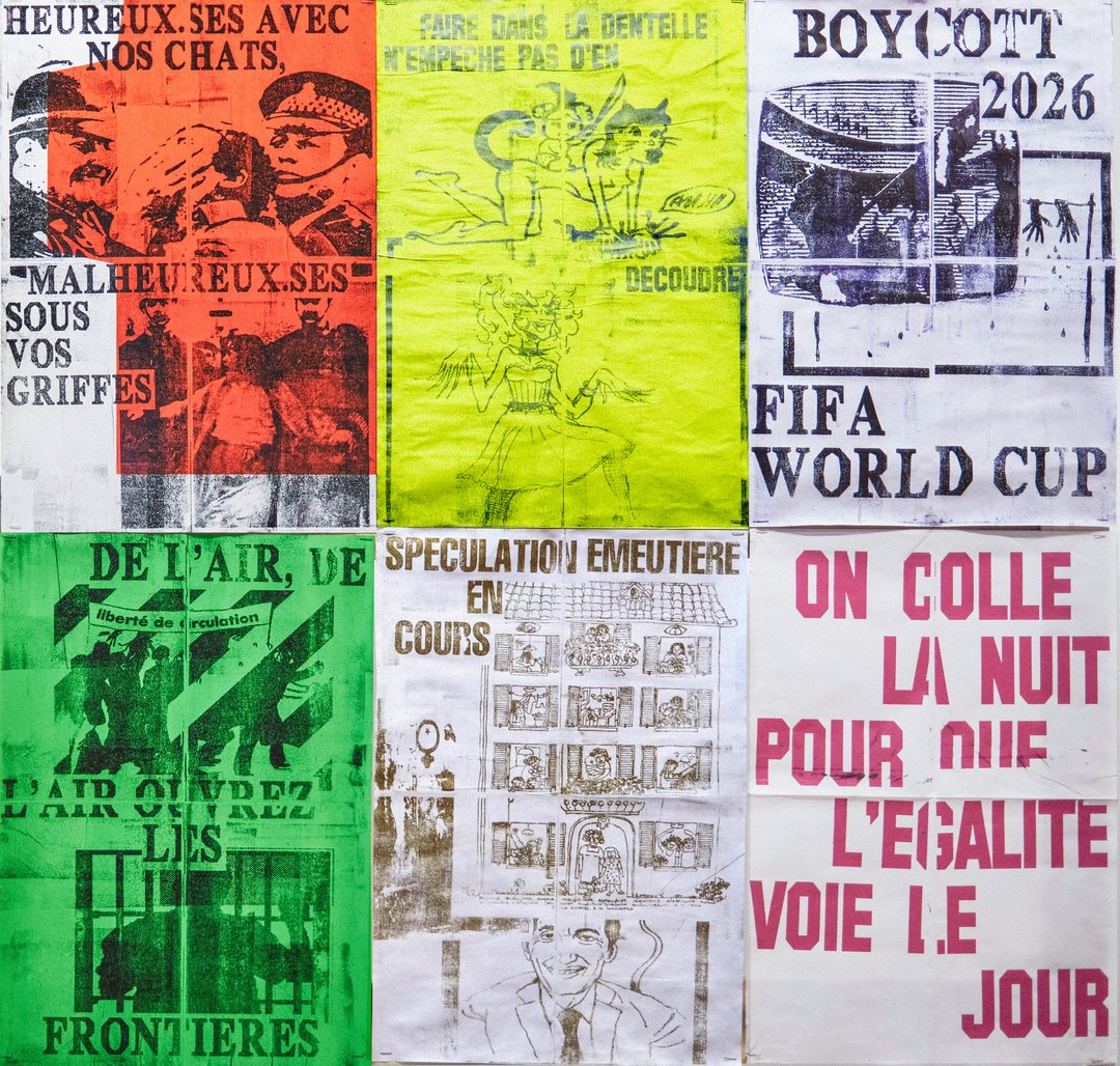
In a context marked by the erosion of social rights and the resurgence of far-right discourse, demonstrations are spaces where voices come together and grow stronger. From these gatherings emerges a rare collective energy: words are set free, solidarity is reinforced, and a shared momentum takes hold. Yet this force often fades and disappears far too quickly. Through a web-based design tool grounded in randomness, Tenir la rue, imprimer la rue aims to capture and extend these moments into everyday life. Using collectively gathered and contributed content, this project allows anyone to compose and print their own poster in the street.
INDUSTRIAL DESIGN
by Gion Luginbühl
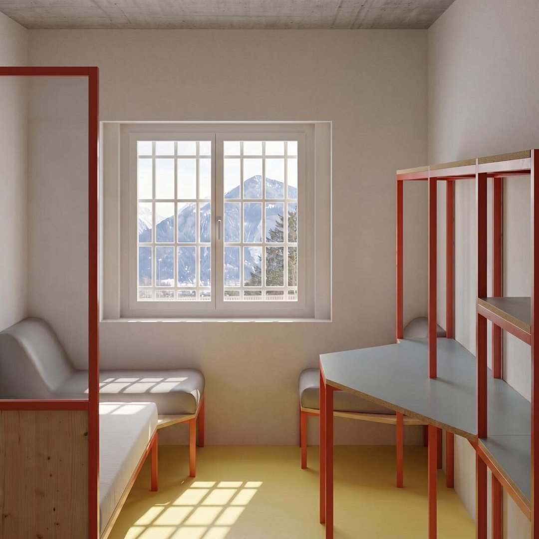
FURNITURE FOR PRISON ENVIRONMENT proposes a more humane approach to prison interiors. Designed as a modular structure fixed directly to the wall, it combines storage, work surfaces, lighting, seating, and spatial separation within a single coherent system. The construction responds to the specific requirements of prison environments: durability, safety, easy maintenance, and the possibility of local production in prison workshops. A careful selection of materials, including laminated beech, larch, plexiglas, and fire-resistant textiles, introduces warmth and variety to the cell. By strengthening the connection between the living space and the window, this project seeks to improve everyday comfort and create a stronger sense of normality.
FINE ARTS
by Kathleen Pickavance
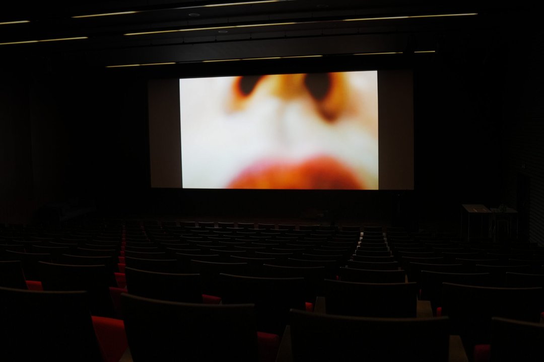
In the film La Senteuse, the artist plays a character who struggles to walk through a field in high heels. In order to reach her desired destination, she carries a long ladder with her, drawing the viewer closer to her body through the lens of an anonymous eye.
GRAPHIC DESIGN
by David Zwicker
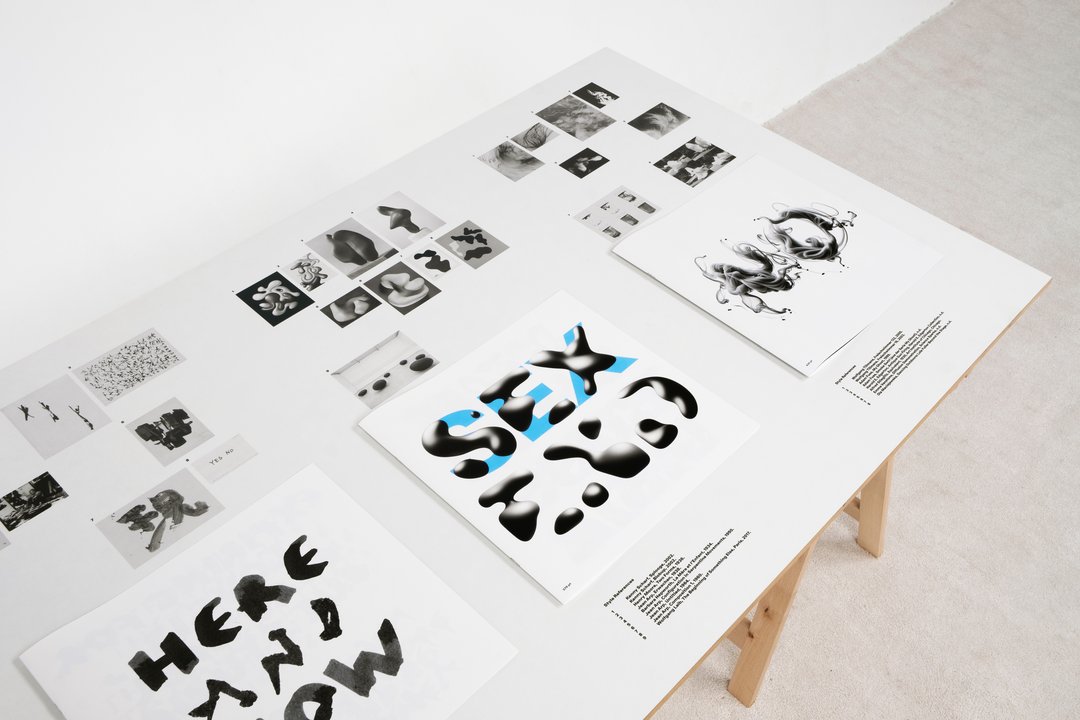
What happens when a typeface steps outside the boundaries of the vector? Typeable Images is a type design and research project that explores this question through emoji font technology, a medium that allows typefaces to be built from pixels rather than paths. Across analog and digital processes, the project reinterprets a single typeface through distinct artistic styles, from analog to digital reproduction, producing image-based fonts that can be typed, combined and overlaid. Typeable Images offers a new human-machine interaction, as well as a new dimension for type design.