GRAPHIC DESIGN
Editorial Design BA3 – S1 25–26
with Jonathan Hares
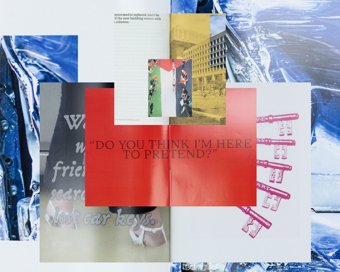
Third-year students had to produce an edition over half a semester, discovering as their subject an event that appeared in the newspaper on the date of the first lesson.
GRAPHIC DESIGN
with Jonathan Hares
Third-year students had to produce an edition over half a semester, discovering as their subject an event that appeared in the newspaper on the date of the first lesson.

GRAPHIC DESIGN
with Jonathan Hares
The third-year students had to produce an edition over half a term, choosing as their subject an event that had appeared in the newspaper on the date of the first lesson.

GRAPHIC DESIGN
with Jonathan Hares, Gilles Gavillet
Helix is a science popularisation project inspired by Isabella Maria Pasqualini’s thesis, entitled “Embodied Space in Architecture, Cognitive Neuroscience and Virtual Reality”, carried out at EPFL Architecture. The book focuses on the links of the human body with architecture and neuroscience, offering an interpretation and an appropriation of the thesis. To do this, the book explores the vector representation of the four chapters, alternating with photographic fragments illustrating the integration of the human body into the architecture of the book.

GRAPHIC DESIGN
with Gilles Gavillet, Jonathan Hares
Nativo+Latino reinvents the heritage and syncretism of the South American continent. Long shaped by the evangelisation of the indigenous people, the consequences of this mix of identities bears witness to the cultural and religious alienation of Latinos. Gradually, awareness of the indigenous condition has pushed their descendants to honour and revive their cult. This project is a place where Latin communities, who aim to reclaim this heritage that was until now regarded as pagan beliefs, to come together, confront one another and express themselves. Nativo takes the shape of ancestral memories and a collective imagination that reflects a reinterpretation of the practice of Catholicism in Latin America in order to restore power in a hybrid vision of identity.

GRAPHIC DESIGN
with Nicole Udry, Jonathan Hares
Recent scientific studies reveal that Red Sea corals are more resilient than average to rising water temperatures. This unique coral refuge on earth gives great hope to scientists and allows them to analyse factors of coral resistance before they to eventually disappear. Red Sea Last Hope combines scientific reports, expedition accounts and geopolitical archives, aiming to raise awareness about the gradual disappearance of corals while highlighting the influence of the geopolitics of the Red Sea, which is delaying research.

GRAPHIC DESIGN
with Jonathan Hares, Aurèle Sack
Yours to Play and Win is a typeface promotion project on the theme of chess. Letters, just like the game’s pieces, are symbols which become meaningful once they have been activated by abstract human activity, i.e. thought. Referring to Duchamp, the ideographic representations of the cognitive process show their real potential, which goes beyond plain visual organisation. The font belongs to the Egyptian family, which hints to a modern mechanism, while honouring craftsmanship with the serifs. The monocase proportions adapt to the game’s modular elements and the rounded edges add an organic quality to recall the human mind. The text showcases the game’s principles and the ideas as a way to demonstrate the project’s message.

GRAPHIC DESIGN
with Nicole Udry, Jonathan Hares
Harmonic Structures is an attempt to develop a modular and musical graphic language that could form the basis of a sound architecture. The first issue reviews information specific to the building and the population of Le Lignon in Geneva, in order to apply it in a two-dimensional musical notation system. Finally, these data are interpreted by a musician using an MPC 1000 to communicate in acoustic terms what precisely constitutes the building.

GRAPHIC DESIGN
with Diego Bontognali, Jonathan Hares
Photosensitive epilepsy is a variant of epilepsy in which the affected person suffers from particular reactions to light and certain static patterns. Due to a lack of awareness of this disorder, our environment contains a large number of visual triggers, which endanger the daily life of photosensitive people. My project reproduces in virtual reality the most harmful locations and elements for photosensitive people, always illustrating two of these variants: the one that is visually accepted and the one that acts as a visual trigger. Being both a graphic designer and a photosensitive person, I sought to highlight the ignorance of this disease, which leads to visual exclusion. This is reinforced by the idea that I myself will never be able to view my own project in its full form.

GRAPHIC DESIGN
with Aurèle Sack, Jonathan Hares
Coemeter offers a reinterpretation of the Trajan typeface. This font is rich in history, from the Roman stones on which it first appeared to its various contemporary adaptations in stone engraving, predominantly found on funerary monuments in the Western world. This typographic work is showcased on a website. A digital cemetery awaits, where you can engrave your tombstone and personalise your mourning space. Coemeter plays on dualities, i.e. the sacred and the profane, history and anachronism, matter and consciousness. This unpretentious and poetic experience invites us to reconsider our connection with stone, memory and loss.

GRAPHIC DESIGN
with Gilles Gavillet, Jonathan Hares

GRAPHIC DESIGN
with Jonathan Hares, Guy Meldem
A family. The starting point is the colonisation of India. The only records we have are of the English men who settled there. The Indian women, their culture and identity were lost, erased. The only one we have left is called Kummo. When my grandfather Lionel arrived in London, he moved to Southall. This suburb is now known as “Little India”. The streets and signs are a testament to its cultural mix. This book aims to tell the suspended stories of my family and the visual forms they have taken, and sheds light on the women that have been erased by history.

GRAPHIC DESIGN
with Jonathan Hares, Nicole Udry
“Jeux Réunis” is a graphic novel that leads us to explore a world in which platform cooperativism is the answer to all our basic needs. This illustrative project highlights the principles of a sharing economy through visual symbols and metaphors. Caught up in the game, the reader embodies a character who, following the discovery of a cooperativism platform, drifts off into a daydream. The aim is then to explore the areas of tension between fiction and everyday scenes in order to understand the ties between the inhabitants of Syn, the city of sharing.

GRAPHIC DESIGN
with Jonathan Hares, Guy Meldem
This artisanal project is an ongoing experimentation in papermaking. The successes, failures and overall evolution of techniques are documented to form a personal journal of an ancient craft. The project addresses the source and status of fibres; it addresses the opportunity to bring back to life old, used and unwanted paper that would have lost all trace of its past life through industrial recycling. The project is about accepting chance and the deficiencies of handicrafts for what they offer instead of eliminating them for what they do not.

GRAPHIC DESIGN
with Gilles Gavillet, Jonathan Hares
Emotions seem to be a simple concept at first glance, but when we try to look more closely at how they work, we soon realise the complexity and subtlety that this very sophisticated form of communication can take. To deal with this subject I decided to focus on facial expressions through the study of masks. Masks are a synthesis and a caricature of emotional archetypes. Moreover, the contexts in which they are used provide leads for research in understanding human reactions to this type of visual message.

GRAPHIC DESIGN
with Diego Bontognali, Jonathan Hares
When I began to take an interest in the world of music, Daniele Baldelli was my first reference. Through an interactive cross-media project, “Cosmic Journey” addresses cosmic sound, a musical subculture founded by Daniele Baldelli. From Rimini to Lazise via Cattolica, cosmic sound is not a style of music, but a way of mixing. https://cosmic.Jean-Rene-Jean.dev

GRAPHIC DESIGN
with Gilles Gavillet, Jonathan Hares
“CSX369” features research on the potential of variable fonts in the ASCII technique. A technical quality is identified – that of precise quantification between two instances – and used for colour mixing through typography. Letters are tripled in the same position and each one has a primary colour. Their interspersed variations create secondary, tertiary, etc. hues. The system is implemented with an image processing tool. The research is presented with a specimen and some posters. Prix de l’ECAL

GRAPHIC DESIGN
with Gilles Gavillet, Jonathan Hares
Pick a subject, an editorial style, and a medium – either book or digital.
![Clio Hadjigeorgiou – Κυπριώτικο Σκετς / [kipri’otiko skets] / Cypriot Sketch](https://ecal-media.sos-ch-gva-2.exo.io/filer_public_thumbnails/filer_public/2f/83/2f83d5e4-9fea-4166-b30f-fec85e1993a5/8a7b55531ce8a922b0046f4bf8fcd279.jpg__800x800_q85_ALIAS-feed-thumbs_subsampling-2_upscale.jpg)
GRAPHIC DESIGN
with Jonathan Hares, Diego Bontognali
Cypriot dialect was first broadcast in the media through radio in 1950. Via three stories by Andreas Koukkides, Cypriot Sketch highlights some cultural and linguistic elements of Cypriot dialect. The language barrier is no longer an obstacle but a communication challenge. Compound words, proverbs and phrases are translated visually and in a playful manner. Considerable linguistic borrowing happened as a glossary of loanwords shows at the end of the book; the words are all taken from the transcribed stories and are translated into the related languages of the dialect.

GRAPHIC DESIGN
with Jonathan Hares, Guy Meldem
I had the opportunity to collaborate with the Italian artist Alessandro Calabrese on a monograph of his latest work. In this work the artist used a flatbed scanner to create all the works that are part of this project. Initially I was faced with this gap between photographic production and manual photographic composition. I was spontaneously inspired to take over the artist's production codes to design the book. In fact the entire book is composed through the use a scanner by hand.

GRAPHIC DESIGN
with Jonathan Hares, Aurèle Sack
Mundaka is a family of fonts inspired by the expressive and vernacular forms of Basque fonts. Originating from a pre-Antiquity language that remains the last living isolate and the oldest language in Western Europe, Basque typography embodies the local identity. Halfway between regionalism and global openness, Mundaka questions the notion of heritage and its cultural propagation in a globalised era. I found it very motivating to work in this cultural context and to get to grips with these specific fonts; this experience has given me ideas for the future.

GRAPHIC DESIGN
with Gilles Gavillet, Jonathan Hares
My graduating piece is a graphic transcription of a contemporary play. Nous , a play by Fabrice Gorgerat, was performed for the first time in February 2019. The play recalls a gun shooting that took place in 2016 at Pulse, a gay nightclub in Orlando, and questions everyone’s role in such tragedies. The graphic direction aims to be as close as possible to the message and feelings that the author wanted to convey. Each scene represents a way of approaching this kind of event: actively, emphatically, passively or neutrally, and is presented in a self-contained object.

GRAPHIC DESIGN
with Jonathan Hares, Nicole Udry
Sans filtre is the result of applied research on communication tools for people with dementia. This editorial project brings together meetings, exchanges, analyses and the evolution of a formal, visual and sensitive language created for people in mental decline. Mainly based on a human experience, this work invites a change of perspective on dementia by focusing on the unimpaired capacities of people who are too often stigmatized and dehumanized by their condition. Structured as a diary, Sans filtre offers a personal and emotional journey into the vast subject of dementia.

GRAPHIC DESIGN
with Gilles Gavillet, Jonathan Hares

GRAPHIC DESIGN
with Vincent Jacquier, Jonathan Hares, Guy Meldem
Anima Mundi is a transmedia platform designed to revive some of the most fundamental philosophical virtues. The project carries out both theoretical and visual research about the «Deep Ecology» movement, which promotes the development of a physical, intellectual and, above all, emotional bond with nature. Different facets of the same content evolve across three mediums:the video-collage unveils an immersive and sensory experience while the book offers a personal study of conceptual matter. Both the book and video are published on a website.

GRAPHIC DESIGN
with Gilles Gavillet, Jonathan Hares
viet/ l’ing/ ai non/ ai l/ (vietato l’ingresso ai non addetti ai lavori entry to non-professionals is forbidden) "The further a project is from its state of completion, the more it is virtual, it does not mean that there is 'less', but on the contrary that it is more open to multiple reappropriations." (Pierre Lévy) This project explores the unfinished Sicilian, these architectures of public order having never functioned. It tries to locate, to grasp the temporal state of these places. The book oscillates between elevation and shock, construction and decomposition. Between the ruin, which incites to remember and the construction site to imagine, what projection can we have, today, of these urban objects?

GRAPHIC DESIGN
with Diego Bontognali, Jonathan Hares
Artefact Analogique is a photographic study and observation work defining and questioning the image development process. Images are put together using various predefined forms and tools, which have been selected according to their graphical potential. After this allocation, a merger process is put into place. Once this has been done, the result is subjected to analogical phenomena such as projection, reflection, rotation and vibration, causing visual reactions.

GRAPHIC DESIGN
with Gilles Gavillet, Jonathan Hares
Pick a subject, an editorial style, and a medium – either book or digital.

GRAPHIC DESIGN
with Vincent Jacquier, Diego Bontognali, Jonathan Hares
«Uréthane» is an immersive experienced through Virtual Reality. It is a personal interpretation of the fashion designer’s work Vanessa Schindler, which aims to communicate visually and in three dimensions the universe of her latest collection. Virtual Reality seemed to me to be a new, rich and appropriate medium to explore within the field of Graphic Design and more specifically by associating it to fashion. Collaborations, visual experimentations and the learning of new techniques are elements that have contributed to my pleasure in carrying out this project.

GRAPHIC DESIGN
with Jonathan Hares, Guy Meldem
The next wave of renewal for music scenes comes from the developing world of the “Next Eleven” countries. Their over-driven economic metabolisms generate all manner of social tensions and cultural rifts, which generates some 21st Century musical form. That non-Western folk forms, colliding with digital technology, will spawn some avant-garde new sound. A form where sound is fully meshed with visual imagery. Next Eleven Paper redefines the way we promote music and fills the gap between physical object and digital media. The first number is set in Mexico City.

GRAPHIC DESIGN
with Jonathan Hares, Nicole Udry
K-A-F-F is a poster series to announce concerts of a culture space. This project is a manifestation of manual and independent print production using screen printing. The compositions are manually and directly posed on the screen to flash the frame. The instant power of music is transmitted through the manual gesture into a visual language and gets reproducible through screen printing. It is the search for an efficient manual production to find a powerful and raw identity through adapted tools. This project allowed me to work manually at 100%.

GRAPHIC DESIGN
with Jonathan Hares, Guy Meldem
The phrase "Purple America" challenges the preconception that the United States is neatly divided between conservative "red " states and liberal "blue" states. Likewise, "Purple Country" aims to add nuance to the political jargon we so often accept at face value. In this political lexicon, words are (defined) not by their conventional definitions, but by articles, poems, political memorabilia. Their meanings warp over time and depending on who they are said and heard by. In these times of incomprehension, "Purple Country" serves as a primer for the linguistic chasm that has divided a nation.

GRAPHIC DESIGN
with Gilles Gavillet, Jonathan Hares, Aurèle Sack
27.03.1977 ((1706:50)) aims to analyse forty years later, the different factors which led to the deadliest accident in aviation history—the Tenerife Airport Disaster—which occured in Los Rodeos Airport, in March 27, 1977 in the Canary Islands, in Spain. Gathering official and documentary sources of references, it is a visualization of the interferences, present under multiple sorts: temporal, visual, behavioral and audio. We wish by this book not only to investigate factors of danger in aeronautics, but also to shape a better future for Aviation Security and Air Traffic Control.

GRAPHIC DESIGN
with Gilles Gavillet, Jonathan Hares, Aurèle Sack

GRAPHIC DESIGN
with Gilles Gavillet, Jonathan Hares, Aurèle Sack

GRAPHIC DESIGN
with Gilles Gavillet, Jonathan Hares
ANIMA is a catalog of images and ideas inviting to imagine an unfinished film about the afterlife. Through concepts such as encryption, symbolism, surrealism, randomness and infinite, the book is a puzzle to decipher. By an infinite combination of pages, there may be a multitude of possible books, films, stories... This editorial research allowed me to question the medium of the book in its structure and reading.

GRAPHIC DESIGN
with Angelo Benedetto, Gilles Gavillet, Jonathan Hares
Make an edition with the list of names of tropical cyclones.

GRAPHIC DESIGN
with Angelo Benedetto, Gilles Gavillet, Jonathan Hares
Creation of an edition from the interview between Lance Armstrong and Oprah Winfrey.

GRAPHIC DESIGN
with Jonathan Hares, Jonas Vögeli
Communication project presenting the latest independent cinema in Lausanne, its archives and a communication system for upcoming events.