Bibliothèque

Marvin Armand – Bibliothèque

“Bibliothèque” addresses typographical signs and their use in the perfume industry. This project features an olfactory alphabet of 45 elements. Each represents a scent of the perfume company “L’Eau de Cassis”. At the crossroads of illustration and typography, this alphabet takes us on a journey through the ephemeral nature of smells. Indeed, this notion of time and temporality inspired me to define a protocol to develop the nature of each sign from figuration to abstraction. “Bibliothèque” thus offers a new way of exploring signs and visual identity.

Diploma project (2020) by Marvin Armand

Know-how
Type design, Visual identity, Packaging
Bibliothèque
Bibliothèque

1/2

Bibliothèque
Bibliothèque

1/2

m432bmfv.jpg
Image Angèle Marignac-Serra

1/2

Image Angèle Marignac-Serra

1/8

Projects related to Visual identity

ON 2040 - MASTER TYPE DESIGN

MA TYPE DESIGN

ON 2040 - MASTER TYPE DESIGN

with Larissa Kasper

Following a collaboration with the Swiss avant-garde brand On, ECAL is proud to present the interdisciplinary work carried out jointly by the 2nd year students of the Product Design, Photography and Type Design Masters.

Audio Reactive

BA MEDIA & INTERACTION DESIGN

Audio Reactive

with Gaël Hugo

Series of audio reactive projects developed for the visual identity of the French Pavilion “Studio Venezia” by Xavier Veilhan at the Biennale di Venezia. Instagram posts were produced based on these experiments. Curators: Lionel Bovier and Christian Marclay Graphic Design: Gavillet Cie

Stephanie Wilson – Iconic

MA TYPE DESIGN

Stephanie Wilson – Iconic

by Stephanie Wilson

Iconic stands at the intersection of typography, social research, and inclusive design. It addresses a growing concern: making reading more accessible for senior readers. Through the development of a typeface named Iconic, the project aims to enhance reading comfort while offering an aesthetic, functional, and adaptable typeface suited to the changes associated with aging. The project was created in collaboration with senior-lab, a Swiss platform dedicated to enhancing the quality of life for seniors. Grounded in a participatory methodology, this collaboration enabled a reality-based approach: available in serif, sans serif, sans semibold, and italics, Iconic was designed based on feedback and testimonials gathered from seniors during sessions held at ECAL.

Type Specimen – 2023 #3

BA GRAPHIC DESIGN

Type Specimen – 2023 #3

with Robert Huber

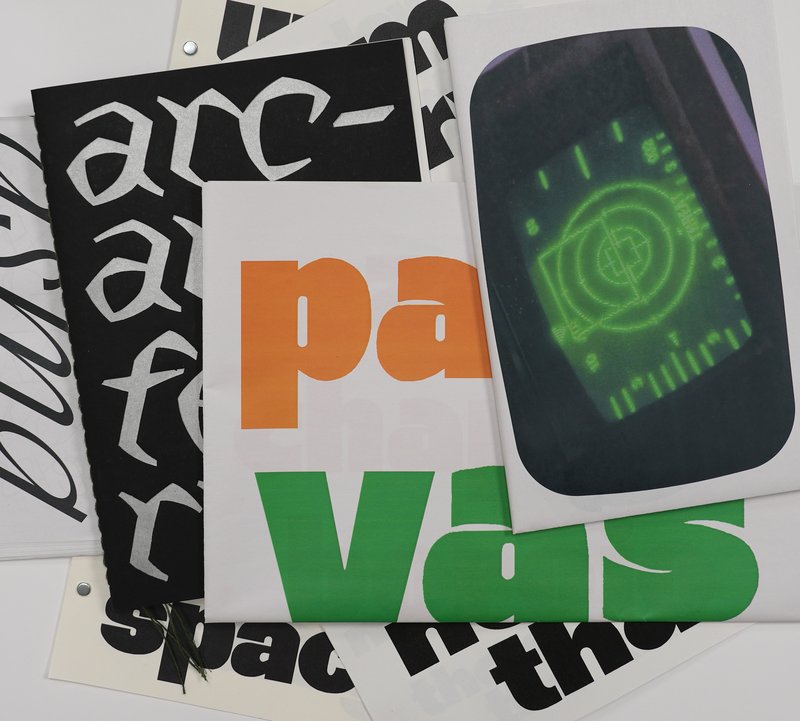
Type design displayed on a specimen.

Break It Fix It

BA MEDIA & INTERACTION DESIGN

Break It Fix It

with Daniël Maarleveld

Break it Fix it is the workshop's result conducted under the direction of Daniel Maarleveld. Based on the music Technologic - Daft Punk, each group have reappropriated a phrase to enhance it graphically. The result is a series of posters, a video clip compiling the different typographic systems, and a series of interactive posters based on the same rules.

Related courses