BA GRAPHIC DESIGN
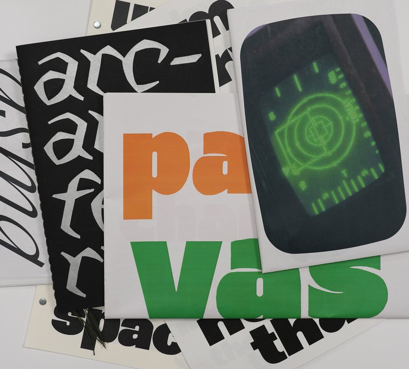
Type Specimen – 2023 #3
with Robert Huber
Type design displayed on a specimen.

Diploma project (2020) by Marvin Armand


1/2


1/2


1/2


1/8
BA GRAPHIC DESIGN
with Robert Huber
Type design displayed on a specimen.

BA GRAPHIC DESIGN
by Simon Cossy
The Openground visual identity project is born out of two observations made by the graphic designer in his practice of basketball coaching for 14 year olds. Firstly, organized sports require resources, organisation and a framework that many kids don't have access to. A lot of them thus quit their club, and some will continue playing the sport they love outside, on public playgrounds. Secondly, an impactful visual language can be a powerful tool to create enthusiasm, motivation and a sense of belonging for these youths. How, then, can one use of this tool in the context of exterior amateur basketball, so that kids who are not able to join a club still feel concerned by the game and legitimate to play it?

BA GRAPHIC DESIGN
by Alexandre Carruzzo
CH38 is a visual identity design proposal for the upcoming 2038 Olympic Winter Games in Switzerland. This project seeks to address the lack of visual unity between the increasingly complex live analytical overlays of televised sporting events with the overall aesthetic of the Games. In an effort to establish a consistent visual connection between the greater aesthetic and the various information displayed on-screen, CH38 offers a variable uniwidth typeface, Swinter. With three degrees of spatial freedom, it brings visual dynamism to the overlay, reflecting the sporting spirit of the Games. Moreover, its geometric construction echoes Swiss values of rigor and precision.
BA MEDIA & INTERACTION DESIGN
with Daniël Maarleveld
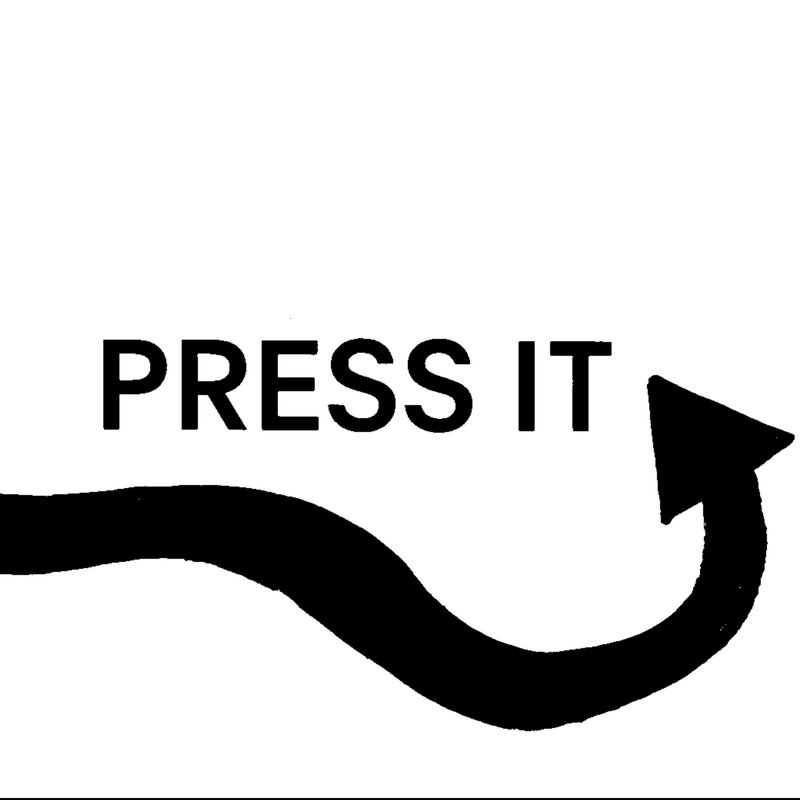
Break it Fix it is the workshop's result conducted under the direction of Daniel Maarleveld. Based on the music Technologic - Daft Punk, each group have reappropriated a phrase to enhance it graphically. The result is a series of posters, a video clip compiling the different typographic systems, and a series of interactive posters based on the same rules.

MA TYPE DESIGN
with Larissa Kasper
Following a collaboration with the Swiss avant-garde brand On, ECAL is proud to present the interdisciplinary work carried out jointly by the 2nd year students of the Product Design, Photography and Type Design Masters.