2026 Diplomas – Bachelor Graphic Design

Published
June 24, 2026

Discover the diploma projects from the Bachelor Graphic Design.


Projects

Clara Besson – L'Or du Transvaal / L'Or des DuBois

GRAPHIC DESIGN

Clara Besson – L'Or du Transvaal / L'Or des DuBois

by Clara Besson

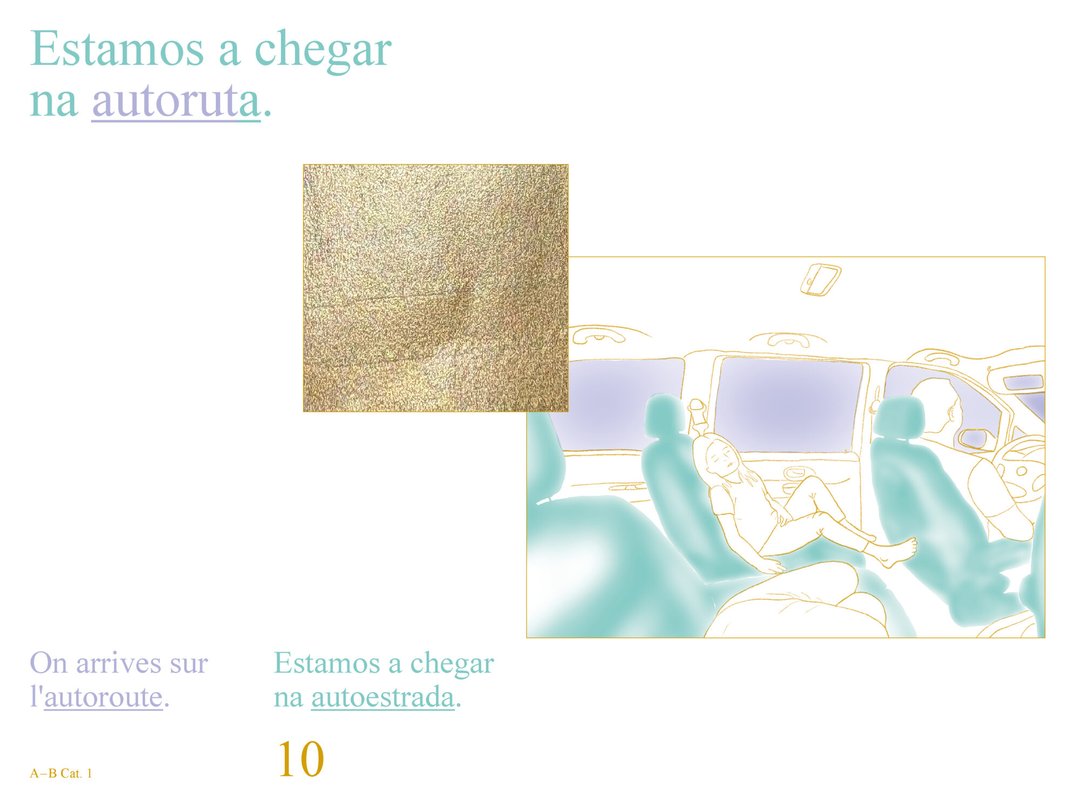
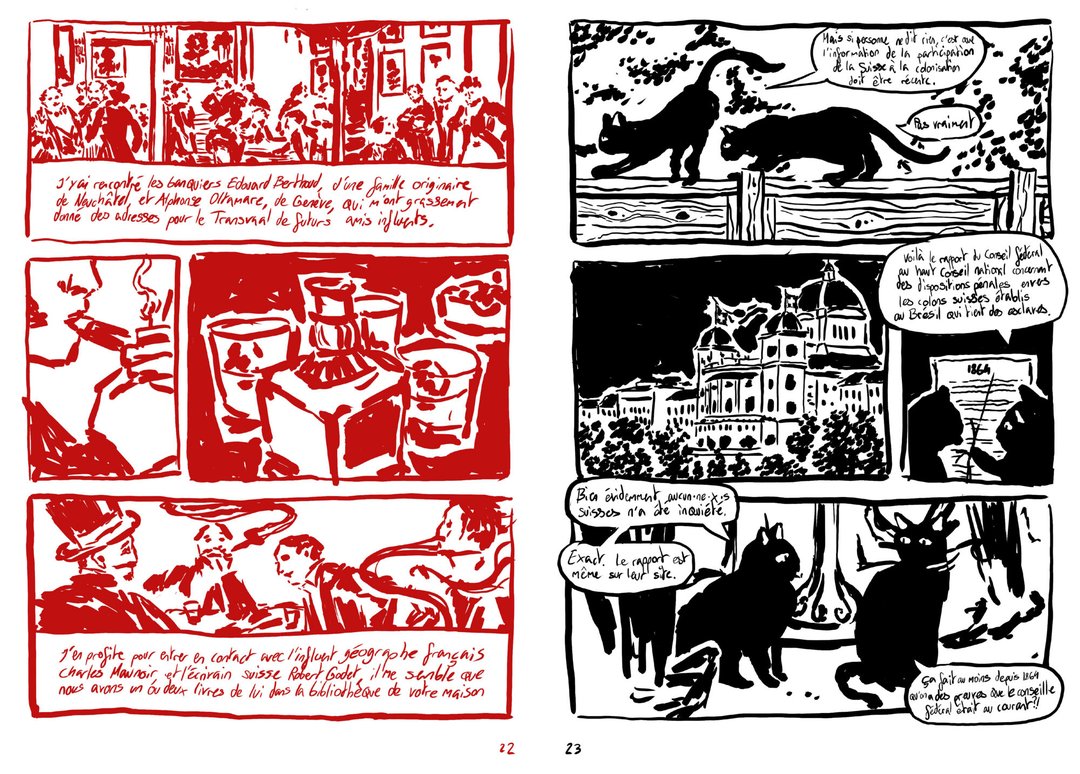
L'Or du Transvaal / L'Or des DuBois is the first volume of the Recto / Verso collection, which aims to encourage Swiss people, and especially young people, to question the history of their country. This volume explores how Switzerland has been and remains imperialist, through the story of the DuBois family from Le Locle, who left to exploit gold in Transvaal in the 19th century. Each double page mirrors two simultaneous realities: the imperialist narrative on the left and its multidimensional critique on the right, the same events told from radically different points of view, by entities that coexist without ever directly interacting. In a context of rising far-right politics across the West, L'Or du Transvaal / L'Or des DuBois intends to fight by the transmission of knowledge beyond academic circles.

Joe Bionda – FINGERS CROSSED WHEN YOU HAVE NO CHOICE

GRAPHIC DESIGN

Joe Bionda – FINGERS CROSSED WHEN YOU HAVE NO CHOICE

by Joe Bionda

Mexico City rests on a ghost. Built on the waters of the former Lake Texcoco, the site of Tenochtitlán, the city sinks by 20 to 40 cm per year. Buildings tilt, cracks spread, structures become unstable: the city is slipping. Through the local creative scene, the magazine INGERS CROSSED WHEN YOU HAVE NO CHOICE envisions a post-apocalyptic Mexico City not as a distant fiction, but as a sensitive extension of the present. A territory where anxiety, desire, and nightmares coexist, shaped by insecurity and violence. This project brings together research, editorial and art direction, graphic design, and artisanal printing. It offers a situated reading of the city, seen as a living palimpsest in constant transformation.

Alexandre Carruzzo – CH38

GRAPHIC DESIGN

Alexandre Carruzzo – CH38

by Alexandre Carruzzo

CH38 is a visual identity design proposal for the upcoming 2038 Olympic Winter Games in Switzerland. This project seeks to address the lack of visual unity between the increasingly complex live analytical overlays of televised sporting events with the overall aesthetic of the Games. In an effort to establish a consistent visual connection between the greater aesthetic and the various information displayed on-screen, CH38 offers a variable uniwidth typeface, Swinter. With three degrees of spatial freedom, it brings visual dynamism to the overlay, reflecting the sporting spirit of the Games. Moreover, its geometric construction echoes Swiss values of rigor and precision.

Maeva Chanson – RIPOST(er)

GRAPHIC DESIGN

Maeva Chanson – RIPOST(er)

by Maeva Chanson

RIPOST(er) is an edition situated between archive and manifesto, exploring temporary autonomous zones through the lens of freeparties. This publication focuses on these ephemeral spaces where individuals gather to dance, vibrate, create, and self-organize outside the frameworks imposed by the system. In the current French political context, where surveillance, repression, and criminalization are increasingly reinforced, these collective forms become targets. This project questions what is truly at stake: not the party itself, but the temporary existence of spaces that escape the logics of control, normalization, and commodification. RIPOST(er) reveals the possibility, however brief, of other ways of creating and living together.

Simon Cossy – Openground

GRAPHIC DESIGN

Simon Cossy – Openground

by Simon Cossy

The Openground visual identity project is born out of two observations made by the graphic designer in his practice of basketball coaching for 14 year olds. Firstly, organized sports require resources, organisation and a framework that many kids don't have access to. A lot of them thus quit their club, and some will continue playing the sport they love outside, on public playgrounds. Secondly, an impactful visual language can be a powerful tool to create enthusiasm, motivation and a sense of belonging for these youths. How, then, can one use of this tool in the context of exterior amateur basketball, so that kids who are not able to join a club still feel concerned by the game and legitimate to play it?

Carolina Crivelli – Gossip

GRAPHIC DESIGN

Carolina Crivelli – Gossip

by Carolina Crivelli

Gossip is a magazine which explores perceptions of femininity through activities that have historically been — and still are today — associated with women, such as knitting, embroidery and cooking. Every aspect of the magazine aims to reclaim the female mode of transmission, which has until now remained on the margins of history, in a political and feminist way: from the hierarchy between text and image, through the horizontal structure of voices, to the printing process, where areas of white, which are normally never highlighted, are printed and brought to the foreground. In an era marked by the resurgence of misogyny, patriarchy and the concept of the "trad wife", Gossip aims to be a space for rediscovering women's history and discussing the role of our activities within society.

Da Silva Romão Caroline – Ce qui nos fica

GRAPHIC DESIGN

Da Silva Romão Caroline – Ce qui nos fica

by Da Silva Romão Caroline

The book Ce qui nos fica brings together Frentuguese, a hybrid French-Portuguese language that emerged within Portuguese immigrant families in French-speaking Switzerland. Through words that were never written down but passed on orally, it captures a memory that is both collective and personal: that of a linguistic, cultural, and familial in-between. The book offers a snapshot of this language, frozen in time as it exists in 2026. What we are left with are not only these words and expressions, but also the memories of the annual journeys between Switzerland and Portugal: the long trips by car or autobus, which are, like us, suspended between two countries.

Siméon Dubuis – UNFOLDING TOPOGRAPHIES

GRAPHIC DESIGN

Siméon Dubuis – UNFOLDING TOPOGRAPHIES

by Siméon Dubuis

In recent years, the mountains have been crumbling spectacularly, and with them, various myths. Far from the idyllic images of postcards, valleys and villages are cut off from the world; in the worst cases, they are wiped off the map. Against this backdrop, UNFOLDING TOPOGRAPHIES re-examines the clichés of Alpine representation to propose new visual narratives. This graphic research project intervenes at the very heart of the production matrix where images are created, appropriating both industrial production techniques such as offset printing and more traditional methods such as copper engraving. UNFOLDING TOPOGRAPHIES explores how our representations shape our environment and influence our interactions with it.

Clea Dunand – Il faut se perdre pour se retrouver

GRAPHIC DESIGN

Clea Dunand – Il faut se perdre pour se retrouver

by Clea Dunand

Il faut se perdre pour se retrouver est un court-métrage d'animation qui retrace un voyage intérieur : le cheminement sensible vers la guérison d'une dépression. Entièrement réalisé à l'aquarelle, le concept utilise la fluidité et les fusions de l'eau pour traduire visuellement l'évolution des états d'âme, de la sombre stagnation vers la reconnexion à la lumière. Ce projet constitue un défi de développement personnel majeur, transformant une expérience intime en une œuvre universelle. Sa particularité réside dans l'expérimentation de cette technique traditionnelle exigeante, où chaque frame peinte à la main apporte une texture vibrante et organique. Une quête artistique et thérapeutique menée de bout en bout.

Alice Gillioz – A Landscape of Consciousness

GRAPHIC DESIGN

Alice Gillioz – A Landscape of Consciousness

by Alice Gillioz

A Landscape of Consciousness materializes contemporary theories of consciousness through an immersive exploration. Along a non-linear narrative journey, visitors navigate a virtual campus where conceptual frameworks take the form of streets and urban structures. A Landscape of Consciousness also unfolds as a festival whose topography mirrors this organization, allowing neighboring theories to coexist and engage in dialogue. Inspired by Robert Lawrence Kuhn's Landscape of Consciousness — a resource originally designed for researchers — this project seeks to build bridges between specialists and non-specialists.

Clara Hoya – Monumentum post inferna

GRAPHIC DESIGN

Clara Hoya – Monumentum post inferna

by Clara Hoya

Monumentum post inferna is a tribute to the place music holds in the graphic designer's life. Since childhood, music has shaped her relationship with the world, and in her teens, black metal opened the doors to a universe whose center of gravity seemed to lie in Oslo, at a now-legendary venue: Neseblod, formerly Helvete. Behind the records and display cases lingers the enduring presence of this shop's past, which has left its mark on the history of black metal, and become a place of collective memory and pilgrimage. Book conceived as a film script, Through Monumentum post inferna presents the objects, stories, and myths that continue to echo the history of black metal within its walls, highlighting their significance and excess.

Noa Jetzer – Alula

GRAPHIC DESIGN

Noa Jetzer – Alula

by Noa Jetzer

Born from an interest in animation, digital media and accessibility, Alula is a project developed in collaboration with occupational therapist Romain Savioz. It explores the following question: what might a digital environment designed to foster autonomy in emotional self-regulation among young people look like? Conceived as a resource space alongside therapy, the project envisions its visual universe through a stop-motion animation, pen-and-ink illustrations and interactive prototypes. Together, they outline an evolving digital garden where each action contributes to shaping a unique landscape. By combining analogue techniques with interactive design, Alula develops a sensitive, narrative and accessible approach to digital graphic design.

Darina Komm – Threads

GRAPHIC DESIGN

Darina Komm – Threads

by Darina Komm

For centuries, the knowledge of embroidery was passed down among women, gradually becoming a tradition and an integral part of culture. Threads reflects a contemporary perspective, exploring embroidery as a form of visual communication. Here, ornaments treated as a structured language — one that carries ideas of protection, identity, and conection. Rooted in the traditions of Central Ukraine between late 19th and early 20th centuries, Threads combines research with interpretation, offering not only historical insight but also a personal attempt to reconnect with cultural memory through photography, pattern, and storytelling.

Mattias Koskinen – SKRÅ - Mind in Finland

GRAPHIC DESIGN

Mattias Koskinen – SKRÅ - Mind in Finland

by Mattias Koskinen

SKRÅ is a clothing brand that draws its inspiration directly from Finland. Designed to reveal what others may not perceive, it opens new paths for exploration. The term Skrå comes from the Swedish language means something oblique or inclined. This first pre-capsule collection, "Mind in Finland", aims to showcase the very essence of the brand. The collection sets aside conventional codes to present a new perspective. It embraces opacity, textures, organic silhouettes, and elongated forms, elements that emerge when landscapes are immersed in light and the shadows it creates. These are the principles that run throughout this work, shaping both the identity and the common thread of the collection.

Nadia Laprés – Partysound

GRAPHIC DESIGN

Nadia Laprés – Partysound

by Nadia Laprés

Partysound is a musical game designed for children. Using cards placed on a table, participants build a score that is performed collectively while moving around it. Three colours correspond to three sound sources: hands, percussion, and voice. Each player is assigned a colour and performs the corresponding symbols as they appear in the score. The music emerges through alternating actions and active listening. Presented in a box containing several game scenarios to help discovering the rules, the project encourages experimentation and the pleasure of being and making music together. Developed from a reflection on the methods of musical education, Partysound offers a freer and more accessible way of approaching music.

Amélie Matthey – révolte urgence, douceur collective

GRAPHIC DESIGN

Amélie Matthey – révolte urgence, douceur collective

by Amélie Matthey

“Revolt Urgency, Collective Warmth” is a manifesto. Printed in a run of 140 copies. Printed exclusively on recycled paper. Printed using donated printing credits. Printed using manual offset printing. Printed using lithography. Printed through resourcefulness and ingenuity. The Pirate Manifesto. Pirate because we must act. Pirate because we must keep telling stories. Pirate as political inspiration. Pirate because, whether it's a massive firestorm or small fires, it will be a revolution. Pirate as living legends of how societies could be organized differently. Pirate as freedom for everyone. Pirate because it's no longer “knock, knock, knock, who's there?” but “knock, knock, knock, we're here.” Pirate is a message in a bottle.

Joanna Metz – Galerie Nationale

GRAPHIC DESIGN

Joanna Metz – Galerie Nationale

by Joanna Metz

Galerie Nationale offers a glimpse of the young photographic scene in Dakar. In collaboration with a team of Senegalese photographers, the artist organised the exhibition Li Nu Boole, What connects us, which culminated in an opening in May, 2026 at the National Gallery in Dakar. This book documents the preparation of the event, the environment, the artists and their artworks, as well as the spectators taking part as actors during the opening. Through conversations and texts, the artists share their journeys, their visions of what connects us, as well as their reactions to the project. Throughout this project, the artist took on the roles of artistic director, curator, and graphic designer, while living an artistic and human experience in the country of her childhood.

Eliott Mouissat – Face Z

GRAPHIC DESIGN

Eliott Mouissat – Face Z

by Eliott Mouissat

Face Z is a publication dedicated to the festival of the same name, which is committed to musical discovery and showcasing emerging artists. Drawing on archives, interviews, and testimonials, this publication seeks to capture the festival's identity and the values that underpin it: horizontality, exchange, and openness to the diversity of musical practices. The project also relies on a handmade production process using an old Riso printer, whose technical limitations defined the layout. Conceived as an evolving archive, this publication preserves a record of the history, memories, and relationships that have shaped Face Z.

Gabriel Polgar – Tenir la rue, imprimer la rue

GRAPHIC DESIGN

Gabriel Polgar – Tenir la rue, imprimer la rue

by Gabriel Polgar

In a context marked by the erosion of social rights and the resurgence of far-right discourse, demonstrations are spaces where voices come together and grow stronger. From these gatherings emerges a rare collective energy: words are set free, solidarity is reinforced, and a shared momentum takes hold. Yet this force often fades and disappears far too quickly. Through a web-based design tool grounded in randomness, Tenir la rue, imprimer la rue aims to capture and extend these moments into everyday life. Using collectively gathered and contributed content, this project allows anyone to compose and print their own poster in the street.

Adam Saragoussi – La Soupe

GRAPHIC DESIGN

Adam Saragoussi – La Soupe

by Adam Saragoussi

How can new narrative mechanics emerge in comics? La Soupe follows the surreal journey of Clarence and Ludwig in their quest toward the Nucleus of the world. Although they share the same pages, the two characters evolve within distinct parallel realities, each associated with a different printing layer. Developed as a space for narrative exploration, the project investigates the possibilities offered by the coexistence of multiple stories and multiple levels of reading within a single page. The images, combining hand-drawn elements with 3D-set designs, build a universe oscillating between science fiction and dreamlike imagery. Entirely printed in risograph, La Soupe deploys various narrative devices in which realities intersect, contaminate one another, and evolve throughout the story.

Korakot Unasit – Close stranger

GRAPHIC DESIGN

Korakot Unasit – Close stranger

by Korakot Unasit

It all starts with a friendship — born by chance, through moments shared in virtual spaces. Without ever meeting physically, a relationship took shape. This paradox raises a question: what does it truly mean to be present for someone? From this experience comes Close Stranger, a moving image project rooted in the world of video games that explores how a bond can evolve in a dematerialized environment, where presence defines itself differently. The trailer gives form to these immaterial ties that inhabit a shared world, but are never fully accessible to one another.

Léa Verboux – In Other Words

GRAPHIC DESIGN

Léa Verboux – In Other Words

by Léa Verboux

Thirteen million works published for free, without publishers or institutional recognition, yet read and rewritten by millions of readers. In Other Words is an anthology dedicated to fanfiction, documenting this practice in its various aspects: its codes, its communities, and the sheer volume of work circulating online. This publication also gathers texts that bear witness to the freedom offered by this parallel literature, where existing works become material to be transformed, extended, corrected, or reinterpreted. By confronting the codes of the traditional book with those of digital culture, In Other Words questions the boundaries between original work and rewriting, and proposes to offer it legitimacy, space, as well as a tangible form.

Arnaud Wenger – How You Read, How You Know

GRAPHIC DESIGN

Arnaud Wenger – How You Read, How You Know

by Arnaud Wenger

Our perception of climate change depends on what we read. How You Read, How You Know is an investigation into the invisible architecture of information. When a wildfire burns, the facts are the same: the hectares, the wind, the displaced lives. But the story told about it never quite is. It shifts depending on who writes, from where, and for whom. This project analyzes the media coverage of two wildfires in 2025: the Los Angeles wildfires in January, and the Corbières wildfires, in the south of France, in August.

David Zwicker – Typeable Images

GRAPHIC DESIGN

David Zwicker – Typeable Images

by David Zwicker

What happens when a typeface steps outside the boundaries of the vector? Typeable Images is a type design and research project that explores this question through emoji font technology, a medium that allows typefaces to be built from pixels rather than paths. Across analog and digital processes, the project reinterprets a single typeface through distinct artistic styles, from analog to digital reproduction, producing image-based fonts that can be typed, combined and overlaid. Typeable Images offers a new human-machine interaction, as well as a new dimension for type design.

Unlisted page: accessible only by direct link, hidden from the site and search results.