FILM STUDIES
Documentary Film Workshop with Marie-Eve Hildbrand - 2026
with Marie-Eve Hildbrand
The 2026 documentary film workshop for 1st year students was lead by swiss director Marie-Eve Hildbrand.
FILM STUDIES
with Marie-Eve Hildbrand
The 2026 documentary film workshop for 1st year students was lead by swiss director Marie-Eve Hildbrand.
FILM STUDIES
with Verena Paravel
The 2026 documentary film workshop for 2nd year students was lead by french director and visual anthropologist Verena Paravel.
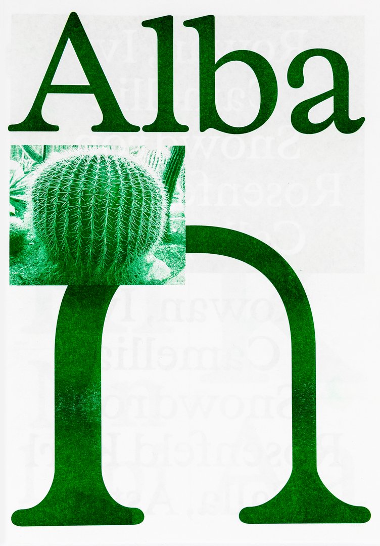
GRAPHIC DESIGN
with Aurèle Sack
Second-year students were required to develop the whole alphabet for one typeface.
GRAPHIC DESIGN
with Diego Bontognali
As part of this editorial design course, students developed a research-based project focused on the selection and design of texts around a shared theme. Based on a curated set of sources, each project presents two editions with identical content, produced in both a large and a small format.
GRAPHIC DESIGN
with Adeline Mollard
As part of the visual identity course with Adeline Mollard, the students developed a visual identity based on a randomly drawn business card. By appropriating a graphic element and its title, each project offers a singular interpretation of it. Each proposal also involves the selection of a tool linked to the associated event (tattoo machine, sander, lithography equipment, etc.), used as a conceptual and graphic extension of the project. The identity is deployed across a range of formats, from business card to F4 size, including posters, flyers, business cards, as well as an animated poster.
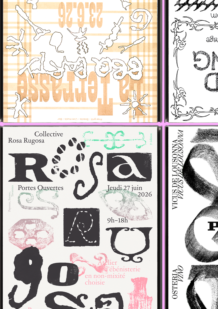
GRAPHIC DESIGN
with Adeline Mollard
Genius Loci, or the spirit of the place, refers to the unique identity or essence of a location. In architecture, this principle suggests that the specific characteristics of a place should be reflected and extended in a design. In the case of the second-year graphic design students, they have applied this principle to communication projects focused on promoting or extending the identity of a particular place through design. Their work likely explores how to visually capture and communicate the essence of a space, using graphic design elements that resonate with the architectural features or history of the place.
MEDIA & INTERACTION DESIGN
with Angelo Benedetto
First-year students designed visual identities for fictional museums. As part of the Dynamic Display course led by Angelo Benedetto, this project led them to create graphic universes that that express the character of each imaginary exhibition site.

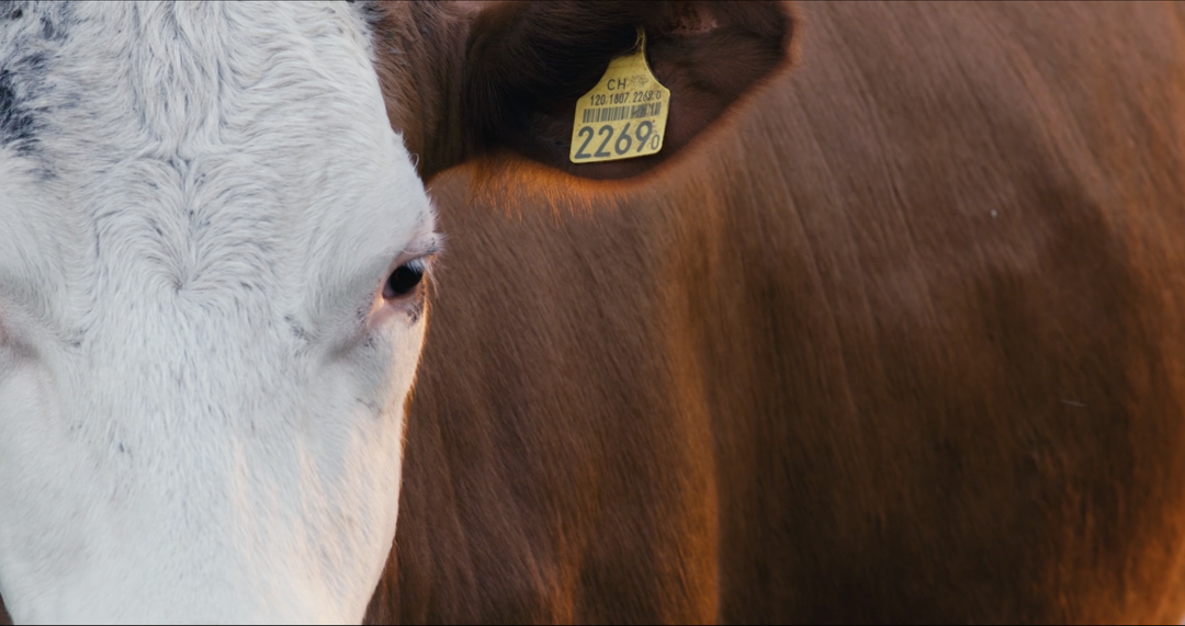
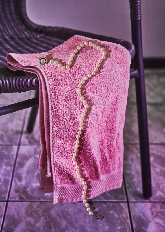
PHOTOGRAPHY
with Natacha Lesueur
Documentary, the power of make-believe Based on projects developed around a common theme, the students develop a personal, in-depth project around the theme of pretense. They build a project that plays with the limits of veracity in photography, using it as an artifice of deception.

PHOTOGRAPHY
with Anoush Abrar
Deconstructed Portrait The goal of this workshop, led by photographer Anoush Abrar, is to explore the meaning of the contemporary portrait. Working with the concept of the “deconstructed portrait,” the students created an image in pairs. The Digital Medium Format workshop week serves as an introduction to both photography equipment and specialized software.

PHOTOGRAPHY
with Orsola Valenti
Off-camera By exploring what lies outside the frame, students develop a sensitive and reflective approach to audiovisual creation. Throughout the semester, students are encouraged to reflect on the political and formal issues surrounding the moving image, as well as the relationship between the visible and the invisible.

PHOTOGRAPHY
with Charlotte Krieger
Unseen This course introduces students to the creation of a seven-image series built around the theme Unseen. They will learn to combine set design, characters, and lighting to produce strong, coherent staged images. Through a practical and technical approach, the course develops their ability to conceive and manage a complete photographic project, direct models, work with natural and artificial light, and collaborate under conditions similar to professional editorial or commercial shoots. Students will refine their photographic vision while preparing for the creative and technical demands of the industry.

GRAPHIC DESIGN
with Aurèle Sack
The third-year students had to develop a typeface and digitize it.
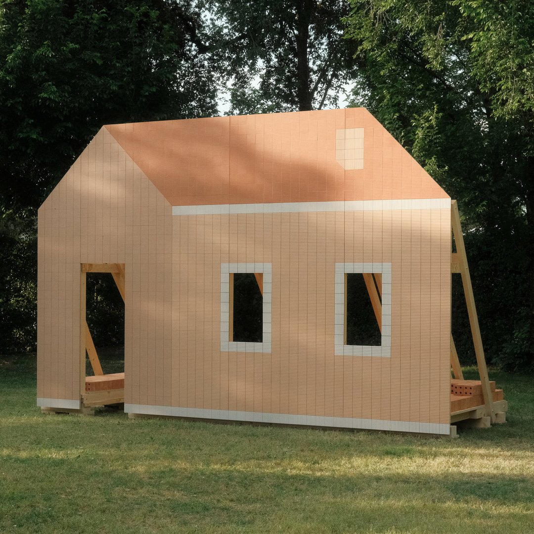
PRODUCT DESIGN
with Camille Blin
For the 2026 Festival des Cabanes at the Villa Medici in Rome, students from the Master in Product Design were invited to develop a project related to the Villa's garden, in collaboration with the renowned Italian ceramics manufacturer Mutina. The Villa's gardens offer a rich historical and spatial context, conducive to exploring aesthetics, function, and interaction with visitors. Students had access to the entire Mutina catalogue (tiles, bricks, and other materials) to build their installations. The project was selected and mentored by the French designer Ronan Bouroullec, ECAL, Villa Medici and Mutina.
GRAPHIC DESIGN
MEDIA & INTERACTION DESIGN
by Malik Ahmed, Alexander Anhorn, Melissa Appelon, Marc Auderset, Olivia Bindon, Baptiste Boulanger, Suriya Brambilla, Diego Buccelloni, Marta Casemi, Davia Ciccoli Trannoy, Alizée Clavien, Timoféi Cruz, Ethan Degano, Nora Dizeko, Andrea Domínguez Formet, Mathias Dugenne, Mathias Gelin, Tanguy Genier, Lila Gomez Gaillet, Juliana Granato, Xenia Grange, Bérangère Gremion, Helena Hell, Rocio Hernandez, Salomé Huwiler, Rebecca Indermühle, Kevin Jeangros, Nolan Latorre, Jose Pardo Pariente, Zachary Ramelet, Gabrielle Richard, Théo Rizzo, Alessia Rollini, Malcolm Semedo Barreto, Anastassia Siebold, Philippe Strässle Zuniga, Baptiste Sultana, Luna Tavernier, Margaux Tinguely
Traduire le mouvement en matière

PHOTOGRAPHY
with Rineke Dijkstra
What is good portrait? What technique do you choose? What kind of light do you use? Daylight or flash? What location or backdrop do you choose for? How do you choose your subject? How do you approach someone you don’t know? In this workshop, the students have explored what makes a good portrait and which tools you can use to create one.
DIGITAL EXPERIENCE DESIGN
with Irene Pereyra
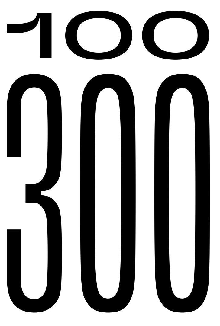
Ethical, Accessible & Mindful Design is a one-week module that trains students to examine the ethical dimensions of design decisions. Through practice, students learn to design experiences that are inclusive, transparent, and considerate of their broader social impact. This semester, the module took low-vision accessibility as its central design constraint. Working under the brief Goodbye to All …, students were asked to guide a user through a permanent, irreversible, and non-negotiable farewell. Beyond WCAG compliance, the exercise required sustained attention to contrast across all interface states, legible typography, keyboard-only navigation, focus visibility, and layout integrity at both 100% and 300% zoom, without loss of hierarchy or readability.

GRAPHIC DESIGN
with Guy Meldem
Third-year students had to produce an edition over half a semester, discovering as their subject an event that appeared in the newspaper on the date of the first lesson.
MEDIA & INTERACTION DESIGN
with David Liebermann, Maximilian Kiepe, Jana Reddemann
Hello World! Goodbye predictable, standardized and interchangeable web. Students questioned the conventions of the digital World, explored the Wide possibilities of the medium, and even invented new approaches to interact with the Web. And what better way to give web design meaning than through the students own portfolios, understood as expressions of attitude and personality. https://websites.ecal-mid.ch/
with Benoit Rossel
This research project by the Film Department at ECAL aims to assess the impact of artificial intelligence on cinema and film education.
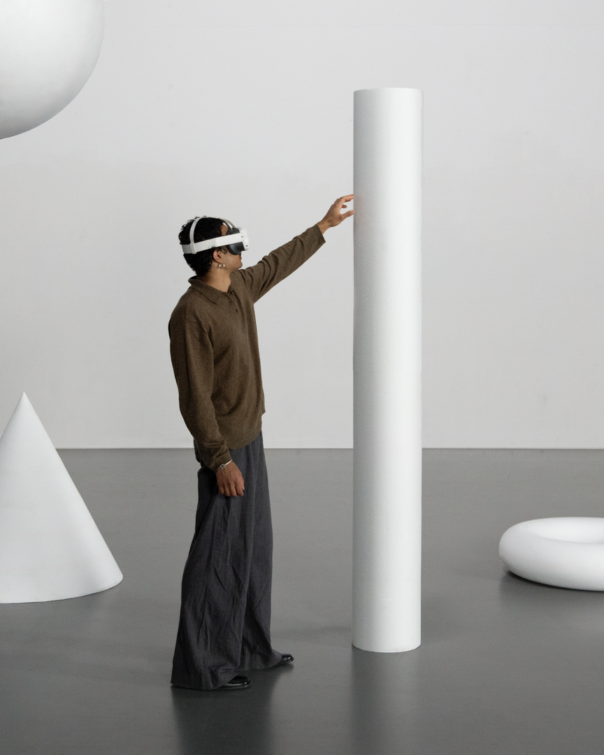
MEDIA & INTERACTION DESIGN
with Mélanie Courtinat
Ce workshop explore la paréidolie, notre capacité à projeter du sens et des émotions sur des formes abstraites. À partir d'une primitive géométrique (cube, sphère, cône...), matrice fondamentale de tout univers numérique, les étudiant·e·s en binômes doivent concevoir une expérience en réalité virtuelle. En s'appuyant sur une synchronisation précise entre l'espace physique et un environnement Unreal Engine, le projet transforme ces objets fixes en supports narratifs.
PHOTOGRAPHY
with Laurence Bonvin
Take risks, experiment, and try out new approaches or techniques in relation to a current or past project, or their future graduation project. Encourage them to take a project or idea further by experimenting with methodology, technique, and production methods, rather than relying on familiar processes, solutions, know-how, or tried-and-true formulas.

GRAPHIC DESIGN
with Yanis Carnal, Raphaël Verona
The Swiss style, also known as the International Style, established itself as the symbol of a radical approach to graphic design and typography. It embodies an ideal of efficiency and rationality. Omnipresent more than half a century after its emergence, does it still hold the same relevance today? What is its influence on our imaginations and our practice? Doesn't Switzerland have other facets through which to communicate, and what new graphic and typographic languages could represent them?
PHOTOGRAPHY
with Natacha Lesueur
“What is clearly conceived can be clearly expressed, and the words to say it come easily.” Nicholas Boileau, *L’art poétique*. As students embark on their final year of study at ECAL, with their interests and methods taking shape, this final project offers an opportunity to challenge their own rules, established practices and influences, to refuse to settle for the status quo and to take risks.
PHOTOGRAPHY
with Julien Bourdeille
Événement Lumineux Through an in-depth exploration of light as a narrative and sensory medium, first-year students created a short film on the theme “Luminous Event.” This project allows them to learn how to manage a complete audiovisual project while mastering the tools of filming, framing, and camera movement.

MEDIA & INTERACTION DESIGN
with Matthieu Minguet, Jamy Herrmann
This workshop explores the use of real-time video streams as a medium for transforming reality. Through live capture or interface-based processes, participants experiment with different ways of altering images using locally run diffusion models. The video stream is approached as raw material, opening up new perspectives on how reality can be perceived and transformed.

DIGITAL EXPERIENCE DESIGN
with RNDR STUDIO
During this one-week workshop, Master Digital Experience Design students used machine learning tools to decompose music videos into their constituent parts: segmented scenes, detected gestures, extracted colors, analyzed beats, separated audio stems, transforming linear audiovisual artifacts into structured datasets. These components were then reimagined as interactive, non-linear systems: explorable maps, generative timelines, rhythm-driven interfaces, and self-recomposing structures built with the OPENRNDR framework.

PHOTOGRAPHY
with Nicolas Poillot
By conceptualizing and producing visual content as part of an editorial series, students will explore the concept of applied photography in a practical, creative, and professional manner, working closely with Art Director Nicolas Poillot.
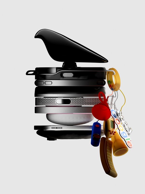
PRODUCT DESIGN
with Chris Kabel
The Industrial Design team at Google (Google ID) initiated a collaboration with ECAL/University of Art and Design Lausanne to develop a concept for a mobile-focused product inspired by a daily ritual. ECAL’s Master Product Design students were invited to envision innovative hardware engaging with contemporary habits. Through compelling storytelling, these conceptual projects consider the human dimension of mobile technology: how it shapes everyday gestures and how our relationships with devices might evolve in the future. This collaboration reflects ECAL’s forward-looking approach to design, combining experimentation, critical thinking, and a strong receptivity to emerging technologies.
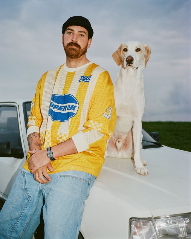
PHOTOGRAPHY
with Anoush Abrar
DRIVE For this week’s theme, “Drive,” first-year photography students were asked to create a portrait shot on medium-format film. Inspired by the sensation of a first driving experience, travel, empowerment, or discovery, the week aimed to explore the relationship between one or more people and a vehicle.
GRAPHIC DESIGN
PHOTOGRAPHY
with Anouk Schneider Agabekov, Nicolas Polli
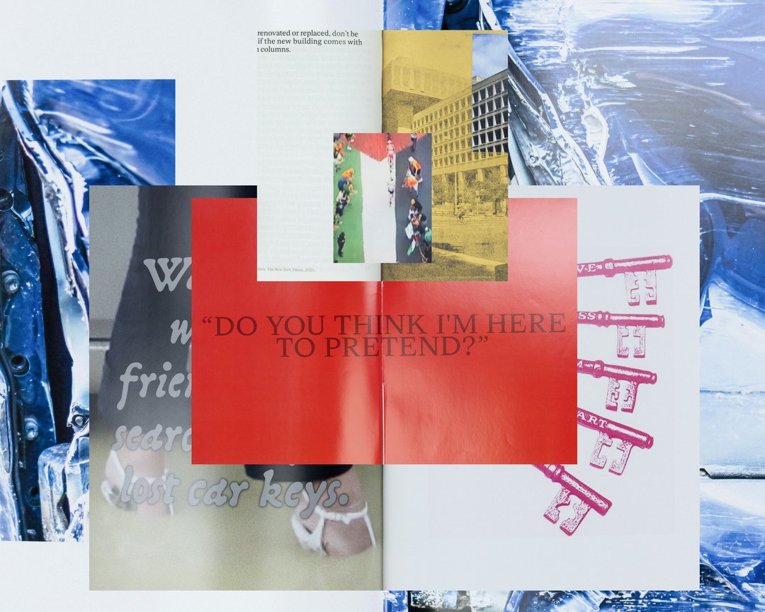
As part of the magazine course led by Anouk Schneider and Emmanuel Crivelli, second-year Visual Communication students had the opportunity to design a magazine during the second semester. Students were encouraged to fully embrace their artistic freedom at every level of creation, whether in terms of format, paper choice, binding, layout, illustration, text, or typography. In this course, the magazine can take shape through various forms of illustration, such as photography, reproduction, contextualization, drawing, 3D, and more. The focus is placed on the author’s artistic vision and the means used to bring it to life. Students take on multiple roles as editor, curator, and architect, assuming the responsibilities of art director, designer, photographer, stylist, illustrator, typographer, editor-in-chief, and editorial secretary. This course highlights contemporary editorial design by exploring the narrative potential of a carefully crafted content sequence.

GRAPHIC DESIGN
MEDIA & INTERACTION DESIGN
PHOTOGRAPHY
with Jean-Vincent Simonet, Léonard Guyot, Florian Pittet (Sigmasix), Vincent Jacquier, Julien Gurtner
During a week of collaborative work, first-year students in the Visual Communication department at ECAL were given the ambitious task of creating a complete audiovisual experience, designing a light and sound architecture based solely on five original musical compositions. Using a central totem-like screen installation and projections on the surrounding walls, enhanced with lasers, they created a visual environment, broadcast in real time, which was presented as a performance to the public at the end of the week. The aim was to construct a universe capable of fully utilizing the space and the various stage elements, inviting the audience to move around and experience the live performance in its entirety. Five cross-functional creative groups, each with a different sound base, were supervised by Jean-Vincent Simonet and Léonard Guyot to produce images and test them throughout the week on the device, which was developed, set up and operated by a sixth group under the supervision of Florian Pittet, Matthieu Minguet and Achille Masson.
MEDIA & INTERACTION DESIGN
with Tibor Udvari
Many platforms degrade over time, shifting from useful tools into manipulative systems. In this workshop, we explore enshittification as a creative method by modifying existing websites or developing small web experiments that exaggerate friction, automation, overload, and disorientation in order to reveal the underlying logics.
PHOTOGRAPHY
with Maxime Guyon
This semester, students will explore how reflective surfaces transform our relationship to image and object. They become thresholds: what the object shows sometimes matters less than what its reflection reveals. Like a photosensitive material, they capture and replay the world, even embodying a form of technological and consumerist sterilization. Mirror-objects disrupt perception: as simulacra, they distort, double, multiply, or elude like a trompe-l’œil. They question what lies beyond the frame, showing what the object “sees” rather than what it is, and can become a space for self-reflection a mirror of their creator sometimes even fostering a narcissistic dimension.

PHOTOGRAPHY
with Natacha Lesueur
Abracadabra! Starting with projects centered on a common theme, students develop their own in-depth work exploring the concept of “magic” in photography. They create a project that explores the relationship between reality and the imagination, using photography as a tool for revealing, transforming, and interpreting reality.

PHOTOGRAPHY
with Calypso Mahieu
Le temps des Fleurs This course, which is both practical and technical, requires students to develop a true photographer’s eye. Its goal is to introduce students to, or help them refine their skills in various photographic genres, such as still life, portraiture, and architecture, as well as documentary and staged photography. These disciplines demand particular attention and great precision in the selection of models, locations, and objects. Mastery of composition, framing, and the management of light, whether natural or artificial, is essential for a successful shot. Throughout the course, students are guided to refine their observational skills and their ability to create images that are both precise and expressive.
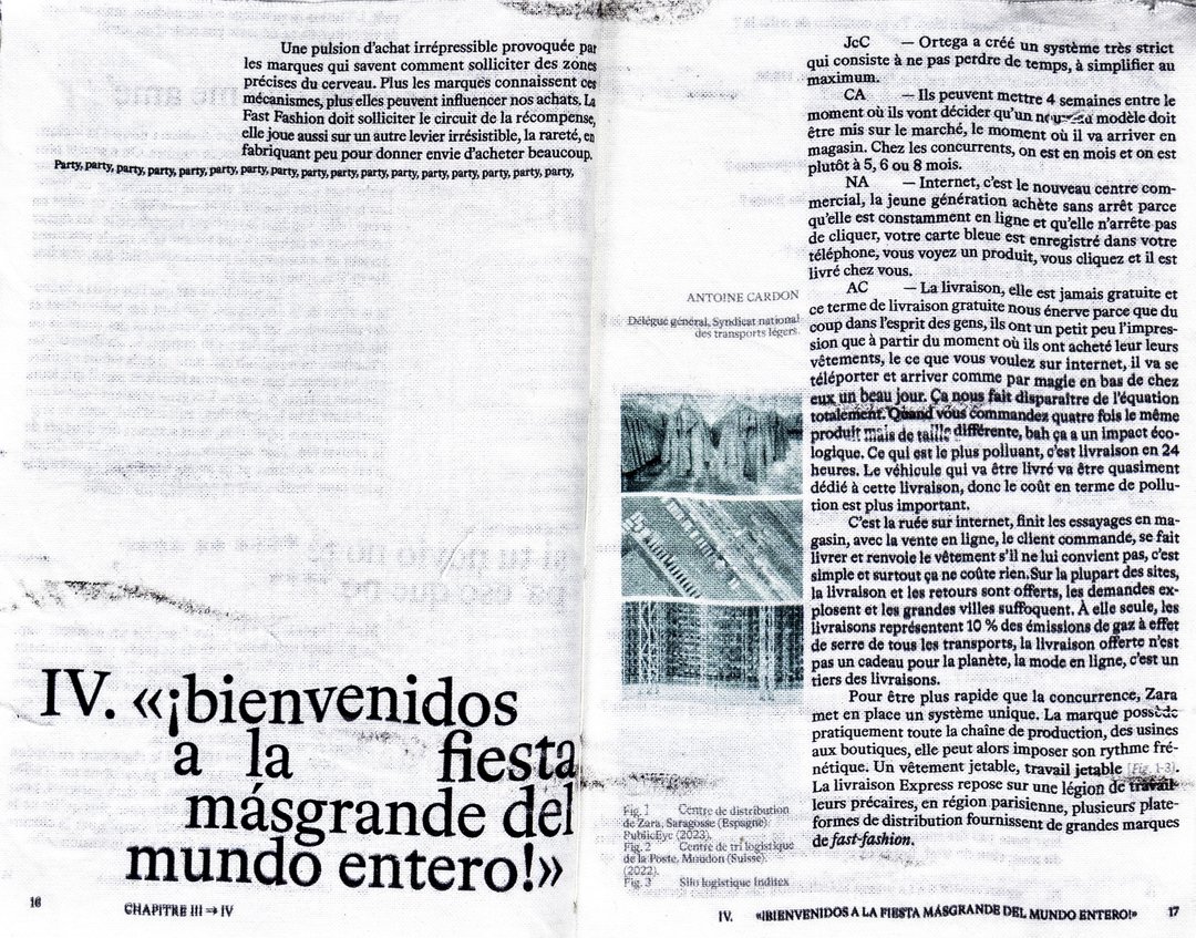
GRAPHIC DESIGN
with Jonathan Hares
Third-year students had to produce an edition over half a semester, discovering as their subject an event that appeared in the newspaper on the date of the first lesson.
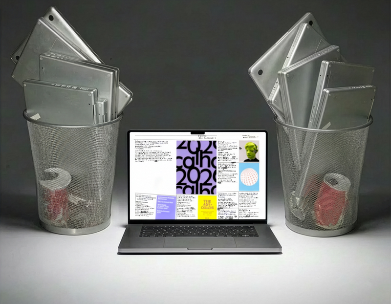
with Jamy Herrmann, Achille Masson, Julien Gurtner, Vincent Jacquier
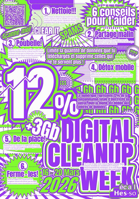
From March 16 to 20, ECAL is taking part in Digital Cleanup Week, a worldwide event dedicated to raising awareness and taking action for a more responsible digital world. A week to repair, recycle, clean and think!

MEDIA & INTERACTION DESIGN
with Harry Bloch
Websites developed over the course of a semester based on books chosen by students, which they adapted into web experiences as part of Harry Bloch's Screen Design course, second year of the Bachelor's degree in Visual Communication.

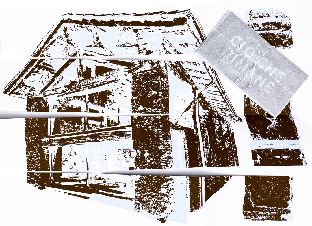
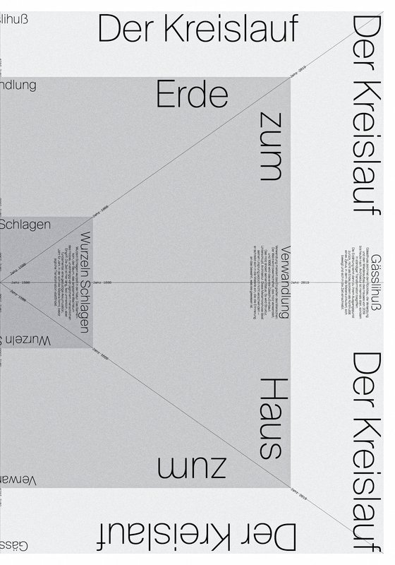
GRAPHIC DESIGN
with Gilles Gavillet
Through the lens of visual identity, this project explores issues related to graphic language and art direction. Each stage of the project examines a different aspect of visual identity development: research, concept, visual language, design, and communication.

PHOTOGRAPHY
with Rachel de Joode, Clément Lambelet
For this workshop, ECAL invited Rachel de Joode, Berlin-based artist whose practice explores the relationship between photography, sculpture, and digital images. During the week, students experimented with transforming photographic images into three-dimensional forms. Starting from simple concepts, they produced or gathered image material intended for printing and treated images as surfaces to cut, fold, layer, and assemble into sculptural objects. Through rapid tests and material experimentation, the workshop encouraged students to move repeatedly between image, surface, object, and documentation. By working with printing, scale, and spatial placement, they explored how photographic images can gain physical presence and occupy space beyond the screen.
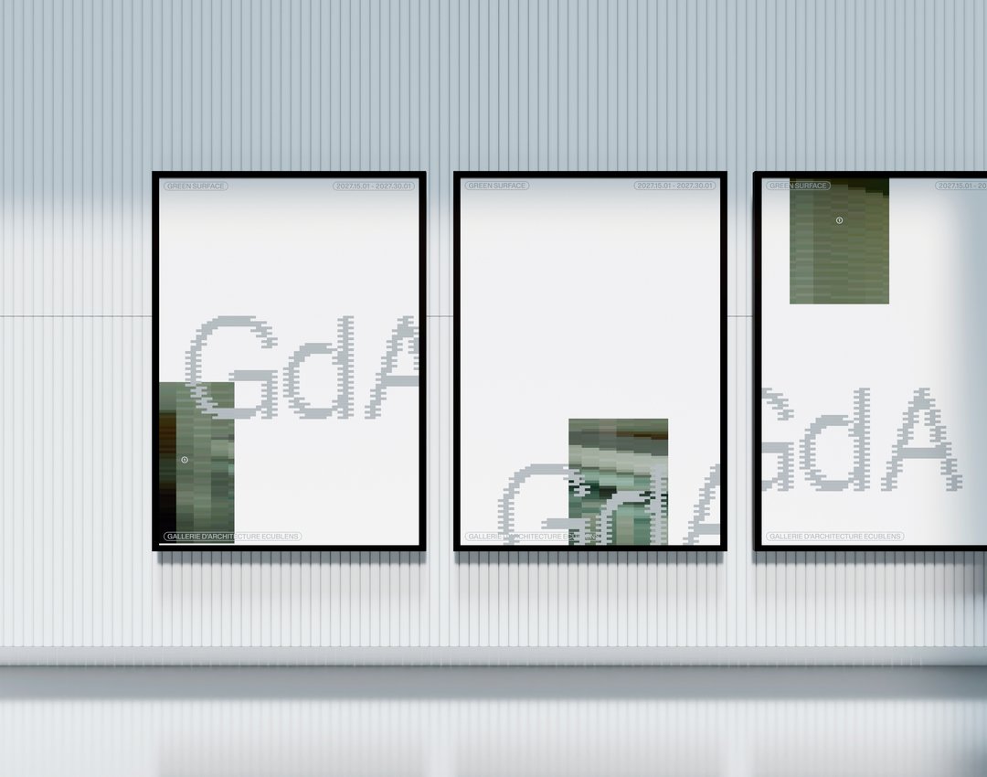
GRAPHIC DESIGN
with Nicole Udry
Genius Loci, or the spirit of the place, refers to the unique identity or essence of a location. In architecture, this principle suggests that the specific characteristics of a place should be reflected and extended in a design. In the case of the second-year graphic design students, they have applied this principle to communication projects focused on promoting or extending the identity of a particular place through design. Their work likely explores how to visually capture and communicate the essence of a space, using graphic design elements that resonate with the architectural features or history of the place.
GRAPHIC DESIGN
with Aurèle Sack
Second-year students were required to manually develop the lowercase letters of two typefaces.
GRAPHIC DESIGN
with Adeline Mollard
As part of the visual identity course led by Adeline Mollard, students developed a visual identity starting from a randomly selected business card. By appropriating one of its graphic elements and its title, each project offers a unique interpretation. The identity is then expanded across a range of formats, from business cards to F4 posters, including posters, flyers, business cards, and an animated poster.
GRAPHIC DESIGN
with Diego Bontognali
As part of this editorial design course, students developed a research-based project focused on the selection and design of texts around a shared theme. Based on a curated set of sources, each project presents two editions with identical content, produced in both a large and a small format.
GRAPHIC DESIGN
by Leandra Adler, Cansu Celen, Layana Comte, Anaïs Dermont, Camille Genoud, Eve Gremaud, Eloïse Guillod, Mathis Harmant, Marie Hintzy, Matteo Lucca, Maxime Manera, Gaëtan Mauclair, Mathys Mauron, Emma Morisseau, Sara Pedersoli, Lucie Pittet, Hélène Prongué, Leonardo Mariucci, Alice Refachinho, Justine Renevey, Gaspard Schlatter, Laura Simons, Vu Toni Thien Duc, Maïa Yassin, Jonas Zesiger
In November 2025, 27 ECAL students took part in Work and Turn, a workshop led by Geoff Han exploring the theme of labor and the often overlooked work that sustains the school. Located in a former IRIL knitwear factory in the industrial area of Renens, ECAL occupies a vast building whose daily functioning depends on many visible and invisible forms of labor. Over five days, students worked in small teams to produce a collective 96-page pocket-sized publication. Each pair created an 8-page photographic visual essay focusing on a specific aspect of labor at ECAL. Rather than relying on traditional portraits, the projects explored more poetic and indirect ways of documenting traces of work through spaces, gestures, materials, and infrastructures. The entire publication was manually printed on an offset press by the students themselves, in either black or red and black. The printing process was a central part of the workshop: participants prepared the plates, set up the press, and ran the prints. This hands-on production process echoed the theme of labor explored throughout the publication.

MEDIA & INTERACTION DESIGN
with Mario Von Rickenbach
This project brings together a series of experiments created by students exploring the intersection between physical reality and immaterial imaginary worlds. Using a mixed reality headset, they transform their environment into experimental spaces where real elements become supports for digital creations.
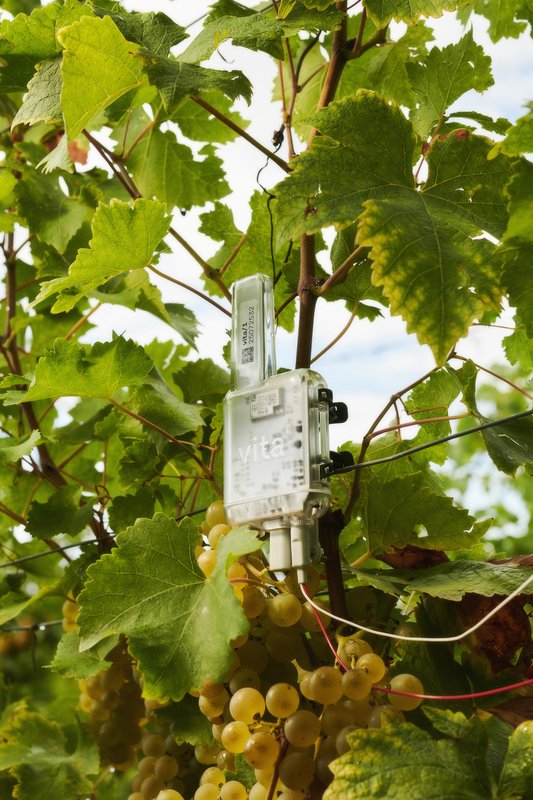
with Stéphane Halmaï-Voisard, Younès Klouche, Frederik Mahler-Andersen Pietro Alberti, Maxwell Ashford, Alain Bellet, Laurent Soldini
Arboricrop is a research project conducted by a multidisciplinary consortium bringing together Vivent Biosignals, Changins – University of Viticulture and Oenology, and ECAL/Ecole cantonale d’art de Lausanne (HES-SO), with the support of Innosuisse. Its objective is to develop a miniaturized plant electrophysiology sensor designed for use in real agricultural conditions: the VITA Mini Sensor.
MEDIA & INTERACTION DESIGN
with Alain Bellet
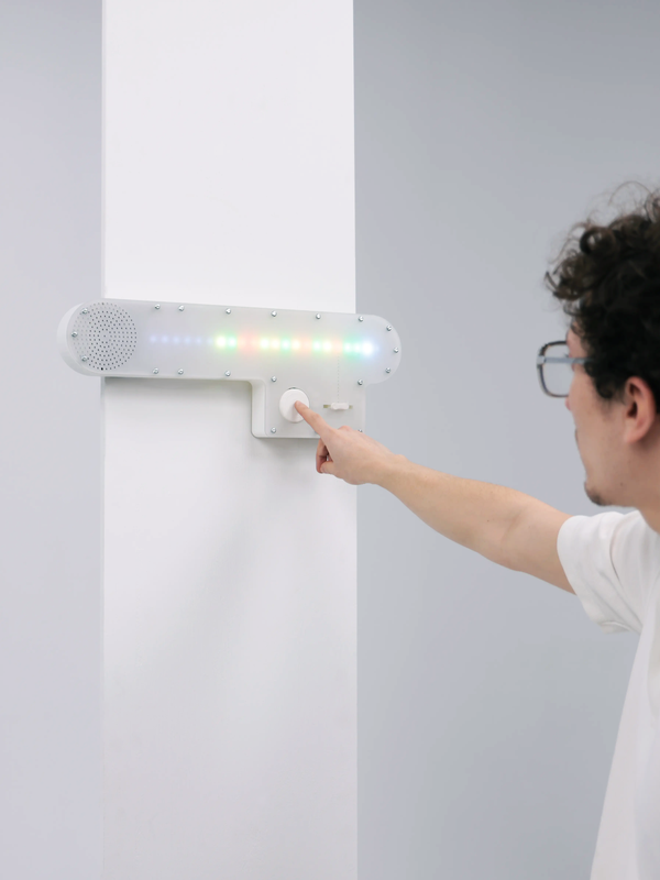
By combining code, electronics, and physical prototyping, first-year students design interactive objects that react, respond, and invite interaction, gathered under the title Talk To Me. Using dialogue as playground and inspired by conversational interfaces, the projects transform physical objects into new forms of interaction.
GRAPHIC DESIGN
with Guy Meldem
First-year students were invited to design a 16-page publication. By experimenting with duotone through various printing techniques, they structured a dual reading experience dependent on the printed colors.

GRAPHIC DESIGN
with Harry Bloch
During the editorial design course with Harry Bloch, the first-year students each laid out a chapter of Charles Dickens' Great Expectations. A final edition compiling all the chapters was produced for the occasion.