BA GRAPHIC DESIGN
Image Creation BA3 2024-2025
with Guy Meldem
Third-year students had to complete an image creation project based on a free subject and medium.

During the 2nd year Bachelor of Graphic Design visual identity course, students had to choose an object allowing them to perform an action and then bypass its basic function.
Following this, the students created a fictitious company or a creator behind this object allowing them to develop a visual identity concept as well as define the recurring elements of the identity in order to establish a modular graphic system that can be applied to a multitude of different media, fixed and animated.
Studio project (2023) by Yohann Kampmann, Simon Maurer, Delphine Moënnat, Monica Müller, Océane Pasteur, Luca Reichenbach, Luca Riva, Angeline Rossetti, Pierre Teissier, Baptiste Torrent, Elsa Trummer, Chloé Vandewalle

Edition & Poster
The exhibition Future Is Below was born from the collaboration of four artists around a single object: the jigsaw blade. Each artist was free to choose how he or she would use it, leaving an almost unlimited space of possibility.
The origin of the exhibition embodies a way of thinking about the underlying themes of ecology and the consequences of the mass of waste produced today by human beings through an object of manufacture. Is a future possible thanks to recovery?


1/7
Edition, Animation & Poster
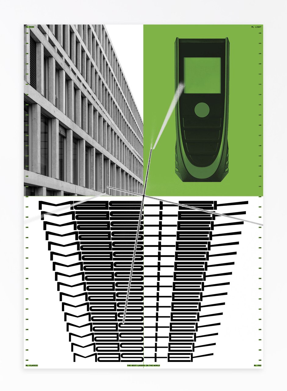
Fictitious visual identity for the company Master. It is a company specialized in the sale of high-end precision lasers. It offers a wide range of products adapted to all levels of use, whether for amateurs or professionals.
The identity is symbolized by a variable font, which perfectly represents the extent of Master's skills. The two axes of the typography are also significant: they represent the precision and the robustness of the proposed lasers.


1/8

Edition, Animation & Poster
Why work from 9 to 5 when you can work from 10 to 4? That's the mantra of ten to four, a brand of accessories made from office objects that advocates non-productivity at work. The edition is presented as a guide to mastering the art of procrastination and can be read during lunch break or on the subway, before work, as a preamble to the day ahead.


1/8
Edition, Animation & Poster
Mineral Grinding Engineering is a fictional company. It manufactures machines to grind the hardest minerals on the planet in order to make objects useful to people's daily lives.
With this project, I tell the story of the realization and use of the PM-23 machine by the company's scientists through the creation of a visual identity. The work is oriented towards a scientific visual, with images of the study, archives, data, diagrams and elements that tell the story of the research.
By Luca Riva


1/7

Edition, Animation & Poster
Clay is a project based on the concept of DIY and conservation through skin care masks. Clay is a creator of homemade cosmetics that promotes sustainability, authenticity, less is more and independence.


1/9
Poster & Animation
The KAOS-3 space is located underground: it is a club for those who want a loud, mathematically confusing, fluid, dirty experience. The identity project wants to look at the main tools for creating the performances offered in the club: the Korg Kaossilators (KO-1), that is, dynamic phrase synthesizers, which produce a different sound or note every time you touch the pad with a finger.
The visual identity of the KAOS-3 club explores music, sound, visuals and modularity through a code that recreates random images through the use of synthesizer touch screens combined with sound.

BA GRAPHIC DESIGN
with Guy Meldem
Third-year students had to complete an image creation project based on a free subject and medium.

BA GRAPHIC DESIGN
with Nicole Udry
Beyond questions of functionality, comfort and individual or collective well-being, the built environment is able to respond in a stimulating way to societal, energy and environmental challenges. The work space, the living space, the public space, the interior space, the street, are carried by real statements of intent that motivate their forms, following certain principles such as climate transition, densification, ecology and energy transition.... The 2nd year Graphic Design students worked on the production of a communication based on one of these principles (or others) and on the architectural realization which refers to it in order to promote it.
BA GRAPHIC DESIGN
with Jonathan Hares
The third-year students had to produce an edition over half a term, choosing as their subject an event that had appeared in the newspaper on the date of the first lesson.

BA GRAPHIC DESIGN
with Nicole Udry
Beyond questions of functionality, comfort and individual or collective well-being, the built environment is able to respond in a stimulating way to societal, energy and environmental challenges. The work space, the living space, the public space, the interior space, the street, are carried by real statements of intent that motivate their forms, following certain principles such as climate transition, densification, ecology and energy transition.... The 2nd year Graphic Design students worked on the production of a communication based on one of these principles (or others) and on the architectural realization which refers to it in order to promote it.

BA GRAPHIC DESIGN
BA MEDIA & INTERACTION DESIGN
BA PHOTOGRAPHY
with Angelo Benedetto, Vincent Jacquier, Pauline Saglio
During the service design course, the 3rd year of the Graphic Design, Photography and Media & Interaction Design bachelor's degree programs realized multi-media projects. A collaboration of the Visual Communication department with the theme of SDGs (*Sustainable Development Goals). The theme named "For a good cause, make the SDGS a reality" aims to develop a cause close to the heart of the different student groups. Each project is composed of at least two different supports, one primary and one secondary. The projects could therefore take any form the students deemed relevant, be it a website, editions and posters, a video sequence, or even virtual reality.