Feed

Type

Course

Know-how

Years

2008 2024
Elsa Trummer – Tournerie

GRAPHIC DESIGN

Elsa Trummer – Tournerie

by Elsa Trummer

My work is about the swiss agriculture, a sector facing many challenges, including a decreasing number of farmers. I have chosen to communicate about agriculture through an educational game, in which players embody farmers working together on a farm. This game emphasizes collaborative spirit, which I consider crucial for our future, while also raising awareness about agriculture and sparking players' interest in it. The objective is to achieve sustainable agricultural development by accumulating points and answering questions to acquire knowledge. My game aims to valorize agriculture by offering a positive alternative and reconnecting the population with the world of agriculture.

Baptiste Torrent – Chandoline

GRAPHIC DESIGN

Baptiste Torrent – Chandoline

by Baptiste Torrent

Chandoline is a proposal to reuse the former Chandoline hydroelectric power station in Sion in the Alps. The idea is to transform the site into a bottling plant for the water previously used to generate electricity. The project establishes the typography and visual identity of this unique mineral water brand. The typeface consists of a cut regular and an italic to the left, whose shapes are inspired by the fluidity of water and the tubular aspect of penstocks. As for the visual identity, it's made up of a corpus of shapes that refer to the falling and rotating movement of water, as well as to the industrial aspect of the site.

Pierre Teissier – IDORAMA

GRAPHIC DESIGN

Pierre Teissier – IDORAMA

by Pierre Teissier

The concept of identity as an organic process that evolves over time clashes with the essentialist approach of surveillance technologies. Algorithms probe us and inscribe us in shackles defined according to prosaic criteria. IDORAMA is a didactic experience which, while placing the human in front of the machine, aims to situate it in a wider context. Using several sensors, the program analyzes the user and collects his geolocation data during a certain time interval. At the end of the capture, a snapshot is returned to the user, in the form of a personalized digital map. The uniqueness of this map becomes a temporal marker, a memory testifying to the use of the program.

Angeline Rossetti – Women Equity in Sport

GRAPHIC DESIGN

Angeline Rossetti – Women Equity in Sport

by Angeline Rossetti

Women Equity in Sport is a campaign dedicated to the promotion and visibility of women’s sport. Although the participation of women in sports federations is increasing, media coverage remains insufficient. This project aims to fill this lack of visibility by creating specialized newspapers for each sporting discipline. Distributed during sporting events, these newspapers will provide information on current issues in women's sport, based on concrete facts and inspiring slogans in order to sensitize and encourage collective awareness. In addition, video reports will offer a dynamic perspective, highlighting the action on the pitch and giving a strong voice to sportswomen, thus helping to change mentalities and promote equality in sport.

Luca Riva – Attitude as Tool – The graphic language of context

GRAPHIC DESIGN

Luca Riva – Attitude as Tool – The graphic language of context

by Luca Riva

Attitude as Tool is a research project on the practice of graphic design through the use of context. The project develops into a book that proposes a working method that invites designers to work in unconventional contexts, integrating them into their professional practice and using these contexts to develop tools, ideas and processes. Derived from a way of observing the world related to the concept of "Adhocism" and encouraging self-production, unlikely combinations of what is at hand, common or unusual materials are integrated into the creation process. Mistakes, unintentional and situational gestures shape unexpected results.

Simon Schönmann – Délits

GRAPHIC DESIGN

Simon Schönmann – Délits

by Simon Schönmann

Délits is a newspaper which aims to shake up preconceived ideas about the police by showing the violence it generates. Taking a foothold in a Lausanne region known to be peaceful, its 70 pages confront the reader with a multitude of media relays, often brutal or sensationalist, part of interventions by the police with dramatic outlets, before reveal a more global structural problem. Proposals for alternatives and reforms are then presented.

Flaurant Kadrija – Deconstructing the static figure of flag (kosovo case)

GRAPHIC DESIGN

Flaurant Kadrija – Deconstructing the static figure of flag (kosovo case)

by Flaurant Kadrija

In this project I explore the figure of Kosovo's flag by deconstructing it into six main categories: territory, politics, history, culture, future and society. Each flag is represented by a static shape, symbolising its unchanging nature. However, through the use of specific iconography and imagery, these forms are transformed, creating new representations that reflect complexity and fluidity. The current flag of Kosovo, created according to European and American rules, lacks an authentic national identification due to socio-political differences. This project aims to represent the true identity of Kosovo through iconographic research. By transforming these static categories into dynamic symbols, I aim to capture the evolving and multifaceted identity of Kosovo.

Delphine Moënnat – Le Soleil a dit qu’il reviendrait

GRAPHIC DESIGN

Delphine Moënnat – Le Soleil a dit qu’il reviendrait

by Delphine Moënnat

There are places where the sun promises to return, where its rays glide over faces marked by the trials of life. Le Radeau is one of those places. Le Soleil a dit qu’il reviendrait invites us to enter, to listen to the rustle of whispers, to observe the discreet gestures that tell stories — their stories. This book explores the lives of those who inhabit this place, through intimate conversations; the border between their world and ours is almost imperceptible. We slip in quietly, as if entering a dream, and realize that these people are not strangers. They could be our brothers, our sisters, our children, or our friends. It is a book that speaks to our hearts, inviting us to reach out, to listen, and to understand.

Morgane Gilliéron – Je l’ai pris, l’ai bien plié & l’ai mis dans vos oreilles.

GRAPHIC DESIGN

Morgane Gilliéron – Je l’ai pris, l’ai bien plié & l’ai mis dans vos oreilles.

by Morgane Gilliéron

I took it, folded it well, and put it in your ears. offers an immersive journey into the heart of a discreet ethnic group, testifying to a marginalised and little-known culture and traditions.The wise and humble nature of this ethnic group is embodied in my edition through a slow and contemplative rhythm composed of texts and images. The project highlights four Fulani crafts – the dagger, pottery, cooking pots, and jewellery – as well as important ceremonies, presented through images, stories, and interviews.My goal is to transport the viewer into a world rich in colours, while honouring my roots and sharing the beauty of this culture.

Yohann Kampmann – Formant

GRAPHIC DESIGN

Yohann Kampmann – Formant

by Yohann Kampmann

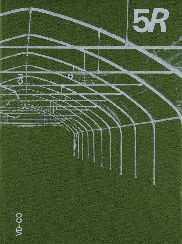
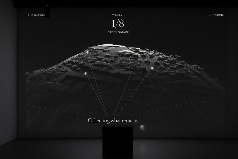
Formant Festival is an audio-visual event featuring music and digital art installations in abandoned industrial sites in Valais in Switzerland. Valais's old industrial sites, once vital, are now neglected or demolished for unnecessary residential buildings. Formant repurposes these spaces for cultural events, preserving heritage and fulfilling community needs. The festival's visual identity uses these architectural spaces in an interactive 3D website, blending sound and visuals to immerse users. This approach encourages public curiosity and exploration, enhancing their understanding and enjoyment of new artistic forms. Formant means each of several prominent bands of frequency that determine the harmonic quality of a sound.

Lisa Grobet – Villa Trudy

GRAPHIC DESIGN

Lisa Grobet – Villa Trudy

by Lisa Grobet

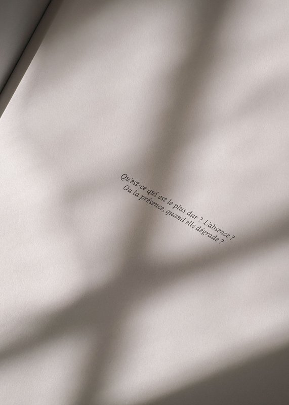
Listening to the walls, perceiving the imprints they bear, remembering the ghosts of the past. Villa Trudy, in Sardinia, is a house marked by the passage of many lives. A father teaching his son to swim, this son becoming a father in turn. The walls bear witness to the changes and traces left by our ancestors. They observe the events that unfold within the house, but remain passive. In a way, they are the guardians of the place, witnesses of an invisible absence. Through sensitive intervention on the remnants of the place, this book aspires to become, in turn, the guardian of memories that would otherwise no longer be tangible, offering a new form of transmission. This project pays tribute to the soul of Villa Trudy by preserving its heritage.

Juliana Ferreira – Ma Chère,

GRAPHIC DESIGN

Juliana Ferreira – Ma Chère,

by Juliana Ferreira

In many migratory movements we see people having artefacts and handicrafts with them wherever they go, because it creates a sense of belonging and comfort. In Ma Chère, the craft talked about is crocheted lace and embroidery combined. This craftsmanship as a form of expression and transmission, symbolising patience and waiting. Ma Chère, is a two-voice retranscription of a migratory journey from Portugal to Switzerland, using letters and these textile supports as correspondences. On the one hand, moving to a new country, the building of a life and the expansion of a community in Valais. And on the other hand, the evolution of a country that has become a postcard.

Océane Pasteur – Rendez-vous

GRAPHIC DESIGN

Océane Pasteur – Rendez-vous

by Océane Pasteur

Anchors are fundamental elements in the construction of identity, so Rendez-vous is one of them. There is origin and nationality, and this year I had a rendezvous with both. Although they are very different, they both make up my identity. Twenty-three years ago I was called Dang Thuy Thu Hang, twenty-two years ago I was called Océane Thu Hang Pasteur. Rendez-vous is about a journey, mine and theirs. To do this, I decided to set out to find my origins and, at the same time, retrace the paths taken by my parents. By reconstructing the key elements of this union, through archives and time, I sought to understand and weave the links between these multiple heritages.

Luca Reichenbach – Substance

GRAPHIC DESIGN

Luca Reichenbach – Substance

by Luca Reichenbach

In the early 20th century, typography involved manual engraving of characters on lead or wood to suit the printing methods of that era. Nowadays, typography is largely digitized during the design phase and applied across both print and digital mediums. This project investigates the shift from physical to digital typography, analyzing its material and immaterial aspects, including its shapes, design and applications.

Jonas Buxcel – Canine

GRAPHIC DESIGN

Jonas Buxcel – Canine

by Jonas Buxcel

Canine is a magazine dedicated to organic and local food in Switzerland. The first edition's theme is rice. I visited local rice producers in Vully, Switzerland, to find out about their methods and their passion. Inspired by their work, a special menu has been created around this grain. The pages of this magazine are packed with creative recipes and captivating stories about Swiss rice. The aim is to highlight this terroir and the art of local cuisine. By exploring farming traditions and culinary innovations.

Olympe Boutaghane – Ask your Neighbor

GRAPHIC DESIGN

Olympe Boutaghane – Ask your Neighbor

by Olympe Boutaghane

As part of the Ask Your Neighbor project, a library of methods, tools, and resources was developed in collaboration with 30 professionals from various fields. The goal is to promote a more collaborative and interdisciplinary approach to design. Opening up to others allows for renewal and helps uncover practical, technical, and creative solutions. This project aims to rethink how we work while encouraging reflection on the use of tools, techniques, and software. Ask Your Neighborseeks to evolve over time, enriched by contributions that deepen our understanding of design, particularly in educational contexts. To share this approach, the methods and resources are presented in workshops at design schools.

Valentin Bonzon – Sueños entre paginas, les rêves entre les pages

GRAPHIC DESIGN

Valentin Bonzon – Sueños entre paginas, les rêves entre les pages

by Valentin Bonzon

Inspired by Gabriel García Márquez's Nobel Prize speech, I went to Bogotá to document a journey exploring the power of reading and writing in a city marked by violence and corruption. The project compiles initiatives promoting reading and writing, highlighting the importance of literature in Colombia. The main chapters address various topics, such as writing workshops for youth affected by armed conflicts or the extensive system of public libraries. Interspersed between these chapters are historical fragments providing context. Finally, poems printed on handmade papers and inserts from second-hand books found in Bogotá structure the work, giving it a unique form.

Rebecca Alfandary – Disparitions

GRAPHIC DESIGN

Rebecca Alfandary – Disparitions

by Rebecca Alfandary

Everything is fated to disappear. This non-exhaustive collection explores the plurality of the manifestations and forms of impermanence, its impacts, its causes, as well as its different timescales. Great and little stories inhabit the same space, and make information and interpretation come together. Text and images, both linked and independent of each other, illustrate each subject and create a dialogue. Throughout the book, a series of interludes give it a more sensible dimension, by referring to our relationship with the ephemeral. The whole is both a testimony and a tribute to what is disappearing, what has disappeared, what will disappear.

Karim Akel – Ma'as Typeface

GRAPHIC DESIGN

Karim Akel – Ma'as Typeface

by Karim Akel

Ma'as Typeface is a family of variable, experimental, Arabic and Latin fonts inspired by Al-Kufi Al-Handassi calligraphy, found mainly in Oriental architecture, and by early XXth century dutch geometric fonts. Through this work, I question the balance of power between Latin and Arabic script as well as the technological tools' efficiency that made for drawing Arabic characters. The theme of multi-script is currently revealing a plethora of issues linked to the balance of power between two distinct writing systems. Ma'as Typeface metabolizes my dissertation research, which explores questions of identity and power between Latin and Arabic scripts through their formal characteristics, evolution and historical context.

Edizioni Arche

GRAPHIC DESIGN

Edizioni Arche

by Ruben Campoy Bähler, Monica Müller

Edizioni Arche unites the idea of inclusion under the umbrella of a publishing house that has as its founding pillars ‘always act in such a way as to maximise the number of possibilities’, a quote from the philosopher Von Foester, which we try to apply in our diploma. The importance of enabling fluent reading and understanding is a primordial concept: everyone should have the right to read and understand. Graphic design conveys this possibility. Arche researches and explores accessible editorial responses to all cases, from comprehension difficulties, motor problems, visual impairments or the simple desire to empathise with others. No less important, books aimed at a wider audience are not excluded: they raise the necessary awareness of sometimes underestimated problems.

L'inventaire

GRAPHIC DESIGN

L'inventaire

by Camille Choquard, Chloé Vandewalle

To make an exhibition catalogue, there are Camille and Chloé, but also all the other hands, and everything that fits between the ends to enter the space of the book, like entering a house with a reading key. L'inventaire is an exhibition catalogue that tells its own story, and that happened in accordance with its own chronology. It invites you to take a closer look at the prologue, which describes the research process, to wander through its heart, which was printed during the opening, with a system of retranscription and live printing, and to thank you in the epilogue, which reverently marks the end of its production. In this way, the book becomes an exhibition space, then returns to its original form.

Alexandra Cupsa – Piedica în calea uitarii

GRAPHIC DESIGN

Alexandra Cupsa – Piedica în calea uitarii

by Alexandra Cupsa

1 Iunie is one of the last abandoned industrial factories in Timișoara that has not yet been demolished. Its demolition is imminent, and its existence might be forgotten. Piedică în Calea Uitării means "An Obstacle to Forgetting" in Romanian and marks the intention of this project. To prevent the factory from being forgotten, and to create a new space within the pages of the book to preserve fragments of 1 Iunie’s life. This is not only a visual journey but also an auditory journey accompanied by a vinyl record. Each episode of the factory's life is introduced through a song from the same period. Beyond 1 Iunie, the project also focuses on the issues of preserving the industrial heritage of the city of Timișoara.

Sacha Décoppet – Mon être

GRAPHIC DESIGN

Sacha Décoppet – Mon être

by Sacha Décoppet

Human trafficking is a complex issue. It is a form of extreme exploitation that needs to be examined and understood in the context of global poverty, restrictive migration policies, economic crises and discrimination based on sex, ethnicity, gender identity or sexual orientation. Mon être is an edition that attempts to explain this phenomenon, by giving a voice to women who have been victims of exploitation, in collaboration with a Lausanne-based association, ASTREE. To do this, the project is a mix of testimonials, the results of artistic workshops, interviews with people fighting against this scourge and journalistic sources.

Simon Maurer – Riposta FC

GRAPHIC DESIGN

Simon Maurer – Riposta FC

by Simon Maurer

Football is the most popular and publicized sport in the world, which gives it the opportunity to be more than just a game. Thanks in part to its popularity, it is used as a promotional medium, a forum, a means of communication. Both by players, fans, institutions, politicians etc. Riposta FC aims to question the place of football in society, its social role and how it could be used differently to serve other purposes than those already existing. The jerseys are second-hand garments with thermo-glued designs inspired and remixed visuals inherent in the world of football with the aim of creating a new interaction.

Ambre Louineau – Helix

GRAPHIC DESIGN

Ambre Louineau – Helix

with Jonathan Hares, Gilles Gavillet

Helix is a science popularisation project inspired by Isabella Maria Pasqualini’s thesis, entitled “Embodied Space in Architecture, Cognitive Neuroscience and Virtual Reality”, carried out at EPFL Architecture. The book focuses on the links of the human body with architecture and neuroscience, offering an interpretation and an appropriation of the thesis. To do this, the book explores the vector representation of the four chapters, alternating with photographic fragments illustrating the integration of the human body into the architecture of the book.

Ilaria Citti – KRUMP

GRAPHIC DESIGN

Ilaria Citti – KRUMP

with Gilles Gavillet, Diego Bontognali

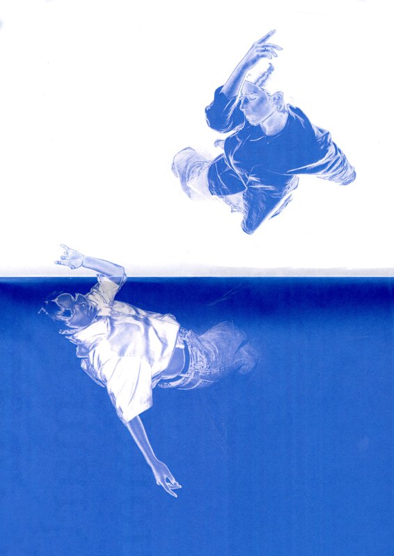
As a Krump dancer, I have noticed a lack of editorial content dedicated to this dance. Originating in the underprivileged areas of South Central in Los Angeles in the 1990s, Krump is a way for dancers to express their anger, aggression, frustration and pain in a positive way. This book sheds light on the spirit of this dance through its codes: its community spirit, its vocabulary, its music and its competitions. By seeking to meet those involved in the dance scene in Switzerland, I hope to offer an authentic perspective on this movement.

Alice Moor – Baraonda

GRAPHIC DESIGN

Alice Moor – Baraonda

with Aurèle Sack, Guy Meldem

Baraonda is a playful system designed to help run creative activities. The workshop is based on a wheel of fortune made up of several circles that determine the characteristics and rules that will be put in place. Nine stages have been devised, starting with the widest circle and working down to the narrowest. A working theme is determined, followed by a technique, different materials, colours, and so on. In addition to the series of circles, I developed various materials to support the workshops: wooden stencils, a collection of images and self-adhesive letters. The development of the project and the results of the activities carried out in primary school classes in Lausanne have been brought together in a printed edition. The whole package comes in a cloth-covered cardboard box.

Michelle Zadio Villarroel – Nativo+Latino

GRAPHIC DESIGN

Michelle Zadio Villarroel – Nativo+Latino

with Gilles Gavillet, Jonathan Hares

Nativo+Latino reinvents the heritage and syncretism of the South American continent. Long shaped by the evangelisation of the indigenous people, the consequences of this mix of identities bears witness to the cultural and religious alienation of Latinos. Gradually, awareness of the indigenous condition has pushed their descendants to honour and revive their cult. This project is a place where Latin communities, who aim to reclaim this heritage that was until now regarded as pagan beliefs, to come together, confront one another and express themselves. Nativo takes the shape of ancestral memories and a collective imagination that reflects a reinterpretation of the practice of Catholicism in Latin America in order to restore power in a hybrid vision of identity.

Louis Roh – Les chemins perdus

GRAPHIC DESIGN

Louis Roh – Les chemins perdus

with Guy Meldem, Diego Bontognali

Millennia ago, humankind discovered electricity and never stopped exploiting and reinventing it, unconcerned, considering this resource to be infinite. This book, Les Chemins Perdus, opens up new horizons, between dream and fiction, through realistic and poetic notions. What if all the lights went out? It stimulates the imagination and offers readers light, childlike speculation. Interest in illustration, storytelling and printing techniques brings this graphic tale to life. This journey of colours and images appeals to a multi-generational audience, tapping into the potential of children’s books in these tense and confusing times.

Pablo Felley – 606

GRAPHIC DESIGN

Pablo Felley – 606

with Gilles Gavillet, Guy Meldem

606 is a travelling and modular art space, built from shipping containers. Every three months, the space changes location and layout. 606 invites local artists to create new universes at the intersection of technology and reality. 606 comes to life at night and showcases its identity through constantly evolving 360-degree projections, which cover and transform the structure of the containers. 606 also exists throughout the city through animated posters that offer a new interpretation of the projected visuals. The communication of 606 is simultaneously developed in 3D, 2D and in rhythm.

Hugo Jauffret – Red Sea Last Hope

GRAPHIC DESIGN

Hugo Jauffret – Red Sea Last Hope

with Nicole Udry, Jonathan Hares

Recent scientific studies reveal that Red Sea corals are more resilient than average to rising water temperatures. This unique coral refuge on earth gives great hope to scientists and allows them to analyse factors of coral resistance before they to eventually disappear. Red Sea Last Hope combines scientific reports, expedition accounts and geopolitical archives, aiming to raise awareness about the gradual disappearance of corals while highlighting the influence of the geopolitics of the Red Sea, which is delaying research.

Ianka Jean-Marie – HYPER-OBJETS

GRAPHIC DESIGN

Ianka Jean-Marie – HYPER-OBJETS

with Gilles Gavillet, Nicole Udry

Part art book, part science textbook, this meta-encyclopaedia evokes the risks of global warming. Going beyond the usual paradigms of the Anthropocene era, these phenomena are known as HYPER-OBJECTS. Through the reading of a simplified language, this system of mental maps conceptualises these complex phenomena. In the context of the ecological crisis, the materialisation of this ecological thinking allows us to measure our impact, while reinterpreting the phenomenon of the end of the world in a more tangible way. Through this visual archaeology, we search for traces of our contemporary civilisation, questioning our relationship with the future. In truth, doesn’t this object bear witness to the destructive movement of the end of the world?

Thomas Neyroud – Yours to Play and Win

GRAPHIC DESIGN

Thomas Neyroud – Yours to Play and Win

with Jonathan Hares, Aurèle Sack

Yours to Play and Win is a typeface promotion project on the theme of chess. Letters, just like the game’s pieces, are symbols which become meaningful once they have been activated by abstract human activity, i.e. thought. Referring to Duchamp, the ideographic representations of the cognitive process show their real potential, which goes beyond plain visual organisation. The font belongs to the Egyptian family, which hints to a modern mechanism, while honouring craftsmanship with the serifs. The monocase proportions adapt to the game’s modular elements and the rounded edges add an organic quality to recall the human mind. The text showcases the game’s principles and the ideas as a way to demonstrate the project’s message.

Vera Gonzalez Ponce – Starlight

GRAPHIC DESIGN

Vera Gonzalez Ponce – Starlight

with Guy Meldem, Nicole Udry

Starlight is a magazine that celebrates inclusion, socio-cultural diversity and sexuality through reggaeton. It is a tool that is designed to give a voice to people who are often marginalised, in order to highlight the invisibilities of our society. This issue offers keys to understanding and food for thought for a more equitable society. Desire manifests itself through images and these always have a primary intention. They are mainly dominated by the male gaze, but by taking things into our own hands this can change. It is possible to reverse perspectives and power dynamics. Be the protagonists of your own desires. Be proud of your own bodies. Be the stars of your own fantasies and of your lives.

Aude Gunzinger – Les Résidences nomades

GRAPHIC DESIGN

Aude Gunzinger – Les Résidences nomades

with Guy Meldem, Nicole Udry

When the usual limits of publishing are pushed back, our senses are confused. We are confronted with new perspectives. Les Résidences Nomades engages the reader in a narrative through movement and body in a 9-meter pictorial language. It depicts a particular place and the customs of those who frequent it. Step by step, we discover a subtle reflection on fantasy, variations in perception and the limits of language.

Ella Paleni – Trait de caractère

GRAPHIC DESIGN

Ella Paleni – Trait de caractère

with Guy Meldem, Gilles Gavillet

The place of the graphic designer in the age of technological advances: today’s world is in constant technological evolution, which raises questions about the place and role of the graphic designer. In this graduation project, I set out to explore this issue by adopting a resolutely manual and artisanal approach. I created a book from A to Z, using traditional manufacturing techniques, from the elaboration of the paper to the final binding. By moving away from the omnipresent process of digitalisation, I sought to express a need to return to the very essence of the graphic design profession. This project highlights the advantages of an artisanal approach in an increasingly digital world. It encourages reflection on the specific skills that graphic designers can bring to the table.

Benoît Rochat – Harmonic Structures

GRAPHIC DESIGN

Benoît Rochat – Harmonic Structures

with Nicole Udry, Jonathan Hares

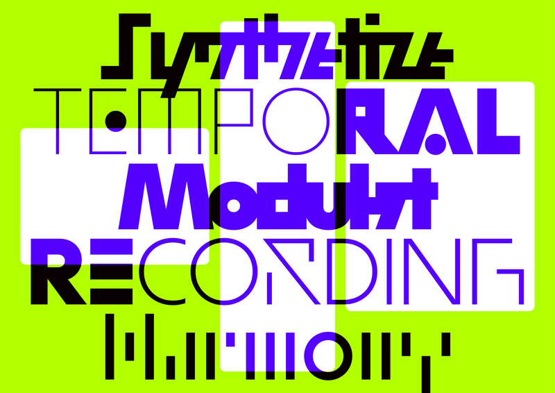
Harmonic Structures is an attempt to develop a modular and musical graphic language that could form the basis of a sound architecture. The first issue reviews information specific to the building and the population of Le Lignon in Geneva, in order to apply it in a two-dimensional musical notation system. Finally, these data are interpreted by a musician using an MPC 1000 to communicate in acoustic terms what precisely constitutes the building.

Aude Meyer de Stadelhofen – Pearly skin, Summer hit, Vanished by the wind

GRAPHIC DESIGN

Aude Meyer de Stadelhofen – Pearly skin, Summer hit, Vanished by the wind

with Diego Bontognali, Guy Meldem

The beach is a conflicting space. At once romantic and ridiculous, timeless and urgent, a fantasised empty space and a crowded shore, a place of freedom and a border. Pearly Skin, Summer Hit, Vanished by the Wind is a trace, a metaphor for the representations of the beach in the collective imagination today, before its disappearance. The newspaper, divided into three themes – anthropology, climate and migration – juxtaposes dreamlike images, factual news, necessary texts and meaningless advertisings. These different languages emphasise the paradoxical complexity of the place. Using cyanotype, the sheet becomes skin, and the print becomes a tan. The back and forth of the waves marks the pages, strewn with grains of sand and sun cream.

Tessa Roy – Digital Feminist Manifesto

GRAPHIC DESIGN

Tessa Roy – Digital Feminist Manifesto

with Guy Meldem, Tessa Roy

The Digital Feminist Manifesto website aims to present a set of principles for envisioning the body and its limitless nature in digital spaces, thus taking into account concepts such as inclusivity, the gender spectrum and intersectionality. The site consists of a textual section (the manifesto and its stakes) and avatars that represent one of the many possible interpretations of the body. These avatars are neither linear nor hierarchical; therefore they are organised in an evolving and branching way. Upon entering the site, we find ourselves at the central point of the page, allowing us to explore the site in all directions and discover its possibilities.

Alexis Gargaloni – Varia

GRAPHIC DESIGN

Alexis Gargaloni – Varia

with Aurèle Sack, Gilles Gavillet

Influenced by the rise of the metaverse, Varia is a metaphor of the early failure and absurdity of this technology, as well as research about typographic shapes. Mimicking the optimisation phenomena of object in 3D engines (Level of Detail), Varia is composed of three cuts of the same name: 0, 4, 8. While Level 0 seems closer to traditional typography, it is in fact a “smoothed out” version of the previous cuts, which already seeks to synthesise letters down to their most rudimentary forms. From the rigidity of the shapes, the existential constraints that the research brings to light illustrate the retrograde and dystopian vision of the metaverse, while at the same time offering a reassuring reflection of a future geometric transition of our bodies.

Laeticia Schwendi – +212 magazine

GRAPHIC DESIGN

Laeticia Schwendi – +212 magazine

with Diego Bontognali, Nicole Udry

Marrakech, nicknamed the “Red City”, offers a vibrant atmosphere and intoxicating fragrances. It is a city that is full of contrasts, where young artists emerge with boldness and contagious passion. +212 Magazine offers a journey to discover these artists and their universe. This work lies in dialogue and collaboration with all participants. It is about creating a genuine connection, exploring interconnections between cultures and bearing witness to the beauty and artistic diversity that emerges. Thus, wearing my different hats, I created this magazine, juggling between artistic direction, writing, interviews and simple discussions. And this is, I hope, only the initial stage of a long journey that will be rich in discoveries.

Ekaterina Bliznyuk – Photosensitivity warning: following content may cause seizures

GRAPHIC DESIGN

Ekaterina Bliznyuk – Photosensitivity warning: following content may cause seizures

with Diego Bontognali, Jonathan Hares

Photosensitive epilepsy is a variant of epilepsy in which the affected person suffers from particular reactions to light and certain static patterns. Due to a lack of awareness of this disorder, our environment contains a large number of visual triggers, which endanger the daily life of photosensitive people. My project reproduces in virtual reality the most harmful locations and elements for photosensitive people, always illustrating two of these variants: the one that is visually accepted and the one that acts as a visual trigger. Being both a graphic designer and a photosensitive person, I sought to highlight the ignorance of this disease, which leads to visual exclusion. This is reinforced by the idea that I myself will never be able to view my own project in its full form.

Agathe Bourrée – Informal Pictures

GRAPHIC DESIGN

Agathe Bourrée – Informal Pictures

with Gilles Gavillet, Nicole Udry

Each year, the seven most influent countries in the world gather to discuss international matters for a weekend hosted by one of the members. Informal Pictures is an inquiry that aims to recreate the atmosphere of these meetings, which lead to major decisions regarding international politics. It is an attempt to understand the influence of the press on the collective imaginary, with regard to those major political events. The study uses graphic design tools and mainstream journalistic sources to recreate an image that never existed, a missing image of political dinners during the annual G7. Those informal images are recreated based on what the newspapers say and used as input in an artificial intelligence to shape the intention of the picture.

Marjolaine Rey – Ici prochainement votre appartement

GRAPHIC DESIGN

Marjolaine Rey – Ici prochainement votre appartement

with Aurèle Sack, Diego Bontognali

Ici Prochainement Votre Appartement is the transition from private property to public space. On the eve of moving out of the family home, but especially in view of its imminent demolition, I have placed La Maison (The House) in a brand-new space, i.e. a book. This book, more than a personal monologue, is an invitation to enter through text and image. From the gate to the garden to the door, all the way to the attic, where the library lies. Iconography drawn from this library has an impact on the layout of the entire volume. The space of the book is my playground. The quarto format conceals half of the content between the pages. It is up to the readers to decide whether or not they want to enter each room of La Maison when they visit. Welcome to my home, soon to be yours…

Alice Villars – Mirù

GRAPHIC DESIGN

Alice Villars – Mirù

by Alice Villars

Mirù is an exploration of the transmission and itinerancy of my mother’s life through interdependent objects, dresses and a book. Clothes say a lot about someone. More than appearance, they are a fertile ground for graphic expression and self-expression. I created five dresses using archive material. The composition of the dresses incorporates ornamental forms and graphic elements, pictures. Each dress becomes an address from my mother’s life, representing a particular atmosphere that gives clues to her story. The editing, meanwhile, creates a loop between the dresses and the book, a place where everything comes together. Mirù plunges into the history and emotions of a life, conveyed through clothes and words.

Leoni Limbach – Wild Tales

GRAPHIC DESIGN

Leoni Limbach – Wild Tales

with Nicole Udry, Aurèle Sack

A flower is not just a flower, it is all living beings that depend on it to bloom. In the context of the biodiversity crisis, this book is a response to Gilles Clément's manifesto The Third Landscape. The landscaper calls for the revaluation of the spaces along our roads of cities. Between over-urbanisation and excessive agricultural monoculture, these forgotten marginal spaces are recolonised by pioneering, wild flora, regenerating ecosystems that are rich in biodiversity. Unlike the herbarium, which proceeds by fragmentary analysis, this project analyses relationships between living beings. Wild Tales is a book of atmospheric illustrations that invites us to draw from the varied colours and shapes of this space as well as the wild stories that make it up.

Laeticia Jakob – Sabina?

GRAPHIC DESIGN

Laeticia Jakob – Sabina?

with Nicole Udry, Guy Meldem

The “Neovertebra” population continues to decline, decimated by high temperatures and food shortages. Nothing grows outside the greenhouses. To remedy the attacks that threaten the plantations, Sabina and Greg develop a dandelion-based fertiliser. Sabina? is a graphic novel in response to the possible collapse of civilisation. Faced with a certain sense of helplessness and passivity, the technique of hand collage appears as a palimpsest through which history can assume new perspectives. Collected images and personal creations accumulate and decay over the course of this dystopia, encouraging the reader to project and assimilate this information.

Romain Oederlin – Archetype

GRAPHIC DESIGN

Romain Oederlin – Archetype

with Diego Bontognali, Aurèle Sack

Is what we see real or subjective? Interpretation is always the result of individual apprehension. This is why space can be manipulated to exacerbate desired relationships. In connection with the perception of our environment, this work examines the principle of anamorphosis generated by typographic typefaces designed in three dimensions. Fluctuating between letters and abstraction, these visual structures offer different degrees of legibility depending on the point of view adopted.

Antonin Maudry – Coemeter

GRAPHIC DESIGN

Antonin Maudry – Coemeter

with Aurèle Sack, Jonathan Hares

Coemeter offers a reinterpretation of the Trajan typeface. This font is rich in history, from the Roman stones on which it first appeared to its various contemporary adaptations in stone engraving, predominantly found on funerary monuments in the Western world. This typographic work is showcased on a website. A digital cemetery awaits, where you can engrave your tombstone and personalise your mourning space. Coemeter plays on dualities, i.e. the sacred and the profane, history and anachronism, matter and consciousness. This unpretentious and poetic experience invites us to reconsider our connection with stone, memory and loss.

Marine Dang – For the Times They Are a-Changin’

GRAPHIC DESIGN

Marine Dang – For the Times They Are a-Changin’

by Marine Dang

For the Times They Are a-Changin’ is a graphic interpretation of the play PRLMNT written by Camille de Toledo in 2017. The anticipatory fiction is divided into two parts: the first one is set in a capitalist system with unlimited expansion and power, while the second one seeks resilience and recognition of the rights of non-humans. The challenge of this publication is to bring these ideologies into dialogue, to offer a parallel reading of the two scripts. To do this, I experimented with the materiality of the object. Through the choice of formats, papers and fonts, I both oppose and mix these statements. Through images, I offer new settings for the play, taking the audience into the ruins of their own world. www.marinedang.ch

Filter