MA DIGITAL EXPERIENCE DESIGN
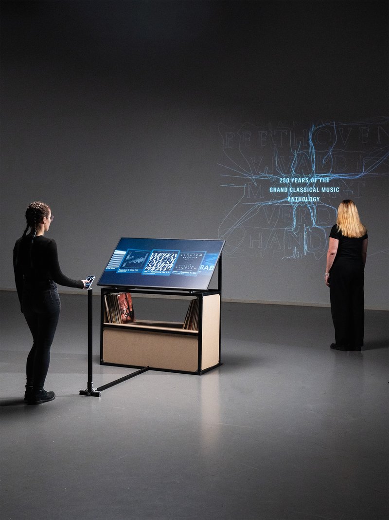
The Modular Mindset
with Antonin Waterkeyn
From connected watches to large-scale billboards, digital interfaces now operate across all scales. Designing a visual identity in this context requires thinking in terms of systems that can adapt to multiple formats, uses, and rhythms. This workshop explores the creation of modular, animated identities for a fictional music label, drawing on motion design and procedural logic. Using Cavalry, students develop dynamic visual systems that transform according to precise rules, while maintaining graphic coherence and a strong relationship to the sound universe.