Identité Visuelle

Identité Visuelle

The international typographic style, also known as Swiss style, is a trend in graphic design developed in Switzerland in the 1950s by Armin Hofmann and Emil Ruder. It emphasizes simplicity, readability and objectivity, using sans-serif fonts as the main and structuring element of the design. Among the corporate identities and logos emblematic of the international style are American Airlines (1967, Massimo Vignelli) Fiat, (Jean Reiwald and Armin Vogt), or Swissair (1978, Karl Gerstner). (source: wikipedia) One of the effects of this very widespread (and rather rigid) style is that everything ends up looking the same. During the next semester, you will give a brand an identifiable personality, in the figurative sense of the word.

Studio project (2019) with Jonas Wandeler

Students
Marvin Armand, Sidonie Bays, Guillaume Besson, Arnaud Claret, Elise Connor, Jean Ducret, Loïc Dupasquier, Astrid Durand, Basile Fournier, Leah Hardy, Lucas Haussener, Bruno Jolliet, Alexandre Lescieux, Niki Paltenghi, Noé Proton, Aurore Péry, Lou Rais, Jean Reynaud, Arthur Seguin, Andréa Uldry
Know-how
Visual identity

The international typographic style, also known as Swiss style, is a trend in graphic design developed in Switzerland in the 1950s by Armin Hofmann and Emil Ruder. It emphasizes simplicity, readability and objectivity, using sans-serif fonts as the main and structuring element of the design. Among the corporate identities and logos emblematic of the international style are American Airlines (1967, Massimo Vignelli) Fiat, (Jean Reiwald and Armin Vogt), or Swissair (1978, Karl Gerstner). (source: wikipedia)

One of the effects of this very widespread (and rather rigid) style is that everything ends up looking the same. During the next semester, you will give a brand an identifiable personality, in the figurative sense of the word.

Aurore Péry
Aurore Péry
Aurore Péry
Aurore Péry
Aurore Péry
Aurore Péry
Aurore Péry
Aurore Péry
Aurore Péry
Aurore Péry
Aurore Péry
Aurore Péry
Aurore Péry

1/13

Niki Paltenghi
Niki Paltenghi
Niki Paltenghi
Niki Paltenghi
Niki Paltenghi
Niki Paltenghi
Niki Paltenghi
Niki Paltenghi
Aurore Péry

1/10

Eugénie Simeon
Eugénie Simeon
Eugénie Simeon
Eugénie Simeon
Eugénie Simeon
Eugénie Simeon
Eugénie Simeon
Eugénie Simeon

1/8

Projects related to Visual identity

Dynamic Identity - 2026

BA MEDIA & INTERACTION DESIGN

Dynamic Identity - 2026

with Angelo Benedetto

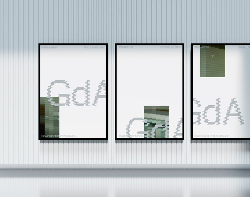
First-year students designed visual identities for fictional museums. As part of the Dynamic Display course led by Angelo Benedetto, this project led them to create graphic universes that that express the character of each imaginary exhibition site.

Mattias Koskinen – SKRÅ - Mind in Finland

BA GRAPHIC DESIGN

Mattias Koskinen – SKRÅ - Mind in Finland

by Mattias Koskinen

SKRÅ is a clothing brand that draws its inspiration directly from Finland. Designed to reveal what others may not perceive, it opens new paths for exploration. The term Skrå comes from the Swedish language means something oblique or inclined. This first pre-capsule collection, "Mind in Finland", aims to showcase the very essence of the brand. The collection sets aside conventional codes to present a new perspective. It embraces opacity, textures, organic silhouettes, and elongated forms, elements that emerge when landscapes are immersed in light and the shadows it creates. These are the principles that run throughout this work, shaping both the identity and the common thread of the collection.

Simon Cossy – Openground

BA GRAPHIC DESIGN

Simon Cossy – Openground

by Simon Cossy

The Openground visual identity project is born out of two observations made by the graphic designer in his practice of basketball coaching for 14 year olds. Firstly, organized sports require resources, organisation and a framework that many kids don't have access to. A lot of them thus quit their club, and some will continue playing the sport they love outside, on public playgrounds. Secondly, an impactful visual language can be a powerful tool to create enthusiasm, motivation and a sense of belonging for these youths. How, then, can one use of this tool in the context of exterior amateur basketball, so that kids who are not able to join a club still feel concerned by the game and legitimate to play it?

Visual Identity - “?”  - BA1 S2 2025-2026

BA GRAPHIC DESIGN

Visual Identity - “?” - BA1 S2 2025-2026

with Adeline Mollard

Last year, the Marché du Temple, an iconic grocery store located in front of ECAL, closed its doors, leaving behind precious memories and a warm atmosphere that had enlivened the neighborhood for decades. This semester, students had the opportunity to reinvent this space by designing a complete visual identity for a new fictional business. Their work resulted in a poster and its animated version, a booklet, and a proposal for a new storefront. To celebrate the end of the semester, an exhibition was organized in the former premises of the Marché du Temple.  

Alexandre Carruzzo – CH38

BA GRAPHIC DESIGN

Alexandre Carruzzo – CH38

by Alexandre Carruzzo

CH38 is a visual identity design proposal for the upcoming 2038 Olympic Winter Games in Switzerland. This project seeks to address the lack of visual unity between the increasingly complex live analytical overlays of televised sporting events with the overall aesthetic of the Games. In an effort to establish a consistent visual connection between the greater aesthetic and the various information displayed on-screen, CH38 offers a variable uniwidth typeface, Swinter. With three degrees of spatial freedom, it brings visual dynamism to the overlay, reflecting the sporting spirit of the Games. Moreover, its geometric construction echoes Swiss values of rigor and precision.

Related courses