Ethical, Accessible and Mindful Design

Ethical, Accessible and Mindful Design

Ethical, Accessible & Mindful Design est un module d'une semaine qui forme les étudiant·e·s à interroger les dimensions éthiques des décisions de design. Par la pratique, les étudiant·e·s apprennent à concevoir des expériences inclusives, transparentes et attentives à leur impact social plus large.

Ce semestre, le module a pris l'accessibilité pour les personnes malvoyantes comme contrainte centrale de design. Sous l'intitulé Goodbye to All …, les étudiant·e·s devaient accompagner un·e utilisateur·trice à travers un adieu permanent, irréversible et non négociable. Au-delà de la conformité aux WCAG, l'exercice exigeait une attention soutenue au contraste dans tous les états de l'interface, à la lisibilité typographique, à la navigation au clavier seul, à la visibilité du focus, ainsi qu'à l'intégrité de la mise en page aux zooms 100 % et 300 %, sans perte de hiérarchie ni de lisibilité.

Projet d’atelier (2026) avec Irene Pereyra

Étudiant·e·s
Amna Ahmad, Delphine Brantschen, Seoyun Choi, Marc Facchinetti, Sina Fathollahi, Gwenaëlle Gustin, Emilie Müller, Cindy Murier, Thomas Neyroud, Shin Young Park, Rishab Sachidanand, Youri Zermatten
Savoir-faire
UX/UI, Web

Hi mum!

Goodbye to parent-child relationship

This tarot game allows a mother to hear and respond to revelations made by her child. In the first version, it is intended only for my mother; in the second version, anyone can share their stories before asking their mother to interact. The goal is to talk to each other as equals in order to break down the parent-child dynamic.

The mother who is playing reveals the cards one by one and can only respond once.  Once the cards revealing the past have been revealed, a bonus card appears to summarize the current relationship. She then must turn all of them over and put them away in a box. The memories are not destroyed, but left in the past so that a new relationship can begin. When a card can be interacted with, it glows and shifts slightly when the mouse hovers over it. To move cards, you can click or drag them.
 

Gwenaelle Gustin

Goodbye Jongny

Goodbye to Jongny

The user witnesses the irreversible demographic transformation of Jongny by Nestlé. A progressive interaction prepares them for the village's disappearance, guiding the ultimate "forgetting" of its history.

My research moved beyond basic WCAG 2.2 checklists to focus on success criteria contrast and reflow. This led to the "Information Density" insight: low-vision users need a clear anchor. I prioritized layout with generous white space to eliminate the "clutter trap". By ensuring that color is never the sole conveyor of meaning adding distinct patterns to historical states; the design remains legible in grayscale or high-glare environments. The choice of Selecta's specific metrics was a direct result of researching how letter-spacing affects readability for users with central vision loss. 
 

Marc Facchinetti

The most inaccessible website.

Goodbye to ACCESSIBILITY

The Most Inaccessible Website is a deliberately hostile interface. By breaking every accessibility rule on purpose, it makes able users feel what others navigate every day.

Instead of treating accessibility as a background constraint to smooth over, I made it the subject. Most projects meet the guidelines quietly; I went the other way building the most inaccessible website possible, so people without disabilities are forced to feel what others deal with every day. I went through the WCAG guidelines and more generaly, looked into how blind and low-vision users actually navigate the web: keyboard-only flows, screen readers, dwell-based interaction, head and eye tracking as cursor replacements. What stuck with me wasn't any single rule, but how much of the web silently assumes a mouse, stable vision, and fine motor control. You don't notice those assumptions until one of them is taken away.
 

Youri Zermatten

Goodbye to micro-digital crimes

Goodbye to micro-digital crimes

This short scenario is about saying goodbye to your micro-digital crimes. A unknown detective is giving you the file they have on your digital activities. Your goal is to read it and then destroy it. 

This project has a lot of high colors, and the WCAG requires high contrast between typography and background. Part of the research was to find accessible typography, and good text size, color choice for reading. Readability was the main objective, without losing too much design. 
 

Emilie Muller

Burden of Expectations 

Goodbye to Conditional acceptance 

The concept is about exploring the duality that is developed when exposed to judgemental ideologies and stories. A duality that laces social perception into every personal decision. The interactions aims to give a glimpse of what it might be like to make often simple decisions, where the user’s choices has implications on how they are percieved. So by the end you say goodbye to this invisible checklist that comes with every choice. Saying goodbye to filtering every choice, big or small, through other opinions.

As the visual design was intentionally chromatic, one that uses saturated colours layered across backgrounds, testing was a challenge. Each colour combination required individual evaluation. Each iteration included testing foreground-background pairings across UI states (default, hover, focus, disabled), adjusting hue, saturation, and lightness values until combinations passed recommendations without compromising the art direction. I used low-vision accessibility test with WCAG 2.1 as a base, focusing specifically on contrast requirements; AA (4.5:1 for normal text) and AAA (7:1) metrics. I also was looking into guidance from resources like the Accessibility Guidelines Working Group's supplementary notes and community-driven tools such as Stark and Colour Contrast Analyser. Typography decisions were guided by legibility principles that go beyond type size. I tested typeface using character disambiguation checking if visually similar characters like S/5 and I/l/1 remained indentifiable at small sizes. This ruled out typefaces with ambiguous letterforms regardless of their aesthetic appeal. Collectively, these findings changed my design process from an aesthetics first to a constraints led approach, where accessibility thresholds became generative parameters rather than last minute checks.
 

Rishab Sachidanand

The machine that forgets

Goodbye to your secrets

My research focused on low-vision accessibility principles from WCAG 2.2 and inclusive interaction design beyond compliance. I studied contrast ratios, typography readability, zoom behavior, motion sensitivity, and visibility in difficult lighting conditions. I also explored the role of dark mode interfaces in reducing eye strain and improving comfort in low-light environments. One important insight was that accessibility is not only technical but emotional. Since the project deals with confession and vulnerability, the interface needed to feel calm, readable, and reassuring without overwhelming users visually. I therefore avoided dense layouts, decorative noise, and excessive animation. Accessibility directly shaped the project’s aesthetic language: the minimalist dark interface became both a conceptual choice and an inclusive design solution. The final experience balances emotional storytelling with clarity, legibility, visual comfort, and ease of interaction.

An anonymous confession machine lets users reveal personal secrets, then permanently destroys them through a ritualized digital interaction that transforms vulnerability into release, making the goodbye emotionally irreversible.
 

Delphine Brantschen

Projets liés à UX/UI

Emilie Maier – Moji

BA MEDIA & INTERACTION DESIGN

Emilie Maier – Moji

with Pauline Saglio, Christophe Guignard, Alain Bellet, Gaël Hugo, Laura Nieder, Lara Défayes

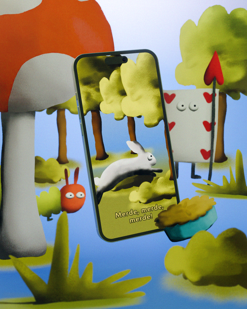
Un mot de passe trop simple peut être décrypté en quelques secondes. Beaucoup réutilisent le même depuis des années ou confient tous leurs mots de passe à des logiciels spécialisés, en comptant ne pas avoir à s’en souvenir eux-mêmes. Moji propose une alternative ludique et accessible pour renforcer notre sécurité numérique, sans complexité. Pensée pour les personnes peu à l’aise avec ces enjeux, l’application accompagne l’utilisateur pas à pas, guidé par Moji - un petit personnage qui simplifie la création de mots de passe et rend leur mémorisation plus intuitive. L’ensemble de l’expérience est conçu pour être fluide et non anxiogène, transformant ainsi une tâche souvent pénible en un moment simple, guidé et rassurant.

Portfol.io

BA MEDIA & INTERACTION DESIGN

Portfol.io

with David Liebermann, Maximilian Kiepe, Jana Reddemann

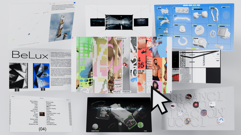
Hello World ! Aurevoir le web prévisible, standardisé et interchangeable. Les étudiant·e·s ont remis en question les conventions du monde numérique, exploré les vastes possibilités du médium, et inventé de nouvelles façons d'interagir avec le Web. Et quoi de mieux pour donner du sens au design web que les portfolios des étudiant·e·s eux-mêmes, compris comme des expressions d'attitude et de personnalité. https://websites.ecal-mid.ch/

Screen Design – 2025

BA MEDIA & INTERACTION DESIGN

Screen Design – 2025

with Harry Bloch

Sites web développés durant un semestre à partir de livres choisis par les étudiants, qu’ils ont adaptés en expériences web, dans le cadre du cours de Screen Design de Harry Bloch, deuxième année Bachelor Communication Visuelle.

Elena Biasi – Magnetic Fragments

BA MEDIA & INTERACTION DESIGN

Elena Biasi – Magnetic Fragments

with Pauline Saglio, Christophe Guignard, Laura Nieder, Alain Bellet, Gaël Hugo, Lara Défayes

Avant l’essor du numérique et des réseaux sociaux, les moments du quotidien étaient capturés sur supports analogiques, puis visionnés en famille de manière linéaire. Ces longues cassettes VHS, faites de séquences successives, ont peu à peu disparu, victimes de leur obsolescence. Magnetic Fragments propose de redécouvrir ces souvenirs oubliés via une interface web tridimensionnelle où chaque bulle incarne un souvenir à explorer et commenter. Destinée à un cercle privé, la plateforme collaborative offre une navigation libre, revisitant les fragments de souvenirs de façon dynamique et rompant avec la structure monotone des anciens visionnages. Magnetic Fragments devient ainsi un lieu de transmission intergénérationnelle où le passé se partage dans le présent.

Enshittification - 2026

BA MEDIA & INTERACTION DESIGN

Enshittification - 2026

with Tibor Udvari

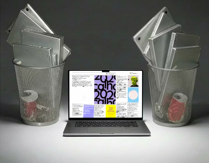
De nombreuses plateformes se dégradent avec le temps, passant d'outils utiles à des systèmes manipulateurs. Dans cet atelier, nous abordons l'enshittification comme une méthode créative en modifiant des sites existants ou en développant de petites expériences web qui exagèrent la friction, l'automatisation, la surcharge et la désorientation afin de révéler les logiques sous-jacentes.

Formations liées