There Will Be Blood

There Will Be Blood

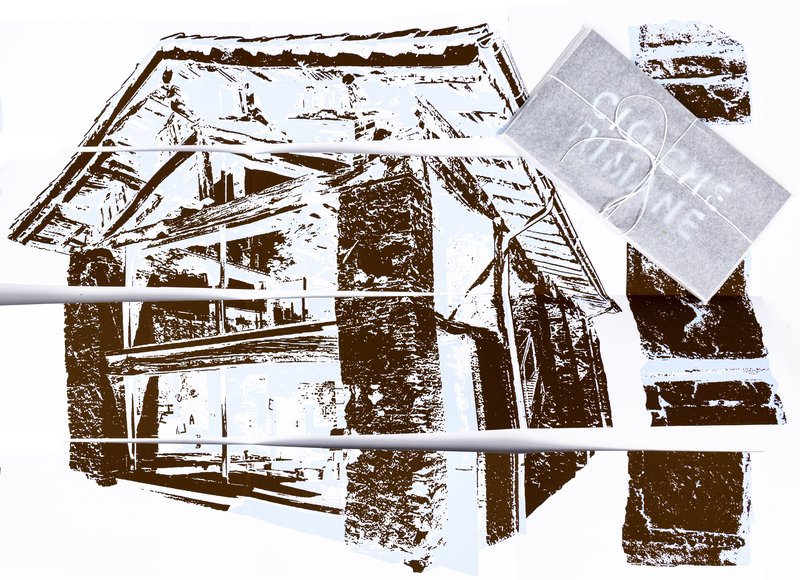
Sonya Dyakova wanted to do something about conveying music through typography. She have watched recently a Paul Thomas Anderson film ‘There Will Be Blood’, and found it very moving and inspiring. The film features an original orchestral score by Radiohead guitarist Jonny Greenwood, and she felt the music had integral and powerful role in the film. On day one the students and I watched the film together. Afterwards, I have asked them to create a poster for it. The poster had to embody the essence of the story and ‘weave in’ the feeling that the sound made. Design is about telling a story, and I wanted to the audience to be able to get the story, or an essential aspect of the story, from looking at the poster. One of the tasks of the designer is to extract essence and communicate it in the most clear voice through tools that we know — typography, colour, image making, printing techniques. All elements of the poster had to have a reason and purpose. She have asked the students to create a list of words, while the film was fresh in their mind, which were reflecting the story. From these words she wanted  them to start making visual elements that would make up the poster. She asked the students to use printing press, using wood and metal to create printing plates. Which, in turn, instructed the look of the poster to some degree. The number of layers was limited by the number of students and time they had — any project has constraints, and so did this one. The result was a healthy variety of approaches: some posters were abstract, some more figurative. She tried to push the students not to be afraid of the obvious. Alan Fletcher’s words are always in her mind: “What distinguishes designer sheep from designer goats is the ability to stroke a cliché until it purrs like a metaphor”.

Workshop (2013) avec Sonya Dyakova

Sonya Dyakova wanted to do something about conveying music through typography. She have watched recently a Paul Thomas Anderson film ‘There Will Be Blood’, and found it very moving and inspiring. The film features an original orchestral score by Radiohead guitarist Jonny Greenwood, and she felt the music had integral and powerful role in the film. On day one the students and I watched the film together. Afterwards, I have asked them to create a poster for it. The poster had to embody the essence of the story and ‘weave in’ the feeling that the sound made. Design is about telling a story, and I wanted to the audience to be able to get the story, or an essential aspect of the story, from looking at the poster. One of the tasks of the designer is to extract essence and communicate it in the most clear voice through tools that we know — typography, colour, image making, printing techniques. All elements of the poster had to have a reason and purpose. She have asked the students to create a list of words, while the film was fresh in their mind, which were reflecting the story. From these words she wanted them to start making visual elements that would make up the poster. She asked the students to use printing press, using wood and metal to create printing plates. Which, in turn, instructed the look of the poster to some degree. The number of layers was limited by the number of students and time they had — any project has constraints, and so did this one. The result was a healthy variety of approaches: some posters were abstract, some more figurative. She tried to push the students not to be afraid of the obvious. Alan Fletcher’s words are always in her mind: “What distinguishes designer sheep from designer goats is the ability to stroke a cliché until it purrs like a metaphor”.

Mateo Broillet, Alexandra Chernopazova, Sabrina Fischer

1/2

ECAL-Affiche-12x17cm-240dpi-AdobeRGB1998.jpg
Naomi Gallay, Clemens Alexander Piontek, Chi-Binh Trieu

Projets similaires

Design en Contexte – BA2 S2 2026

BA DESIGN GRAPHIQUE

Design en Contexte – BA2 S2 2026

with Nicole Udry

Genius Loci, “l’esprit du lieu”, désigne l’identité spécifique d’un lieu, son essence. En architecture, selon ce principe, les caractéristiques uniques d’un lieu sont prolongées dans une réalisation. Les élèves de 2ème année en Design graphique ont travaillé sur une communication basée sur ce principe et sur la réalisation architecturale qui s’y réfère afin d’en faire la promotion, ou de prolonger la communication du lieu.

Identité Visuelle - « ? » - BA1 S2 2025-2026

BA DESIGN GRAPHIQUE

Identité Visuelle - « ? » - BA1 S2 2025-2026

with Adeline Mollard

L’année dernière, le Marché du Temple, épicerie emblématique située devant l’ECAL, a fermé ses portes, laissant derrière lui des souvenirs précieux et une atmosphère chaleureuse qui animait le quartier depuis des décennies. Ce semestre, les étudiants ont eu l’opportunité de réinventer cet espace en concevant une identité visuelle complète pour un nouveau commerce fictif. Leur travail a donné naissance à une affiche et sa version animée, un livret et une proposition de nouvelle devanture. Pour célébrer la fin du semestre, une exposition a été organisée dans les anciens locaux du Marché du Temple.  

Création d'image -  Motifs en Résonnance (ECAL × Chillon) - BA1 2025-2026

BA DESIGN GRAPHIQUE

Création d'image - Motifs en Résonnance (ECAL × Chillon) - BA1 2025-2026

with Guy Meldem

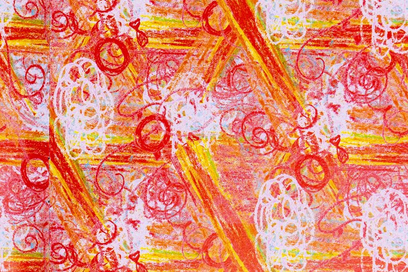
Dans le cadre de l’exposition ECAL x Chillon, qui se tiendra au château éponyme, les étudiants du Bachelor Design Graphique ont conçu des motifs inspirés des caractéristiques du château. Sous la supervision de Guy Meldem, ils ont créé des systèmes graphiques variés. Ces motifs seront imprimés en tenture dans la salle des armoiries du Château de Chillon pour une exposition temporaire.

Design Typographique - BA1 S2 2025-2026

BA DESIGN GRAPHIQUE

Design Typographique - BA1 S2 2025-2026

with Robert Huber

La création d’un logotype consiste à établir une identité visuelle unique, ancrée dans un univers bien défini.  Les étudiants de première année en Design Graphique ont conçu un logotype entièrement dessiné à la main, en lien avec un sujet, un concept ou un environnement de leur choix. Ce projet a nécessité des recherches approfondies dans les archives typographiques. Chaque étudiant a compilé un carnet de références et élaboré un ensemble de spécimens, afin d’enrichir et de structurer leur réflexion graphique et formelle.

Design écran - Évenément Flexible - BA1 S2 2025-2026

BA DESIGN GRAPHIQUE

Design écran - Évenément Flexible - BA1 S2 2025-2026

with Harry Bloch

Dans le cadre du cours Design écran avec Harry Bloch, les étudiants ont choisi librement un événement comme point de départ de leur projet. À partir de recherches documentaires, textuelles et iconographiques, chacun a développé une édition digitale pensée comme un poster interactif et flexible, réagissant aux changements de format et de dimensions de l'écran. Le projet interroge ainsi la mise en page comme système vivant plutôt que composition figée. Chaque proposition s'accompagne d'une réflexion conceptuelle et formelle, articulant contenu événementiel et expérimentation du médium écran.

Formations liées