


BA MEDIA & INTERACTION DESIGN
Break It Fix It
with Daniël Maarleveld
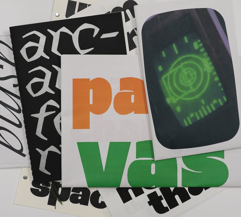
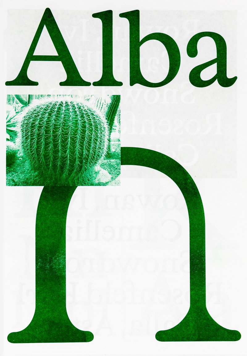
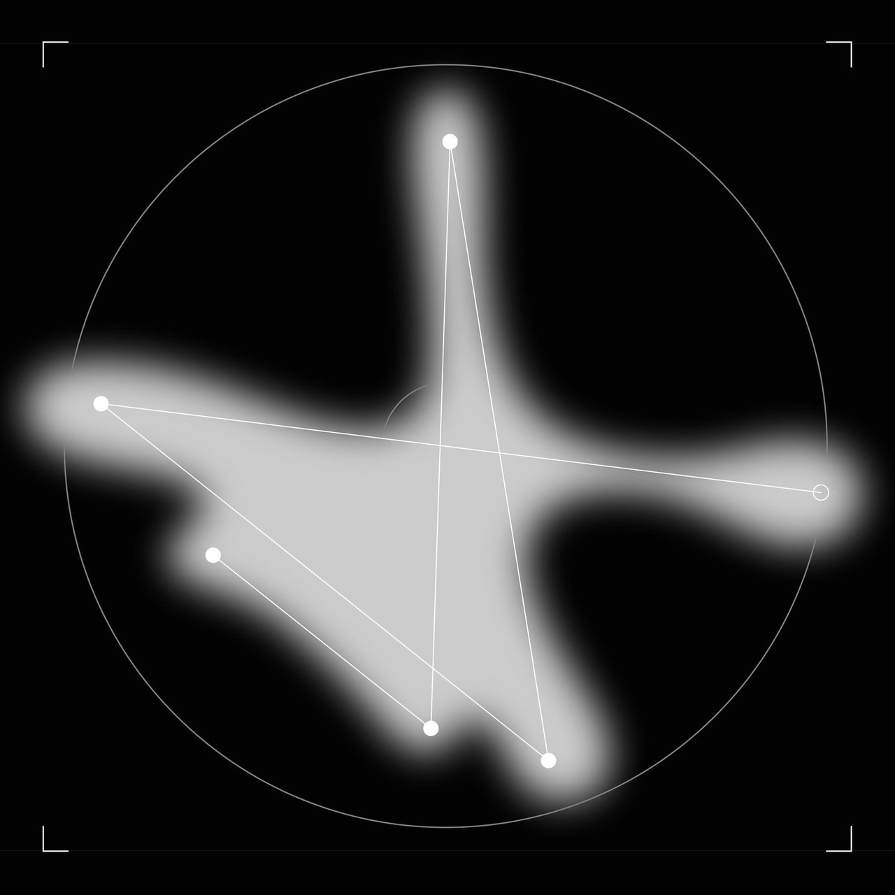
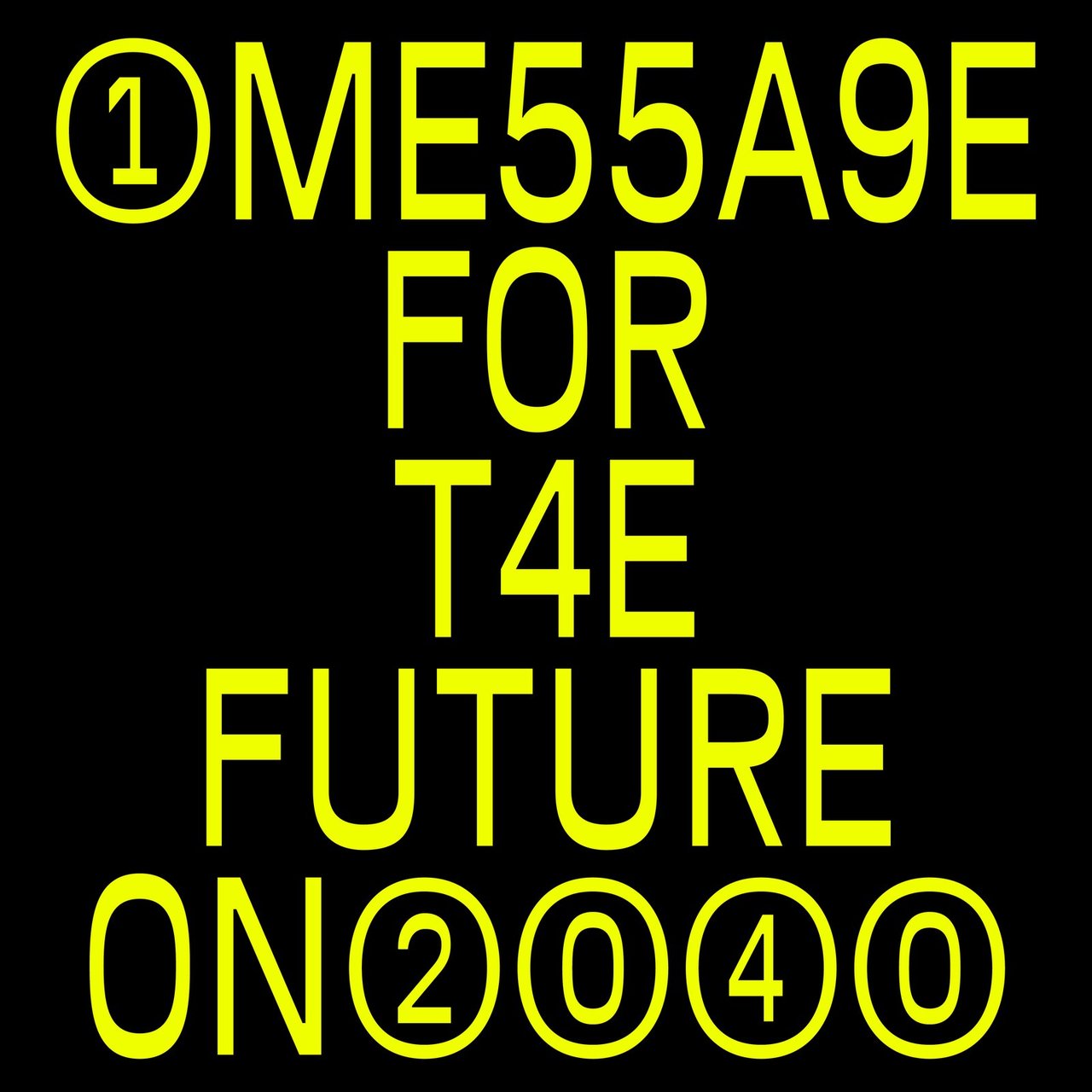
Break it Fix it est le résultat d'un workshop réalisé sous la direction de Daniel Maarleveld. Basé sur la musique Technologic - Daft Punk. Chaque groupe s'est réapproprié une phrase de la musique afin de la valoriser graphiquement. Le résultat est à la fois: une série d'affiches, un clip vidéo compilant les différents systèmes typographiques, ainsi qu'une série de posters interactifs basés sur les mêmes règles.